Table of contents
In every organization, different people need to answer completely different questions from the same data.
For instance, CEOs need to make different data-driven decisions than front-line employees, who need to monitor progress differently than functional managers. And if you are an agency, clients rarely need to see the level of detail you need to see if you’re doing the work for them; they just need to see the results.
Yet, most software tools only let you visualize data in one way, even though “one size fits all” doesn’t work for reporting.
That leaves you with the task of figuring out how to create visualizations yourself, which is not always easy.
Fortunately for you, I’m going to try and simplify the process of presenting and visualizing data for someone with a different perspective than yours.
First, let’s talk about what you should leave out entirely.
Everyone knows the average CEO does not need to see how many new Twitter followers their company account has gained. (Vanity metrics be damned!) Also, your board of directors doesn’t need to know your traffic goal this month. If you’re in sales, your sales VP probably doesn’t need to see how many calls you made today (unless you have a history of slacking off).
But, choosing what to omit shouldn’t be the only thing you customize when visualizing data for different audiences.
Here’s a quick list of other questions you should ask yourself every time you visualize your data for someone:
- Should you show your performance against your current goal or not?
- Should you show daily fluctuation?
- Should you show a comparison to a previous time period?
- How much historical data should you show?
To illustrate how these 4 questions impact your data presentation, I’ve prepared 4 different visualizations of the same metric — website sessions — for four different audiences. I’ve also written the logic I used to arrive at them…
The Do-er Needs Daily Granularity
If you’re reading this, you’re probably a do-er; the one doing the work. You’re probably also the one who has to build reports to show the impact of your work to clients or bosses.
But before you start building reports for others, first figure out how you’re going to monitor performance for yourself.
Monitoring performance, I’ve discovered, is a process that most companies do poorly or not at all. Don’t make this mistake. If you’re on the hook for producing monthly improvement, you better be making sure you’re on pace to your monthly goal every day or every week at least. Or if you need to hit quarterly goals, checking your metrics every week or a few times per month is a must.
For purposes of this example, let’s say that you’re on the hook for hitting a monthly goal, like Kevin Kononenko, our content marketing manager.
When Kevin joined the Databox team, he began setting up Databoards to monitor the impact of his work. I’d look at them, but didn’t really get the insight I wanted. One day, I asked him, “Why do you look at it that way?” and that’s when I realized he’s monitoring the data for different reasons than I am.
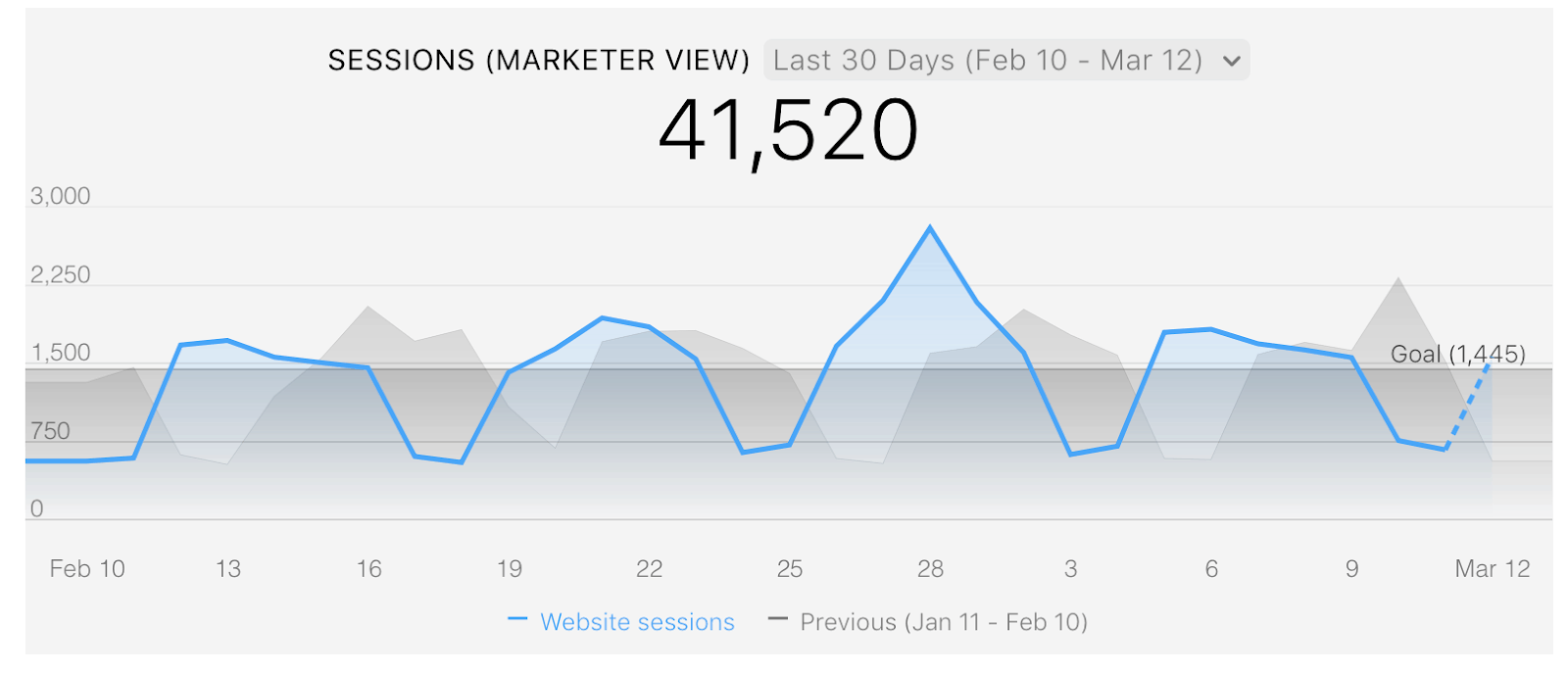
Here’s an example of a Datablock he monitors.
Why is he monitoring the data differently than I do?
For him, identifying daily spikes and ensuring weekly consistency is critical.
Increasing sessions and signups month-over-month is his job. Because he’s on the hook for hitting targets we’ve set, he’s doing new things every day to drive sessions and signups. A few of those things include managing content for our blog, our social content promotion and email marketing.
By monitoring for daily spikes as he’s executing these marketing tactics, he can identify the things he did that day that caused more sessions and signups, then repeat those activities or do more things similar to them.
For example, in the case of blogging, when he sees an article getting more social shares than the average post, he can promote it more than he normally would.
Further, by monitoring for weekly consistency, he can see whether he’s on track for the monthly goal. (The shaded blue area above the daily goal line, typically on the weekdays, needs to be greater than the white space below the line, typically on the weekends.)
Since he has a monthly goal, it’s critical that he doesn’t get behind in a given week. The whole team is counting on him to hit that goal and if he doesn’t, he needs to explain ‘why he missed’ to the whole team during our monthly all-hands meeting.
PS. You might have noticed if you examined Kevin’s Datablock closely that he likes to look at the “Last 30 days” (instead of month to date) and he has the previous month’s stats visible in the shaded grey area too. This gives him maximum perspective on his recent performance.
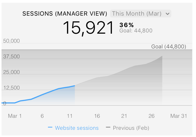
The Functional Manager Needs To See Monthly Goal Performance
Although my title is CEO, I’m more like a functional manager since everyone in marketing and sales reports directly to me right now. Given the broader scope of things I need to monitor and manage, I can’t pay attention to what causes daily or weekly spikes, like Kevin does.
However, I do care a lot about hitting our monthly traffic goals because there is a direct correlation between our website traffic and our new sales. (Based on our historical data, we’ve developed a model that tells us how much traffic we need each month for the next several months to get us to our revenue targets.)
So, in my case, I look at the data a bit differently using a cumulative line chart, like the one below. As you can see, it’s difficult to see daily or weekly fluctuations in my chart. (Kevin’s chart is much better for that.) But I can see a few things more easily in my chart, including whether we’re doing better than last mont and whether we’re on track to hit our monthly goal.
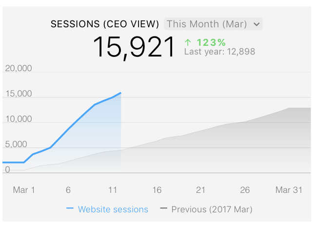
The CEO Needs to See Year-Over-Year Improvement
In a typical mid-sized organization, there are a few management layers between the team doing the marketing work and the CEO. In fact, in most organizations, the person running the business isn’t that involved in setting or executing the marketing strategy. (Personally, I think that’s a missed opportunity, but that’s for another post.)
So, in most cases, the CEO isn’t going to want to monitor month-to-date performance to a monthly goal (like I do). They might simply be happy knowing that their annual marketing expenditure is getting them year-over-year growth.
In fact, many of the agencies in the Databox Partner Program sell their clients on the fact that they can produce modest growth year-over-year. After all, if you’re only spending $5-10k USD per month on an agency, you can’t expect them to double your multi-million dollar business overnight. You should expect an ROI, but not miracles.
So, in this case, visualizing the monthly performance in comparison to the month a year ago, like in the graph below, is a better way to show progress.
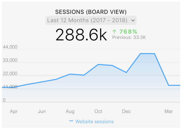
The Board Wants to See Consistent Improvement Over Long Time Periods
In our case here at Databox, like many other startups, we have a board of directors made up of experienced investors. They sit on lots of boards and see lots of data.
If I showed them any of the graphs above, they’d be asking me, “What are you hiding?” Showing only a month’s worth of data does not tell the full story. They’d correctly argue that anyone can perform well for a few weeks or month, especially if compared to the same month in the year prior.
Also, since they’re busy people who spend just an hour or two per month with us, it’s not realistic for them to remember how we’ve performed over the last 3 or 6 months in every metric.
What they want to see in a graph is steady monthly growth; a track record of being able to grow a number month-over-month over a long period of time. This demonstrates that we’ve discovered a repeatable process that we can leverage to hit bigger and bigger goals.
As an example, if I were to show them how our traffic has grown, here’s the graph I’d show. While not every month was better than the previous one, it demonstrates that our team can grow traffic considerably each quarter.
With this data, it’s easy to show that if we invest more in what we’re doing, we can be sure we’ll grow this number even faster.
Different Visualizations for Different Folks
Hopefully, the examples above help you think differently about how you build your dashboards or reports when presenting to different stakeholders.
Here’s some guidelines I follow:
- Do-ers need daily fluctuations and progress to goal: If you’re the person doing the work to improve a metric, monitoring fluctuations and progress to goals on a daily (or at least weekly) basis is key. This gives you time and the information needed to course-correct your plan and ensure you hit your goals by the end of the month.
- Front-line managers need progress to monthly goal achievement: When reporting the impact of your work to a boss who has a bunch on their plate, just show them what they care about. In most cases, that is progress to monthly or quarterly goals.
- CEOs need to see historical improvement: Show historical performance based on the improvement your intended audience expects. If your client or bosses expect month-over-month improvement, show that. If annual improvement is what is expected, show the year-over-year improvement.
- Boards need to see more history data: The further someone is removed from the person doing the work, the greater the importance of historical data. For example, if you’re reporting to a CEO or executive that’s a few levels above you or a board, you have to show them more historical data so they can conclude whether or not you’ve figured out a repeatable model.
Unfortunately, none of these rules are hard and fast. Every organization is different.
Some CEOs will want to micro-manage the details. Some functional managers will want to track daily results. Some do-ers don’t need to monitor metrics daily.
So, it’s always important to ask people how they want to see the data. If they don’t have any ideas, use the examples above as starting points for a conversation.
How are you presenting data to different audiences?
As you can probably tell from the stories I shared above, I learned these lessons through trial-and-error. As an engineer turned sales executive and two-time CEO, I’m no stranger to presenting data.
But that doesn’t mean I have it all figured out either.
Kevin opened my eyes to the importance of daily monitoring. Presenting to our board over the last year gave me an idea of what they want to see. Plus, all of these visualizations are predicated on our annual growth targets and our cadence of setting monthly goals, things that might not be relevant in your situation.
So…
If you’ve got a better or different way of visualizing data for different audiences, please share what works for you in the comments. We’re still learning too!