Table of contents
Let’s face it. In today’s “data-driven” world, there is no shortage of data.
We have data from our marketing campaigns, our website behavior, video plays, Facebook posts, purchase data, email and lead information – the list goes on.
In fact, according to Chief MarTec, there are now over 6800 marketing technology companies.
In a recent report from Widen, the primary challenge for marketing and creative professionals was not collecting and visualizing their data…
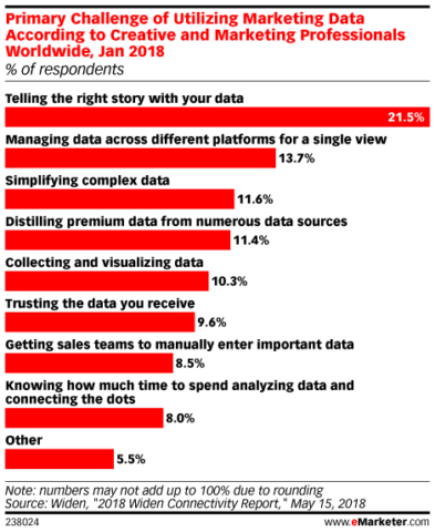
…instead, the biggest challenge was simplifying data. That is the process of managing several sources and then telling the story in order to be able to truly act on the data. Sound like you?
At MashMetrics, as you might expect, we like to mash all this valuable data together to maximize returns for our clients. While other tools may have strengths in slicing and dicing to find the dirty details, Databox helps us hone in on the most important metrics as well as quickly view our data in context.
But what are the most important metrics to monitor and what is the best way to present it on a Databoard?
Here’s the strategy we use with our clients.
Why am I looking at all these numbers anyway?
Let’s start by asking ourselves, “Why are we even looking at this data in the first place?”
You usually want to answer important questions about all the things us marketers (or salespeople, or creative, or …) are working on:
- Are my Google Ads growing traffic as they should or just costing me too much?
- Are the blogs I am writing generating some buzz, and which ones?
- Did those product walkthrough videos payoff?
- Which products are lingering in my inventory?
- Are my partner emails gaining value or creating more noise for them?
Numbers should turn into an action.
These are just a handful of questions you may ask. If you look carefully, they are all asking one of two questions (or a combo of both).
- Should I be spending more time growing a metric or improving a metric?
- Should I be increasing my Google Ads impressions, or should I be decreasing my spend?
- Should I keep writing more blog content or focus on writing better or longer content (or perhaps simply finding more backlinks)?
- Should I create more videos or perhaps place them on higher traffic pages to get more views?
Here are the 4 main goals of all websites: Awareness, Engagement, Conversion, Loyalty.
Each of the questions above focuses on a certain key area of your customer journey and likely aligns 90% – 100% with one of those “goals”, or why you are doing something in the first place:
- Attract quality eyeballs (Adwords and Organic Search)
- Engage those attracted eyeballs (Blogging, Video, Product Inventory)
- Convert engaged eyeballs (Adwords Retargeting, Blogging, Product Inventory)
- Create Loyal eyeballs (email marketing)
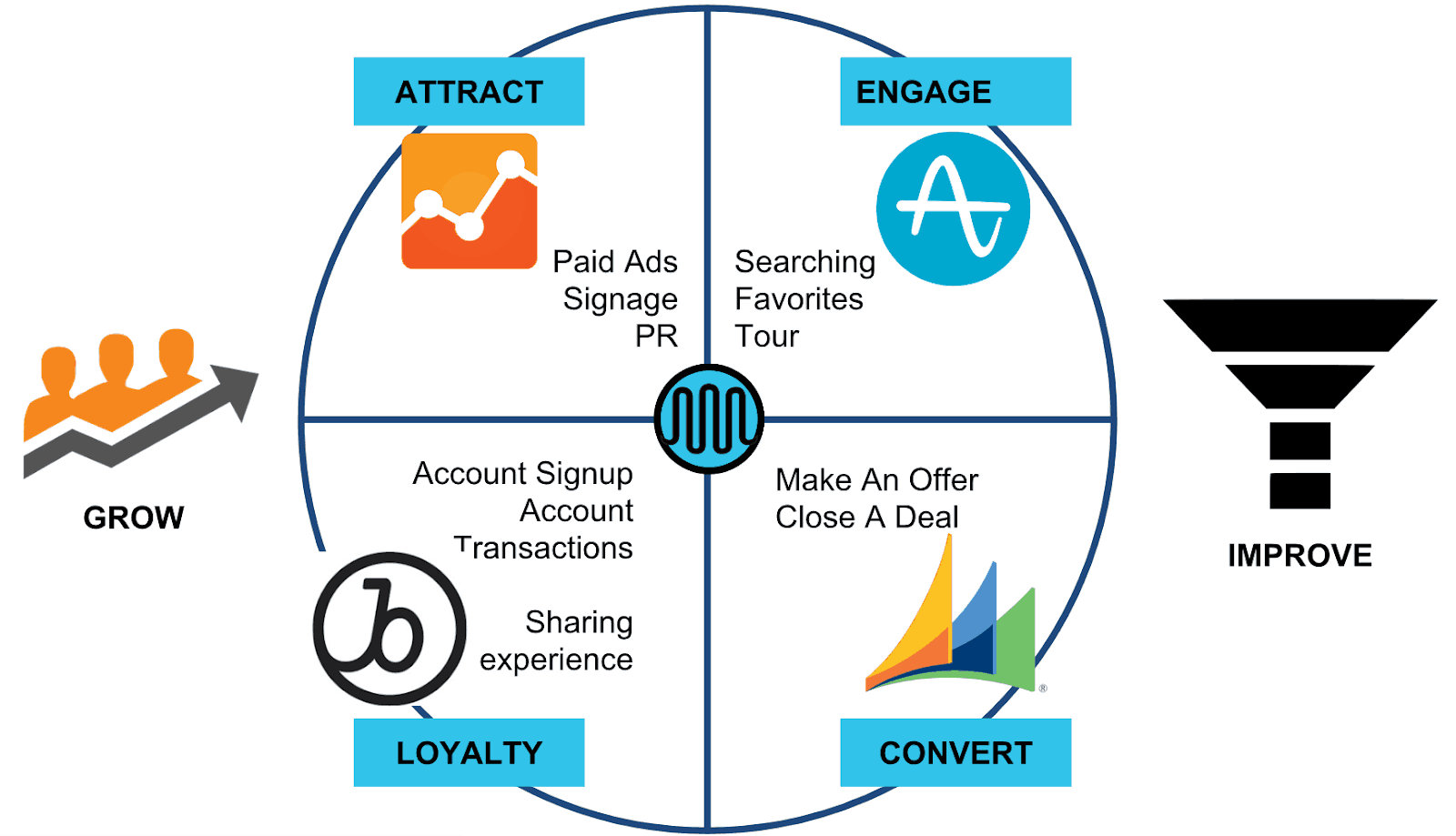
At MashMetrics, we use those 4 categories to determine specific areas of the marketing funnel that need improvement.
We set up a series of Databoards to easily review the 4 stages for any client. We can see how a website, specific traffic channel, social media profile, or campaign is performing within these agency dashboards.
Create your Measurement Plan Databoard
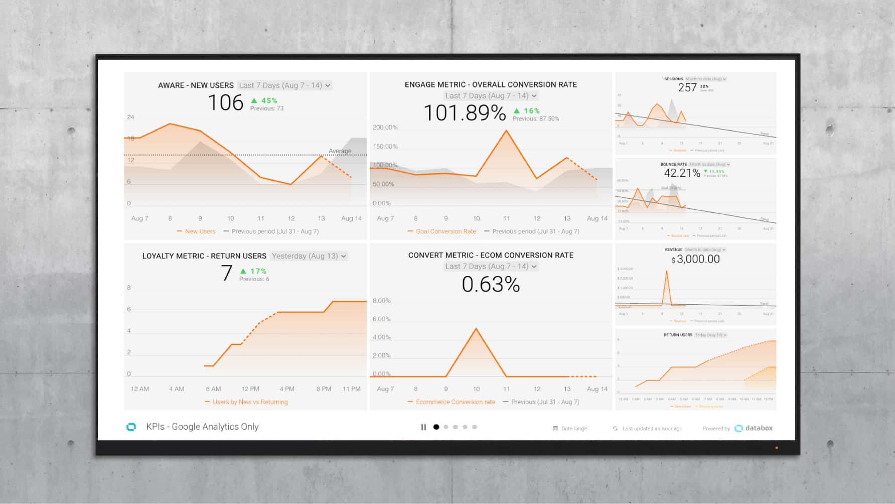
| Awareness Goal (Grow Effectively) |
Engagement Goal (Adopt the user) |
Loyalty Goal (Return and Share) |
Conversion Goal (Purchase Action) |
|---|---|---|---|
| Non-Bounced Sessions | Goal Conversion Rate | Return users | eCommerce Conversion Rate |
This example, showing four important top-level KPIs of our website, is a pretty good start. We use this daily view to track our short-term and long-term performance in those four key areas.
How To Measure Your Blogging and Overall Awareness
Let’s use this framework to gauge the performance of a major activity for many B2B marketing teams – blogging.
Not only does blogging seem to take up quite a few resources, but the payoff can take also awhile and can be hard to measure even when you start seeing some traffic growth. This is all the more reason to start monitoring performance and look for key trends.
We can ideally impact several of our core “missions” with blogging:
- Attract new eyeballs from organic search with relevant “actionable” user content
- Engage returning eyeballs that were on the fence with cool topics
- Keep customers coming back to learn more about our products and services through relevant content
Databox allows us to easily monitor all these areas at once. Let’s decide on 4 key performance indicators (KPIs) for determining the effect of our blog:
- How much NEW traffic is it generating? KPI: Sessions from blog content
- Are users engaging in the content at all? KPI: Goal Conversion Rate from blog landing pages
- How likely are users to convert both at a micro and macro level? KPI: Individual Goal Completions
- Does it give our loyalists something to talk about? KPI: Facebook shares or impressions
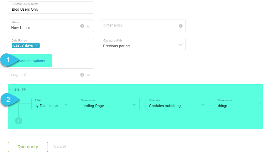
Let’s dig further into the “Attract” category. Here’s how to use the Databox Query Builder to only look at new users that landed on your domain via blog content.
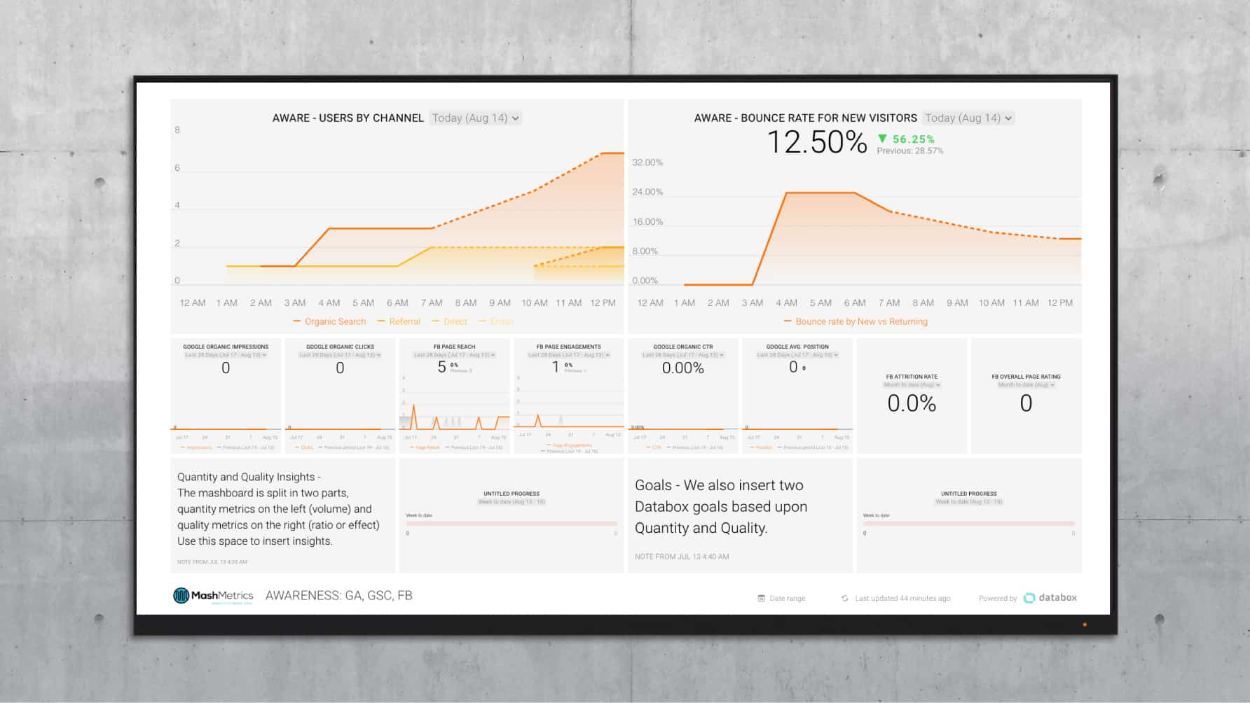
This is great for your boss to see blog performance, perhaps, but you want to keep an eye on a few more details if you want to track overall awareness of your brand.
Using this same familiar framework, we can use additional Datablocks to get more context into our metrics. Compared to the Databoard above, we can simply decrease the size of the Datablocks and add more metrics to see a bit more detail into what is going on.
Here’s how to focus on your top of funnel metrics only, with a bit of detail:
Get the overall Awareness dashboard
And, here’s how you might break down the Awareness and Engagement categories into more specific metrics:
| Awareness Goal (Grow Effectively) |
Engagement Goal (Adopt the user) |
Loyalty Goal (Return and Share) |
Conversion Goal (Purchase Action) |
|---|---|---|---|
| Non-Bounced Sessions | Goal Conversion Rate | Return users | eCommerce Conversion Rate |
| –Search Console Impressions | –Form Completions | ||
| –Referral Sessions | –Trial Downloads | ||
| –Facebook Impressions | –Facebook Shares |
How To Create A Series of Automated Dashboards
One advantage to the simple Databox interface is the 8×4 design. At times, we want to go a bit crazy on adding data, which can be a huge fault in data adoption.
Instead, this “limitation” keeps us focused on why we are reporting on the data and what is most important in that context. You can always create more Databoards and organize them through the use of Tags.
These same key indicators can also be set up as Goals, Alerts, and daily Scorecards.
Repeat this design for many different initiatives you are running with these key ingredients:
- Organize your Databoard into a core intent, like Attracting, Engaging, Converting or Creating more loyalty.
- Highlight a Key Quantity Indicator Metric (how much volume)
- Highlight a Key Quality Metric (the quality of the volume)
- Supporting factors to those metrics
- Use these marketing automation dashboards to streamline your marketing efforts and make them more effective
We hope this helps get you started.