Table of contents
A great reporting solution doesn’t just save you time
It helps you make better decisions. Don’t get me wrong, saving 12~ hours every month is great. But the biggest value is the ability to gather stakeholders around the data, to help them see what performance was, what changed, and what to do next.
That’s where the magic happens. You’re not just saving time. You’re focusing on improving key metrics together. Great reports help you find opportunities to improve, or address downward trends before they get worse. They provide insights you didn’t have before. And ultimately, they help you make better decisions, together.
So we’re excited to share the newly enhanced Databox Reports, designed to help you do just that.
Share what performance was

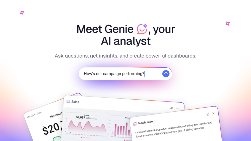
The foundation of every report is sharing how you performed over the past month, quarter, or year. This includes visuals to help viewers quickly understand historic performance. Databox Reports lets you do this in seconds, by adding the Metrics and Databoards you’re already tracking. Or add a text block to share more context, so stakeholders understand what they’re looking at.
Highlight what changed

But it’s not enough for viewers to know what performance was. They need to know what changed. “We hit 20,000 sessions, and drove 1,500 signups”. Is that the same, better, or worse than you historically do? Are you trending up or down?
You can help stakeholders understand this by adding Data Stories, which compare performance to previous periods by using comparison periods and percentages of change. Or, add an AI-generated summary to summarize this for you automatically based on the data you included. And of course, you can add comparisons to previous periods, or change percentages on the Metrics and Databoards you add.
Configure your layout
We’ve also added rows and columns to help you better organize your content. This provides flexible design options, so you can format the content however you need.
Discuss what to do next

Now that your team or clients know how you performed and what changed, it’s time to talk about what to do next. Where should you focus your time, energy, or budget? What steps will you take to improve?
We did some research and found that teams have a variety of ways they like to report. Some prefer to present reports on a live meeting, so they can answer questions and make sure everyone’s on the same page. Others prefer crafting async writeups that stakeholders can digest in their own time, and then meet to discuss later. While others prefer to look at live, interactive dashboards.
Now, Databox Reports offers two powerful formatting options to let you share data your way. You can format your Report as a slide presentation or as a long-form writeup. For example, choose the Slides format to share performance using presentation mode and speaker notes. Or choose the Page format to share a written write-up.
And if you need to change formats on the fly, you can do it in 1-click.
Style it your way

Make sure your reports are on-brand and nicely styled by adding a cover photo and emojis, customizing background colors, and formatting your text with new fonts, bullet points, text color, bold, italics, and more.
Make better decisions, together
Databox Reports are designed to help you gather your audience around the data, and use it to make better decisions that drive meaningful growth, and we’re excited to share it with you. Learn more or give it a spin today.