Table of contents
Whether you’re running a Google Ad campaign or one on social media, the ultimate goal is always the same: guiding prospects to a high-converting landing page. To achieve that, it’s helpful to look at proven landing page examples that excel at turning clicks into conversions. When your landing page design is spot-on, it doesn’t just capture leads—it propels your entire marketing strategy toward success.
But what does a high-converting landing page look like? And, more importantly, how can you create one for your company?
Google it, and you’ll drown in conflicting advice – keep it simple, pack in all the key information, and optimize landing page speed, but also add strong visuals.
To filter out the fluff, we’ll share 17 high-converting landing page examples and best practices sourced directly from 37 companies.

Here’s what we’ll be covering in this article:
- How Landing Pages Impact Performance
- What Makes a Landing Page Effective?
- 17 Landing Page Examples from Top Companies for Inspiration
- Track your Landing Page KPIs with Databox
How Landing Pages Impact Performance
Landing pages are standalone web pages created with a specific purpose in mind. They are designed in a way to minimize distractions and give the right amount of information to prospects to convert – be that downloading an ebook or signing up for a free trial.
Hence, it’s no profound mystery that landing pages have a direct impact on the conversion rate.
With persuasive copy targeting user pain points, visual elements that give a sneak peek into your product, and strategically placed call-to-action buttons, you can witness a substantial surge in the conversion rate. In fact, many companies believe a good landing page conversion rate can lie anywhere between 21-50%.
Landing pages also influence how effective your ad campaigns are. They are mere extensions of your ad campaigns as they provide greater context to what is being advertised. Ads capture interest, while landing pages transform that initial attraction into engagement and, finally, conversions.
It goes without saying that a well-connected ad page and landing page is the key to success. A disconnected one will only result in a high landing page bounce rate.
To improve conversion performance consistently, you also need to understand what changed and why. Instead of manually reviewing GA4 reports after every campaign update, teams now use AI data analysts like Databox MCP to ask plain-English questions about bounce rate shifts, conversion trends, or traffic quality and get answers based on their actual historical data. Because it uses your real metrics and definitions, it can explain performance changes clearly, helping you refine landing pages with more confidence.
Lastly, landing pages can impact more high-level business goals, like brand trust and credibility. A landing page that converts often includes strong social proof cues, like customer testimonials and trust badges.
With the number of companies providing similar offerings, the inclusion of social proof can be the difference between a prospect abandoning the incompleted buyer’s journey and sticking till the end for the final purchase.
What Makes a Landing Page Effective?
The best-converting landing page is one that harmoniously blends different tactics.
This is not a baseless statement as most of the 37 companies we surveyed have implemented multiple strategies to create high-converting landing pages.
Now what are these effective strategies, you may ask?
- Optimized landing page speed
- Implemented clear and prominent CTAs
- Conducted A/B tests for different page elements
- Incorporated responsive design for mobile users
- Integrated customer testimonials or case studies
- Employed persuasive storytelling techniques in copywriting
- Utilized heatmaps or user behavior analytics

Now executing all of the above strategies on your landing pages might appear overwhelming. Particularly if you’re a smaller company with limited resources and expertise available.
Luckily, some strategies hold more weight than others. When asked about the most important factor that makes high-converting landing pages, our respondents chose:
- Clear calls to action – CTAs are designed to encourage action. A well-designed CTA that features clear instructions ends confusion and motivates leads to make the next move.
- Persuasive and informative copywriting – At the of the day, people are looking for solutions to their problems. The right copy conveys your value proposition, addresses pain points, and builds credibility.
- Engaging visuals or multimedia content – Strong visuals improve the user experience and enable prospects to view your product before having to purchase it.

17 Landing Page Examples from Top Companies for Inspiration
Let’s move on to what you’re really here for – the best converting landing page examples that will inspire you to make your own.
We’ve sourced these landing page examples from the following companies. Each example also features an inside perspective as to why those pages have secured maximum conversions.
- Sylvane
- Serpple
- Evolo
- Belkins
- RecurPost
- Content Whale
- SEO PowerSuite
- Broadcast2World
- Candida Diet
- OSHA Outreach Courses
- The Expert Editor
- 2Stallions
- Clickx
- Groove Commerce
- PRM
- MonsterInsights
- OptinMonster
PRO TIP: Save Time Creating Your Google Analytics 4 Traffic Dashboard
Yes, you can DIY in Google Analytics 4, but what if you would prefer a simpler, easier route? After all, once you learn how it’s done, you still have to choose the right metrics and design your custom dashboard to answer the important questions your stakeholders have, for example:
- How many people are visiting my website?
- Which channels bring in the most users?
- How engaged are my users?
- How well is my website keyword optimization performing?
and more…
Now you can benefit from the experience of Google Analytics experts, who have put together a great Databox template showing all the most important website traffic KPIs. This template allows for easy integration with scheduled report delivery. It’s simple to implement and start using as a standalone dashboard or in marketing reports!
You can easily set it up in just a few clicks – no coding required.
To set up the dashboard, follow these 3 simple steps:
Step 1: Get the template
Step 2: Connect your Google Analytics 4 account with Databox.
Step 3: Watch your dashboard populate in seconds.
1. Sylvane

If you’re an eCommerce store offering an extensive array of products, this landing page example would be of interest to you. It has all the elements to convince the visitors to purchase.
Here’s what Meg Hellerstedt from Sylvane has to say about their high-converting landing page: “Our warehouse deals page is the most high-converting landing page on our e-commerce store. I attribute this success to three things:
- It starts with a compelling headline
- Has strong social proof
- Clear CTAs”
Hellerstedt further adds, “The headline ‘Save on open-box and returned items’ effectively entice customers to head to the landing page, then the testimonials and prominent CTA buttons help in sealing the deal. Emphasizing the markdown price is a great selling factor, too. Seeing the price slashed from $300 to $100 is always a trust sales tactic.”
Key takeaways from Sylvane’s landing page:
- Include (and reinforce) trust indicators. If you offer money-back guarantees or something similar, prominently feature it. Take inspiration from Sylvane as it highlights its money-back guarantee not only in the above-the-fold copy but also as an attractive badge.
- Add a touch of personalization. Writing copy like ‘Special Offers for You’ gives the impression of a personalized experience, which compels the visitor to engage and possibly, convert.
- Offer discounted prices. Showing before and after prices is a great way to engage your price-sensitive prospects. It’s also a great way to spread positive word-of-mouth.
2. Serpple

Who says you need to overdo the design to achieve remarkable landing page metrics? A simple-designed web page with clear copy and a limited color palette can get the job done equally well.
But there’s another secret behind the high conversions that Serpple’s homepage brings.
Adam White from Serpple shares, “We do a ton of above-the-fold content AB testing on our homepage. The current iteration continues to beat out other more benefit-driven headlines. This actually was contrary to what we thought would happen but there is something about the message of ‘loving our rank tracking software’ that beats out the message of ‘getting more traffic and sales’ which we assumed would be a better-converting headline.”
Key takeaways from Serpple’s landing page:
- Test your landing page elements. Guessing games rarely work when looking to optimize your KPIs. What you think may work, might not, and vice versa, which is why you must test important elements, like headlines, calls to action, etc.
- Show your product straight away. Even if you offer a free trial or demo, you should include screenshots of your product as Serpple has done. Not only does this give a sneak peek into the functionality but enhances transparency.
- Include frequently asked questions. Most people have a dedicated page for their FAQs. But adding a few questions towards the page’s end (like Serpple has done) ends any ambiguity without having to consult the support team.
3. Evolo

Want to know how the above landing page gathered a conversion rate of 17.72% and an inverse bounce rate of 60%?
Kevin Larsen from Mediaveien, the website’s developer and ad campaign manager, spills the beans:
“What makes this landing page different from other landing pages on the same site, is product-market fit. It targets a specific user group that is very interested in this service, and the landing page’s quality is overall better than competitors’ landing pages.”
Key takeaways from Evolo’s landing page:
- Create different landing pages for different user groups. Gone are the days when your target audience was one homogenous group. Cater to different segments by addressing their pain points and giving them exclusive solutions.
- Give options to explore. Not everyone is ready to purchase – some like to do their due diligence before committing to a tool. Take inspiration from the above landing page example as it gives the option to book a demo and contact a customer service agent along with the ‘Try Now’ button.
- Keep the above-the-fold clutter-free. If the top section contains excessive copy and visual elements, the website visitor will struggle to decide where to look. Think of your core value proposition and make that the highlight of your landing page.
4. Belkins

Belkins, a lead generation agency, has designed a great way to capture leads – a free and accessible ROI calculator. Not only is this a smart idea, but the landing page design and copy are aimed at showing value first and pushing a conversion later.
Michael Maximoff from the Belkins team shares, “Our ROI Calculator landing page is our highest-performing landing page, and 30% of our website conversions come from this page alone. The biggest factor and difference with this page compared to others is its interactive element — a fill-in ROI calculator tool created for different client personas with a clear CTA and follow-up system.”
Maximoff further adds, “We created this simple, data-driven tool for the sole purpose of driving conversions through our website landing page, which is ever-present on our site and promoted externally as well. Landing pages offering simple tools that help your leads get accustomed to your offer convert like crazy, and I’d highly suggest creating one if you have a cool idea and the resources to do so.”
Key takeaways from Belkins landing page:
- Add an interactive element. Games, carousels, and interactive infographics, among others, are great ways to encourage engagement and prolong the average time spent on page. The longer a person stays on your landing page, the greater the chances of them moving further on the buyer’s journey.
- Offer something of value. Providing a free valuable resource, like an ROI calculator, subject line checker, or PDF converter, helps to start the relationship on a positive note. And when your prospects are ready to purchase, your tool will be top of mind.
- Keep your landing pages short. Belikins’ landing page follows a no-BS approach and includes only essential information. Don’t cram everything on a single page – the last thing you want is to overwhelm the visitors.
5. RecurPost

Who says a blog post can’t be your top-converting landing page?
Debbie Moran from RecurPost shares the strategy behind using blogs as a medium to rake in conversions:
“This landing page effectively communicates steps for auto-tweeting on Twitter. It highlights how auto-tweeting can save time, streamline social media management, and enhance overall Twitter engagement. This page also features a user-friendly interface, providing step-by-step instructions and visuals on how to set up auto-tweeting, all of them helping the page rank on top on SERP.”
“Now Twitter being extremely popular and having a large user base, the landing page “How to Auto Tweet on Twitter” has specific messaging tailored to Twitter users, addressing their pain points and also demonstrating how RecurPost provides a unique solution compared to other social media scheduling tools. So this page becomes an all-in-one solution spot for all the user queries regarding Twitter automation, thus becoming the highest converting landing page on RecurPost.”
Key takeaways from Belkins landing page:
- Create product-led content. If you plan to use your blog as a conversion-driving force, remember to illustrate your product value throughout. Describe a problem, give a solution, and then present your company as the best solution provider.
- Keep the navigation bar limited. Landing pages are designed to minimize distractions, and RecurPost nails this by only adding pricing and features menu items. If you have to add menu items, make sure they help to aid the decision-making process.
- Strategically place calls to action throughout the landing page. Just because a piece of content is informative doesn’t mean you have to be skimpy with the CTAs. Use them to break large chunks of content – you never know when your visitor converts!
6. Content Whale

This landing page example from Content Whale proves how you can achieve a high conversion rate without having to add any visuals. What makes this landing page a success is that it includes all the essential information needed to make a confident decision.
Bhavik Sarkhedi from Content Whale shares more on this strategy, “They want to see samples; the page has it. They want to see FAQs for miscellaneous things; the page has it. They want a contact form; it has the same. Best storytelling copywriting; well, it does have that too.”
Key takeaways from Content Whale’s landing page:
- Discover user concerns and address them. Talk to your customers and note the bottlenecks that impact their decisions – is price a concern or, perhaps, security? Address these concerns to eliminate doubts in decision-making.
- Add a variety of call-to-action buttons. Don’t just link to your demo or pricing page, but instead, link to all complimentary pages. Content Whale links to their price calculator and sample pages, along with a contact form – all-important for converting leads.
7. SEO PowerSuite

In the tough SEO software industry, this landing page from SEO PowerSuite emerges as a standout example. The landing page showcases a clean design with a limited color palette, key features complemented with product screenshots, and attention-grabbing CTA buttons.
Aleh Barysevich from SEO PowerSuite attributes the success of their high-converting landing page to two factors.
“First and foremost, the page offers a free tool, which is a major draw. It’s not about just collecting contact details for a newsletter; it’s about providing real, useful SEO data at no cost. This aspect alone boosts our conversion rate significantly.”
“Then there’s the second factor – the sign-up form. This is where our experimentation really paid off. The version with the dark background is not just a design choice; it’s a strategic one. It catches the eye immediately, drawing users in as soon as they land on the page.”
Barysevich continues, “Adding the G2 rating icon to the form further improved our conversion rate. This small addition has a big impact, lending credibility and building trust. This combination of offering something valuable for free and a well-crafted sign-up form is what really makes this landing page effective.”
Key takeaways from SEO PowerSuite’s landing page:
- Add social proof in the above-the-fold section. Most people won’t scroll down the landing page if they’re not impressed with the initial view. Adding social proof in the above-the-fold section is a great way to add credibility instantly.
- Use colors strategically. Don’t use colors without a purpose. Like SEO PowerSuite, use the striking colors from your palette to highlight your calls to action.
- Make your headline short and clear. The headline should share your value proposition but write it in a digestible manner. It should state the value straight away (free in this case) and shouldn’t be unnecessarily long.
8. Broadcast2World

Probably the most well-designed landing page example from our list, Broadcast2World is a treat to the eyes. But the design isn’t the only reason this landing page has generated high conversions.
Sunny Arora from Broadcast2World shares the secret, “We introduced 2 step landing pages last year, where basically we take basic information from the user like work email and video objective on the first page with a compelling offer and clear CTA. And then, on the next page, step 2, we ask for more detailed information. This basic technique increased our conversion rate by 5X in a few months of implementation.”
Key takeaways from Broadcast2World’s landing page:
- Don’t push your leads away. You don’t ever want to ask for too much information that you scare your prospects away. Capture initial interest and then focus your efforts on converting it – even if it means breaking your landing page campaign into two parts.
- Focus on the overall visitor experience. This landing page example offers an immersive experience that is consistent from the top to the bottom. The design is consistent and cohesive and creates the impression of dealing with a legitimate firm. Points to note!
9. Candida Diet

This landing page brings in 70% of conversions for Candida Diet’s website. It might look like a simple blog article but Lisa Richards from their team shares why it’s such a success.
“This is the content our TA is searching for in order to understand their candida symptoms, and our long-form content piece, including what to eat and what to avoid, directly aligns with their search intent. We’ve included an insightful infographic to help them digest the information easier while making it memorable. We’ve also embedded simple sign-up forms within the content to make it easier for them to sign up for our free treatment plan.”
Key takeaways from Candida Diet’s landing page:
- Appeal to different types of prospects. There are two types of people; visual learners and readers. This landing page example appeals to both because it is a long-form article but also includes an infographic that acts as a summary.
- Create valuable and helpful content. The focus should be on providing value, be it through a step-by-step guide or a free backlink checker. It’s easier for visitors to trust websites that have their interests in mind.
- Encourage two-way communication. By opening the comment section, Candida Diet has enabled visitors to connect with them. This creates a positive impression for other visitors because it increases trust and humanizes your brand.
10. OSHA Outreach Courses

This landing page example from OSHA Outreach Courses is deceptively impactful. It’s a short, simply designed web page that has garnered an impressive conversion rate.
Farhan Siraj from their team shares why, “This landing page has a high conversion rate because it clearly mentions the discount we provide on multiple enrollments in our eLearning platform. Customers across industries actively seek discounts, and when a website dedicates a special page to it, search engines tend to rank that page higher. This results in increased traffic and improved conversion chances.”
Siraj further adds, “It’s also important to note that individuals searching for discounts are usually at the end of their buying journeys. They are highly likely to convert if they find what they are looking for. This page also enables customers to easily calculate the discounts they will receive in clear numbers, this sort of transparency and clarity is always effective.”
Key takeaways from OSHA Outreach Course’s landing page:
- Include trigger words. By using phrases like “discounted offers,” “most-in demand,” and “great discounted price,” OSHA Outreach Course has evoked impulsive reactions and as a result, immediate purchases. When used strategically, trigger words can do wonders for your conversion rate.
- Make the payment procedure simple. Wherever possible, reduce the steps it takes for a lead to purchase. In the above case, OSHA Outreach Course collects vital company details on the same landing page and then finishes the payment on another page.
11. The Expert Editor

Concise and precise – that’s how I’d describe this landing page example. It features limited copy, barely any visual elements, and a contact form with only two mandatory questions.
But Brendan Brown from The Expert Editor team credits the high conversions to another reason.
“I believe that the ‘Get Started’ page on The Expert Editor website stands out primarily due to its persuasive and informative copywriting. This approach has proven to be the most critical factor in its high conversion rate. The copy on this page is effectively crafted to not only inform potential clients about our services but also to persuade them of the value and benefits we offer.”
Key takeaways from The Expert Editor’s landing page:
- Follow a blended approach when writing copy. In Brendan’s words, keep the copywriting both informative and persuasive. Sharing information about your services combined with a few persuasive words here and there educates and motivates your leads.
- Highlight your privacy/confidentiality policy. When sharing confidential information, security is always a concern. It’s always better to highlight how this information will be stored and treated, instead of just hiding your policy in the landing page’s footer.
12. 2Stallions

If you’re looking to get more conversions for your gated content pieces, this high-converting case study landing page from 2Stallions is a good example to refer to.
What makes it so impactful is the clutter-free above-the-fold section that captures attention and then converts it to engagement in which the visitor signs up for the case study.
Geetha Boyani from 2Stallions Digital Marketing Agency shares why they’ve bagged a consistent conversion rate with this landing page:
“The landing page is designed to be concise and easy to navigate, ensuring users won’t be overwhelmed by excessive information. The form utilizes standard questions, making it simple and straightforward to complete. This landing page has consistently maintained a conversion rate of 3-5% for over a year, demonstrating its effectiveness in capturing leads.”
Key takeaways from 2Stallions landing page:
- Write an attention-grabbing headline and subheadline. The first step in increasing conversions is capturing interest. A bold headline with a well-crafted subheading (when executed well) does the job best.
- Highlight your achievements. Don’t shy away from bragging about your industry awards/achievements. They add instant credibility and position your brand as a market leader.
- Reinforce your calls to action. In a single-scroll landing page, 2Stallions included the Download CTA button three times. Repeating the CTAs helps to reinforce the action you want the prospect to take.
13. Clickx

Solomon Thimothy from Clickx attributes the success of their high-converting landing page to several different factors. Let’s have a look at which factors worked in the company’s favor.
“This landing page is packed with testimonials. That’s the biggest differentiator, hands down. However, other elements like engaging and aesthetically pleasing visuals, persuasive copy, fast loading speed, and mobile friendliness are also very important. Without these other elements, people would not be able to see that precious social proof that we’ve collected over the years. So it’s always a combination of factors.”
Key takeaways from Clickx’s landing page:
- Highlight your founder/team members. When you add a picture of your team/founder front and center, it instantly humanizes your brand and helps to build that crucial trust.
- Include video testimonials. Surely trust budges and written reviews are important, but they can’t exceed the impact of video testimonials. When your clients express genuine enthusiasm about the positive impact your service has made, and wholeheartedly recommend you, you’ll undoubtedly attract a multitude of leads.
- Add a powerful claim. When you make a bold promise, it makes the prospect curious to the extent they explore more of your services and feel compelled to test that claim.
14. Groove Commerce

Getting conversions on gated content pieces is difficult for many, but not for Groove Commerce. Spencer Flaherty from their team shares the reason behind the landing page’s success:
“Famous advertising executive David Ogilvy once said that ‘Headlines Are Worth 90% of the Advertising Dollar.’ If your offer, such as a gated piece of content, isn’t converting then the first place to check is your headline. What makes this landing page particularly high-converting is that the information covered inside of the eBook is highly valuable to eCommerce retailers evaluating a platform switch.”
Key takeaways from Groove Commerce’s landing page:
- Strategize thoroughly before you create. eBooks are not the easiest and quickest to create. Hence, it is important that you carefully choose the topic before you put in that commitment. Which topics, you may ask? Any profound customer pain points that drive them to find solutions.
- Give an inside sneak peek. Gated pieces can be a hit-and-miss – you never know if they’ll be worth sharing your private details. To communicate the value, give a brief description of what to expect in the eBook, just like Groove Commerce has done.
- Show related content pieces. It’s always good practice to share related content. If your readers enjoyed the first piece, they’ll explore the ones being recommended to them. This translates to more time spent on the website, which boosts the probability of conversions.
15. PRM

If you have to explore one landing page example from our list, let it be this one.
Everything from this landing page screams premium and exclusivity. Its top section is a video that shows the latest collection while the remaining page displays the elaborate items grouped into similar categories.
Regarding the conversions this page generates, Kamil Bajołek from PRM says, “The landing page stands out for its clear focus on high-end brands and limited collections, which is a key differentiator from other landing pages. This focus is evident in the way the page is structured and the content it highlights.”
“One of the main features that make this page unique is its emphasis on exclusive offers and limited-time promotions, such as the prominent “BLACK FRIDAY UP TO -70%!” deal. This creates a sense of urgency and exclusivity, encouraging visitors to take advantage of these offers while they last.”
Bajołek continues, “Another notable aspect is the user-friendly design of the page. The layout is clean and easy to navigate, with clear categories like clothing, footwear, and accessories, making it simple for users to find what they’re looking for. The use of high-quality images and the option to view more details about each product further enriches the user experience.”
Key takeaways from PRM’s landing page:
- Include urgency-creating elements. When you create urgency, either through the design or the copy, you increase the chances of impulsive purchases. For a retail business, this is a sure-shot way of boosting conversions.
- Highlight your top perks. If you offer benefits like free delivery or 24-hour shipping like PRM does, make sure it’s not hidden away in a large passage of content. Instead, it should be made prominent, so it grabs the attention of interested buyers.
16. MonsterInsights

One look at this page and you’ll know for sure why it brings in high conversions. This landing page is focused on one thing only and that is to persuade users to upgrade.
Syed Balkhi from MonsterInsights shares their strategy for driving conversions from this landing page:
“This is an upgrade offer to the Pro plan landing page which aims at our existing users of the Plus version. The page includes a clear CTA that it is a one-time offer, which urges users to take action. Besides, it includes (1) the comparison of the original vs. discounted price, reminding users that it’s a huge and limited-time deal, and (2) a progress bar showing 90% completed, making it sound simple and easy to upgrade. All those factors combined make it an irresistible deal.”
Key takeaways from the MonsterInsights landing page:
- Add a progress bar. There is something about progress bars and not leaving them incomplete. Adding them is a strategic move that plays with human psychology and compels the user to convert in hopes of meeting that 100%.
- Feature all your trust badges. Trust indicators on pricing and upgrade landing pages are a must because they show that the website isn’t a scam and that the potential buyer can make the purchase without having any second thoughts.
17. OptinMonster

The last landing page example on our list is from the popular lead generation tool, OptinMonster.
Thomas Griffin from their team shares the reasons behind the high conversion rate of this landing page:
“We go beyond the basics of landing page design to craft compelling content that converts. Our landing pages guide prospects effortlessly toward the desired action, using clear page sections, visually highlighted benefits, and persuasive social proof. And of course, we don’t forget to place call-to-action buttons throughout the page to ensure no lead is left behind.”
Key takeaways from OptinMonster’s landing page:
- Focus on the visual layout. When you provide a tool with an elaborate list of features, mentioning them all can appear overwhelming. To make it more digestible, rely on the layout style of your landing page to break the content flow and give each section its deserving attention.
- Add a CTA to the sticky header. For longer landing pages, like the one above, add a sticky/fixed header that reinforces your value proposition and features a call to action. This is to ensure the visitor doesn’t get consumed on the page to the extent they forget what they were initially looking for.
Track your Landing Page KPIs with Databox
I’m positive you now must have several strategies in your arsenal after going through the above high-converting landing page examples.
But the job isn’t complete after executing the strategies – you must also timely track the landing page conversion rate along with other metrics to ensure you’re on the path toward success.
Just like there’s a better way to design landing pages for high conversions, there’s a more efficient way to monitor key metrics.
While many marketers turn to Google Analytics for insights, this approach has its drawbacks. Applying different filters for performance comparisons can result in errors, and the manual process of extracting data into spreadsheets for reporting is a permanent headache.
Enter Databox – a better and stress-free way to monitor and report on landing page KPIs
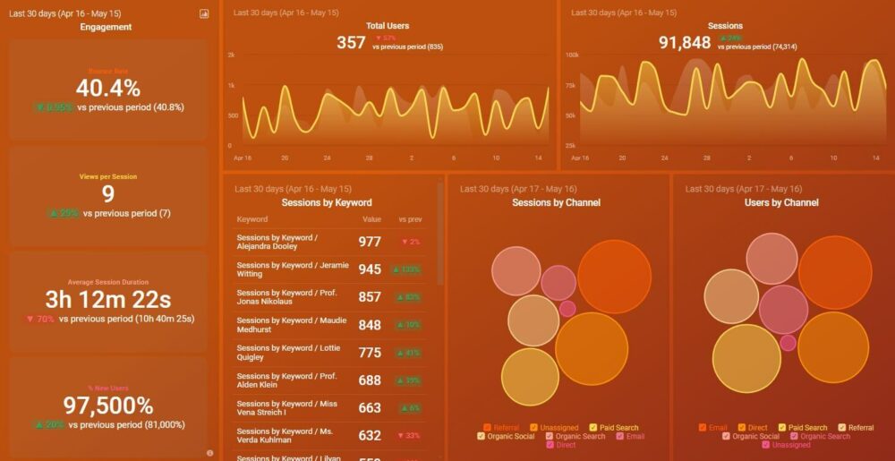
Connect Google Analytics as a data source (along with 130+ integrations) and display important metrics in visual dashboards like this website engagement one. There are 200+ dashboard templates to choose from and you can use the drag-and-drop editor to customize the layout.
If you prefer a more hands-on approach, you can also create these dashboards from scratch and personalize them with your brand elements. Sharing these dashboards with the management is a piece of cake as well!
We’ve just touched the tip of the iceberg when it comes to exploring Databox’s features. Sign up for a free trial to witness how you can use Databox to skyrocket the performance of your landing pages.
FAQ
Databox is a Business Intelligence (BI) platform known for its ease of use, robust data analysis features, and shareable reporting tools. It enables users to track and visualize performance metrics from multiple sources in one place, making it easy to monitor landing page KPIs like conversion rate, bounce rate, and CTA clicks.
To improve organic and paid CTR, Databox offers benchmarks, campaign comparisons, and actionable insights. Users can monitor A/B test results, identify bottlenecks, and refine page elements like headlines and visuals based on performance data by connecting sources like GA4. Automated reporting also streamlines communication, ensuring teams stay aligned on what’s driving conversions.
From GA4, Databox can track seamless performance of landing pages by device categorization like desktop, mobile, or tablet. Paying attention to KPIs such as session duration and bounce rate per device ensures your landing page is tailored for every user experience.
Of course, it can. With Databox, monitoring KPIs such as the conversion rate and ‘bounce rate’ enables landing pages to be evaluated for different versions. This greatly simplifies the process of determining the landing page version with maximum conversions to optimize further.
The landing page performance can be monitored with Databox as it provides for data tracking. Thus, a user can view in real time how the landing pages are performing. Custom dashboards can be configured to track specific KPIs, and set alerts when any metrics breach defined boundaries.