Table of contents
Hey everyone. Welcome to another episode of Data Snacks.
Today, we’re talking about sales forecasting, specifically using your sales data from HubSpot CRM.
In this episode, we’ll show you how to pull your data together to learn the following:
- How much revenue is in your pipeline this month?
- How much of that will your team close this month (or this quarter)?
We’ll answer these and other relevant questions you may have when it comes to recreating your sales forecast in Databox using data from HubSpot CRM.

Below, you can view the full episode, or, keep reading for a fully transcribed version of the episode complete with relevant screenshots.
Now, since your sales forecast is a critical KPI you may need to track alongside other metrics from your marketing, sales, customer success, and finance tools, it’s worth duplicating in Databox.
Sales Forecasting Using HubSpot CRM
If you’re using HubSpot CRM, you are probably familiar with the default forecasting chart on your sales dashboard. It’s basically a bar chart with just one bar that allows you to see how much revenue you expect to close in a current or future time period. Here’s ours for this month.
If you’re not familiar with this chart, HubSpot has a great article you should read called How to do sales forecasting in HubSpot CRM.
As the article details, HubSpot actually provides several different ways to do forecasting. But this chart is the simplest since all you have to do is define your deal stages and define the probability of winning for deals at each stage.
That said, if you are using the HubSpot forecasting tool, I’ll also show you how to pull that into Databox and visualize it, too.
HubSpot CRM Sales Forecasting Visualized in Databox
Let’s start with duplicating that first graph. Here’s how we’ve set up our stages and the percent likelihood of winning we’ve assigned each stage.
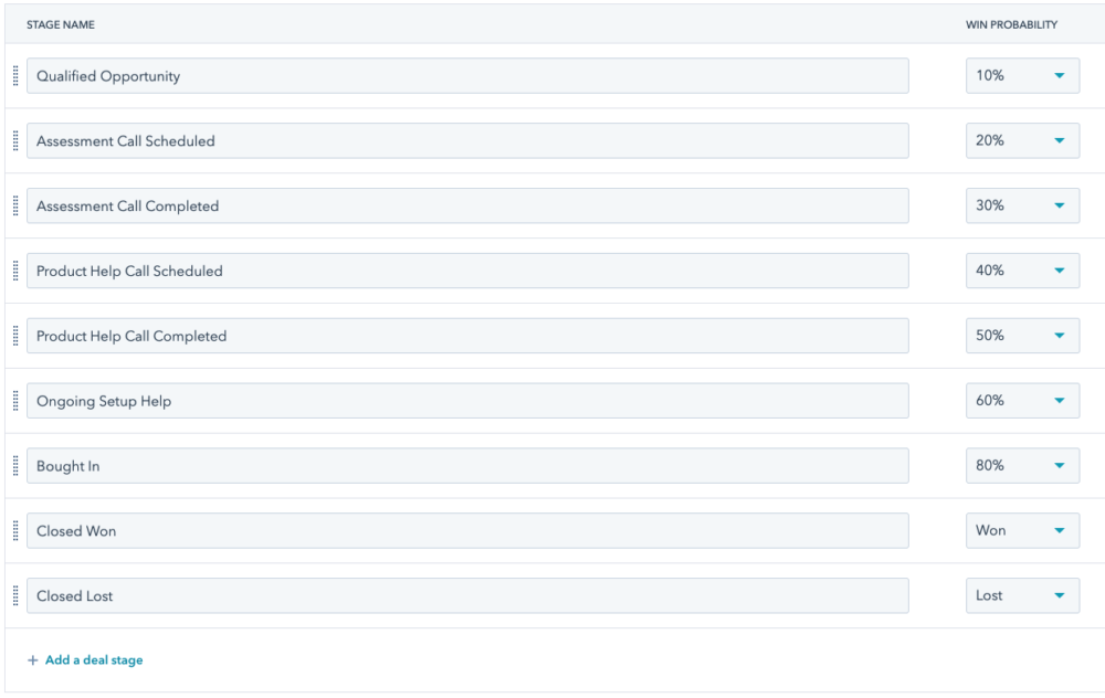
Now it doesn’t matter how you’ve defined yours, but you will need to know these numbers in order to set up your forecasting in Databox. Unfortunately, we can’t just duplicate that forecast chart in one-click since HubSpot doesn’t provide these percentages via their API. But, no worries––I’m going to show you how to recreate this forecast in Databox using our Data Calculations feature. I’ll show you four different ways you can do it.
Here’s what the report will look like when you’re done…
It includes:
- a simple table that shows you forecasted revenue by deal stage
- a really simple number visualization that just shows your total forecast,
- a pie chart to show the amount and percentage of forecasted revenue by deal stage
- and the funnel chart, so you can visually compare the forecasted revenue in each stage with a glance.
Now, to get a full picture of your forecast, it sometimes makes sense to look at it in different ways. At the end of this, you’ll be able to decide which one (or ones) you like best. And as always, if you get stuck trying to do this yourself, just reach out to our support team via chat and ask for help.
If you are already pretty comfortable with using Databox, check out our popular use cases article for HubSpot Sales and skip to the section titled calculating projected closed one amount.
Let’s Start Building Dashboards
Let’s dive in and see how to get this built. So, first I’m going to start with a blank Dashboard.
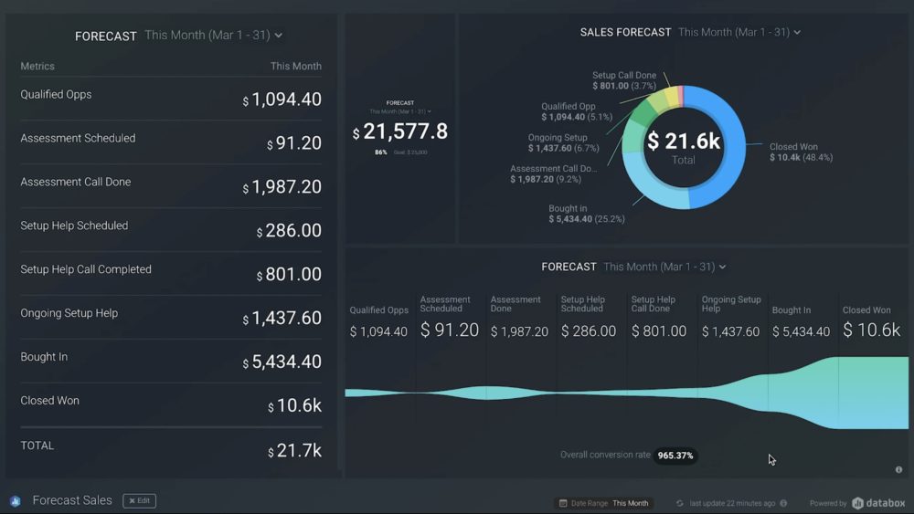
Unfortunately, we cannot predefine your forecast, but we do have a metric called “Forecasted deals by stage”. I’m going to drag it onto the sales dashboard to show you how easy it is to grab. And what this data block shows is the total amount of revenue in each stage with a close date during the period you’ve selected.
So in this case, I’m going to set it to this month and this number of course will be much higher than your forecast. Now, let me show you how to create a table like this, but with each stage multiplied by the probability of win percentage. Now this will give you a more accurate forecast. So remember this screen?
We need those percentages that you have set in your HubSpot account to build this table. We’re going to drag a blank basic table visualization onto the Dashboard.
Then we’ll select HubSpot CRM as our Data Source and click create a new Data Calculation. So for the data calculation, we’re going to pick the metric deal amount by stage by date, and then pick the first stage in our funnel. Now, in our case here at Databox, that stage is called Qualified Opportunity. That’s when our sales team identifies someone who’s a good fit, but we haven’t talked to them over zoom yet.
Since we expect the deals at this stage to close at 10%, I’m going to multiply this number by 0.1 .
Now, I’m also going to give this data calculation a name and set the format so that it shows up as currency in our visualizations. Then I’m going to add another metric to this table and create another data calculation for my next stage.

And so on and so forth for each stage. So your table will look like ours once you add all of your stages. And on this table, you can see that I decided to sum all the values up at the bottom of the table. And I selected this month as my default date range. So as a result, at the bottom of the table, I get this month’s forecast. If you (or someone looking at your Dashboard) want to look at this quarter’s forecast, just change the date range on the Datablock or Dashboard. Really, you can do any current or future date range they might need.
Visualization Options to Consider
Personally, I think the table is the best way to look at your forecast, but maybe if you want to just present your forecast to your CEO and you don’t want to give them more detail than needed, then a number of visualization might be best.
So to build a number of visualization blocks, we’re going to create a data calculation that sums up all of the data calculations we just created. Very meta, I know. So, let me show you real quick, how to do that inside data calculation. Since we named all of the former data calculations with a name that starts with the forecasted amount and included the stage name in the name too, I just selected each one and added them up.
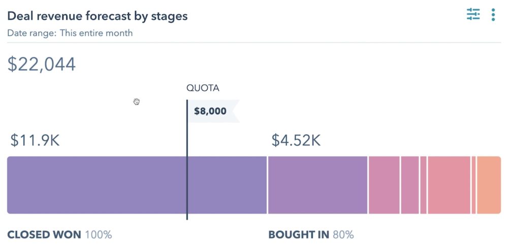
The last two options I created here for you are a pie chart and a funnel chart. For the pie chart, you construct it very similarly to the table chart. I designed this as a multiple metric pie chart. I also clicked show total value in the middle and show values for each by slice. Then, I go in and add each of the data calculations I created previously.
And the pie chart is great for seeing how the deals at each stage contribute to the forecast. The pipeline visualization is very similar, but I love the pipeline visualization even more because it’s really easy to glance at it and see how much of our forecast includes deals at different stages.
We’re three weeks into our month and more than half of our forecast is in our later stages . That’s a good sign. If you’re seeing the opposite where most of your forecasted revenue is in early stages, you should be a bit worried. Unfortunately, the pipeline visualization isn’t really built for forecasting because it doesn’t sum up the numbers.
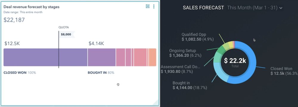
So if you’re going to use it, I suggest also using the number visualization alongside it. And that’s it. As you can see our forecast in Databox matches our forecast in HubSpot.
Monitor and manage your sales prospects as they move through the different stages of the buyer’s cycle using this sales pipeline dashboard.
Oh wait, I also told you, I’d show you how to build your forecast in Databox if you’re using the forecasting functionality in HubSpot.
It’s actually a lot easier since we can pull in the forecasted amount into Databox. So to create this metric, we’re going to use our custom metrics feature. You could use a pie chart, table chart, or a pipeline for this one too. So to show you real quick, I’m going to use the pie chart. And after I drag a blank pie chart onto the Dashboard, I’ll select HubSpot as my data source, of course. Then I’m going to create a custom metric. So for this custom metric, I’m selecting Forecast Amount as my Metric, Deal Stage as my Dimension, and Close Date as our date and filtering it to just show deals from our one pipeline. And I’m going to give it a name called Forecast Amount by Stage.
And that’s it. Keep in mind that this forecast uses different percentages to calculate the amount of revenue from each deal stage that contributes to the forecast. And inside HubSpot, you set these percentages on a screen that looks like this, as HubSpot’s help article shows:
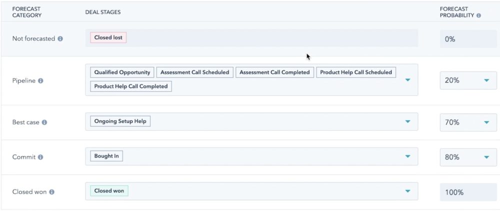
So, so the numbers in this Pie chart won’t match the default chart on your sales dashboard, but will match the numbers you see under sales and forecasting in HubSpot, or this screen here:
Adding a Goal to Your Forecast Datablocks
And before we go, let me quickly show you how to add a goal to your forecast datablocks. I’m going to add it to the number datablock.
So first I’ll click the data block, and then I’m going to select the “compare with” drop-down. Select other, and then Goal, and from there, I’ll click the link that says “Set a Goal” and enter my goal.
That’s it for today. So to recap, we just covered:
- Several different ways to visualize your sales forecast in Databox,
- How to duplicate your forecast in our sales dashboard software, depending on what forecasting method you use in HubSpot CRM and
- How to compare your forecast against your goal (or quota).
Now, of course, this is just one thing you can track in Databox. There are hundreds of metrics you can track from HubSpot and thousands more from our many, many integrations.
Get the most out of Databox by tracking data from multiple sources in one spot and any device. Any questions? If you need help in getting any of this set up for yourself, start a chat with one of our dashboard experts.
Browse through these CRM dashboards here.

They know the ins and outs of HubSpot CRM and Databox and can get you set up quickly. See you next time.