Table of contents
Modern-day businesses rely on data to make strategic decisions, but…. data is not useful until it becomes information. In other words, data doesn’t mean much if you don’t know how to interpret it.
So, how do you turn data into information? By developing a strong reporting process to display your data in a practical and useful way. As data passes through multiple hands within an organization, effectively communicating your results is crucial in guiding decision-making.
Databox simplifies a business’s ability to monitor the different stages of data in order to create a repeatable reporting process. By facilitating data collection, data management, analysis, and reporting, businesses can use Databox to make more data-driven decisions.
Developing a Reporting Process With Databox
Here is how you can develop a reporting process with Databox:
1. Collecting Data
Collecting data is the first step in establishing an effective reporting process. Companies need an efficient way of combining data from multiple tools into a single view in order to understand the platforms and strategies that are delivering the best results.
You may think that the best way to accomplish this is to take screenshots or to manually import your data into a Google Sheet, but, choosing this type of manual process makes you subject to human error, data quality issues, and most importantly … wasted resources. There are better ways to do this!
By using reporting software like Databox you can automatically pull all your data into a single platform. With the Data Manager, you are able to connect 130+ data sources in order to get real-time insights from all your platforms. The Data Manager facilitates your ability to manage data source connections, preview connection details, and view all available metrics.
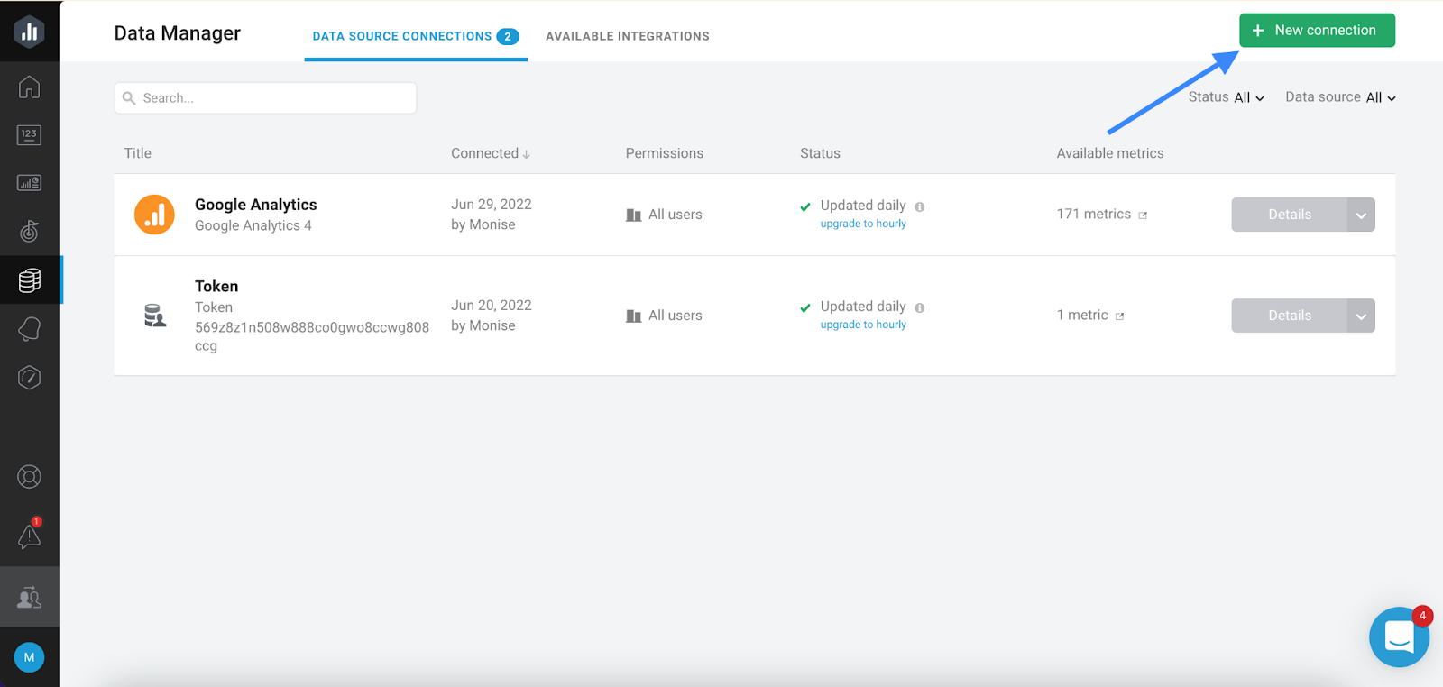
You can connect a new data source by navigating to Data Manager -> + New Connection
2. Defining Metrics & Goals
When tracking the success of your campaigns, it can be overwhelming to decide what to track if you don’t know which metrics or goals are most important to you.
Metrics
The metrics you choose should help you track your output and measure your impact. So when defining your metrics, it might be helpful to split them into these categories:
1. Output & Outcome Metrics
Output metrics are used to measure your activities and are directly related to the work you are doing. While outcome metrics are used to measure the impact of your output and are used as indicators of performance. Outcome metrics can be further broken down into leading outcomes and lagging outcomes.
Leading outcomes are metrics that can show you the immediate impact of your outputs while lagging outcomes are metrics that measure the delayed impact of your efforts.
2. Quality & Quantity Metrics
Quality metrics help showcase the caliber of the outcomes generated while quantity metrics measure your total number of outcomes.
These classifications will make it easier to identify the metrics you should include in your dashboard to track your performance.
Using the Metrics Screen in Databox you can align your metrics by verifying and visualizing the data you would like to track in your dashboard. Metrics can be organized with tags to help you identify their use case or metric category.
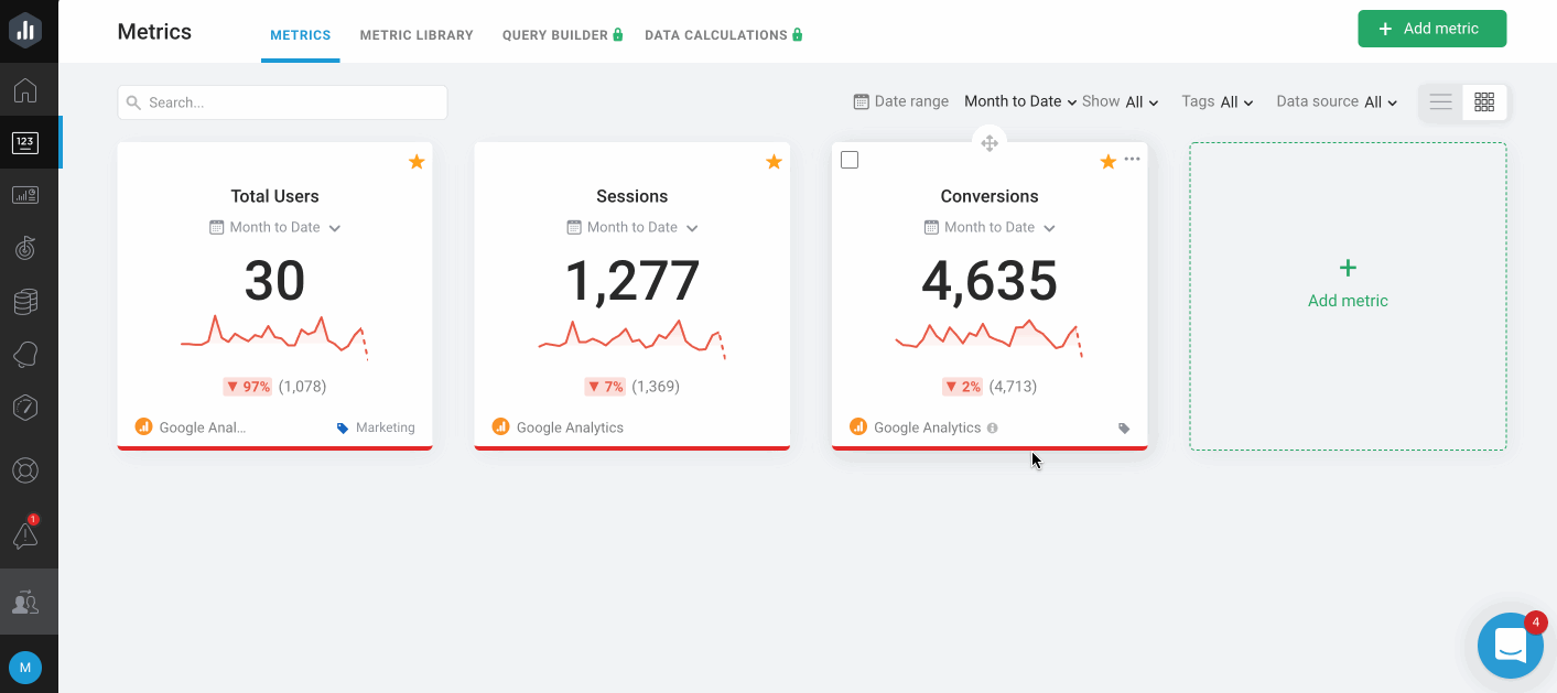
You can add metrics to your metrics screen by navigating to Metrics -> Add Metrics -> Add to My metrics
Goals
Similarly, you want to set goals to help you define your short-term and long-term accomplishments. Defining your goals is a great way to determine the context and purpose of your data.
Goal-setting can help you answer questions like ‘am I on track to achieve my goals?’, ‘what’s impacting my progress?’ and ‘can I make any adjustments to improve my performance?’
By navigating to the Goals panel in your account, you are able to define your goals to automatically help you track your progress. When creating your goals in Databox, you can define both your long-term and short-term objectives.

You can add a new goal by navigating to Goals -> + New Goal
3. Creating a Dashboard
Defining clear metrics and goals will help you create a dashboard that uncovers actionable insights from your data. You can use a dashboard to monitor KPIs in real-time, track your progress towards reaching your business objective, make data more accessible to everyone in your team, and help you understand the correlation between your outputs and outcomes.
Like the dashboard of a car, dashboards should only include metrics that will help you understand, monitor, and improve on current performance. To effectively do this, dashboards can be broken down into two separate types – overview and drilldown dashboards.
Overview dashboards include outcome metrics to help you get a general understanding of your current performance. While drilldown dashboards include a combination of both outcome and output metrics to help you understand the why behind your performance.

You can create a new dashboard in Databox by navigating to Databords -> +New Databoard.
Once you are in the Designer, you can use basic, custom, or calculated metrics to customize the data in your dashboard. The way you visualize your data is just as important as the data itself, so make sure you consider the different visualization types you can use for each metric.
Basic Metrics are the easier way to get your dashboard setup. It combines a data visualization type with the right metric to give you a pre-made Datablock. You can then easily drag and drop this Datablock into your dashboard.
4. Monitoring Results
By regularly monitoring the data you included in your dashboard you can quickly identify the strategies that are delivering the best results and the actions you need to take to improve on current performance. In fact, according to Databox’s State of business reporting, an overwhelming majority of companies said that monitoring and reporting improved their performance.
Here are a few ways Databox can help you automatically monitor results:
Scorecards
With a Scorecard, you can automatically track up to 15 metrics. Scorecards can be delivered daily, weekly, or monthly to your preferred channel (email, push notification, or slack) to help you stay on top of your KPIs.

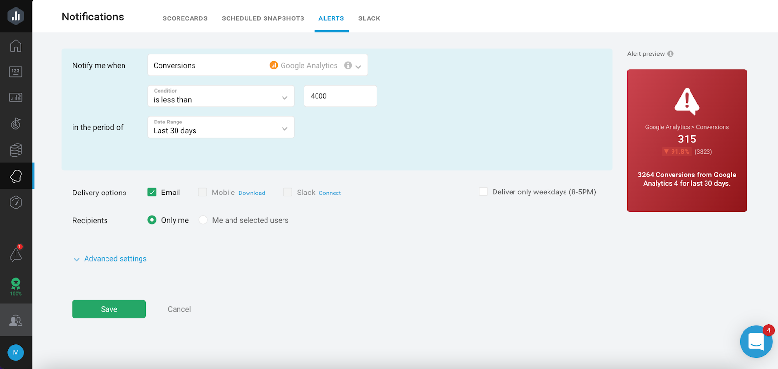
Alerts
You can use Alerts to get automatically notified of emerging trends. Alerts can be set up to monitor goals or to help you identify sudden changes in your data that may indicate you need to adjust your strategy. Alerts are a great way to understand the correlation between the work you are doing and the results you are seeing.
Scheduled Snapshots
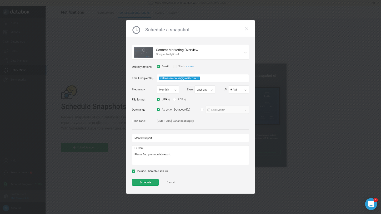
Scheduled Snapshots automatically export your dashboards at regular times, helping you make data a more regular part of your routine. You can also choose to include a sharable link to grant recipients view-only access to the live dashboard.
5. Creating a Report
Creating a report is a crucial part of your reporting process as it serves as a way to analyze data in a past time frame to guide future decisions and strategies.
Your report should include 4 sections: Overview, context, discussions, and conclusion. Let’s take a look at these in more detail:
Overview
The overview section of your report highlights your key findings in a few sentences. It is a great way to set your agenda by addressing the sections you will cover, main insights, conclusions, and next steps.
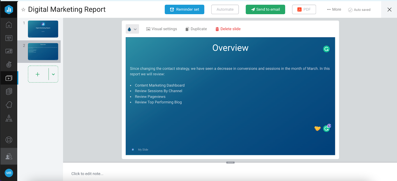
You can use the Text Slide in Databox to include the overview section in your report.
Context
The context section in your report is used to answer the who, what, why, where, and when. In other words, it provides the background information the reader needs in order to consider your findings and conclusions.
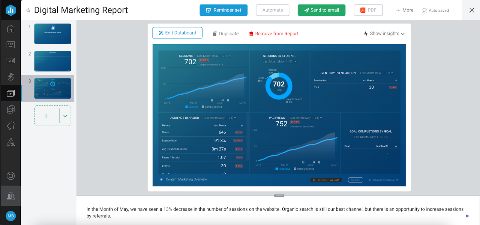
You can use the Databoard Slide to import a full dashboard into your Report. Including a dashboard gives the reader a full picture of why your findings are important.
Discussions
The discussions section in your report is used to present your findings by digging into the details of your results.
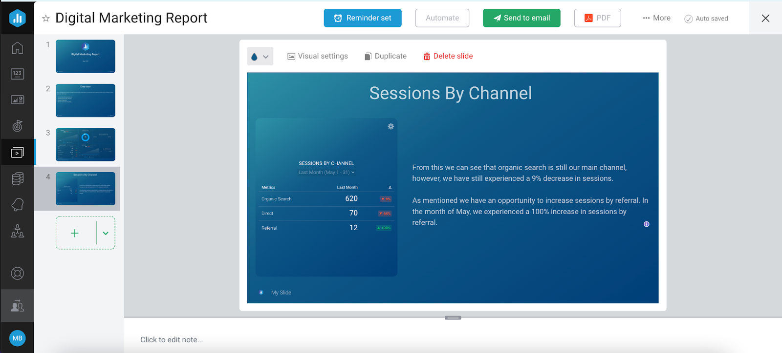
You can use a side-by-side slide to further drilldown into one particular metric. With this slide, you can include insights to help you develop your findings or highlight issues that may have prevented you from hitting your target.
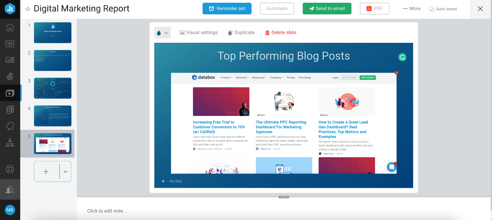
The image slide is also a great way to dig deeper into the performance of your campaigns. You can use this slide to include images of top-performing posts, ad previews, competitions, reviews, and more.
Conclusion
Lastly, your conclusion should briefly summarize the areas of improvement you can observe from your discussions and clearly communicate the next steps. By presenting your key findings, decision-makers can use your conclusions to guide future strategies and initiatives.

By using a data story slide, you can list your conclusions in order of importance and include recommendations to further improve your performance. With Data Story, you can include dynamic elements that are updated automatically, making your conclusions easier and quicker to formulate.
6. Presenting a Report
Part of a good presentation is good preparation! When presenting your Report you want to make sure you are effectively communicating your results, here are a few ways Databox Reports makes preparation easy:
Deck-like presentation
Structuring Reports in a deck-like format helps you deliver a better presentation while maintaining the audience engaged.
Notes
You can include notes in each slide to facilitate conversation and structure your presentation delivery. Notes are also a great way to provide additional context to campaign performance or draw a correlation between two metrics.
Automation
Report Automation makes it easy for you to prepare Reports for your presentation. You can schedule a Report to be delivered to a specific email address, at regular intervals. Once you have automated your Report, you can set up Reminders to make sure you have enough time to include the final updates and get the final approvals before your presentation.
7. Archiving a Report
Archiving a report is a great way to increase the understanding of your business’s progress as it provides evidence of past performance. In Databox, archived reports can be accessed whenever necessary.
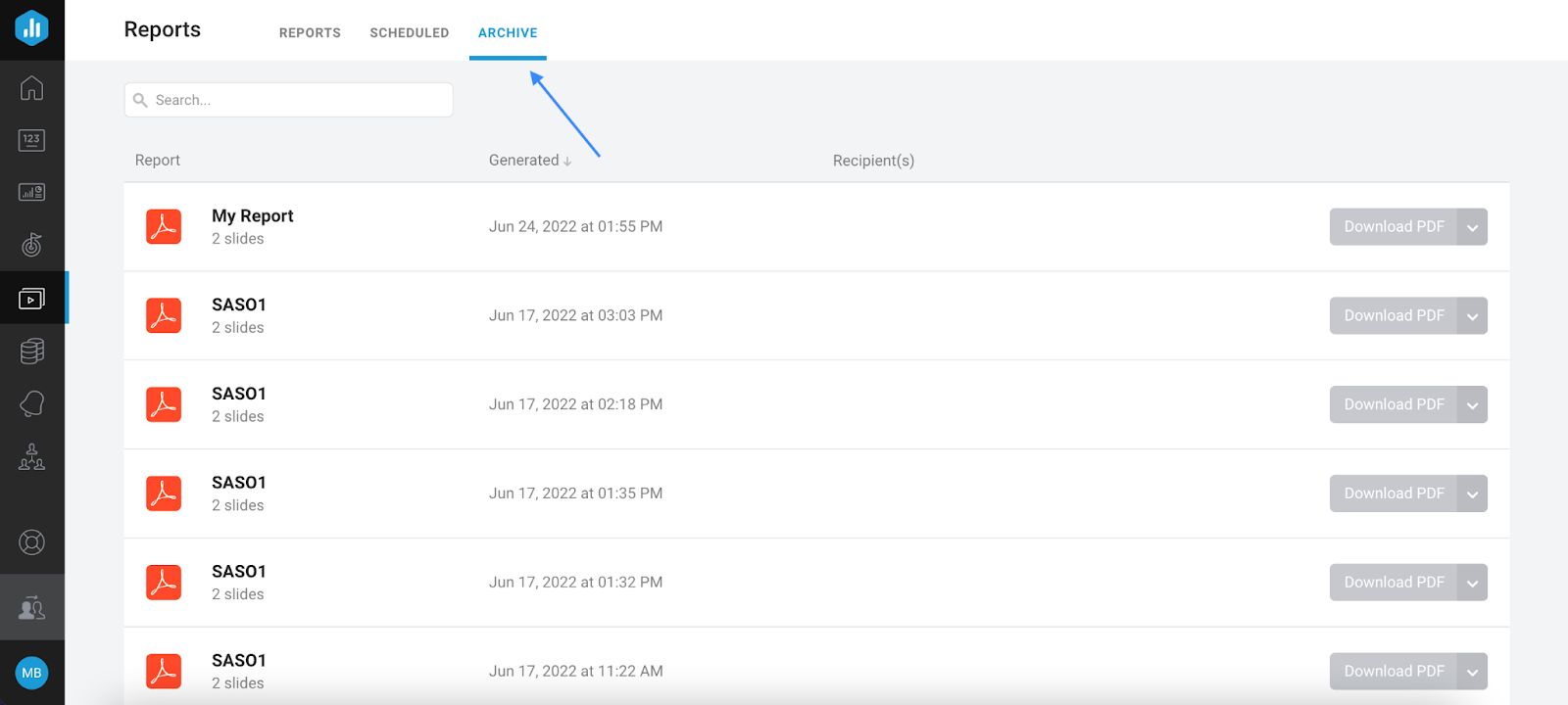
To check your archived reports you can navigate to Reports -> Archive.
Your One-Stop-Shop For Business Analytics And Reporting
In order to build a successful strategy, businesses rely on data to identify opportunities for improvement. Establishing a reporting process facilitates a business’s ability to define goals to track progress, monitor trends to establish the effectiveness of its initiatives, and communicate results to guide decision-making.
With Databox you can now handle your entire reporting process from a single place. Don’t waste your time on tedious tasks like collecting data, creating dashboards, or even creating your reports!
In just a few clicks you can automate your business analytics AND reporting, saving you time and energy to focus on the things that really matter. Start your 15-day free trial today and develop a flawlessly automated reporting process.