![The Only Google Analytics Acquisition Dashboard You’ll Ever Need [Data Snacks]](https://cdnwebsite.databox.com/wp-content/uploads/2018/02/27131907/GoogleAcquisitionDataSnackBG.jpg "The Only Google Analytics Acquisition Dashboard You’ll Ever Need [Data Snacks]")
Table of contents
Data Snacks is a video series from Databox that shares bite-sized tips to help you be more data-driven.
Acquisition reporting, and more specifically channel attribution, is one of the easiest things to overcomplicate.
The amount of channels, dimensions, and demographics you can sort by is the greatest offender for analysis paralysis.
I’ve been there. I’ve spent weeks, even months, trying to perfect the ideal view of acquisition efforts.
The main reason I joined Databox last year was that I saw the potential for this product to solve what had long been a pain point for me–spending less time on reporting so I could spend more time on the work.

For that to happen, the reporting needs to be:
- Accurate: Goes without saying…
- Focused: There are countless things you can track, but only a handful you should track based on your goals.
- Simplified: Filters and dimensions should help clarify insights and direction, not add complexity and cloud your understanding.
This month at Databox we set a new record for new customers, an accomplishment I attribute to our efforts toward ensuring all of the above.
In our latest episode of Data Snacks, I’m sharing how I built our acquisition dashboard using only Google Analytics, as well as the thought process behind it all.
Want the template used in this episode? You can download it for free right here.
A better way to track acquisition in Google Analytics
To best understand how our website is performing in terms of acquisition and conversion, we built the following Datablocks that we track in real time. (The data included in each Datablock is sample data.)
Sessions / Users (Combination)
While most people debate the merits of each (sessions is a better measure for overall website engagement, users a better measure of unique engagements on your website) we’ve found it’s best to track both metrics against one another.
By doing this, we’re able to quickly identify the makeup of our audience without having to spend more time digging deeper into the data.
If “users” sees a low representation in comparison to “sessions”, it’s likely that a low number of unique website visitors account for your overall website engagement. From an absolute standpoint, this isn’t good or bad–you have to decide what that means for you.
If “users” sees a high representation, it’s likely that you’re driving a lot of new website visitors to your website.

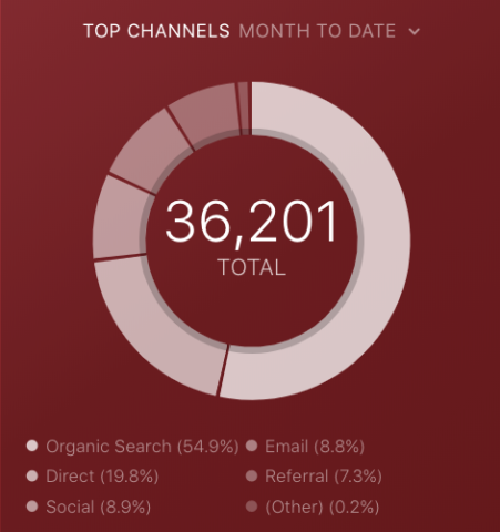
Top Channels
This one is straightforward, however, the pie chart visualization allows for easy consumption.
Based on the total number of sessions (or other metrics of your choosing) you can see which channels are driving the most volume.
Pro Tip: Your Go-To Dashboard For Doing a Deeper Dive on Website Traffic and Conversion Sources
Struggling to find an easy yet effective way to gain a comprehensive understanding of your traffic sources, user behavior, and revenue generation?
You can do all that and more with our plug-and-play GA4 Acquisition dashboard template:
- Understand user acquisition: See where users come from, tailor outreach, and track new user growth;
- Focus on high-performing channels: Identify top channels, optimize resource allocation, and adjust underperformers;
- Track revenue & engagement: Monitor revenue growth, active users, and the effectiveness of your campaigns;
- Go beyond traffic & conversions: Gain deeper insights into demographics, sales, customer journeys, ARPU, and more;
- Optimize marketing & drive results: Make data-driven decisions to improve your marketing strategy and achieve business goals.
You can easily set it up in just a few clicks – no coding required.
To set up the dashboard, follow these 3 simple steps:
Step 1: Get the template
Step 2: Connect your Google Analytics 4 accounts with Databox.
Step 3: Watch your dashboard populate in seconds.
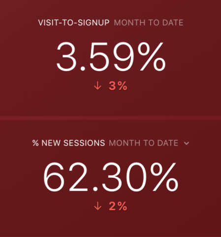
Visit-to-signup & % new sessions
Sessions (or visits, users, pageviews–whatever your top-of-funnel metric of choice is), when viewed in isolation, are relatively trivial.
Calculating your visit-to-signup rate is a better measure of how your website is actually performing. This helps protect against overvaluing volume growth at the top (“Hey! We increased traffic by 25%. Let’s celebrate!”) while seeing flat or low growth downstream.
A healthy marketing and website strategy should see both (visits and signups) growing at similar rates. If not, it’s likely that you’re:
- Driving more unqualified visitors from new channels and/or content you’re exploring.
- Doing a good job of bringing visitors back to your website, but not so much in driving new visitors. (Sessions still go up, yet signups will remain flat.)
% new sessions
A healthy organic search strategy will show up in the number of new sessions you’re generating each month. If your top channel is organic search, your % new sessions should be well represented as well.
Keeping an eye on this is just one more way to protect against trivial growth at the top of your funnel.
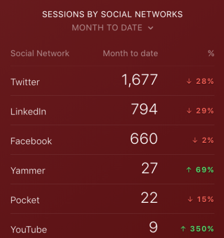
Sessions by social networks
While the number of channels and platforms continues to grow and evolve, it becomes more important to identify high-leverage areas and spend less time on everything else.
One area where this is most critical is social media marketing, as many marketers subscribe to the “check-the-box” method of simply posting their content and promotions to all of the available channels.
It’s a poor approach and one that’s a result of a lack of visibility into how each platform performs against the whole.
Tracking sessions by social networks with comparisons turned on is the best way we’ve found to continue prioritizing areas of high-leverage and ensuring there’s growth month-over-month.
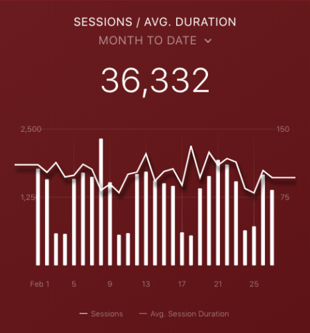
Sessions by average sessions duration
This is an area where I like to draw a correlation between the number of sessions we’re seeing, and the average length of time these sessions occur.
The reason we track this is to quickly see if spikes in sessions result in a lower average session duration. If this is true, while not absolute, it’s a good signifier that we may have driven a higher number of unqualified visitors during a specific time period.
Once again, it’s a way to get out in front of trivial growth at the top of your funnel and make any necessary changes to your website and/or distribution strategy in order to ensure the level of engagement you need.
What should we cover next?
That’s it for now. Once again, you can grab the template here.
Anything specific you’d like to see covered in future episode of Data Snacks?
Want to create your own custom GA dashboard? Check out our DIY dashboard designer and build custom business dashboards for free.