


Table of contents
As of this year, more website pages are viewed on mobile than desktop. To maintain or grow traffic, leads and/or sales from online marketing, serving your mobile visitors what they want and need is paramount.
Given how fast mobile website traffic has grown, it’s fair to say the trend snuck up on many marketers and executives before they could react. In fact, even after Google stopped sending mobile searchers to poorly designed mobile sites in 2015 (nicknamed Mobilegeddon by webmasters), some marketers still haven’t launched a mobile-friendly website.
But, while having a responsive-designed website is an important first step, there’s much more that can be done after that. Most marketers and webmasters treat the mobile site experience just like the desktop one. And while you probably don’t need an app, you might want to think about your mobile site differently than your desktop version.
If you’re worried you’re not serving your mobile visitors effectively, here are a few steps you can take to figure out how much you’re losing out.
1. Monitor Desktop Metrics Separate from Mobile Metrics
Diagnosis is the first step in fixing any problem.
Unfortunately, very few marketers have a system for monitoring and improving their mobile KPIs separate from their desktop KPIs. Without a system for analyzing mobile traffic, marketers are missing opportunities to convert mobile visitors to customers at a higher rate.
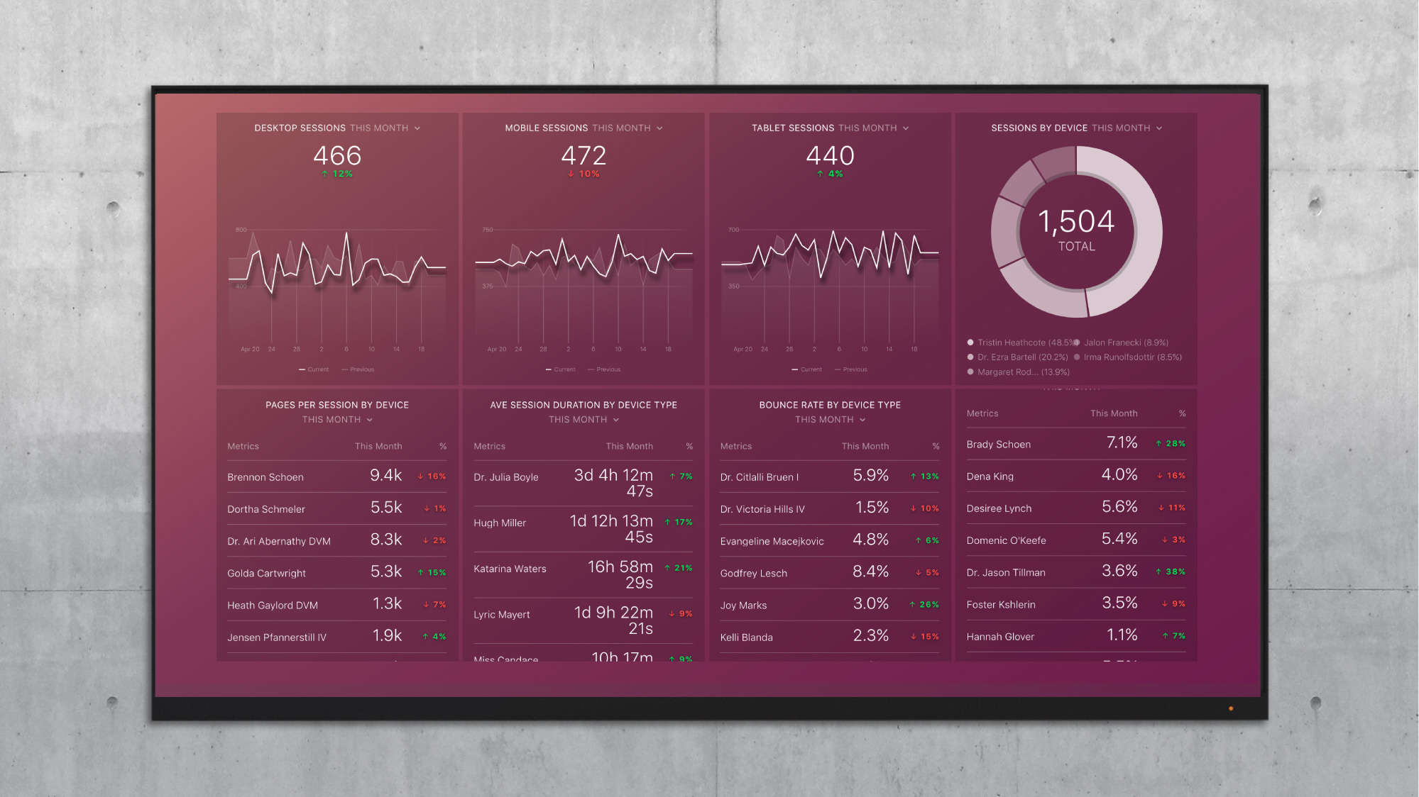
Fortunately, Google Analytics allows you to determine the health of your mobile traffic versus desktop traffic. You can monitor metrics like sessions, pages viewed per session, session duration, bounce rate and percentage of new and returning visitors by a dimension called “Device Category”. There are three device categories: mobile, desktop, tablet.
One of Databox’s partners, OverGo Studio, recently rolled out a new Databox report called, “Mobile vs Desktop Traffic Quality” for one of their clients, Heavenly Greens, a company that sells artificial turf lawns to homeowners on the West Coast. They have shared it in our Templates directory so you can use it in your own reporting.
2. Consider Launching a Simplified Mobile Site
Heavenly Greens launched a mobile-responsive website in 2015, well before the first Mobilegeddon. That turned out to be an important move, as new visits from mobile devices were up 41% year-to-year by 2016.
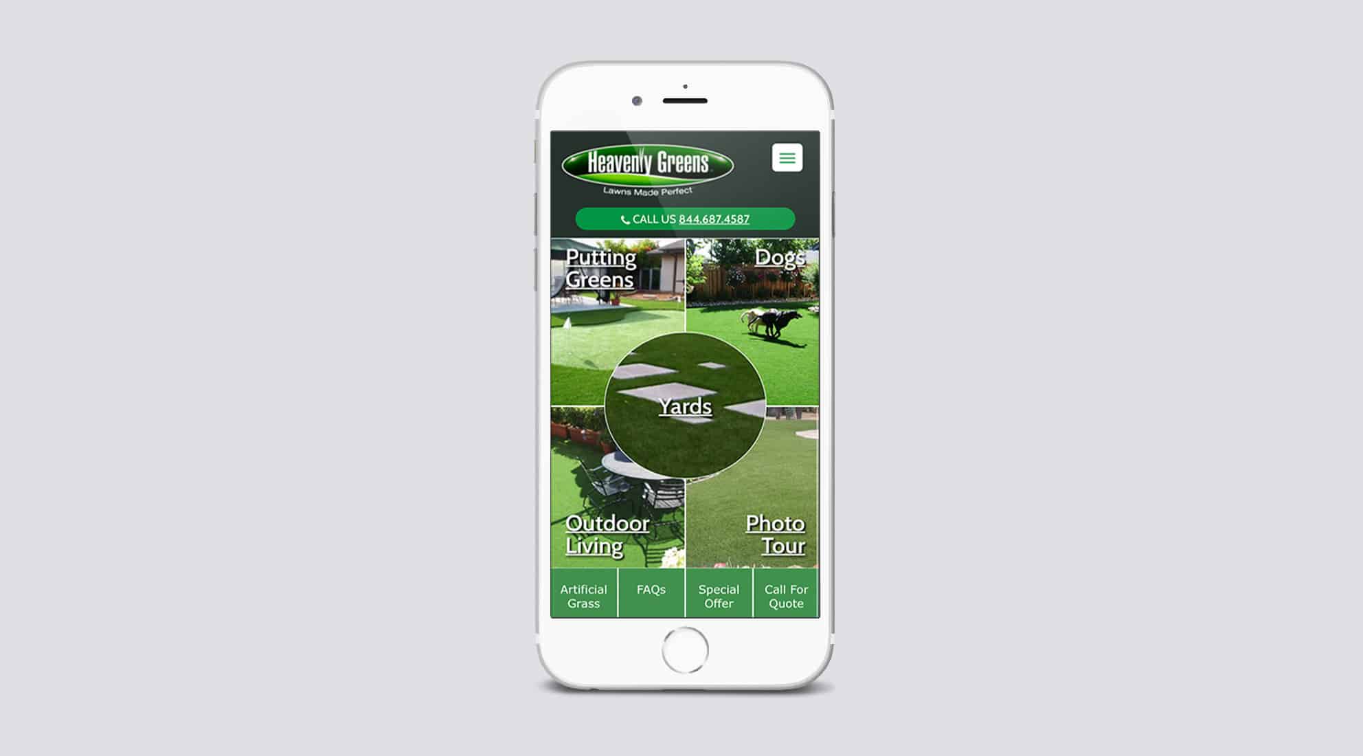
OverGo Studio had a hunch they could turn more of that traffic into sales for Heavenly Greens if they focused on the mobile experience even more, though. Their first step was to identify what mobile visitors were more likely to do than desktop visitors; to map the typical mobile buyer’s journey through the site. What they discovered, “As is true for many B2C businesses, mobile site visitors wanted to take action,” Mary Planding, Chief Strategy Officer at OverGo, shared. To take advantage of this opportunity to generate more inquiries, they launched a simplified mobile navigation and a new design that allowed visitors to find what they want right on the mobile home page. This allowed mobile visitors to get where they wanted to go with just one click. Here’s the design:
After testing proved efficacy, they rolled it out.
Right out of the gate, two key traffic quality stats dropped. Mobile pages per sessions went down 19% and time on mobile site decreased by 17.4%. But, they didn’t freak out, “We had designed the new mobile navigation to give users the ability to act. We shortened the time and reduced the number of clicks needed for the average mobile visitor to get what they wanted,” said Planding.
As you are probably thinking to yourself right now, those stats for desktop traffic would probably be very concerning — but for mobile users, it’s not necessarily a bad thing. Because the dips coincided with the change in the navigation, it was a reasonable assumption the mobile visitors were getting the information they needed, faster. Given that “88% of consumers who search for a type of local business on a mobile device call or go to that business within 24 hours,” according to the Google Mobile Movement Study, it’s important to design mobile sites to enable buyers to take action.
For B2C local businesses especially, mobile sites should be designed to deliver specific information quickly, not for the long-form browsing typically done on desktops.
3. As You Experiment, Monitor These Key Mobile Traffic Quality Metrics
The dashboard above monitors key mobile traffic quality stats for Heavenly Greens. Wild swings in any of these metrics is generally a bad thing. A small dip in any one or two of these metrics doesn’t usually mean disaster. But, monitor them all to make sure nothing catastrophic has happened and to ensure that the marketing strategies you’re using are having the desired effect.
Here’s a description of each of the metrics and what to look for:
- Sessions by Device: OverGo and Heavenly Greens produce content and run ads to grow their traffic month-over-month and year-over-year. Given that many of their visitors look at their mobile site as a last step before calling them, it’s critical that mobile traffic grows as its the best, early indicator of future sales. The first four month-to-date datablocks help them monitor desktop, tablet, and mobile sessions compared to last month and as a percentage of the whole.
- Pages/Session: As in the Heavenly Greens data shows, this number will probably be lower on mobile. If your business is like Heavenly Greens, consider designing your mobile site so that it encourages action and purposefully reduces the number of pages a visitor needs to view to get what they want.
- Average visit duration: Like pages/session, it’s ok if this number is lower for mobile visitors versus your desktop visitors. If it’s higher, they might not be finding what they need and you should consider getting feedback from mobile site visitors about what they were hoping to find. And if it’s drastically lower, you might have overly simplified your site.
- Bounce Rate: This is a measure of the percentage of people who come to your site and either exit right away or don’t visit a second page. If your average visit duration is low and your bounce rate is high, you are probably not serving your mobile visitors at all. However, if bounce rate is high and you’re generating leads, calls or contacts, there’s probably nothing to worry about. To reduce bounce rate, isolate the pages that have a lower bounce rate and determine what’s successful about them. Is the end action for the user clearer? Adjust copy and CTA placement accordingly. Alternatively, look at the pages that have high bounce rate on mobile and try to improve the conversion percentage.
- Percent of new sessions: The percentage of new mobile sessions should remain steady unless you’re doing specific things to reduce or increase it. For example, if you begin running re-marketing ad campaigns or send out an email campaign, it’s possible that the percent of new visitors could decrease.
Editor’s note: Would you like to view your most important website metrics at-a-glance, anywhere you go? Track your current performance with the Databox mobile app and access the website analytics dashboards you’ve built from your mobile device too!
The great thing about all of these metrics above is that they are great early indicators of the impact of any change you make to your mobile site or advertising. Taken together, they give a complete picture of traffic quality. But…
4. Track Conversions to Determine The True ROI of Your Mobile Efforts
While the metrics above are valuable for monitoring the health of your website traffic quality, there’s no substitution for monitoring conversions. You can track conversions in Google Analytics by setting up goals. Depending on what software you’re using to capture leads or facilitate phone calls, you might also be able to track conversions in there too.
When setting up goals, ask yourself: what action do you ultimately want mobile visitors to take? Not only should that inform the the design of your mobile site, it should also be the action you measure, so you know your design and your marketing is working.
For example, Heavenly Greens has a phone number on the front page of their mobile site, and tracking associated with that number has shown a 30% increase in calls since they relaunched the mobile site. They use Invoca to track calls. They also use HubSpot to manage their website and inbound lead generation. While it isn’t possible to see which leads come from mobile inside HubSpot, the Heavenly Greens sales team verified mobile lead volume was up too.
Ideally, you’ve integrated lead capture and call tracking tools with Google Analytics to do closed- loop reporting. If not, you can use a system like Databox to report both conversion data and traffic quality data side by side.
Mobile Websites Should No Longer Be an Afterthought
Thirty percent of all U.S. e-commerce sales happen on mobile now. But even if you don’t directly sell from your mobile site — i.e. Heavenly Greens, which routes users to contact them — you still need to make sure you’re tracking mobile analytics.
And that’s just a first step.
One of the great promises of mobile marketing has always been the chance to directly and instantly engage in a phone conversation with a potential customer on a device they almost always have with them at the moment they are ready to talk about buying your product or service. Google calls this the Zero Moment of Truth. HubSpot calls it Inbound Marketing. Buyers just call it convenient.
But without the ability to monitor your mobile analytics and the right mobile website strategy, your business may not be providing the convenience your buyers want. On the flip side, mobile analytics monitoring helps you understand how effectively you’re serving your site’s mobile visitors, which should then drive investments and strategy for both your site design and your mobile marketing.
“OverGo Studio’s data-driven mobile design process raised serious questions about our mobile engagement strategy,” said Heavenly Green’s Scott. “Our target persona lives in Silicon Valley. As arguably the most tech-savvy consumers in the world, they have high UX and design expectations when buying.” Smartly, Scott invested in improving Heavenly Green’s site and is enjoying more sales because of it. “By monitoring our data frequently, we ensure a steady flow of leads from our mobile marketing and even identify further ways of improving results.” Scott added.
What are you doing differently to better serve and convert mobile visitors?
You better do something soon. There are now more mobile devices than people on Earth and sad though it is, more people have access to mobile phones than toilets globally. As a result of its pervasiveness, almost all digital growth now comes from mobile, while the desktop has become “a secondary touch point for an increasing number of digital users.”


