Table of contents
At Databox, we constantly incorporate user feedback into our content creation process.
Sometimes, I get content inspiration from conversations with our customer support or sales manager. Other times, I look at popular topics in the Slack community we have created with our top users.
And of course, I look at popular blog topics from the past with our Blog Quality Metrics dashboard to determine what is already popular with site visitors.
Over the past 6 months, one topic has been consistently mentioned across all three channels: marketing benchmarks. In other words, our customers want industry-specific or firmographic data that will help them evaluate their success against similar companies. In-house marketers need benchmarks so that they can explain their performance to their bosses. And agencies in our Partner Program need benchmarks so when their clients ask, “How do we compare to our competitors for this metric?”, they will have an answer ready.
We heard this from all angles- conversations, Slack and top-performing past content– so we knew that our solution needed to go far beyond the typical piece of content. If we just wrote another text-heavy blog post, we would not be giving this the attention it deserves.
So, I spent about 6 hours digging up and formatting industry and firm-specific metrics from research published by companies like HubSpot and Unbounce. This data was locked in charts and other unstructured forms of data. If a marketer wanted to find the metrics most relevant to them, they would need to search these reports and see how their company fit in. To make it easier for them, I built a tool that dynamically serves them the most relevant data immediately.
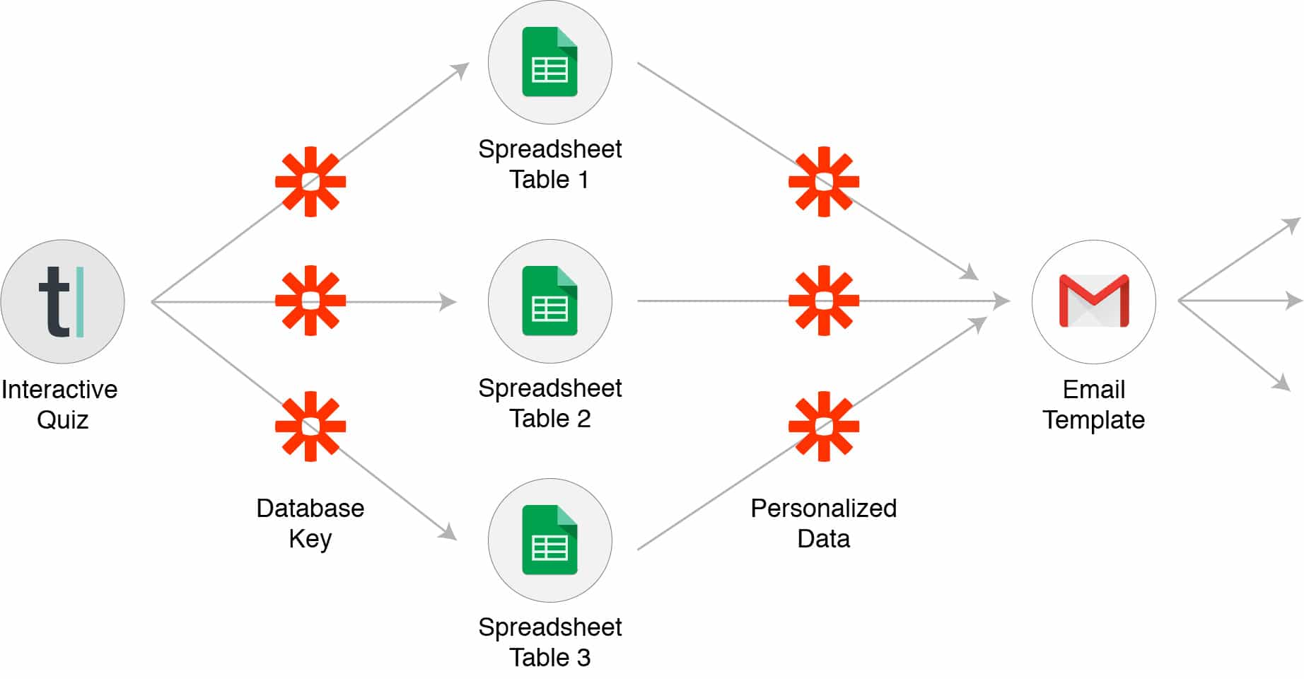
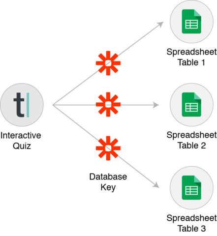
I turned to Typeform to create an interactive quiz that would ask inbound marketers a couple questions without being intrusive (important). Then, once they provide an email address, I send them the benchmarks for their specific company size and/or industry.
To do this, I use Zapier to extract data from Google Sheets, which acts as a database in this case. I also created a standard HTML email template to share the benchmarks via Gmail. If I wanted to get a little more sophisticated, I could do it through HubSpot or another marketing automation platform that connects to Zapier.
Here’s a diagram that explains all of it.
Here is my full method for building the tool in 48 hours for under $100.
Sections
- Creating The Interactive Quiz
- Pulling Customized Data Based on Responses
- Delivering Data To The Quiz Taker
- Why Do It This Way?
Creating The Interactive Quiz
I used Typeform to create the quiz. Although we also use SurveyMonkey quite a bit, I chose Typeform because I feel it provides a better user experience. Typeform provides easy customizability and branding. Here are some examples of Typeforms, if you have not heard of them before. They create excellent user experiences.
In order to respect privacy, I only asked demographic questions that would help me deliver better benchmarks. Here is the full list: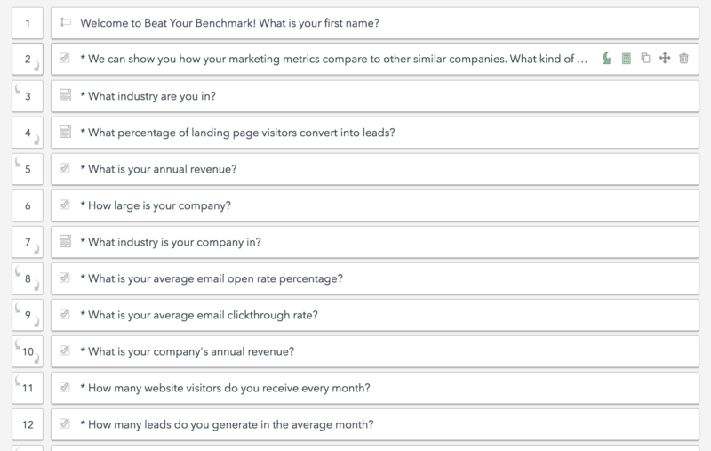
Typeform uses Logic Jumps to create different ways for visitors to move through your surveys. In our case, the user experience depends on the inbound marketing metric you would like to measure. Some benchmarks are specific to an industry, while others are specific to a company size. I needed to ask a different question set for each user. This requires the Typeform Pro plan, at $30 a month. You can create unlimited Typeforms with it.
The real magic comes from the specificity of the tool. Marketers are accustomed to hearing average statistics across all industries like, “The average email open rate hovers around 20%”. But, the granular and arguably more useful stats are locked up in these niche reports. So, I wanted the quiz to reflect that level of detail.
Pulling Customized Data Based on Responses
Here is the toughest part. Usually, when you want to send emails with customized data at scale, you need a more complicated marketing automation system that works with a server to pull data. That means engineering hours, complexity and a longer timeframe. I wanted to create something useful in 48 hours and see if it solved a real problem for our customers.
I set up worksheets in Google Sheets that act like tables in a relational database. If you don’t know what the heck a relational database is, no worries. All you need to know is that each row of data has a key, or a number as a unique identifier. That is the id column in the row below.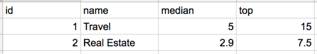
The above snippet shows that the median landing page from companies in the Travel industry has a 5% conversion rate, while top performers convert 15% of visitors. Each worksheet has a table with data related to different marketing metrics: landing pages, email interaction, visitors/leads/MQLs etc.
Next, I needed a way to tie specific answers from survey respondents to the related benchmarks. This may be the ‘hackiest’ part of all — 0r most clever, depending on how you look at it. I included specific IDs in the question text itself. Like this: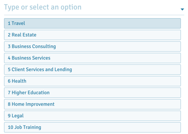
Since every answer begins with a number, I know which benchmarks to deliver to the user! It matches the row ID in the worksheet.
In Zapier, I first set up a Trigger for every time a user finished this particular Typeform. Then, I used the Filter to run different Zaps for different data requests. If a respondent wanted landing page data, I need my Zap to reference the correct worksheet.
Next, I used the Formatter to extract the unique ID from the beginning of the answer text. If the answer was Travel, the ID will be 1.
In Zapier, I used the Lookup Spreadsheet Row Search to find the row of data relevant to the user response. If the respondent wanted data for the Travel industry, I could access that row.
This can get pretty complicated if your survey considers multiple factors. The most complicated version of this quiz serves three customized sets of data. So, I used three different Lookup searches to find the three rows.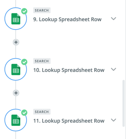
This requires the Zapier Starter Plan, at $20 a month.
Delivering Data To The Quiz Taker
At this point, I had:
- The respondent’s firmographic data,
- An estimate of their performance for one out of five inbound marketing metrics from Typeform, and
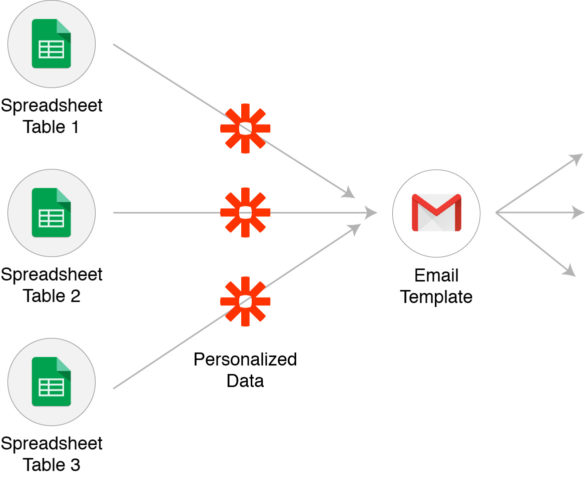
- Their relevant benchmarks from the Google Sheets lookup. Now, I needed a way to deliver it.
Since Databox is a marketing reporting software that is focused on automating reporting and presenting data in dashboards, there is no way that I was going to send a text-heavy email! After all, if these respondents use benchmarks in our product, they would see them within the graphs themselves. They would not just be text on the screen.
I chose to use Gmail as opposed to HubSpot or MailChimp for two reasons:
- Ease of testing: I can easily tell if my emails are being sent with the correct formatting without a long testing process.
- Ease of designing: I can use HTML to format my emails directly within Zapier. Although this will lead to a simple email design, it is much easier to control than a template from a third party service.
Gmail does limit you to 500 emails a day. I don’t expect that to be an issue.
In order to create well-formatted graphs within the email, I turned to Google Image Charts. They allow you to pass in all the data via URL parameters, like this:
https://chart.apis.google.com/chart
?cht=bhs
&chs=500×140
&chco=2ca8cc|61C46E
&chxr=0,0,30,10
&chxt=x,y
&chxl=
1:|Top%20Performers|Average
&chbh=50,10
&chd=t:4,25
&chds=0,30
&chm=N,404040,0,-1,11,,l:5
&chxs=0,000000|1,000000
The API will take a few hours to understand, but after that, there is no need to feed in data from a server. And, since the graphs are actual images, you do not need to worry about formatting issues that commonly affect HTML emails.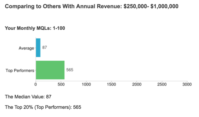
You can design the rest of the email within Zapier itself. If you know HTML and have a design in mind, it is very easy.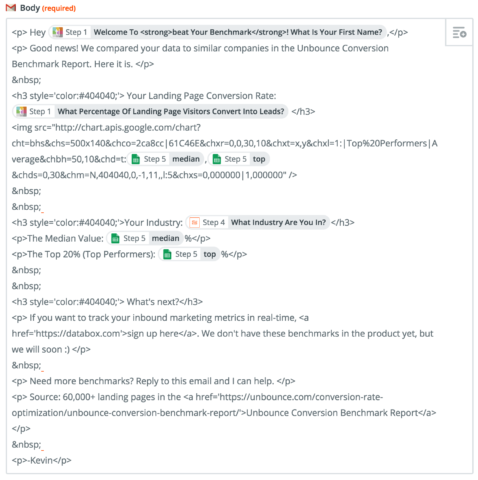
Why Do It This Way?
I had a couple other options for creating this content. I could have:
- Created a traditional marketing offer. You know, a guide like “Industry-Specific Benchmarks for Inbound Marketers” with a link to download a PDF. This would not solve the original problem- marketers would still need to scan until they found the metrics relevant to them. And, I would not be able to include highly-detailed data since it would quickly become overwhelming.
- Shared a Google Spreadsheet. I have seen a couple B2B marketers offer spreadsheets full of data. Although that may seem exciting, there is no user experience and no customization to each person.
- Created a traditional survey. I could have used a tool like SurveyMonkey. However, their surveys do not react well to multiple branches of question logic. It does not feel customized.
- Not asked any questions about marketer’s actual data. I could have structured the survey around simply asking for the benchmarks themselves, like “Show me the averages for landing page conversion rates in the travel industry”. However, that would force marketers to calculate their comparison themselves. This makes it obvious by putting their data right next to industry averages.
When To Create An Interactive Tool
Okay, so not every piece of content will be a good fit for this level of interactivity. That being said, it’s an opportunity to set yourself apart from all the marketers that just write blogs or offer ebooks.
Here is my advice: Find a burning problem from your customers that is not already addressed by your product or any major competitor.
Let’s say that you are building a CRM tool for companies with sales teams of 5-15 people. Every sales team has at least one member that hates the CRM and refuses to enter data into it, even though it will look like they do nothing if they fail to use it.
You could build a tool that allows this member to enter data into the CRM via email or Slack or another preferred communication service. Then you can pitch this tool as a solution for sales managers to help their stubborn salespeople participate.
This would go far beyond the blog that your competitors are writing: “8 Ways To Convince Salespeople to Use Their CRM.” But, it is only worth the extra effort due to the size of the problem and universal appeal.
If this works out for you, let me know in the comments!