Table of contents
If you have ever created a company landing page, you probably used one metric to define success: how many people click the big freaking button (aka call-to-action)?
You know, like this:

Image cred: Usability Hour
However, this metric has one fatal flaw: what if these visitors click the button and expect value that your product or service does not actually provide? In other words, what if your landing page misleads them?
Yes, you will eventually see the effect of a misleading landing page when these visitors do not return to your product after creating an account. Or, they book a demo but do not follow up after that. Or they click into another page and then exit after learning about the actual value of your product or service.
Here is what’s even worse: if your landing page misrepresents your product, your intended audience will lose interest! They will search for another solution to their problem.
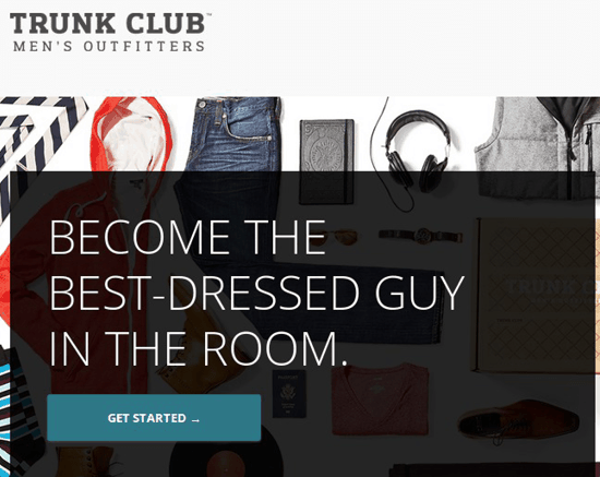
An excellent landing page. Image Cred: Quick Sprout
You need a quick way to figure out what is going on in your visitor’s heads without waiting for results from weeks of A/B testing or sales calls to roll in.
Here are three traditional ways to solve that:
- Go to coffee shops and approach people while they are out in the open. Run them through a 5-10 minute test. Yes, I have tried this, and although it does work, it is a time-consuming process.
- Approach people at train stations with the same questions. This worked for Mint.com‘s Aaron Patzer. Also painful.
- Run 1-on-1 user tests by booking time with people in your building that do not know about your product or service. This can take hours of recruitment and logistics (though new tools like User Interviews are making this easier.).
Since I am an impatient person, I got tired of all these painful methods. So, I developed a way to use Amazon Mechanical Turk to ask open-ended questions that reveal the value that visitors expect from your site. It will take you 20 minutes to set up, cost $1.50 per response, and can get you 50 responses in 2 hours. UX professionals sometimes call these “unmoderated usability tests”.
If you are not already familiar, Mechanical Turk allows you to post small, web-based jobs called HITs (Human Intelligence Tasks). These tasks are usually between 5 seconds and 10 minutes long. Once you post a HIT, any Worker on the platform with a sufficient rating can complete it. You cannot segment by demographics. An estimated 500,000 Workers have registered for the platform.
If you expect first-time visitors to reach your site without any knowledge of your offering, this will help you determine the effectiveness of your pitch. That should cover pretty much every product and service.
What types of products/services qualify for this kind of test?
After running this process hundreds of times, I have found that you can get great feedback as long as your product does not require domain-specific knowledge. And if you are unsure, the risk is only $30 for 20 tests.
Example: If you are selling a tool that helps SEO consultants do their job, this will not work. Domain expertise is needed.
Example: If you sell a social media scheduling tool like Buffer, this will work. Even though the tool targets social media marketers, it connects to an experience that everyone understands: posting on social media.
Example: If you are building a website for a law firm, this usually will work. Even though Amazon Mturk Workers may not find themselves in need of any particular legal service, they can still describe how a person might benefit. If this is a niche legal service, however, it may not work.
Quick Summary of the Process
I have used this process for three separate use cases:
- Determining how well a landing page communicates
- Polling on how to best display information in a web app
- Testing an onboarding sequence
Each use case will have an example from a previous company I ran, Vivergy. Vivergy helped consumers measure and lower their environmental footprint.
In each case, here are two necessary pieces:
- Script: A series of questions that will get a detailed response, not a “yes/no” or “I would never use this”
- Quantifiable threshold: A way to tell if your site or feature is doing well enough
PRO TIP: How to track these 10 popular Google Analytics 4 metrics
Sure, there are dozens (and dozens?) more Google Analytics 4 metrics you could track. But, starting with these 10 commonly tracked metrics will give you a pretty high-level view of how your marketing is working…
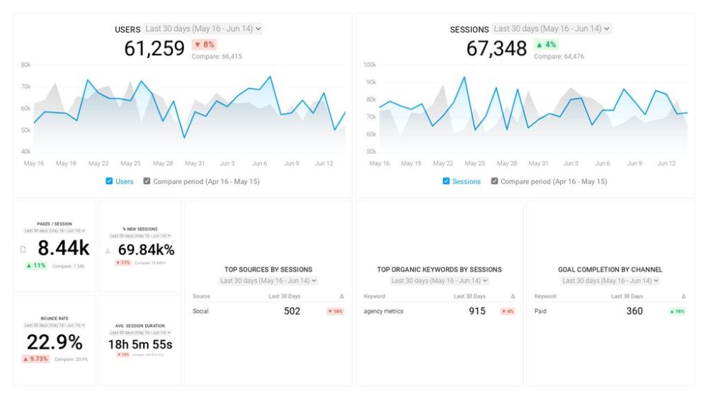
- Sessions: The number of sessions can tell you how many times people are returning to your website. Obviously, the higher the better.
- Sessions by organic keyword: Which organic keywords bring in the most traffic to your website? This may help you determine whether your SEO investments are paying off.
- Bounce rate: Do visitors leave shortly after landing on your website? Or do they stick around?
- Average session duration: How much time are people spending on your website? Users with a high average session duration are most likely relevant to your company.
- Goal completions: How many users responded to your call to action?
If you want to track these in Google Analytics, you might find the visualizations limiting. It’s also a bit time-consuming to combine all the metrics you need in one view.
To better understand how your website performs in terms of traffic growth and conversions, we’ve made this plug-and-play dashboard that contains all the essential metrics for understanding how successful you are at optimizing different aspects of your website.
You can easily set it up in just a few clicks – no coding required.
To set up the dashboard, follow these 3 simple steps:
Step 1: Get the template
Step 2: Connect your Google Analytics account with Databox.
Step 3: Watch your dashboard populate in seconds.
Case 1- Landing Page Value Proposition
Here is the “above the fold” portion of the landing page from my previous company.
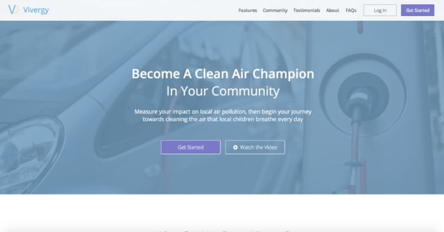
There is no way to know whether the Workers from Mechanical Turk are interested in this site. It doesn’t even matter.
All I need to know is this: Can visitors imagine success that anybody might achieve with this site?
If they cannot find any value proposition, then when qualified traffic arrives at the site, they will not have a chance at becoming active users!
According to the Nielsen Norman Group, your landing page must communicate a clear value proposition within 10 seconds. That means you only have 10 seconds even if the visitor is part of your target audience. This is why Mechanical Turk is a good fit. These Workers are trying to complete as many tasks as possible in their available time. Just like your users, they are not going to take time to read everything. They are going to quickly skim it and give you a visceral reaction.
Here is the script I used to test this page.
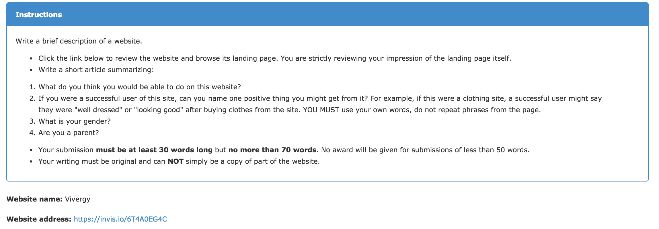
There are only 2 real, open-ended questions. One asks about the functionality of the site, and the other asks about the value it provides. If you want reasonable responses, this is all you can ask at $0.50 to $1.00 per response.
Responses
Here are a couple example responses:
“I believe this site would allow the user to contribute to cleaning pollution from the air. A successful user of this site, would feel better about themselves and contribute to a cleaner world. I am a male and not a parent”
“Vivergy is a website dedicated to informing others on how they can reduce air pollution in their local communities. They provide useful information such as personal suggestions on how you can cut back on your pollution contributions, tools such as a pollution score calculator, and advice on how to collaborate with your neighbors and neighborhood and start your own clean air movement.”
“Vivergy is a website that makes it easier for an individual to make an ecological difference in their community. Vivergy allows you to see how much you are contributing to pollution, and customizes suggestions to reduce your impact. In this way, it allows you to see how individuals impact their local environment, and the world.”
You can download the full CSV of 20 responses here
I ran this test multiple times with a variety of headline and body copy combinations. Usually, 10% of responses were fake/unrelated. From the remainder of responses, I considered the landing page successful if 80% described the value proposition correctly.
When I tweaked the headline and body copy, I measured whether visitors understood some value proposition of the product versus the value proposition I wanted to highlight. For example, if I ran a CRM company, there are a variety of things I could emphasize:
- Organizational transparency
- Efficiency of sales team
- Ease of organizing daily activities for salespeople etc.
I would want to highlight the fact that salespeople close more business when they track it in my CRM. So, I could look for that value proposition specifically in the responses.
Case 2- Displaying Information Within Site
If you want to test individual features, I recommend InVision. It allows designers, marketers and developers to collaborate with wireframes and screenshots of new features. You can use it to share mockups before spending expensive time on development.
I wanted to test two ways to display critical user data. So, I created an InVision prototype. One was bar-oriented, one was gauge-oriented.
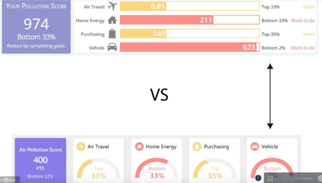
Yes, I tried another variation with the order flipped to remove any bias. I used the following script to compare the two.
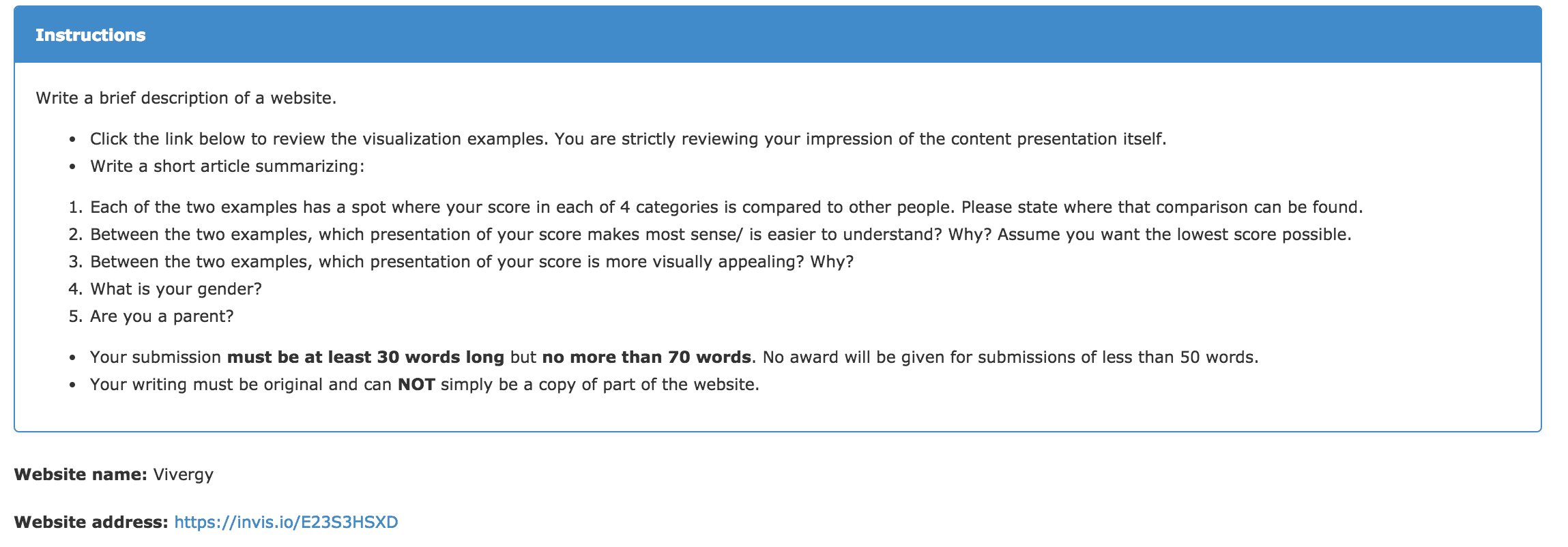
Again, open-ended questions allow you to get responses from non-users. Keeping it short and focused on one part of the site isolates the visual choice that I want to test.
Responses
“The comparison for the 4 categories can be found to the right of each individual category or found within the circle. It is easier to understand the bar visual along with the words written out next to it. It would help me do better with pollution. The circle graph layout is more visually appealing because the lower pollution score. I am a male, and not a parent.”
“You can compare your overall score by looking just underneath your score, where it gives you a percentage based comparison of your score with the scores of others. I like the top example, where the scores are presented with a nice graph, which is easy to look at and understand. I am a male with no children.”
Get the full CSV of 40 responses here
The bar chart format won out by about 2 to 1. This approach needs to be deployed carefully. It will not work with terminology and actions that are contextual to your entire user experience. It only works for general design decisions. We were able to decide what needed to be built in 4 hours, rather than days or weeks of split-testing.
Case 3- Onboarding Sequence/Lead Quiz
We created an onboarding sequence to set users up for a successful first-experience of the full site once they created an account. Of course, this introduced some friction.
Without the onboarding sequence, users were immediately faced with an email/password form if they wanted to go further. That is a lot to ask for a new visitor that only has a hint of what he/she will gain.
With the onboarding sequence, users got a teaser for the full-site experience. But, as they completed a 1-minute long process, they needed to understand why they were filling out the information. What would it get them?
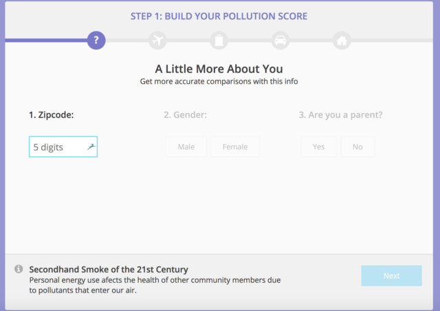
So, I used the following script to investigate whether users understood why they were filling out a quiz. This should also work if you use a quiz as part of lead generation.
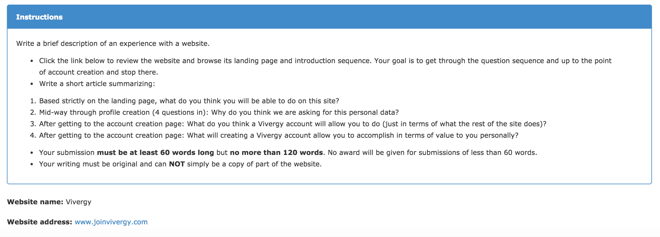
I gave 12 minutes and $2 per response for this one due to its length. It asks for user impressions at three critical points- at the landing page, at the halfway point of onboarding and at the account creation phase. If users don’t understand why they are going through the process, they will never follow through and create an account.
Responses
“I think this site is a way to connect with others in hopes of learning how to lower how much pollution you generate. Air pollution caused by traveling is on the rise and a lot of people still chose this way to travel. I guess asking these questions is to see how much a person contributes to it. I think after getting to the account page will allow me to see how much my actions effect the environment. Making an account will allow me to find ways to limit it and team up with others who are doing the same.”
“The first thing I notice about the site is the big blurb about air pollution, so I assume it’s about that. I assume you are asking for personal data for ad revenue purposes. I think a vivergy account would allow me to learn about air pollution. I don’t really have any interest in making an account so it really has no value to me personally.”
The responses show that there still needs to be some improvement in the onboarding sequence. There are too many responses that miss one of the questions badly. Also, it looks like I phrased the last question poorly, because too many Workers assumed that I was asking whether they wanted to become a user. But, asking 4 questions at once also pushes the limits for this format. I aim for 80% of responses with correct answers to the first three questions to feel confident in this sequence
How to Get Started
If you want to start using this process:
- Go to the Amazon Mturk site and sign up as a Requester.
- Add credits to your account.
- If necessary, set up an InVision account as well and create sharable links for any mockups you need to use.
- Use one of Amazon’s templates to get started.
General Tips
- When in doubt, add extra time and extra pay. I aimed for rates that worked out to $10 an hour for the worker. You will receive angry messages if your timeframe cuts off Workers early, and you will lose reputation on the site.
- Another good reason to offer a generous price: It guarantees that Workers respond to your HIT quickly. If the price is too low, nobody will sign up.
Types of Problems This Can Solve
Outside of receiving instant, actionable results within hours, this process will also help you start a conversation with your boss, client or team.
If you want to prove that your changes help visitors better understand your offering, you can use this guide to collect the evidence and share with the team.
If you use 2 week sprints, this process will help you build landing pages and features correctly and on time.
This will not work for every product or service. But, if it works for your brand, you can use it to feel confident in your decision-making from the very beginning of the project.


