Table of contents
This story actually begins a couple of months ago. August, to be precise.
I hadn’t even been offered the role at Databox yet and I was already disagreeing with the CEO (and my potential new boss) Pete Caputa.
Early on in our discussions about me coming on board, I had mentioned to Pete that I thought Databox’s market positioning was in direct conflict with how the product and its use case had evolved ever since he had come on board in early 2017.
He agreed. But he also didn’t think addressing it was an immediate priority.
“Let’s bring on a few hundred more customers,” Pete said. “Then we can go back and make the necessary changes to the website.”
I agreed on premise. But disagreed with the timing. At the time, the Databox website was communicating a completely different message to a completely different audience. Sure, the use cases will continue to evolve and more customers would validate the key value propositions, but the website should change over time too.
In a crowded space, I argued for defining the market positioning rather than letting the market define it for us. We’re not Geckoboard. We’re not Klipfolio. We’re not Domo or Tableau. We’re not just another dashboard or BI tool. Databox is different, and I strongly suggested communicating that difference to the market ASAP.
Once your product is defined, whether by you or external forces, you wear that hat.
After a few conversations back-and-forth, both on the phone and in-person at Databox’s office in The Davenport (we’re in the same building as HubSpot), we were on the same page.
I joined Databox. And as the first priority, Pete agreed to let me rebrand the Company.
The Pivot from Enterprise
Like many people working in the martech space, specifically in Boston, I had heard of Databox before. But whatever impressions I had of the product’s utility were changed once I started talking with Pete and Davorin Gabrovec (Databox co-founder and Chief Product Officer) back in August.
I needed to reconcile that difference in perception before moving forward with the rebranding project.
I started lining up some interviews with the current folks on the Databox team. And not just with the marketing folks, but also our engineering and product teams. Here’s some of what I learned:
In the years prior, Databox had been positioned more toward executives and the analysts that work for them within enterprise companies, enabling them to understand how their business was performing at any time, on any device–but with a strong emphasis on mobile. (Remember when mobile was all anyone ever talked about–like AI today?)
Here’s what that positioning looked like:

Unfortunately, selling to large companies proved difficult, and while they had a few successes, they failed to prove a market.
The Move to Mass-Market
Databox started pivoting in mid-2016 when they launched the ability for users to sign up and use the product for free, all by themselves. The response was quite strong as Davorin shared in a 2016 recap.

Freemium was key, as it further accentuated one of the core differentiators and value propositions of Databox; making data more accessible to anyone on your team. Davorin shared the grander aspiration over lunch one day in September.
“We wanted to build a different kind of company,” Davorin explained. It was an unseasonably warm day in Cambridge as we sat outside Blaze on First Street, enjoying a few slices. “One that enabled marketers, and really anyone inside a company, to do all the work themselves without the need for engineering and analysts. This way, they could discover the insights they need quickly and move forward.”
Fast forward to today, and a few things are working really well:
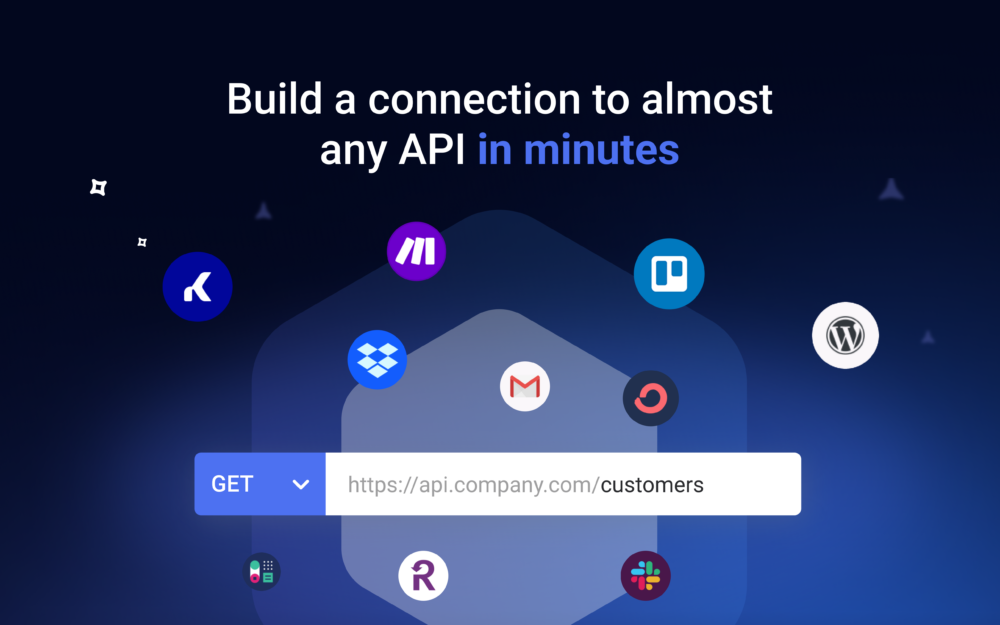
- The freemium offering attracts a wide variety of companies looking to monitor data from multiple data sources in one app. (The 50+ 1-click integrations that Databox has built–as varied as Google Analytics, HubSpot, Mixpanel, Salesforce, MySQL, and Quickbooks–helps with that.)
- The agency use case: Service firms like marketing agencies have account managers literally spending hours every month copying data from tools and spreadsheets, and pasting it into slides (for many clients) for their monthly reporting meetings. Databox is not only helping to improve their efficiency in this area, but also allowing them to reallocate those hours to the strategy and execution that actually moves the needle for clients.
In addition to learning from the team, I also needed to talk to a few customers, and most notably, some of Databox’s partners, in order to get a better idea of the pain we were solving.
Spreadsheets, slide decks, and status meetings suck
Most organizations are simultaneously overwhelmed by the data they have available to them and unaware of how their business is actually performing. (Despite the average company spending hours viewing analytics screens, filling in KPI spreadsheets, and building slide decks.)
Even when organizations are diligent about analysis and reporting, only a handful of people within the organization, most commonly the VPs and others in leadership, are the ones with a holistic view of how everything is performing.
And like agencies, that’s only because analysts and managers spend hours, or even days, preparing the reports for their individual focus areas. Those reports are then filtered up to the executive view along with decks from all other areas of the business.
If the rest of the organization is “lucky”, these compiled reports are shared on a monthly basis. But by then, the data is, well, outdated. (And consider if someone ran a faulty analysis or cut and paste something wrong into a document. By then, the whole company has made the wrong decisions.)
Copy and paste into spreadsheets. Visualize in slide decks. Present in status meetings.
That whole painful slog meant the pain was two-fold. First, it’s awful, time-consuming, cost-laden work. Second, and most importantly, it’s a block for proactive adjustments and truly agile approach. What I was really hearing was:
“Spreadsheets, slide decks, and status meetings suck.”
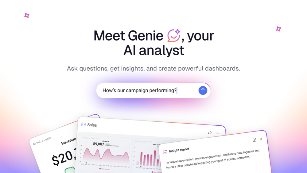
We found our raison de’etre. Spreadsheets, slide decks, and status meetings have to go. In their place, we could empower professionals across departments to monitor performance and make necessary adjustments in real-time. They could set goals, record annotations, automate alerts and scorecards to communicate progress; all without the need for a single spreadsheet, slide deck, or status meeting.
We could enable teams to truly be agile and data-driven. We could empower anyone within a company to answer the hardest question… (more on that in a second.)
It’s Been One Week….
I collected all of this background prior to my official start date. I needed to hit the ground running, and this enabled me to have all the necessary conversations with customers, my new team, and leadership so that on day one, I could focus on execution.
That’s exactly what we did.
I had final drafts of copy for a new homepage ready to go on my first day.
From there, I had productive conversations with Pete and Davorin, shared my ideas with our head graphic designer, Gasper, and within a week, our front-end designer, Inga, had brought the whole vision to life.

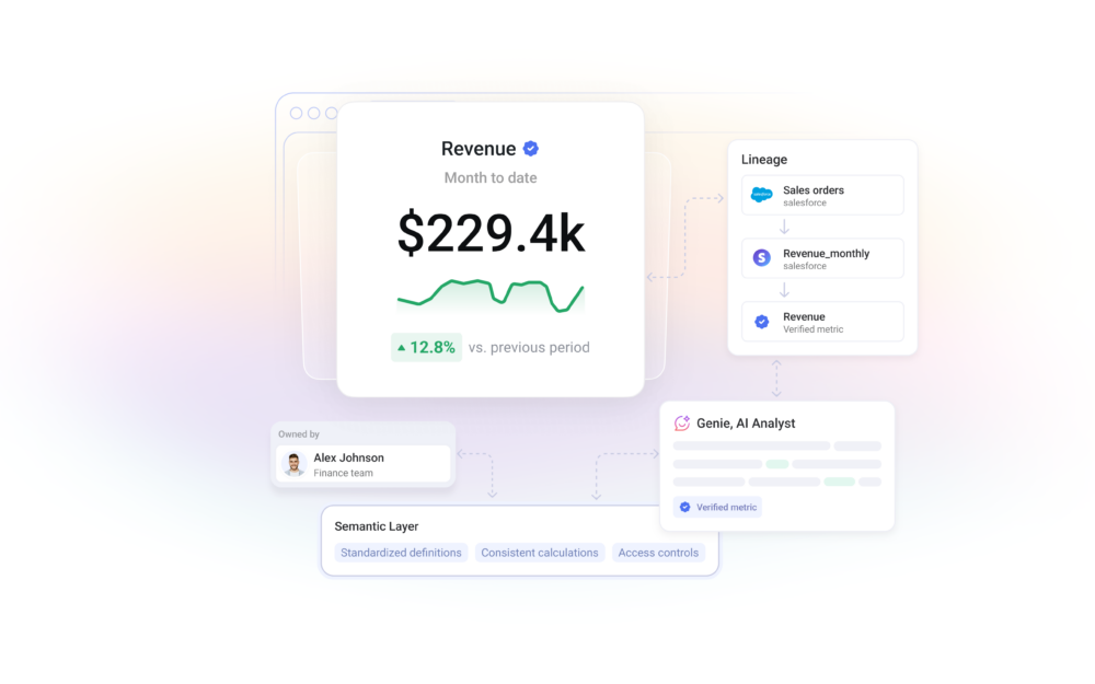
Do you know what happened today in your business?
Can you answer that question? If you’re being honest, probably not.
Most people know what they did. But, they don’t know how well it worked. Most certainly don’t know how their whole team performed today, let alone the whole company. The above question is probably the hardest one most people in your company could be asked today.
To answer it, teams need access to all the data. They need a way to track performance to goals, be alerted when things go wrong, and to share analysis and recommendations with each other in real-time.
Not only that, to make smart decisions, they need the ability to work with the data without having to rely on engineering and analysts.
Enter Databox. If you’re a user or customer already, make sure we live up to this vision in your organization. If you haven’t tried us yet, how does this all sound to you?
You can give it a try for free right here.
Feel free to follow up with me personally regarding your experience. You, the end-user, are what will continue to help us evolve this.
P.S. We’ll be tracking how this new website positioning performs. Stay tuned for updates and for more behind-the-scenes stories about how we’re making decisions like these.