Table of contents
How many times have you said: “Wow, I can find all the data so fast in this spreadsheet”?
…or how about, “I really like the way the data in this sheet is presented.”
🙄
Let me guess, not so often, right?
Spreadsheets offer a simple way to collate data and store a lot of information in one place.
However, that doesn’t mean they are useful for everyone. For most people, spreadsheets aren’t easy to navigate, and most importantly, they’re hard to actually pull insights from.
For people to feel in control of their team’s performance, the data needs to be accessible. It needs to be visual. And, it needs to be quick.
So, where does that leave our spreadsheets?
I’m glad you asked. Databox allows you to visualize the data from your Google spreadsheets easier than ever. Here, I’ll show you how.
Prefer video to text? Here’s a brief video outlining everything you need for setting up your Google Sheets with Databox.
Why should you use Google Sheets with Databox?
Google Sheets is a free, web-based spreadsheet program that allows users to collaborate while they create and edit files online in real-time.
For the reasons stated earlier, Google Sheets alone is not the most elegant solution for tracking and understanding performance. But, when combined with Databox, it can be.
Databox enables you to connect your Google spreadsheets so you can visualize rows and cells of data and pull insights in a way you never could before. Using different Visualization Types allows anyone on your team, regardless of their level of spreadsheet mastery, to create helpful visualizations of performance quickly.
And, once you connect a spreadsheet to Databox, the data will update automatically any time there are changes to the data in the spreadsheet itself.
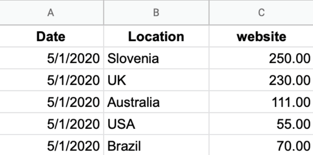
So, you get this….

…instead of this.
You’re able to create Databoards where you can visually present how the data in Google spreadsheet is correlated. No more looking for different pieces of information all around the spreadsheet to create a report.
As mentioned above, another benefit from using Google Sheets and Databox is that you can sync data manually. Once you know that there has been a certain change in the spreadsheet, you can update it right away in Databox, too.
Open up the metric that you’ve built in Databox, Save it again, then select Purge the existing data stored and all the updated data will appear.
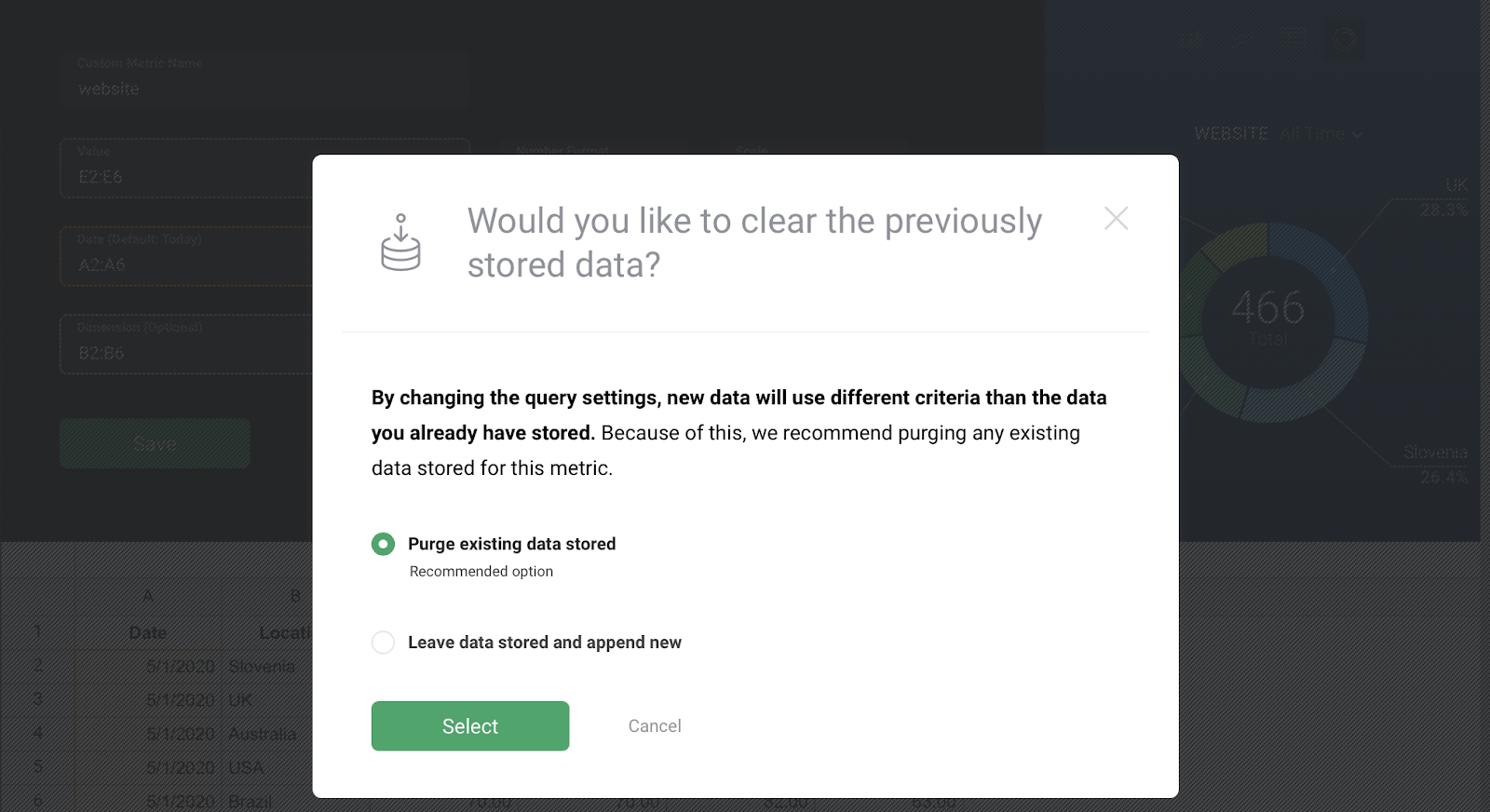
In rare cases, you can also use the Leave data stored and append new option. This applies when:
- You’ve updated only a certain cell in your spreadsheet and you would like the system to sum the previous and the new value, or
- You have previously pushed data into Databox and those values are now no longer available in your spreadsheet, but you wish to keep them in your report in Databox.
Connect platforms that don’t directly integrate with Databox using Google Sheets
While Databox natively integrates with 100+ tools, there may be some tools that you’re using that do not currently have a native integration.
In these cases, you can simply pull data from any tool into Google Sheets and then connect that spreadsheet to Databox.
This way, you can visualize data, build reports, etc., just as you would any of the other native Databox integrations.
The same is possible with programs that are not cloud-based, such as Microsoft Excel. Connect Excel to Google Sheets, then to Databox. And if you have any queries set up in your sheet, Databox will pull in that, too.
How to Prepare Your Google Sheets for Databox
The Google Sheets integration with Databox launched over a year ago now (you can read more on first steps using Google Sheets with Databox here). During this time, we’ve been able to collect information on where, why, and how our users leverage the integration and the questions they have.
While everyone uses Google Sheets to track data differently, there are some common things that need to be set up in order for the integration to be effective.
1. Select Value
Once your Google Sheet is connected and you start creating a Custom Metric for it in Query Builder, there are three fields that need your attention – Value, Date, and Dimension.
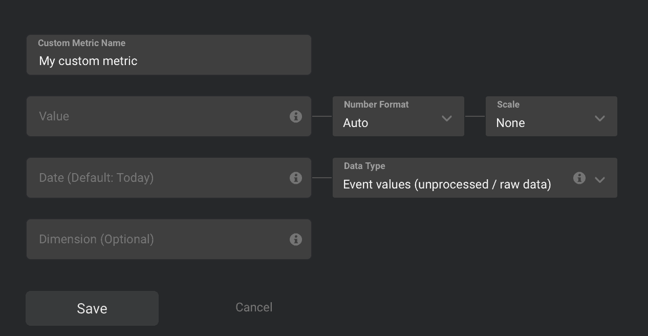
When referring to any of them, you should usually select a whole column or whole row, rather than fixed ranges. That way, when you add new rows and columns, the data will automatically be recognized and your custom queries won’t need to be changed.
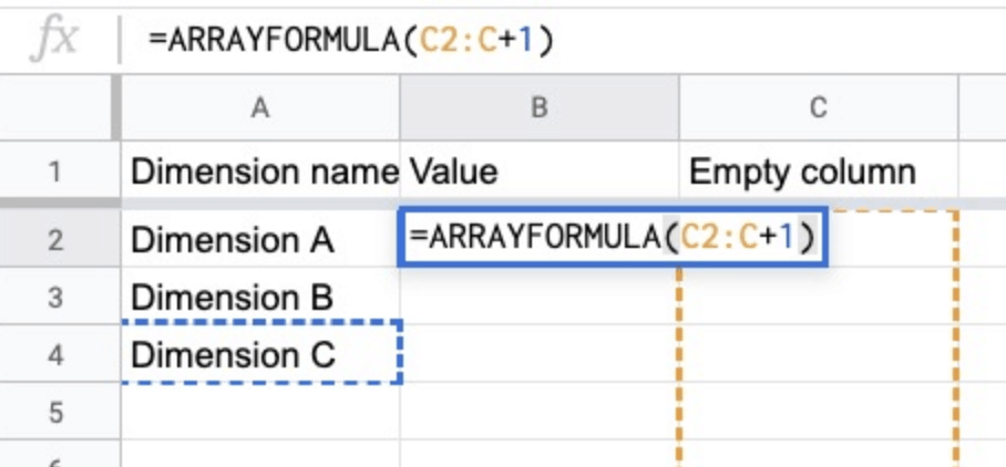
Our integration works only if a numerical Value is chosen. If you have a Google Sheet with no numerical values set up, you can solve that by using the Array formula. This creates a new column with 1s from top to bottom.
2. Select the Date
Then, select the Date. If the Date column is blank in Databox but not in your spreadsheet, you need to set the right format for the date column in the sheet. Select the whole Date Column, navigate to Format, and under Number, choose the Date option.
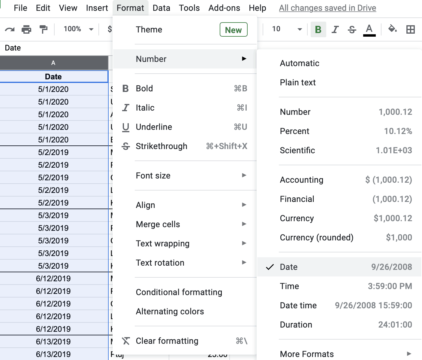
In order for Databox to recognize all dates and allocate values to those dates, date cells in Google Sheets need to be formatted as “date”. The date needs to always be entered in the format DD/MM/YY but you can change the format into whatever you want. E.g. Dec 2020 or Dec 20 or Dec or anything else.
Don’t have the dates set up? You can still create the metric. In this case, the system will automatically connect the data to the time when it was pushed into Databox. This means you’ll have to have the right Date Range chosen in Databox for when you’ll want to see that data visualized.
So, if you’ve pushed the data in today and you have the Databox Date Range set to yesterday, it’ll seem like there’s no data. Once changed to Today, the data will appear.
2. Selecting a Data Type
Next to Date, you’ll see the Data Type field.
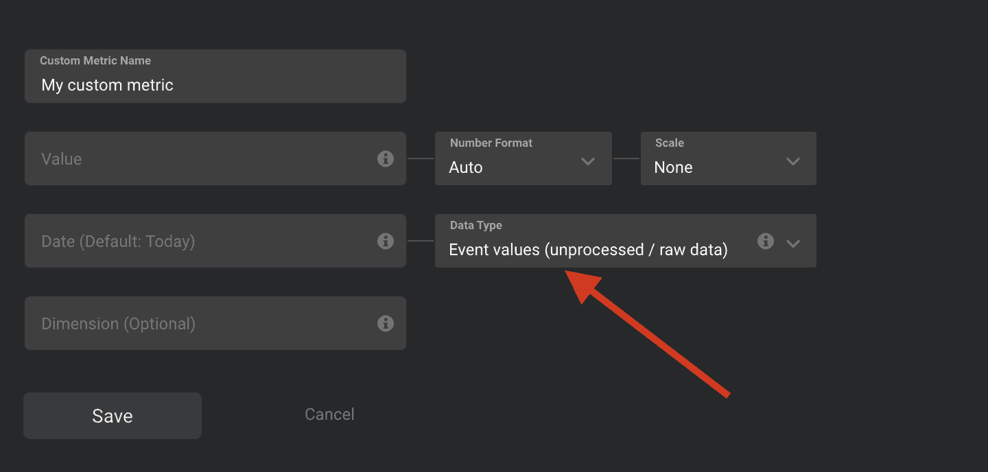
Here, you choose how you’d like the Values to be presented. If your data is not showing correctly, most times it’s because the wrong Data Type is chosen. When choosing a Data Type, you have three options.
Total values – useful when you’d like to see the current total value displayed (such as Total Followers, or Total Engagements, etc.).
Daily values (or monthly values) that come in handy when you want to measure your daily progress – starting each day from zero and then showing the value as the latest entry of the day (Daily calls, Daily meetings, etc.).
And then there are Event Values. This one is the most common, so it’s also the default option. This shows the current, aggregated data and is chosen when you have multiple individual values at the specified Date Range. This option requires a Date selection.
There’s also an extra checkbox in place which you need to check when you have multiple values on the same date. And if at any point one dimension repeats at least once on the same date.
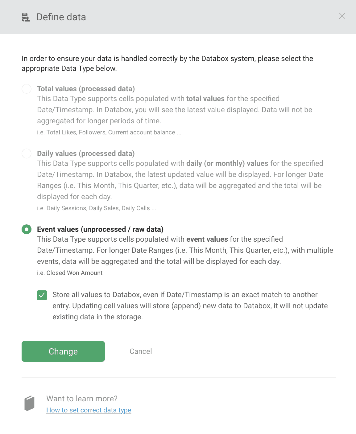
But not, if every date has an individual dimension. Here’s what you also need to keep in mind when using this option:
- When the checkbox is selected, every row will be pushed as a unique row in Databox and every change will be pushed as a unique entry into Databox – not overwriting, but aggregating.
- If only some cells are updated, both theold and the new entry will stay in the system. The best thing to do then is to re-save the Custom Metric where these cells are used and select the Purge Data option to avoid any irregularities.
- When updating your Google Sheet (with the checkbox on or off), new rows should only be added at the bottom of the document. If you add them at the top or in between it may result in duplicate data syncing in Databox and consequently in inconsistencies. In those cases you can purge the Custom Metrics individually to resolve it.
3. Selection the Dimension
And last, the Dimension part of the metric. Its job is to categorize the metric value based on common criteria, so it’s usually to help you segment the data by Country, Product Name, Author, Sales rep etc.
Each Value can be associated with one Dimension.
How does your Google Sheet data sync to Databox?
All the custom metrics in Databox sync on an hourly basis.
However, Google Sheets does have some specialties in regards to syncing. The last synced time for Google Sheets is updated when new/changed values are pushed into the system. If there are no changes, the system still syncs the Sheet but doesn’t change the “Last updated” time in your Data manager and on your Databoard.
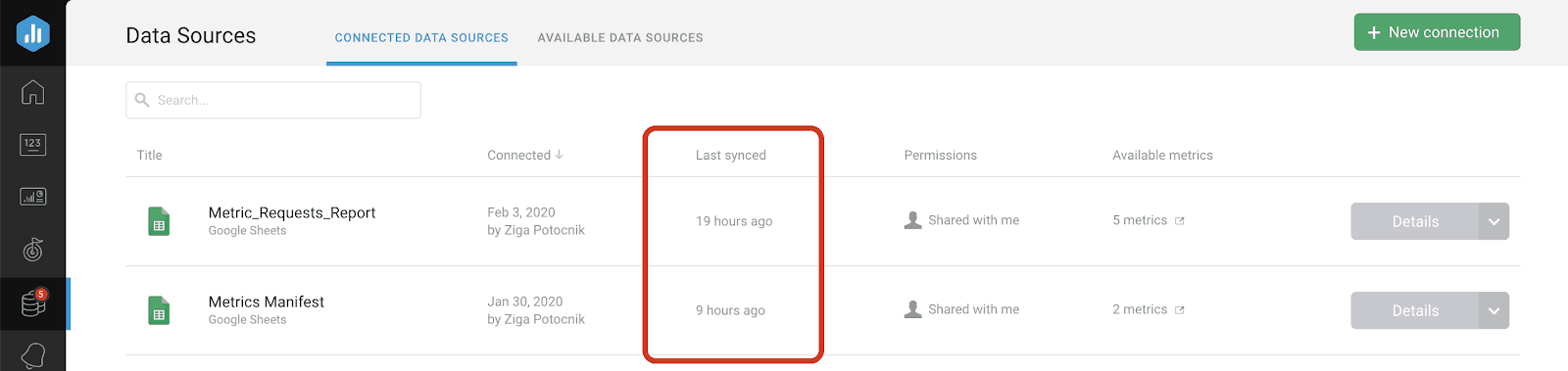
You can see that your Google Sheet sync went through by checking your Google Sheets metrics under the Query Builder tab.
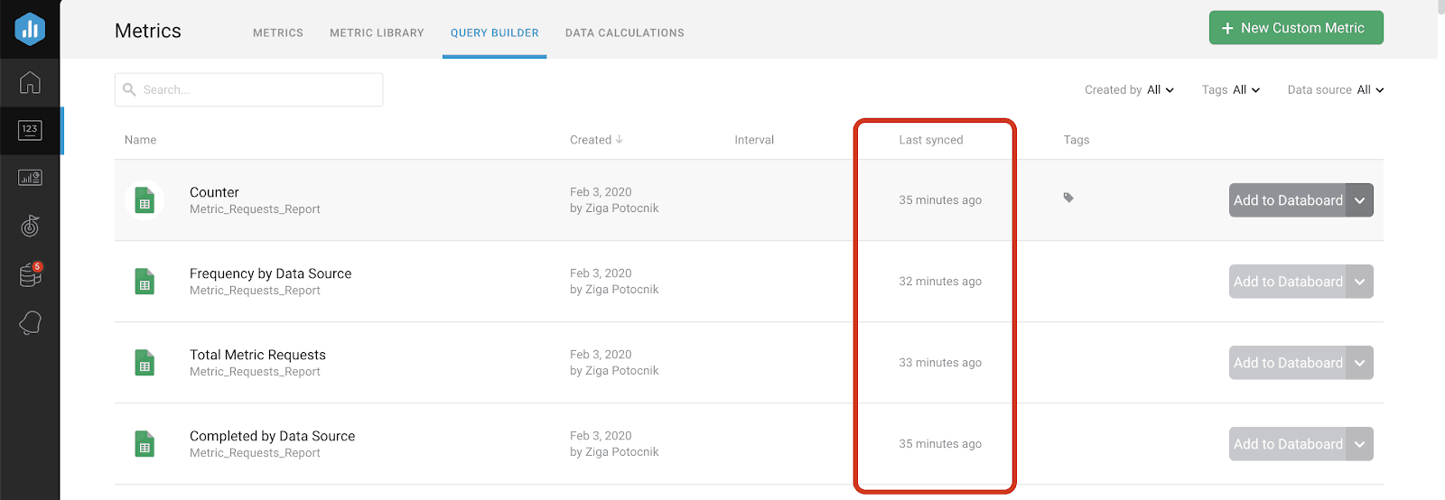
There, you’ll find the information on when the sync last went through, regardless of the fact if there were indeed any changes made or not.
Get started visualizing your Google Sheet data in Databox
If you have any questions or if you need help setting up, connecting Google Sheets and creating Custom metrics for it in Databox, you can visit our Knowledge base or send us a message at help@databox.com and let us know how you’d like to track your Google Sheets.
For current Databox users, log in to your Databox account to start visualizing your spreadsheet data in a more colorful and visually appealing way.
New to Databox? Start by creating your Free account. From there you’ll be able to start your trial and test out all different Google Sheet/Databox combinations.