Table of contents
While it can be helpful between reporting periods, simply sharing a dashboard or report with raw data is not always enough. Both clients and team members want more from monthly and quarterly reports. They want to know the journey towards progress with all its ups and downs. For any professional, it’s important to learn how to tell a compelling story with all the data that you have gathered.
Analyzing data is definitely not reserved for the data team anymore. Thanks to the ability to quantify most of the work done within the company, more and more team members need to know how to not only read but also present data. This is where Databox Reports can really help.
What is a data story?
In order to tell a good data story, we need to comprehend what it is and what it entails. So let’s start with that.
A data story can be defined as a narrative constructed around a set of data that puts it into context and frames the broader implications.
It is important to keep in mind that while data itself is relevant, it is the insights that we form based on it, as well as the conclusions we draw, that help to create a compelling data story. Unlike business intelligence or data science which emphasizes the technical task of turning data into insights, a data story brings these insights together in order to help us to better understand relevant business goals or objectives.
Of course, the story is only enough if it is accompanied by eye-catching visualization, but we will revisit that a bit later in this article. A bit of suspense, like true storytellers 🙂
Why Telling a Story with Your Data Matters
Now that we know what a data story is, we should also be aware of how important it is (and how necessary). Telling a story with data is important because it allows the narrator to put the data into the context of a broader objective. This can often be done with visual aids that help break down the compiled data so that the audience, regardless of their background, expertise, or technical knowledge, can easily understand them and their implications.
Data storytelling also helps us bring data closer to people of different learning styles and allows the narrators to come up with communication methods that are best suited for their respective audiences. This means that, for example – an auditory learner may respond better to a spoken presentation, on the other hand, a visual learner may require more data visualizations and other visual aids. So to get the best possible outcome – a truly well-crafted data story should include a combination of these various components so a diverse audience can stay engaged.

Incorporation of Data Visualization
Essentially, any representation of data through images and other visuals is a type of data visualization. With the advancement of technology and more data visualization companies on the market, the art of data visualization is more mature than ever before. It can be just as practical as it is creative, depending on the purpose and audience that data visuals are being produced for.
How Databox Reports Can Help
A Report is a deck-like presentation that includes a combination of data, text, and images in order to add context and provide a record or story of your performance data.
Data Stories allow you to add dynamic elements to the text of your Reports. This includes a Metric Value, Metric Name, Date Range, Comparison Period, Comparison Period Value, and Comparison Period Percentage. By including these dynamic elements, you can ensure the context of your Reports stay up-to-date based on the most recent data sync.
So let’s see how it works –
A tale of the most relevant Blog KPIs that each marketing team needs to track.
So we will start our story with an overview Dashboard that contains all the metrics that we need to keep an eye on –

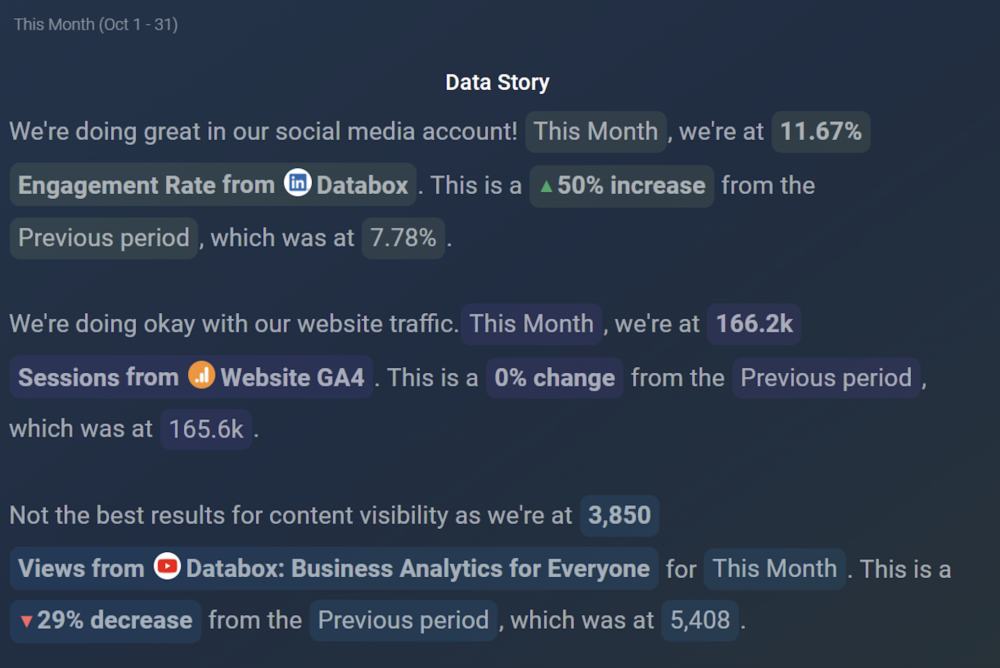
Once we have an overview we want to analyze the data in more detail so we will move on to a Data Story slide where we can easily tell the story using the preset formats or write up our own.
For example –

Here we can write sentences with dynamic elements (like dates, comparisons, and metrics) that update automatically within our report. This can help us tell a story about our work and the impact it has had thus far. As well as point out the metrics that might need more attention going forward.
Next, we want to really dig deeper into a metric that might need improvement and tell its story –

From here we can choose to drill down into some additional relevant KPIs or move forward and just add potential recommendations.
For example –

So that was the data story of our blog performance. And with Databox Reports you can easily write your own.
The best part?
All the data you see updates on a regular basis so you can use your report month over month to tell the story of how you managed to improve and overcome obstacles to get to the desired goals for all your Blog KPIs.
Start Using Databox Reports
If you have any questions or need help getting set up, you can visit our Knowledge Base or send us a message at help@databox.com and let us know how we can help you with setting up the Report of your choosing. New to Databox? Start by creating your free account. From there, you’ll be able to connect your data from more than 70 different platforms. Then you can add the metrics to your metrics screen, create data boards, automate your reporting, collaborate with your teammates, and much more. You can even start a trial to try out Reports. Enjoy!