Table of contents
Need some help with data processing and using pivot tables in Google Sheets?
Then you are at the right place.
Spreadsheets are very useful for organizing data, but when you have too much, Google Sheets can become rather difficult to manage. But this is where pivot tables and our guide come in.
In this guide, we will share a step-by-step process of how one can use the Google Sheets pivot table function for making data organization easier and more effective. After reading this article you should know all the basics of pivot Google Sheets data sets and understand the basic concepts of using the Google Sheets report editor.
So, let’s get started!
- What Are Pivot Tables?
- Benefits of Using Pivot Tables
- How to Make a Pivot Table in Google Sheets
- Pivot Tables: Tips and Tricks
- How to Refresh a Pivot Table in Google Sheets (and Why)
- How to Build a Cloud Pivot Table
- How to Format Pivot Tables in Google Sheets
- Visualize your Google Sheet Data in Databox

What Are Pivot Tables?
A spreadsheet is just a set of columns and rows. When you add in some formulas, it becomes easier for people with data entry skills to understand the numbers inside cells — but when your spreadsheet starts getting large enough that reading through every little calculation gets difficult (especially if they’re all on different pages), pivot tables come into play.
Pivot tables are undoubtedly one of the most useful tools for organizing and interpreting information on spreadsheets. it makes reading through bulky amounts much easier while still providing valuable insights to readers who don’t want or need all those extra numbers clogging up their brain.
While pivot tables help summarize large datasets, the next challenge is interpreting what those summaries actually mean for your business. Instead of manually reviewing multiple tabs and calculations, many teams now use AI data analysts, like Databox MCP, to ask plain-English questions about trends in their spreadsheet data and get answers grounded in their real metrics, definitions, and historical context. This makes it easier to understand why totals shifted, which segments are driving changes, and how those spreadsheet insights connect to overall performance.
Benefits of Using Pivot Tables
Pivot tables are a fantastic way to organize large data sets so you can easily see what’s going on with your numbers. They also provide other benefits including sorting, analyzing, and managing information all at once.
Sorting Data
By using the Google Sheets pivot table function, you can sort your data in whatever order works best for you. This is especially beneficial if you want to pull out specific information by sorting it first and then creating another pivot table based on that criteria. Sorting at its core is simply changing your spreadsheet’s data set so everything shows up correctly without any confusion or misinterpretations. Pivot Google Sheet tables make the task very easy with their efficient layout design which allows quick number-crunching while maintaining readability of results.
Analyzing Data
Pivot tables give you the power to analyze your Google spreadsheets data and see it from a different perspective. These tables provide insights on how data can be used for business, marketing, etc., which makes them an invaluable tool when you are trying to streamline your decision-making process.
Managing Data
Pivot Google spreadsheet tables can easily manage large amounts of data while still allowing the user to understand what they are looking at. The Google Sheets report editor is an easy way to get started with making changes and new reports, so users don’t have to spend hours trying to figure out how pivot Google Spreadsheets works on their own.
Related: How to Use Google Sheets + Databox to Track & Visualize Performance
How to Make a Pivot Table in Google Sheets
You don’t have to be an expert Google Sheets user to make a pivot table. All you need is the Google Sheets report editor and some data that needs organizing. Once you have your data and spreadsheet ready, follow these steps:
Step 1: Creating the pivot table
Start by opening up your Google Sheet file. Then, find the pivot table icon in the top menu bar to activate it. Once you’ve done that, click on “pivot table” and choose which data set you want to use for the Google spreadsheets report editor.

It should be the one where there are different values associated with each row of numbers. If needed, add or remove columns from your Google sheet before continuing forward so everything fits together properly within your spreadsheet’s layout design.
1. Select Data and click on Pivot Table.

2. Choose between how you want to insert the pivot table (New sheet or existing sheet).

3. So you just created a pivot table, but the table is empty because you haven’t added any columns, rows, or values to it from your data set.
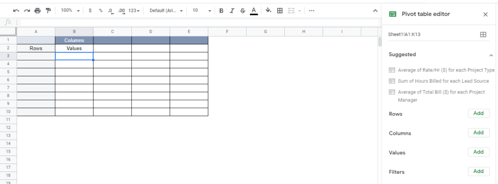
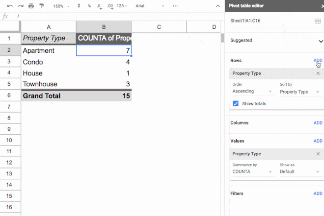
In order to fill this table, you have to use the pivot table editor shown on the right side of the screen.
That’s it!
Step 2: Using the Pivot Table Editor
The Pivot Table Editor helps you to add or remove data to your pivot table with two different options available. You can choose Google’s suggested rows, values, and goals or edit your pivot table manually.
We’ll go through both of these options.
Suggested pivot tables
Google’s built-in AI makes creating your pivot table a breeze!
To use it, you will need to go through the same initial steps when adding your data and values, but instead of adding them one by one – which can take hours if there are many items – Google automatically generates pre-built pivot table suggestions.

Usually, the suggested pivot table objectives are precise. But check everything before you move further.
The other way to create a pivot table is with the Google Sheets Explore tool – a great feature for analyzing data and getting valuable insights from it.
To use the Google Sheets Explore tool, click the star-shaped icon on the bottom right of the Google Sheet.
You’ll find the Explore window with a few recommendations regarding your data.
You can click to generate the specific table and visual presentation options of your data in various recommended formats.

Manual options
The other option is to edit the pivot table manually.
But before diving in, make sure that these are what each option means:
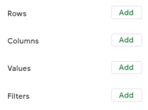
The four different headers will appear at the top of all created pivots – keep an eye out for them so they don’t get lost among other options on the screen.
- Row label – The column headers of your Google spreadsheet data set.
- Column label – What each row in your Google Sheets pivot table represents, or its values. You can add new ones under this category by clicking on any blank area inside of this section. The more rows and columns there are, the more information is available to sort through.
- Values/goals – Where all numbers are placed after being sorted out based on either their value or goal. If not already filled out with preset categories for sorting purposes, select “value” from the dropdown list above it before starting another manual process if needed.
- Filters – You can filter results from your pivot table. For example, you can apply a date filter if you only want to view the projects that you’ve done or delivered in December.
Step 3: Building the report
The next 3 steps will help you to create a readable Google Sheets report.
But first, under the Pivot table editor, select Rows and Values to add the data.


This is how should your pivot table look like now.

On to creating your report:
1. Add rows
Add Rows category within the Pivot table editor.

Select one row for the pivot table to include the data from chosen column into your pivot table. That data will appear as row headings.
2. Add columns
You’ll see the Values data displayed aggregated information for every column.

3. Add values
Click on Values. You will see the same column headings list.
Select one and the pivot table will summarize that specific column.

Reading the pivot table
Open any spreadsheet or other document containing a pivot table. The page field sorts data by main categories from the set, making it easy to find what you’re looking for.
Column fields are at the top of the pivot table.
Row fields are located along the left side of the pivot table. These two sets of fields are calculated within the body of the pivot table.
Data items are in the body of the pivot table. Data in the center of the pivot table is the actual calculated data based upon the row, column, and page field headings.
Take a look at grand totals such as “Total” or “Grand Total” rows and columns. This is the result of the summarized or calculated data.
You can also sort data by specific headings by clicking the drop-down arrows beside any column or row heading.
Related: 13 Ideas on How to Use Google Sheets In Your Business
Google Sheet Pivot Tables: Tips and Tricks
We’re not magicians, but we’ll show you some great tips & tricks that can help you save time processing numbers in your Google Sheets Report Editor.
Hopefully, this list of tips and tricks will make your data processing endeavors smooth.
It includes tips on using multiple value fields, changing aggregation types, adding filters, using multiple row fields, and copying pivot tables.
- Multiple value fields
- Changing aggregation types
- Adding filters
- Multiple row fields
- Copying Pivot Tables
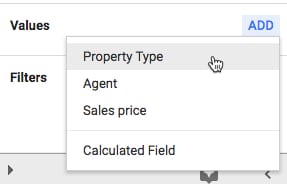
Multiple value fields
You can get a clear picture of how sales prices are distributed into different categories by adding more value columns. Click Add in the Values section of the editor and you can create value columns.
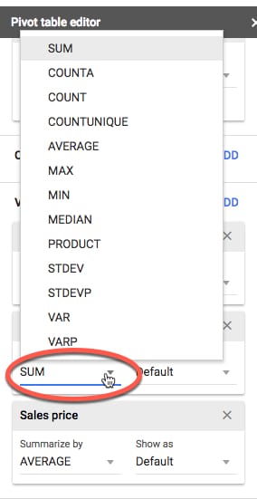
Changing aggregation types
You can produce fresh insights by changing the aggregation type of one of the columns, e.g. change the SUM to AVERAGE instead.

You can select desired aggregation options. Click on SUM (or AVERAGE or other selected column) and choose from the menu:
Adding filters
A nice feature of Pivot Tables is that you can create “named sets” which are just like named ranges, making it easy to have filters based on the same set of values. In this example we will show a count of properties for each property type:
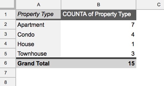
We see all 15 properties from the dataset.
If we choose the filtering by Agent, we will see the data from just one of the Agents.
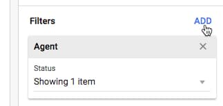
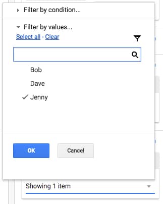
Click on the “Status > Showing all items” and uncheck the items you want to discard.
Keep selected the data that will be used to create the Pivot Table.
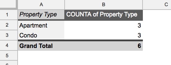
Now you see just Jenny’s selected properties.
Multiple row fields
This one can be very helpful when it comes to different sorting reviews.
In the example below, when you add a second-row field, it appears as sub-categories, so that between the two columns in your Pivot Table all the unique combinations of the two fields are shown.
Copying Pivot Tables
There’s a quick trick for copying an existing Pivot Table, rather than starting over.
It also gives you the option of moving your Pivot Tables to a different tab.
Click into the top left corner cell of your Pivot Table and click copy (Cmd + C on a Mac, or Ctrl + C on a PC/Chromebook). This adds the Pivot Table to your clipboard and you can paste it wherever you want in your Sheet (Cmd + V on a Mac, or Ctrl + V on a PC/Chromebook).
- Find the copy option for your Pivot Table by clicking the top left corner cell of the Pivot Table
- Select Copy (Cmd + C on a Mac, or Ctrl + C on a PC/Chromebook).
- Paste it wherever you want in your Sheet (Cmd + V on a Mac, or Ctrl + V on a PC/Chromebook).
*Note: Ensure that there is enough space available wherever you wish to paste a copy of your Pivot Table.
Related: 40 Advanced Google Sheets Tips for Marketing Pros
How to Refresh a Pivot Table in Google Sheets (and Why)
The good news is – You don’t need to manually refresh pivot tables!
But… There are a few cases in which you might need to force a refresh:
Case 1: Your pivot tables have filters
If you have filters in your pivot table, your data won’t be updated when you change the original data values. To fix this problem, you need to remove the filters in your pivot table. Check out how to remove those filters below.

Make changes to the original data set.
Add again the filters within the Pivot table editor (Click the Add button in the Filters category).
Case 2: Adding new rows that are outside the pivot table’s range
The pivot table only takes the data from the original dataset within the pivot table’s range into account. If new rows of data are added outside of that range, they will not affect the pivot table. You can adjust the pivot table range to fit your data by adding blank rows above and below the initial data so it can be extended as needed or within the pivot table editor.

However, if you leave blank rows in your original worksheet, the pivot table will also show blank rows. To avoid this, you can either add a filter to display only the rows with values or edit the range directly to include your new rows.
Case 3: Your original dataset has functions such as TODAY and RANDOM
If you have pivot tables that update automatically, a simple change to the original dataset won’t update the pivot table. One solution is to avoid including functions such as TODAY and RANDOM in your data or by using cloud pivot tables to update the pivot table.
If you have any of the issues mentioned in the original dataset sheet, both methods will automatically update your pivot tables to the desired version.
How to Build a Cloud Pivot Table
Information stored within a database is often too large to work with using a regular spreadsheet. And while Google Sheets does have a five million-cell maximum capacity, a better option to summarize and analyze large amounts of data is to use Cloud Pivots.
Handling large amounts of data with a Cloud database is much easier than a spreadsheet because Cloud databases let you do things like:
- Query information to see information from another place.
- Sort your data based on any factor.
- Filter your data to see only the “important” parts.
- Use mathematical functions to manipulate your data.
- Data analysis often requires users to work with smaller slices of information.
To build a Cloud pivot table, select the underlying data you wish to visualize.
Example: Using Salesforce – Select the objects and fields.

You can build the same Cloud Pivot Tables for databases.
- Step 1: Select the table and fields you want to include in the pivot table.
- Step 2: Select the columns and rows you want to include in each of your measures.
- Step 3: Choose a calculation method for each measure. Example: If you want a total for a particular column, select Sum, then select a field from that column to include in your sum.
- Step 4: Set an auto-refresh schedule.
How to Format Pivot Tables in Google Sheets
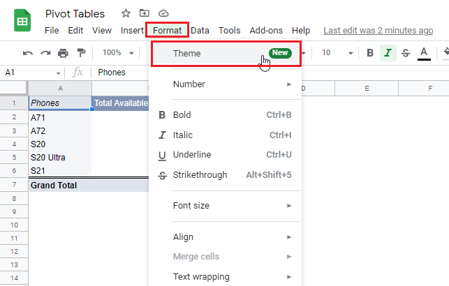
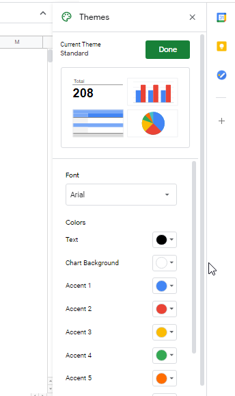
Everything starts with the “Format” option in the menu bar.
From the drop-down menu navigate to the “Theme”.
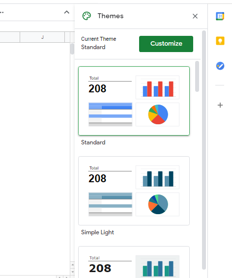
It will take you to the “Themes” window and there you need to click on the box with a downward arrow located at the bottom of this window. This is where you need to select the theme that you’d like to be applied on your pivot table.
Takeaway: It doesn’t matter what kind of data Google Sheets has, but if you use the right visual display, it will make it far more evident and easy to interpret.
Related: How to Create A Bar Graph (and more) in Google Sheets
You can also customize the visuals of your pivot table like shown below.
If you are creative enough you can make amazing themes individually.

Visualize your Google Sheet Data in Databox
What if you could take the same data from a Google spreadsheet and instantly visualize it an easy-to-understand dashboard with just a few clicks?
That’s exactly where Databox can help you! It allows you to layer key metrics on top of your spreadsheet or pivot table. This means that instead of looking at rows and rows of spreadsheets, you can bring in actionable performance insights that help you make smarter decisions.
Databox integrates with Google Sheets to make your data easy to navigate, analyze, and pull insights from. Our tool can help you automatically pull data from any spreadsheet, calculate custom metrics, and more. The combination of tools opens up possibilities around real-time or historical reporting, displaying multiple worksheets in one place, and creating dashboards that will help teams visualize their performance.
Try it today – sign up for a free trial now and join 20,000 satisfied growing businesses and agencies using Databox.