


Table of contents
The perfect CTA button on your Facebook ad can make the difference between driving home significant results and ending up with zero response.
Why?
Because Facebook CTA buttons tell your audience what you need them to do if they’re interested in the ads they see and ready to take the next step.
Without it, you’re likely to lose business from interested leads since they have no idea how to learn more about you or the deal you are offering. Few, if any, would bother to google and find your business website or the deal you’ve put out.
But what makes an effective CTA button?
A result-driven CTA button clearly specifies the next step a prospect needs to take after seeing the ad. Once clicked, it also meets your audience’s expectations by delivering what it promises.
Choosing the right CTA button also depends on understanding how people actually behave after they click. It’s not enough to measure clicks alone, you need to see what happens next, how conversion rates differ by button type, and whether performance changes over time. Teams now use AI data analyst, like Databox MCP, to ask simple questions such as “Which CTA drives the highest qualified leads?” and get answers based on their real campaign data and historical trends. That makes it easier to connect button choice to actual business outcomes, not just surface-level engagement.
Let’s walk you through at all these details and more as we cover the following today:
- How to Add Call-to-Action Buttons to Your Ads on Facebook?
- Facebook Ad CTA Options
- Facebook Ads CTAs: Which Buttons Perform the Best?

On we go:
How to Add Call-to-Action Buttons to Your Ads on Facebook?
Adding a Facebook CTA button isn’t rocket science. Follow these steps and you’ll be able add a call to action to your ad in no time:
- Head to your Ads Manager and click Create.
- Choose your marketing objective and Continue.
- Now, choose your audience, placements, schedule, and budget and click Continue.
- Select the Facebook page where your ad will run.
- Pick your ad format. Note you can’t add a CTA with Instant Experience and collection formats.
- Now choose your video or image for the ad and add your text.
- Pick an option from the CTA dropdown menu next. At this point, you can see the preview of the CTA button. Keep in mind that if you’ve selected the marketing objective of Reach, Brand Awareness, or Video Views, click Add a website URL to see the call to action dropdown menu.
- Hit Publish.
Remember: the list of call-to-action buttons that you can see differs according to the marketing objective you pick. Not sure what the most common ad objectives are among Facebook experts, here’s what we learned in this study on Facebook ads.
Good read: Facebook Ad Formats: Which Are Best for Driving Awareness, Traffic, & Conversions?
And what about eliminating the CTA button altogether?
That’s not what the experts recommend.
78.1% of them say that ads with CTA buttons performs significantly better than ads without CTA buttons.
The reason? A call-to-action button clearly specifies users what they need to do after they see an ad (if they’re interested).

PRO TIP: What’s the overall engagement of your ad campaigns?
Want to make sure your Meta ads are performing and trending in the right direction across platforms? There are several types of metrics you should track, from costs to campaign engagement to ad-level engagement, and so on.
Here are a few we’d recommend focusing on.
- Cost per click (CPC): How much are you paying for each click from your ad campaign? CPC is one of the most commonly tracked metrics, and for good reason, as if this is high, it’s more likely your overall return on investment will be lower.
- Cost per thousand impressions (CPM): If your ad impressions are low, it’s a good bet everything else (CPC, overall costs, etc.) will be higher. Also, if your impressions are low, your targeting could be too narrow. Either way, it’s important to track and make adjustments when needed.
- Ad frequency: How often are people seeing your ads in their news feed? Again, this could signal larger issues with targeting, competition, ad quality, and more. So keep a close eye on it.
- Impressions: A high number of impressions indicates that your ad is well optimized for the platform and your audience.
- Amount spent: Tracking the estimated amount of money you’ve spent on your campaigns, ad set or individual ad will show you if you staying within your budget and which campaigns are the most cost-effective.
Tracking these metrics in Facebook Ads Manager can be overwhelming since the tool is not easy to navigate and the visualizations are quite limiting. It’s also a bit time-consuming to combine all the metrics you need in one view.
We’ve made this easier by building a plug-and-play Facebook Ads dashboard that takes your data and automatically visualizes the right metrics to give you an in-depth analysis of your ad performance.
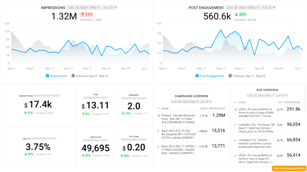
With this Facebook Ads dashboard, you can quickly discover your most popular ads and see which campaigns have the highest ROI, including details such as:
- What are your highest performance Facebook Ad campaigns? (impressions by campaign)
- How many clicks do your ads receive? (click-through rate)
- Are your ad campaigns under or over budget? (cost per thousand impressions)
- What are your most cost-efficient ad campaigns? (amount spent by campaign)
- How often are people seeing your ads in their news feed? (ad frequency)
And more…
You can easily set it up in just a few clicks – no coding required.
To set up the dashboard, follow these 3 simple steps:
Step 1: Get the template
Step 2: Connect your Facebook Ads account with Databox.
Step 3: Watch your dashboard populate in seconds.
Facebook Ad CTA Options
You’ve a few options to choose from. Let’s broadly divide them below based on the marketing funnel slice each option falls into.
- CTA buttons for awareness:
These buttons are for prospects who don’t know about your company but will do once they see your ad.
Buttons for this part of the funnel: ‘learn more,’ ‘apply now,’ and ‘download.’
- CTA buttons for consideration:
These ad CTA buttons are for prospects who are aware of your business offer and are exploring the solution that you provide. Ads in this funnel stage help prospects decide if your business is good for them.
Buttons for this funnel slice: ‘learn more,’ ‘download,’ ‘contact us,’ and ‘book now.’
- CTA buttons for conversions:
Lastly, these button options are for converting leads that are interested in buying from you. At this point, leads are ready to buy and your ad is the push they need to call their final shots.
Buttons for encouraging conversion: ‘message us,’ ‘apply now,’ ‘subscribe,’ ‘sign up,’ and ‘get quote.’
Over 40 people that we talked to for learning about Facebook CTA buttons use these buttons and a few others such as ‘play now,’ ‘watch more,’ and more this year.
Of these, the ‘learn more’ button is the most widely used CTA button for Facebook ads.

‘Learn more’ also happens to be the button that drives the most results for our contributors. ‘Shop now’ and ‘download’ are two more effective buttons for ad campaigns.

Related: How to Write a Call to Action: Increase Your Conversions with 16 Proven Tips for Crafting CTAs
Facebook Ads CTAs: Which Buttons Perform the Best?
In this section, we’ll discuss the top 4 Facebook CTA buttons that perform the best.
But before we dig in, it’s essential to be clear on this: select the CTA button for your ad based on your ad objective. Or, to put it more simply: “choose the CTA that is the best fit for the action you want consumers to take,” Jackie Kossoff from Jackie Kossoff – Marketing & Design says.
“For instance, if you want them to download a free guide, choose ‘Download.’ If you want them to purchase a product, choose ‘Shop Now.’”
Acronym Media’s Gellena Lukats shares more examples: “If the goal is purchasing a hotel room, we would use a ‘Book Now’ CTA. If the consumer is taken to an informational page for more details, ‘Learn More.’”
Picking the relevant CTA helps you send a clear message about what you want your potential customer to do. And as Lukats adds, “the goal should really be to guide the consumer along the user journey, and give them the best user experience, utilizing CTAs that will resonate for each vertical, advertiser, campaign, audience, and ad unit.” You can measure the effectiveness of your CTAs using these social media dashboards.

With that, let’s look at the most popular Facebook CTA buttons:
- The ‘learn more’ CTA button
- The ‘sign up’ now CTA button
- The ‘message us’ CTA button
- The ‘download’ CTA button
1. The ‘Learn more’ CTA button
“Time and time again, we see that the ‘‘learn more’ CTA outperforms others – even when we’re asking someone to schedule a call or download a lead magnet,” shares Amanda Sexton of FocusWorks Marketing.
Sexton observes, “we haven’t determined whether it’s due to Facebook or just user preference, but it consistently gets more and better leads than any other CTA for both B2B and B2C.”
In fact, Hockerty’s Salva Jovells goes on to say, “If you doubt between ‘shop now’ and ‘learn more,’ choose ‘learn more’ as people on Facebook are not ready to buy directly and they expect to elaborate their decision process before taking action.”
This makes sense as almost everyone wants to learn more about something before they share their email address with you or buy from you. This is true irrespective of where people are in their buyer’s journey.
Want to drive better results with the ‘learn more’ CTA button? James Pollard from The Advisor Coach LLC. has the answer for you: “use emojis.”
“In my experience, the ‘learn more’ CTA button provided by Facebook drives the most clicks,” Pollard admits. “However, when you’re running an ad, you should put your desired CTA (such as a link) in the text above the image/video and highlight it with emojis to draw attention. Some popular emojis include the hand/pointing emojis, as well as the arrows.”
That said, it’s worth keeping in mind the point we discussed earlier – choose your CTA button based on the action you want your target audience to take.
To this end, Pollard shares their experience. “The only time ‘learn more’ isn’t my highest-converting button is when I’m sending people directly to a webinar signup page. In that case, ‘sign up’ wins. So, my advice to people trying to create a good CTA is to start with ‘learn more’ and split-test against that.”
2. The ‘Sign up’ now CTA button
This is another popular CTA not only in Pollard’s case but also something that the Incorporation Insight team has had success with.
Michael Knight, however, emphasizes the need to be specific with your ask.
“Make your request as specific as possible,” Knight comments. “Consider writing your CTAs like this: ‘Sign up for (your product/service you offer) now to receive (benefit to the reader)!’” suggests Knight.
Why? Because “creating specific propositions will encourage your readers to sign up because they will understand the benefit of the deal.” In fact, people only take action when they know what’s in it for them.
So make your CTA about them by being clear, concise, and specific.
Summing up, Knight advises, “create a call-to-action that clearly communicates the benefit of taking that action to the reader. It’s not enough to simply state what your company does; try to pique readers’ interest by telling them exactly what you can do for them.”
3. The ‘Message us’ CTA button
Like the ‘learn more’ CTA, the ‘message us’ button helps readers get more information without forcing them to make an immediate decision.
It is somewhat more applicable for those toward the end or, at least, middle of their buyer’s journey. Even so, someone early in the journey might also not hesitate to message a business if the offer is relatable enough for them.
The best part? This CTA button helps businesses qualify leads better. Depending on which leads are high quality, the brand can follow up with them, aiming to build strong relationships to drive them to conversion.
4. The ‘Download’ CTA button
Last on this list is the ‘download’ Facebook CTA button.
Here’s why it works: it’s fast, easy, and gets a prospect the lead magnet within a few clicks. Prospects don’t need to stick around to share more information or read more information to get to their objective.
Think of it like this: only a few clicks and they get what they opted for. Smooth, isn’t it?
Another reason why this CTA is so effective: prospects interact with your content at their convenience.
However, keep in mind what CocoFax’s Olivia Tan shares, “using the ‘download’ button for a paid eBook will help you improve the cost per click (CPC) of your ad campaign, but there are only a few chances that the person will buy.”
Why? Because “the user clicked on your ad considering the product was available free to download,” Tan explains.
So why not use the ‘buy’ button here? Tan talks about it too. “Using the direct ‘buy’ button may not increase your cost of getting a lead, but there are better chances of converting that lead to a sale because the person was already into your product and was ready to buy it.”
The takeaway: One, the ‘download’ and ‘buy’ CTAs are different – mainly because users have different expectations from them.
Your audience expects a freebie or app download/installation when they hit ‘download’ and they’d only click ‘buy’ if they’re lower in the marketing funnel and are ready to buy from you.
And, two, the ‘download’ CTA button is way more popular than the ‘buy’ one.
Although you know now what the most popular Facebook CTA buttons are, we recommend you select the button that best meets your ad campaign’s goal.
For example, “if the goal of your campaign is to drive purchases from your eCommerce site, then using ‘Shop Now’ is a must. Furthermore, if the goal of your Facebook ad campaign is to drive app installations, we strongly recommend you use the CTA ‘Install Now.’” Larry Li from Verum Ecom elaborates.
Keep in mind, “the goal of choosing your CTA button is encouraging viewers to ultimately complete the purpose of the ad campaign. Choosing an irrelevant CTA button may cause confusion and drive users away from performing the action.” Measure the performance of your chosen CTA using this social media dashboard software.
You can also start with one of the popular CTA buttons for your Facebook ad campaign (provided it is relevant) and split test to see which delivers the best result from there.
The impact of the CTA (call-to-action) button on Facebook ad’s CPM (cost per thousand impressions) can vary depending on several factors, such as the campaign objectives, ad creative, target audience, and bidding strategy. Choosing the best CTA will help reduce Facebook Ads CPM.


