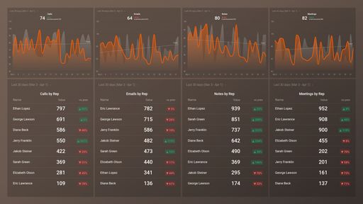
Track some of the most common Sales Team Activity metrics and KPIs and analyze your Sales Team Activity performance with just a few clicks.
TOP Sales Team Activity INTEGRATIONS
This free, easy-to-understand, customizable Appfigures Ads Revenue Performance Overview Dashboard Template can help you easily track and analyze your ads and the revenue that they generate. You get to drill down into your most important metrics, such as ads revenue, ads requests, impressions, clicks, and so much more. Use the wealth of data available to help you improve your campaign performance and increase your ads revenue.
What you’ll learn from this Appfigures Ads Revenue Performance Overview Dashboard Template:
By connecting your Appfigures account, you’ll learn:
How are my ads performing in different countries?
By tracking Ads Overview by Country, you will be able to see in which market are your ads performing best This will allow you to adjust your strategy and work on increasing the revenue in the countries where you are underperforming.
How many clicks do my ads receive?
Measure the total number of ad clicks your campaigns are receiving over a given time period and have a better understanding of the content that resonates best with your audience.
How often are people seeing my ads in their news feed?
Measure the overall impressions of your ads. Compare what you're seeing to previous time periods and track whether your reach is improving with time, and if not, how you can make adjustments to improve it.
What is the number of my Ads Requests Filled?
This is an important metric because every ad opportunity that does not get filled represents a loss of potential earnings. A higher fill rate will lead to more ad revenue, and by tracking this metric, you will know whether you need to take additional steps to improve it.
How are my ads performing based on revenue?
By tracking Effective Cost per Mille, you will be able to measure the average performance of various ad units based on revenue and use the results as a benchmark when experimenting. The higher the average eCPM, the more money earned.
Data Source: Appfigures
Pull additional data using our integration with Appfigures.
What else can you track and visualize with our integration with Appfigures? When it comes to Appfigures, you can access new and insightful integrations and get more valuable data from your apps. You can also sync the following data sources through Appfigures integrations:
- App Store Connect
- Google Play
- Amazon Appstore
- Windows Store
- Steam
There are numerous metrics and metric combinations you can track using Appfigures. In Databox, you can quickly visualize 50+ metrics directly from Google Play, the Windows App Store, the Amazon App Store, App Store Connect, and Stream.
Read more about Databox’s Appfigures Integration.
Customize this dashboard with Databox
Don’t just track your KPIs. Here are hundreds of tips for improving your ads performance.
Visualizing your performance data in a way that’s easy for everyone to interpret is the first step toward achieving better results for your business. So, what can you do when some of these metrics are trending down?
We’ve collected a few resources that contain tips from hundreds of other marketing professionals on improving ads and revenue, avoiding marketing mistakes, and more.
What’s the Average CTR for Facebook Ads, and How Do You Improve It?
8 Proven Ways to Reduce Your Facebook Ad CPM
15 Tips for a Lower Facebook Ad Frequency and Higher Relevance Score
18 Ways to Improve the Google Ads Quality Score of Your Next Campaign
Create Better Google Ads with the Help of These 11 PPC Ad Copy Examples
Google Ads Click-Through Rate (CTR): What's Considered Good and How Can You Increase It?
 HubSpot CRM (3)
 Intrix CRM (1)
 Pipedrive CRM (1)
 HubSpot Marketing (1)
 Salesforce CRM (1)