Updates Now Live")
Table of contents
Just a couple of weeks ago, we announced a bunch of customer-facing improvements to our visualization capabilities.
Today, we’re excited to share a few more. Six, to be exact.
Among a few other things, these improvements give you more ways to compare your current performance to previous periods and let you change the order of your metrics in certain visualizations more easily.
Check out the video to see all of the updates. Or, see the list of changes below. These are already accessible in your account, so, just log in to your account to view and leverage these improvements.
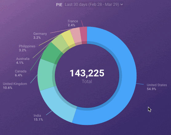
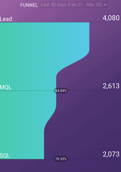
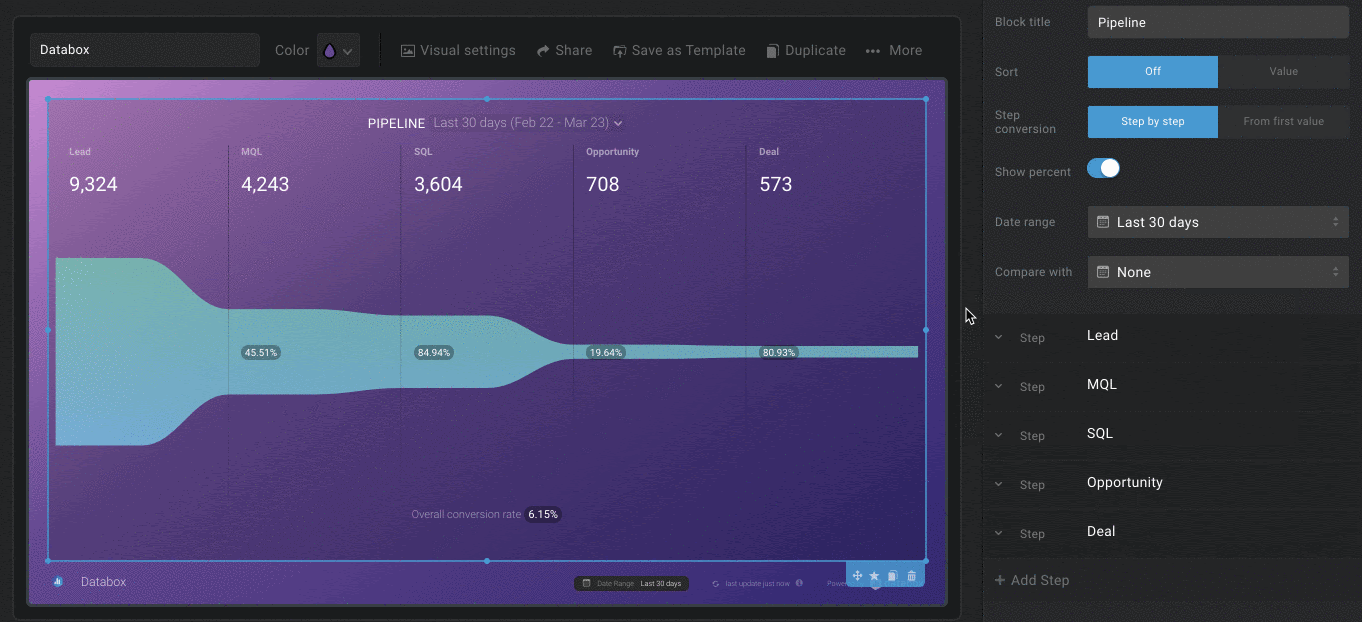
1. Display comparisons on your pie, funnel, and pipeline visualizations
We’ve made pie, funnel, and pipeline visualizations more practical by adding the option to compare your data to previous periods.
Pie charts quickly show the share each value makes up of the whole. For example, which sources drive the most leads? This makes it possible for you to easily see how any changes made to those campaigns impacted the numbers over time.
And while funnels and pipelines allow you to take a step beyond merely looking at conversions and conversion rates, they can also quickly identify if there’s a leak or bottleneck in your sales funnel somewhere.
With this improvement, you can easily track whether any changes you’ve made have made improvements or not.
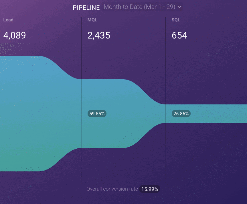
No more clicking and changing the date ranges to previous periods in order to see and calculate the difference. The comparisons to previous periods or goals are now visible on your pie, funnel, and pipeline charts as soon as you open up your databoard.
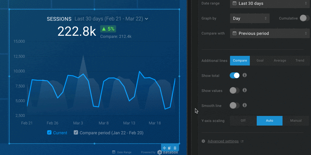
2. Set your chart scales
We’ve also made a small but impactful improvement to the Y-scale in line and bar charts.
Now, as seen in the example below, you can set the Y-scales minimum and maximum value, allowing you to decide how your data is presented.
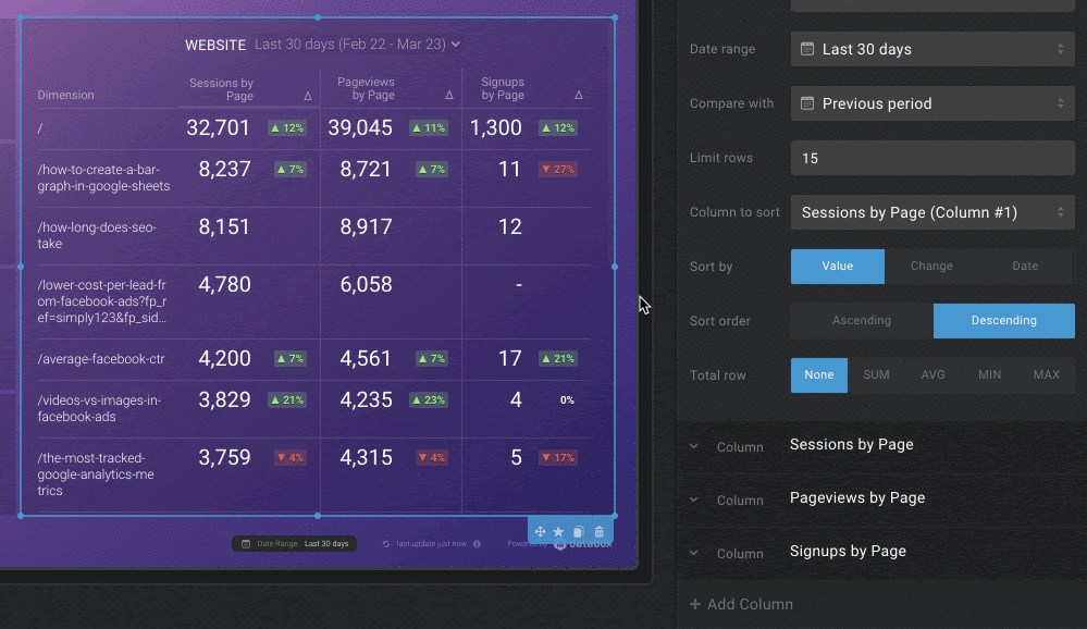
3. Reorder your advanced table columns
Now, you can reorder the columns in an Advanced Table easily and whenever you need to — no more deleting and creating new columns so that you can see the data in a different sequence.
This is especially handy for when you have a new metric/dimension to track in the table, or more simply, for those times where you forget to add a specific metric/dimension to the visualization when you’re starting out.
Now, simply click and drag your columns to the desired location.
4. Rearrange metrics on your Pipelines and Funnels
Your sales pipeline might change or evolve over time with new stages, removed stages, etc.
Those changes would then render your pipeline and/or funnel visualizations in Databox obsolete, as you had to change the whole chart and all of the pipeline/funnel metrics manually whenever changes like those occurred.
Now you can simply drag and drop those metrics into the right spot and view the flow of your results in seconds.
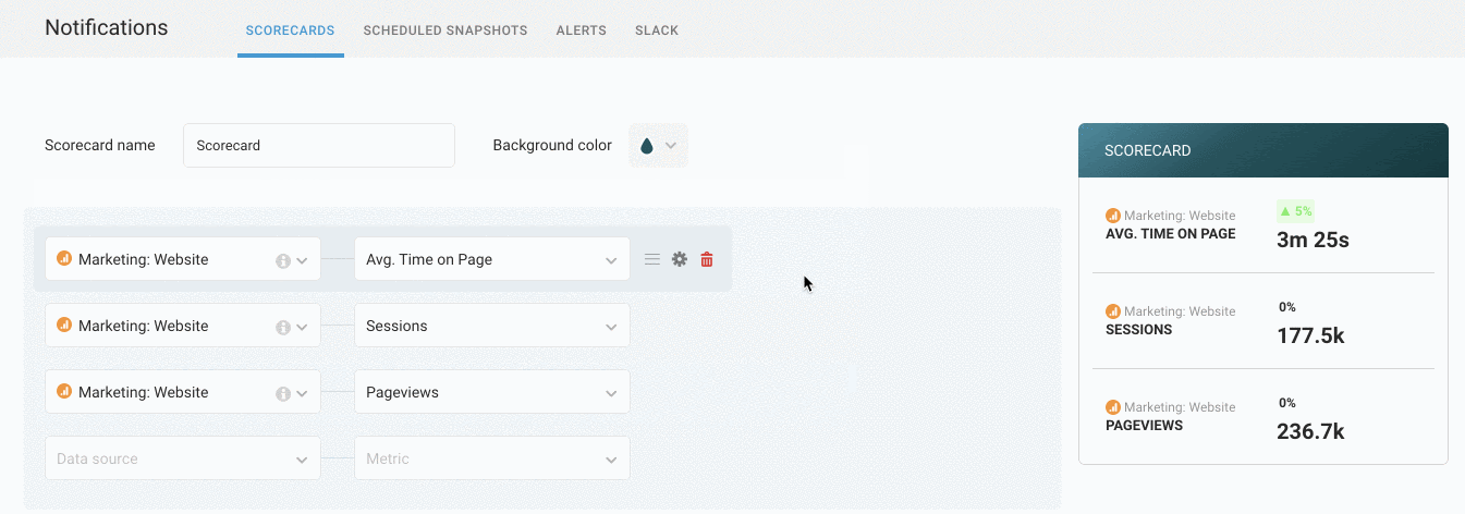
5. Rearrange metrics on your Scorecards
With Scorecards you get all the business updates you need waiting for you in your inbox every day, week and/or month without logging in to multiple tools or waiting for updated slide decks.
You can create them for sales, marketing, customer support, and more, and even set specific scorecards for each of your team members.
As your company evolves your areas of focus may change and some metrics suddenly become more important than others, so it’s natural that they need to be prioritized and immediately visible.
With this update, you won’t have to worry about creating a completely new scorecard every time you’re making a shift in your business. Instead, you’ll be able to simply rearrange the rows in the Scorecards you already have created and make sure the right metrics are always on top.
6. Get more insights from the Calendar Heatmap
Monitoring daily performance trends and fluctuations has never been easier thanks to the improved Calendar Heatmap which now features additional visibility and clarity around performance values.
The legend is now dynamic and provides better and faster orientation when you’re hovering over a specific day in the Heatmap. And, each day in the Heatmap, which are responsive in size, comes equipped with support to show values for each day with just a click of a button.
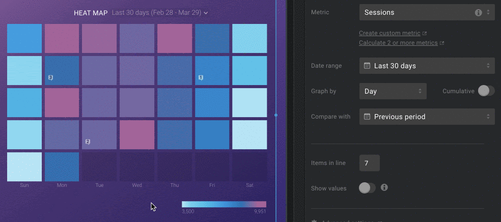
Plus, navigating through Heatmaps is easier and faster. How? You’re able to determine the number of Annotations on each block with just a glance. And you now have the option to turn on the comparison to a previous or custom period which you’re able to track in a new tooltip that pops up on each bucket when you’re hovering over it.
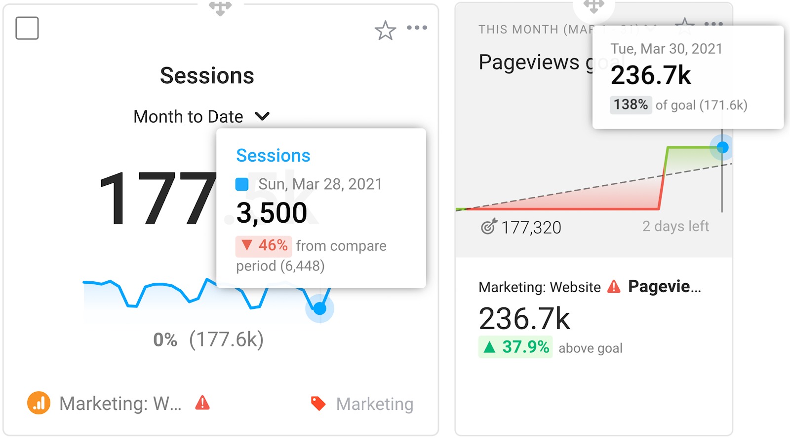
Speaking of new tooltips. We’ve updated them on our Metrics and Goals screen as well, ensuring easy data accessibility and consistency throughout the entire platform. Have you had a chance to check them out yet?
Getting Started
For current Databox users, log in to your Databox account to check out all of these improvements.
New to Databox? Start by creating your free account.
From there, you’ll be able to connect your data from more than 70 different sources.
Any visualization updates that you’d like to see in Databox? Add and vote for your favorites on our roadmap site.
If you have any questions or need help getting set up, you can visit our Knowledge Base or start a chat.