Table of contents
What happens when you allow a marketer to create a more consolidated view of business performance without needing to manipulate data in spreadsheets or design reports in slide decks?
And what happens when you allow them to do that quickly?
Loving the new visualization options in @databoxHQ today. Already taking advantage to show more data-dense visualizations. pic.twitter.com/LWbSrYGBYE
— Parker Short (@Parker_Short) March 7, 2018
? to @databoxHQ for the new UI dashboard refresh. Those funnels visualizations are looking ? pic.twitter.com/shTl9HCaFN
— Kyle Campos (@kcampos) March 7, 2018
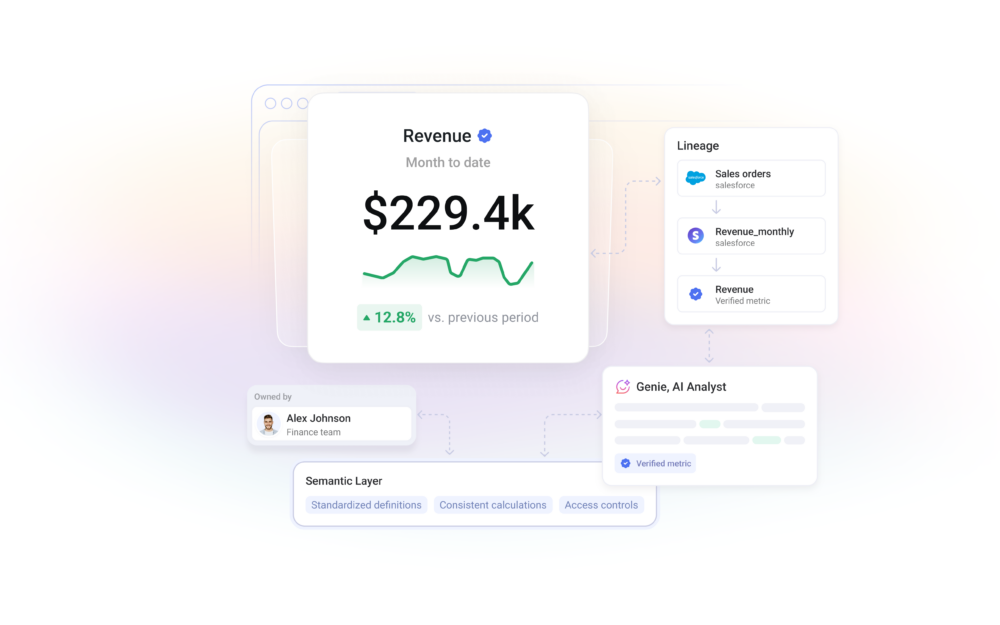
Great things happen when you enable people to view all their data in one spot.
“I’m a student of Edward Tufte, and one of the lessons he preaches is, ‘give the viewer the greatest amount of ideas in the shortest amount of time in the smallest space’–these updates allow us to do that for our business,” said Chris Handy, founder of ClosedWon. “Databox allows us to skip trying to understand what the data is, and move straight to what it means and what to do about it.”
This is unprecedented.
In my experience, insights are rarely accessible. Marketers often need to pull data from 12 different tools and then make sense of it all before they can visualize anything in a way that identifies actionable insights.
When people start using Databox, their primary goal is to pull all of that scattered data into one place so that everyone on their team can have access to it on all their devices.
In the beginning, we just focused on helping marketers visualize their key performance indicators (KPIs). Our latest update gives users the ability to more quickly identify the reasons why metrics are (or aren’t) moving.
With these changes, Databox is making in-depth performance insights and analysis even more accessible (and beautiful) for everyone with our performance dashboards.
Here’s what we’ve changed…
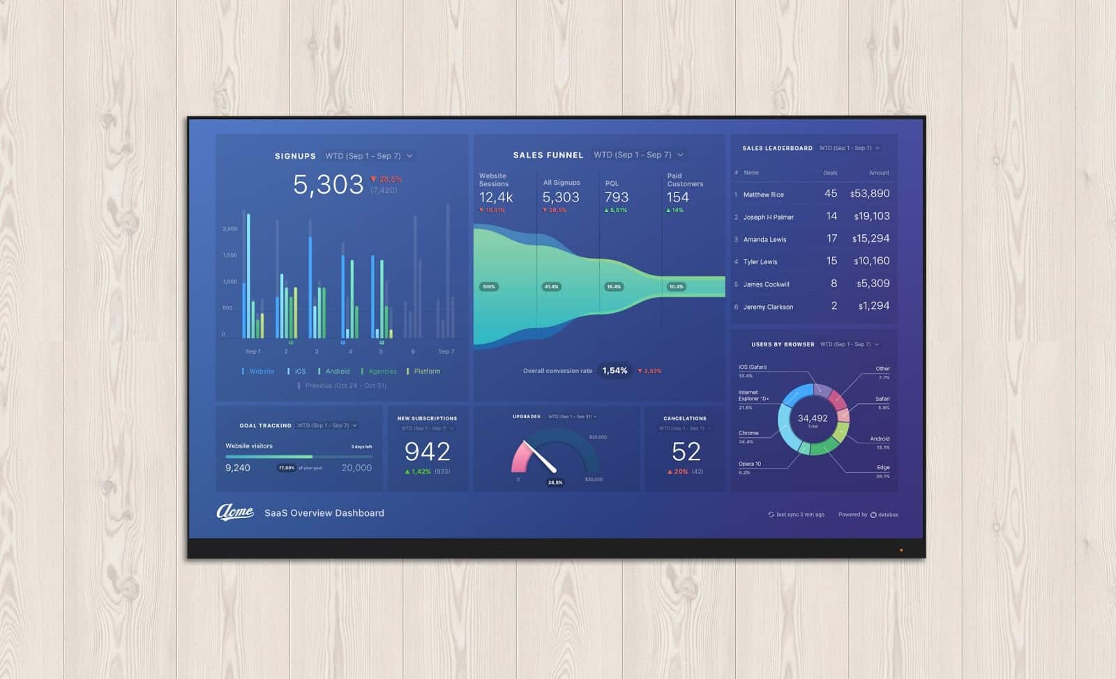
Creating In-Depth Visualizations to Improve Business Performance
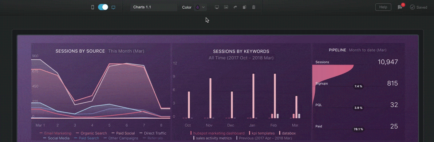
Our engineering team completely reworked all the charts and graphs within Databox, so the first thing you’ll notice with these updates are the visual changes.
The new charts and graphs are not only visually stunning, but changes in their functionality now allow for deeper analysis of your performance data. (More on that later.)
Here are just a few examples of how your performance data now looks with just a few clicks.
We’ve completely reworked all charts, graphs, and supported functionality on mobile, too.
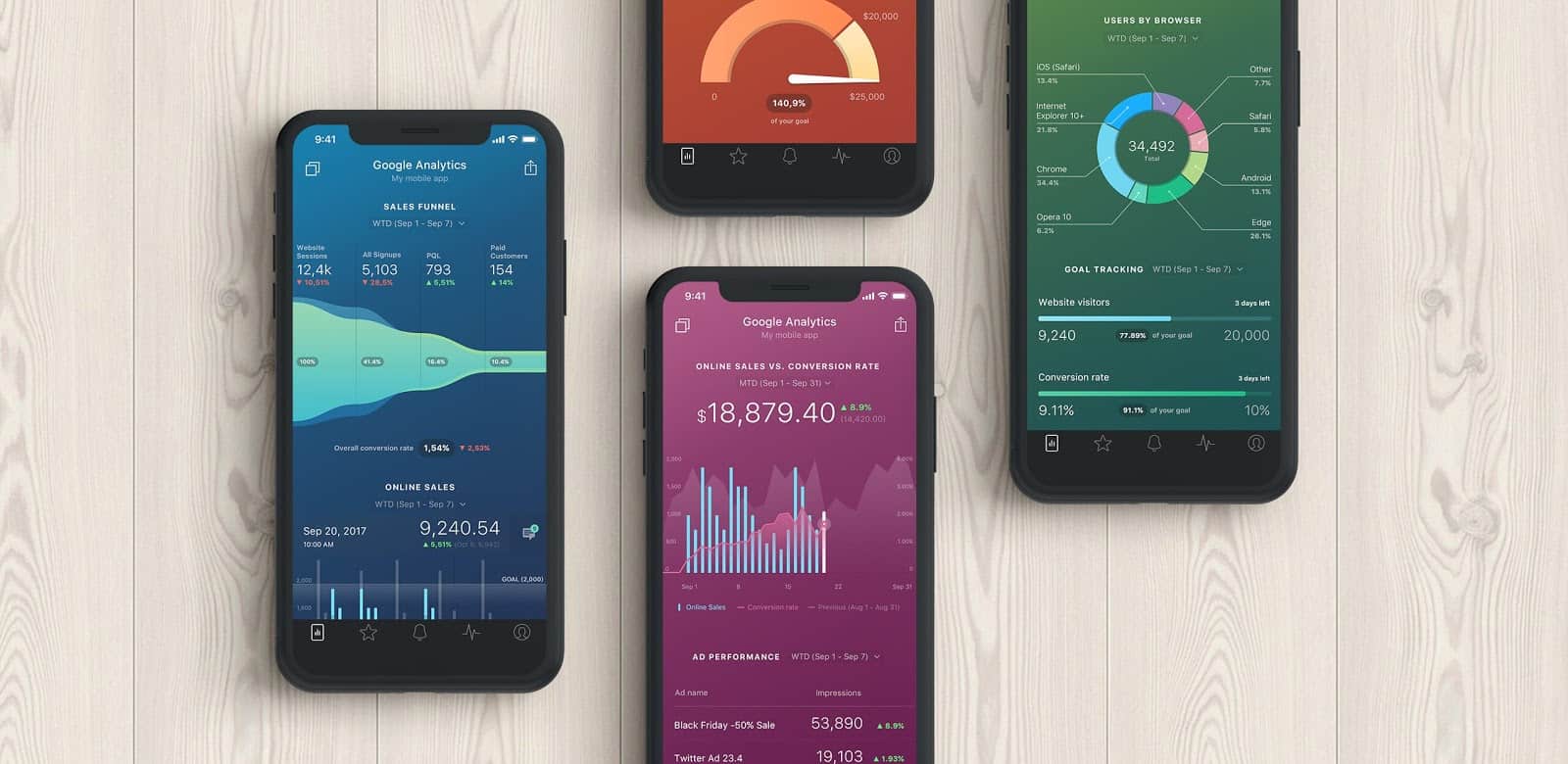
We’ve also added new colors and themes. This gives you more control over how your reports look and feel.
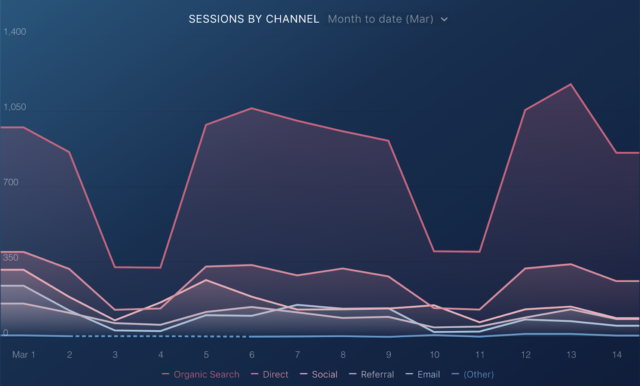
Unlock Advanced Attribution Insights to Improve Business Performance
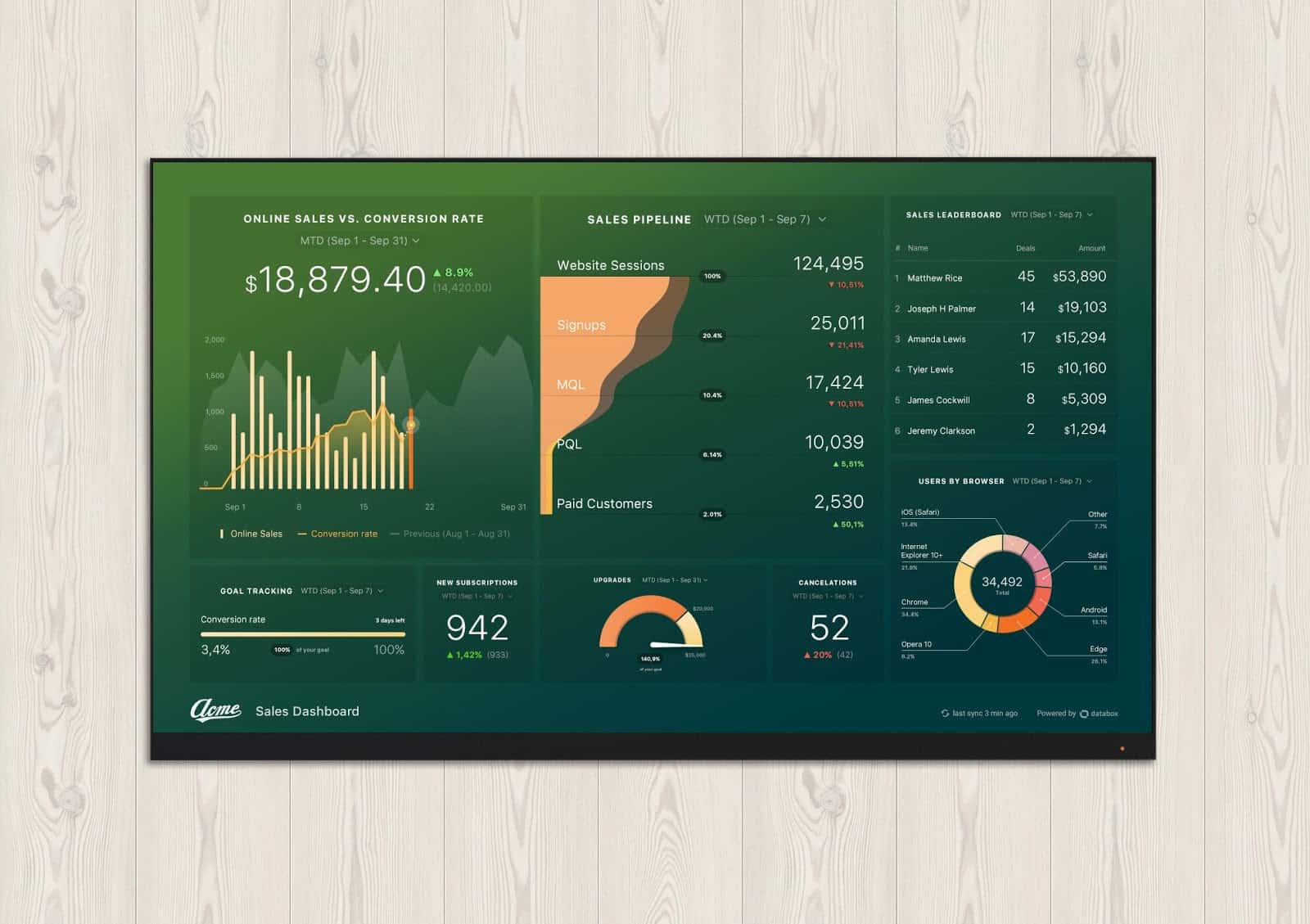
Databox line and bar graphs now support multi-dimensional metrics. You can plot sessions by channel in a multi-line graph. This lets you track daily, weekly, and monthly changes to spot strengths and weaknesses in your strategy.
Previously, you could track multi-dimensional metrics like these using a pie chart. While it’s a useful visualization, it doesn’t offer the granularity needed to spot daily or weekly performance changes.
In this line graph, you’re seeing sessions by channel tracked month-to-date. As you can see, the multi-dimensional line graph provides greater insight into the highs and lows of your month. This can inspire more productive dialogue around adjustments that can be made.
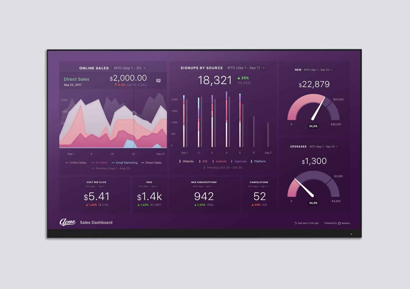
You can now select a “stacked chart” in both line and bar graphs. This gives you more ways to customize how you view your data.
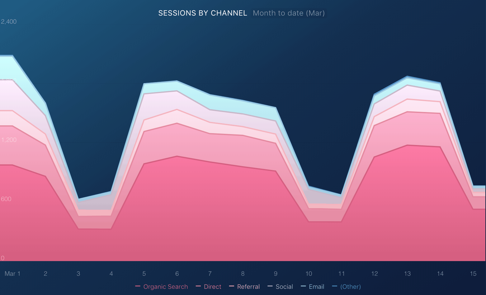
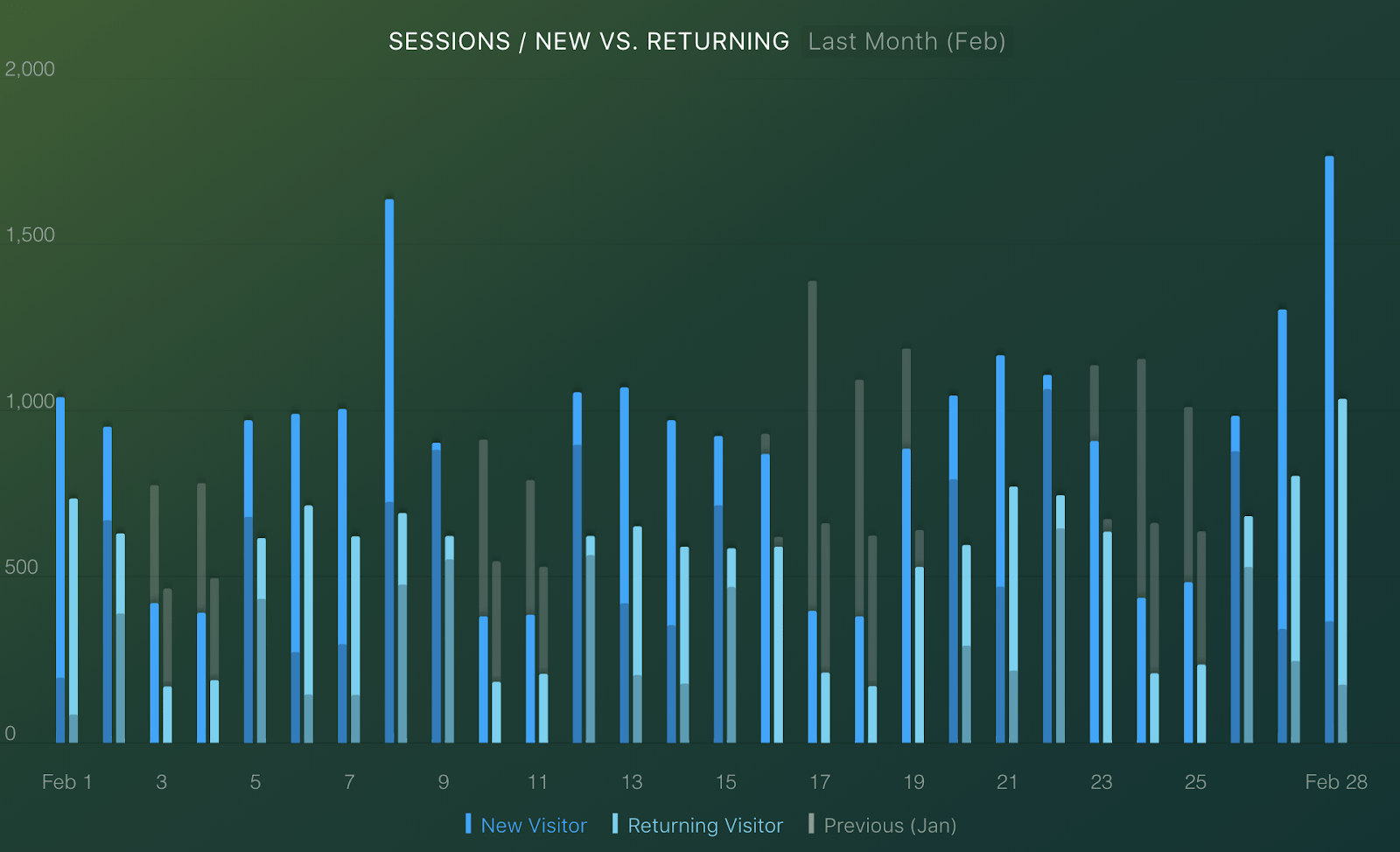
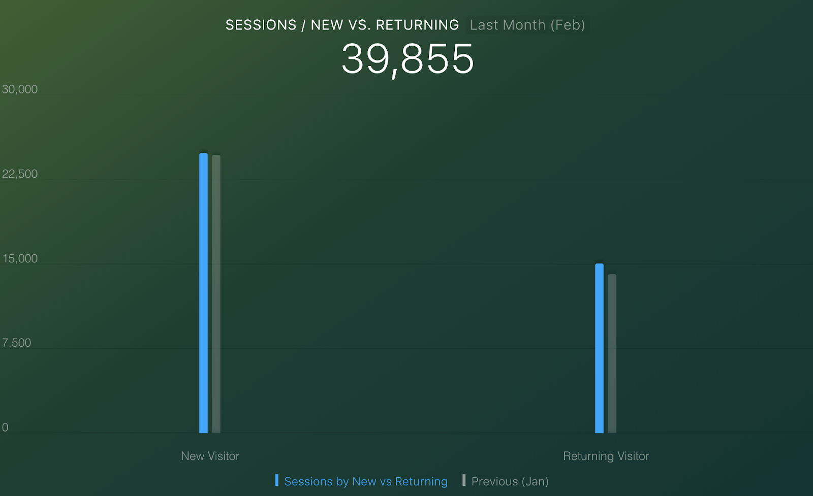
Here’s what a bar graph tracking new vs. returning visitors (compared to the previous period) looks like.
Quick tip
You can now swap the x-axis of a bar graph to sort by dimension, not just by time. (For example, in the chart above, you’re seeing new vs. returning visitors tracked over the course of February. In the chart below, you’re seeing that same data sorted by dimension rather than time series.)
“With these new stacked line and bar graphs, we’re able to understand performance in real time with as little effort as possible,” said Handy from ClosedWon. “This allows us to adjust behavior as needed without having to scroll through countless spreadsheets or screens in other apps. It removes the processing of information associated with checking data in all of these other places.”
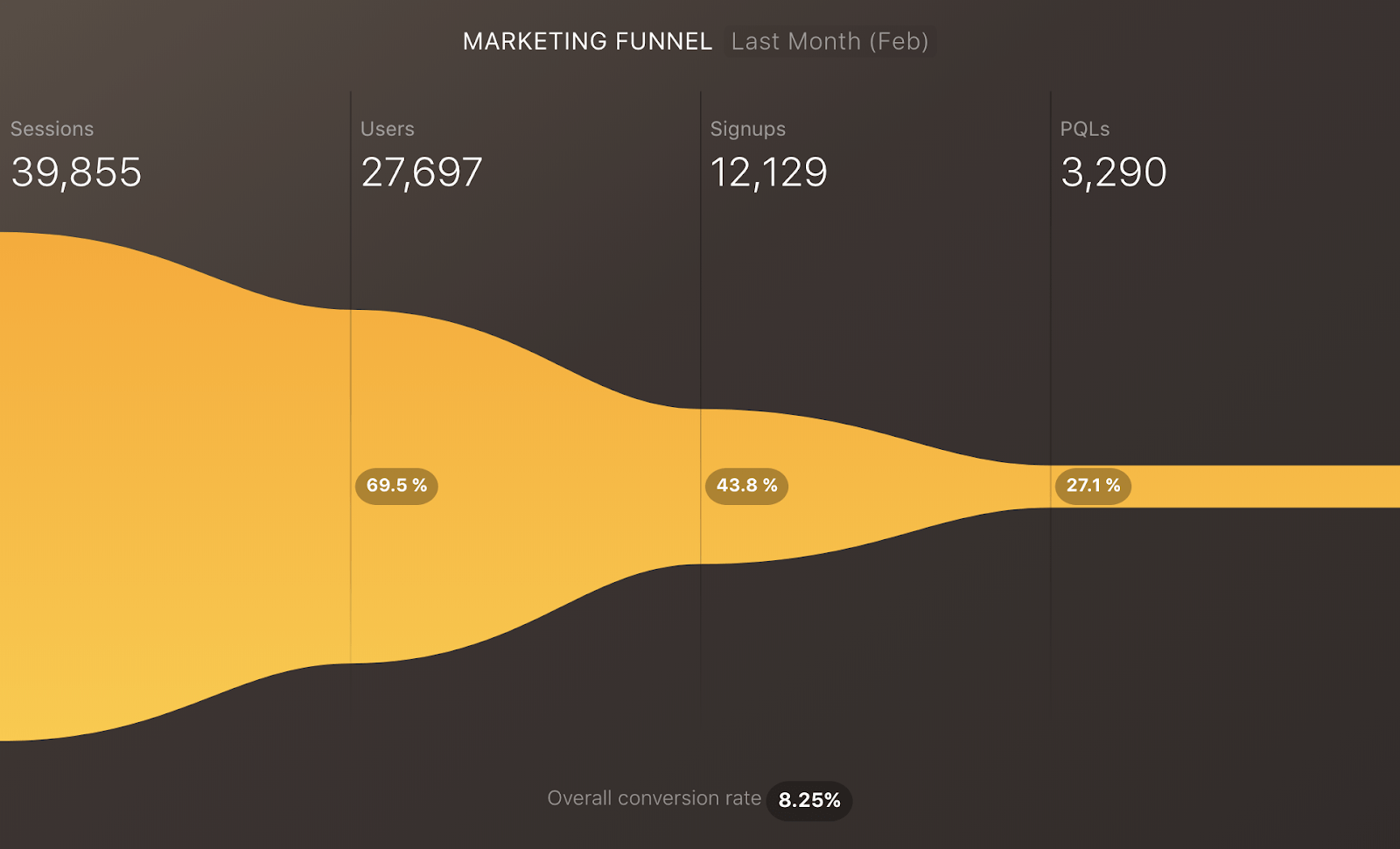
The funnel visualization has been redesigned to be a more direct reflection of conversion rates. Now you can also choose to track conversion rates in your funnel step-by-step, or from first value to conversion.
Want to see how your business performance looks with these types of visualizations?
With our free business dashboards, you can start tracking key performance metrics in minutes.
Making Business Performance Insights Accessible to Everyone
These updates mark Databox’s transition from just a performance monitoring tool to a business dashboard software that enables deeper analysis, too.
We’re excited to announce these updates. This is just the first wave of improvements to charts and visualizations.
Rest assured, though, we’re staying to true to our roots of being the “easiest to setup” and “easiest to use” data visualization tool available (according to G2Crowd). To that end, we’ll be updating our templates and pre-configured Datablocks in the next few weeks so you can just drag these new visualization types onto your existing Databoards.
FAQ
Databox is a business intelligence platform that helps you track, visualize, and analyze your business performance in real time. It connects with your data sources and turns key metrics into clear, visual dashboards.
Databox centralizes your metrics from tools like HubSpot, Google Analytics, and Salesforce so you can monitor and improve performance without switching between platforms.
Databox is built for ease of use and fast setup. Unlike other BI tools, it requires no coding, offers deep integrations, and emphasizes real-time business performance tracking across all levels of a company.
By offering real-time visual insights, Databox helps teams quickly spot trends, issues, or wins. This leads to faster, more informed decisions based on live business performance data.