Table of contents
As of today, Databox just got a bit more personalized to you.
That’s because we’re launching a slew of improvements that make it even easier (and quicker) for you and your team to setup Databox and find what you need afterward.
We liked the old Databox user interface (UI) and know that many of you had grown accustomed to it, but as we’ve continued to add new features that allow you to set and assign goals, schedule performance alerts and notifications, and dig deeper into your company’s performance, a refresh was needed in order to keep everything organized and allow you to find exactly what you need, quickly.
Let’s get into what’s new and why we changed it.
Watch as we highlight some of the changes in the 5-minute video below
A Completely New Home Screen, Personalized to Each User
Before today, the Databoards screen was essentially your “home” inside of Databox. It’s where you were directed after signing into the application.
But, as we’ve learned and observed from users (specifically ones that built lots of Databoards and set Goals), this screen didn’t tell you much by itself. To check your performance, you had to click into a Databoard– even just to see your most important key performance indicators (KPIs).
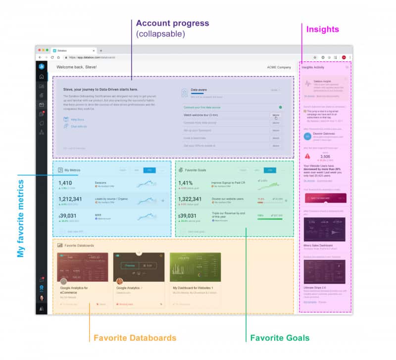
To fix this, we are launching a proper home in Databox–one screen where each user can get a personalized look at how their most important metrics and goals are trending, as well as open favorited Databoards quickly.
The Home screen can now be customized by everyone in your organization.
For example, if you are the Sales VP of a company, you might care most about deals created, deals closed and closed won amount. But, if you are a Marketing manager you’ll care more about traffic, leads and new deals. Now, upon logging in, the sales leader will have a different view than the marketing manager: each will see the metrics, goals and dashboards that give them quick access to their preferred metrics.
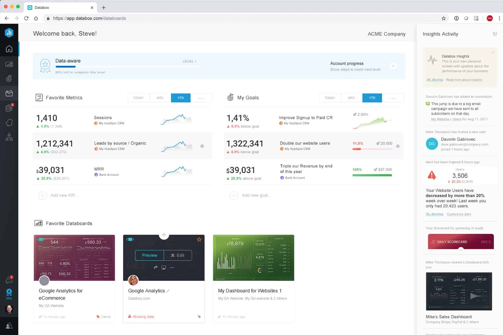
Databox’s Insights stream, a reverse-chronological stream with performance and account usage updates, and Account Progress, a list of suggested activities to guide your implementation of Databox (which we plan to improve this quarter too), are both featured on the Home Screen too.
Visit your new Home screen now to favorite metrics, goals and Databoards.
See Your Most Important Metrics As Soon As You Login
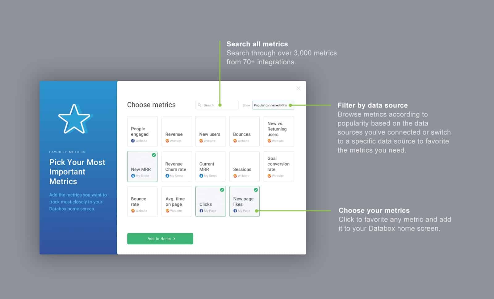
With the new Home screen, we are also introducing a new element called “Metrics.”
While Databoards are great for grouping related metrics into one view, most companies and teams have a few high-level metrics that they need to be able to quickly monitor multiple times per day or week.
Metrics — featured directly on your Home page — allows you to do just that.
Now in Databox, each user in your account can select the most important metrics to appear on their home screen, ensuring they’re always up-to-date and in a position to make improvements in key areas.
To set it up, just click “Add favorite metrics” on your home screen and choose from a list of the most popular metrics from the data sources you already have connected or search by data source and/or metric for any of the other nearly 4,000 metrics we pull from 100+ systems.
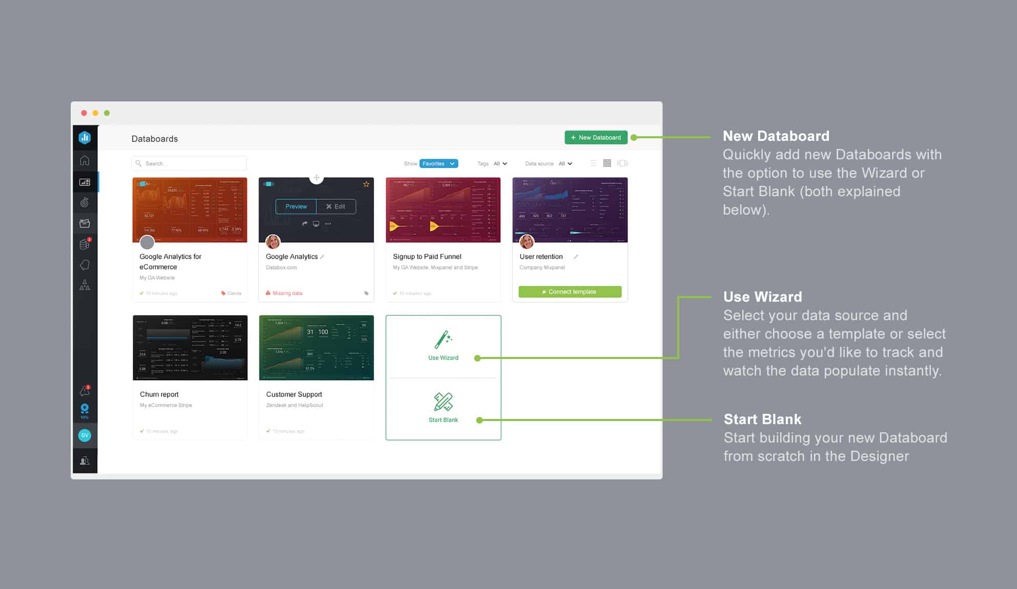
Build New Databoards More Quickly Than Ever
While we get rave reviews for the Databox Designer’s ability to customize dashboards and thousands of users each month use one of Databoard Templates, our users repeatedly asked us for ways to create new Databoards more quickly by choosing multiple metrics at once.
With the new Databoard Building Wizard, we’ve made it easier for you to build new Databoards by allowing you to select multiple metrics and visualizations from any of our 130+ data sources.
To launch the new wizard, click the “New Databoard” button from the Databoards screen.
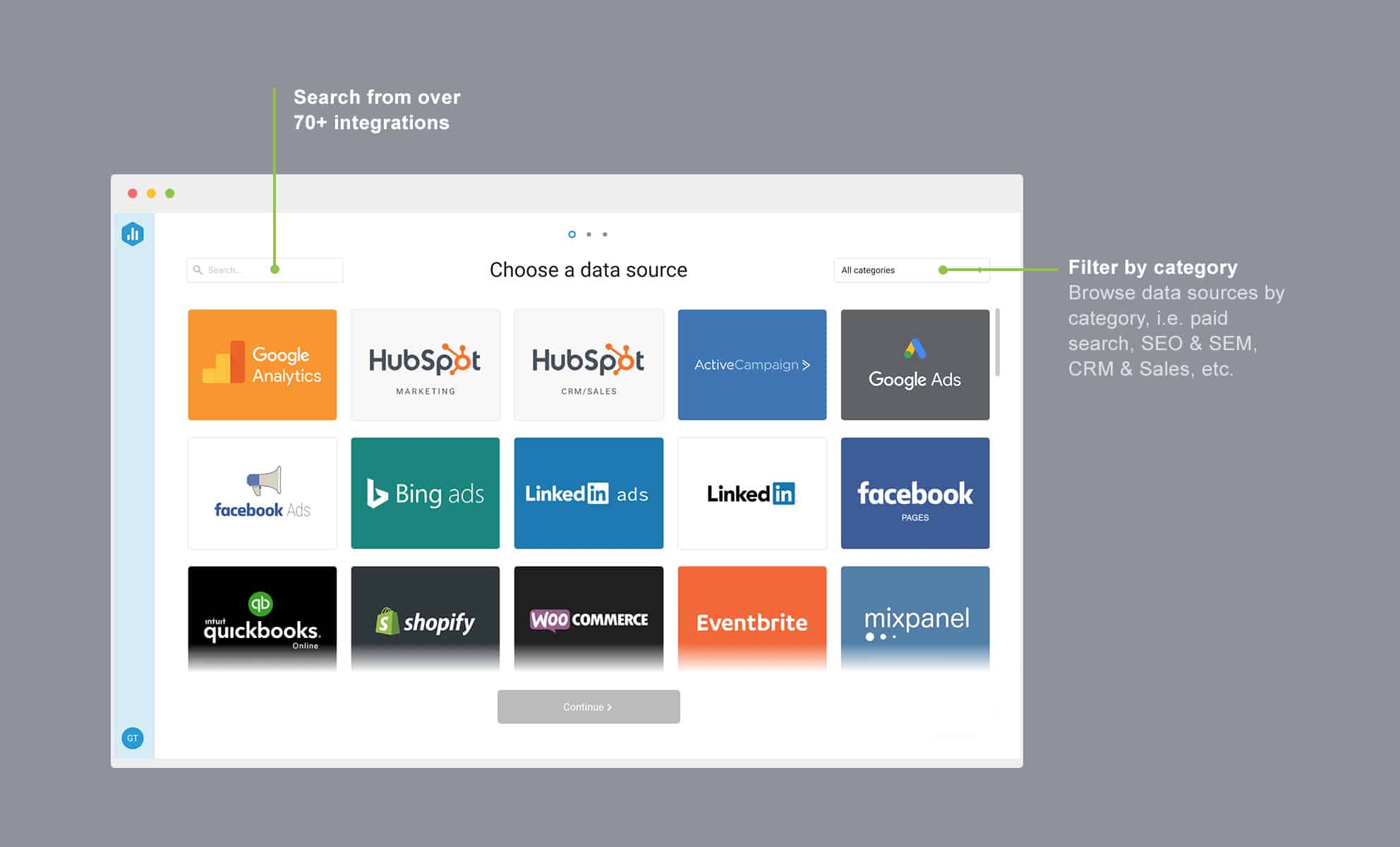
Then, choose the data source you’d like to pull data from in your new Databoard. (You can add more data sources later.)
Then, simply click on the metrics you’d like to add to your Databoard. The metric and the corresponding visualization will populate in your new Databoard instantly.
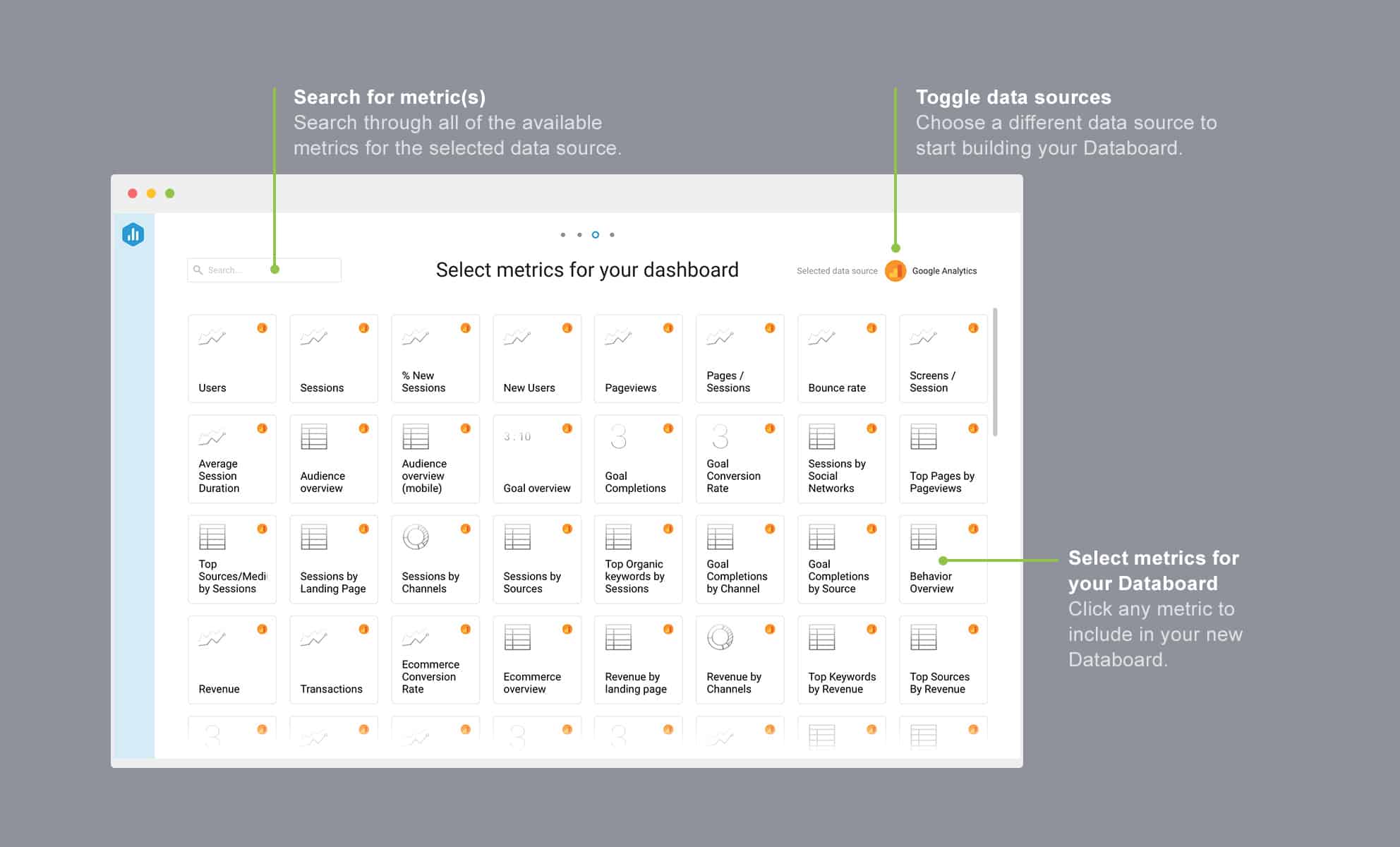
As usual, once you create a Databoard, you can add additional metrics to it from the “All Available Metrics” screen or directly from the left-hand pane of the Designer.
A New Navigation to Give You More Space for Your Metrics
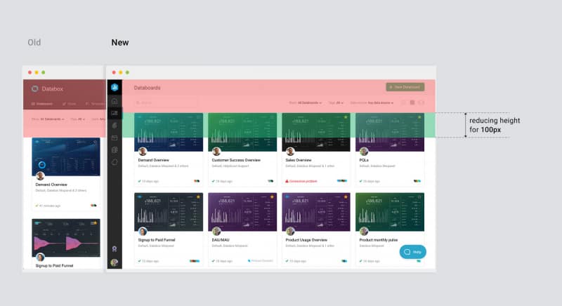
Vertical space is very precious on desktop computers since browsers have many toolbars and displays have grown to be wider, but not taller.
Our top header (everything above the actual content) took up a lot of visible space above the fold.
To give you more space to see your Databoards, Goals, Clients or whatever else you’re viewing, we moved to a vertical-oriented navigation. By doing this, we reduced our header height by 40% (100px).
As you can see in the before and after screen grabs below, this change puts much more focus on the content and functionality across the whole application.
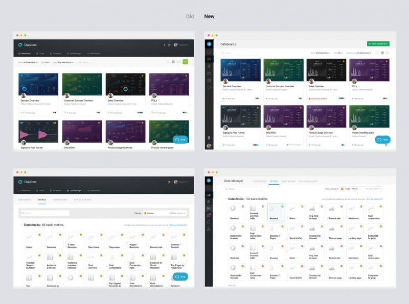
In addition to changing the location of the navigation, we also changed the location of the sub-navigation, giving it more emphasis at the top of each screen.
But don’t worry, all the same functionality is in the same spot. Other than the location of the navigation bars, nothing has changed; all the same functionality is available in both navigation bars.
New, Consistent Functionality for Every Feature
Over the last two years, as we added a lot of new features quickly, we didn’t take the time to think about how to place elements like tags, filters, search boxes, etc., consistently across the application.
This resulted in each page having those elements in different places. For example, see how we previously placed the search box in different places on different pages in the screenshots of the old app below.
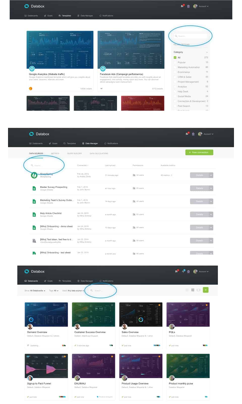
In the new app, we standardized the position of filters and the search box.
Now, when trying to find a goal you created, a Databoard, a scorecard or specific client accounts (if you are an agency)–search functionality is always positioned prominently in the top left corner.
But, that’s not all…
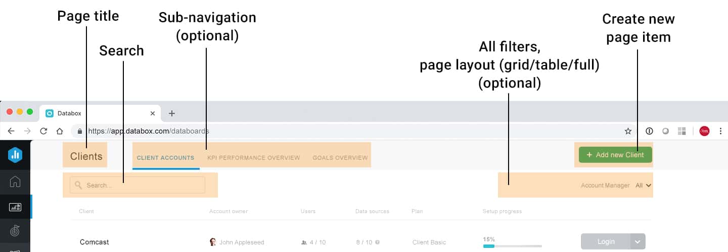
Now, every page will have a page title, sub-navigation, main Call-to-Action (CTA) (usually a ‘create new item’ button), search, and filters– all in the same location. All at the top of the screen and consistent across the whole application, no more exceptions.
Responsive Design for Every. Single. Screen.
One of the things our customers love most about Databox is that you can build a dashboard once and it automatically works on every screen:
- Need to broadcast your team’s sales performance on a TV mounted to your office wall? Check?
- Need to show a some data while you are taking them out to lunch? Just open the mobile app.
- Want to spend some solitary time digging deeper into your performance? No problem, just open multiple dashboards in your browser tabs on your laptop.
Unfortunately, not everything about Databox was responsive on every device.
No more!
Use the Web-Based App on Your Mobile Browser
Although we have a native mobile app for both IOS & Android that allows anyone to monitor their metrics anywhere and anytime, there are users who log into our web application via a browser on the mobile device, too.
Now, the same functionality works in a mobile browser as on a computer.
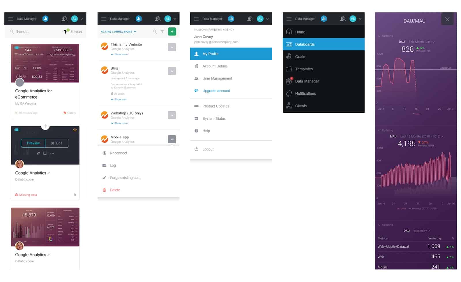
As the screen grabs above show, the navigation on mobile is positioned on top and the content is responsive, so there is no need to rotate or zoom-in.
Improved Experience for Large Monitors
Widescreen formats are becoming a standard, especially on laptops, which has also become the standard device for work. Because of these trends, there is more space available horizontally than vertically and app designers need to think about how to place the most relevant content and functionality above the fold.
For example, since many of our users have more than ten or even hundreds of Databoards, the old UI required them to scroll quite a bit to find a specific Databoard they needed, as you can see below.
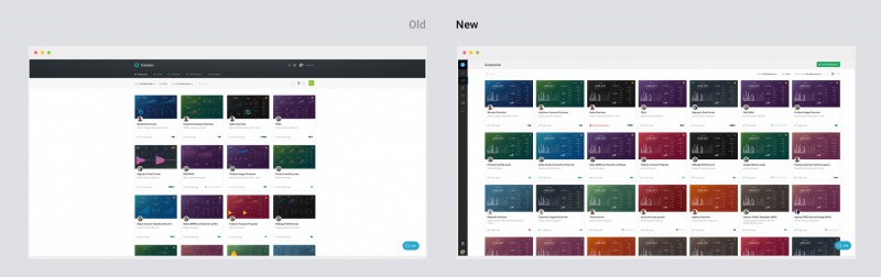
With the new release, we reworked all the pages to fully adapt and fill in the content across the screen.
With these changes, we have solved for two extremes: very large screens (iMacs and > 21” monitors) and mobile devices and everything in between.
See all the changes live. Give us your feedback…
With our new wizards and Home screen, you have the control to define what success looks like for you– and track it easily too.
Existing users can log in now to see all the improvements. Not a Databox user yet? No sweat. You can create your free account here.
Either way, we want your feedback, so we can continue to make it easier for you to track and improve YOUR performance.
After all, how you evaluate your performance is unique to you; every company, team and person needs to track different metrics, set different goals and analyze different correlations to accomplish what’s important to them.
Stay tuned for new updates coming to make that even easier: more personalization wizards, advanced analysis capabilities and smarter recommendations based on what’s important to you.