Table of contents
Want content that people LOVE to share?
Data journalism is the not-quite-new approach to content creation sweeping the nation.
Companies and marketing teams adopting this strategy craft impressive, dynamic content, which they use to engage their audience and drive traffic to their sites.
Expert content marketers use the A-B-C framework to measure their content, and data journalism helps with at least the first two parts.
- Acquisition: Data-driven content is shared more often than typical content. KPIs: Social shares, pageviews.
- Behavior: Data-driven content increases reader engagement with your posts. For example, IBM found that infographics were 30x more likely to be read than a normal article. KPIs: Time on page, Bounce rate.
- Conversion: This is the percentage of visitors that complete a goal on your sight, like signing up for a demo or downloading an ebook.
Whether it’s stories for your blog, infographics for social media or supporting statistics your marketing team can use in their publications, data journalism is a tool you can use to expand your brand (and get noticed).

What is Data Journalism?
Data journalism is the use of numbers, statistics and numerical data in one form or another to write a story. There are two main styles:
- Data-driven stories
Content creators review large databases of information and write content based on the trends they find. - Data-supported stories
Content creators develop their stories and use data (usually in visually interesting graphics) to support their content.
“Data can be the source of data journalism, or it can be the tool with which the story is told — or it can be both,” explains Paul Bradshaw of Birmingham City University in his article “What is Data Journalism” published on the Data Journalism Handbook. “Like any source, it should be treated with skepticism; and like any tool, we should be conscious of how it can shape and restrict the stories that are created with it.”
Data journalism takes seemingly unrelated data and shows the reader what it means for them. It can be literally shown with interesting visuals; or it can be in written form.
“Data journalism can be based on any data that has to be processed first with tools before a relevant story is possible,” states Henk van Ess, author and data journalism trainer. “It doesn’t include visualization per se”.
It is not a new concept.
Graphic displays of data were used (albeit very rarely) in American newspapers as far back as the 1840s.
“Although graphical displays of data … were exceedingly rare in U.S. newspapers .… Maps became common during the US Civil War in the 1860s, but in the 1840s, illustrations of any kind (let alone data visualization) were rare,” explains Scott Klein, in his article “Infographics in the Time of Cholera”.
Klein is the Deputy Managing Editor at ProPublica, an independent, nonprofit newsroom producing investigative journalism. He spent a few years studying the history of data visualization in the news. While the actual visuals weren’t present in newspapers, data was. “Newspapers were publishing data on commodities prices, cargo shipments and births and deaths since their very beginning,” he explains.
The difference between data-driven content and regular content (like a list of numbers) is the intent. Content usually provides an overarching story, communicated through visual aids. This can be an infographic, statistic-heavy article, or really anything with graphs, charts and statistics.
Why should you use Data Journalism?
Data journalism lets you break away from the repetitive “me too” content most people write.
It lets you filter through demographic statistics, trends, product reviews and more to create a coherent story relevant to your target audience.
You look at the individual numbers and see the big picture. Then you share this big picture with your target audience.
By publishing the big picture, you breach the gap between “supplier of product/service” (aka you) and “user of product/service” (aka your target audience). Provide statistics or demographics surrounding your product; highlight the popular trends over the last decade; offer tips and advice on how to make informed choices for their next purchases.
In fact, you give your readers a better sense of who you are by what you deduce from the information. You provide transparency for your brand.
Marketing and demographic companies publish statistics you can use as your data – or you can run your own statistics gathering campaign.
The former allows you to see what’s happening on a local, national, international and global scale. The latter means that your numbers will be specific to your brand and customer base.
Here are some examples of data journalism in action:
Guide Your Next Property Investment in Africa with Data Science
Olalekan Elesin shows the most and least profitable regions in select African countries through analysis of unit rent price to unit sale price ratio, number of property listings by region, profitability ration distribution and more.
We Analyzed 100 Million Headlines. Here’s What We Learned (New Research)
Steve Rayson uses bar charts to which phrases and words have the highest engagement on Facebook and Twitter (among other things).
Plan A Full Year of Content With All The Blog Post Ideas You Ever Need
Sarah Peterson gives the top 10 types of content that drives traffic by analysis the top 200 blog posts on Sumo’s content-creating customer’s sites.
For more examples, read this article on the marketing site import.io: “8 fantastic examples of data journalism”
Data journalism will help you and your company find the important trends (or even help you spot a new trend to start), and it’ll help your target audience see the value in your product and services.
“The language of this network is data: little points of information that are often not relevant in a single instance, but massively important when viewed from the right angle,” writes Mirko Lorenz, journalist and information architect at Deutsche Welle in his article “Why Journalists Should Use Data”.
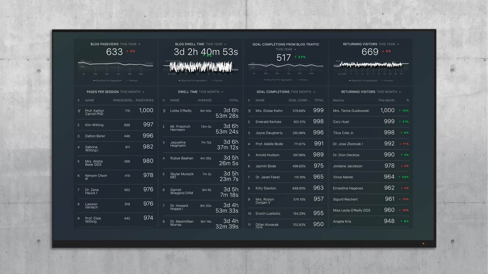
PRO TIP: How Are Users Engaging on My Site? Which Content Drives the Most Online Activity?
If you want to discover how visitors engage with your website, and which content drives the most engagement and conversions, there are several on-page events and metrics you can track from Google Analytics 4 that will get you started:
- Sessions by channel. Which channels are driving the most traffic to your website?
- Average session duration. How long do visitors spend on your website on average?
- Pageviews and pageviews by page. Which pages on your website are viewed the most?
- Total number of users. How many users engaged with your website?
- Engagement rate. Which percentage of your website visitors have interacted with a piece of content and spent a significant amount of time on the site?
- Sessions conversion rate. How many of your website visitors have completed the desired or expected action(s) and what percentage of them completed the goals you’ve set in Google Analytics 4?
And more…
Now you can benefit from the experience of our Google Analytics 4 experts, who have put together a plug-and-play Databox template showing the most important KPIs for monitoring visitor engagement on your website. It’s simple to implement and start using as a standalone dashboard or in marketing reports!

You can easily set it up in just a few clicks – no coding required.
To set up the dashboard, follow these 3 simple steps:
Step 1: Get the template
Step 2: Connect your Google Analytics account with Databox.
Step 3: Watch your dashboard populate in seconds.
How to Adopt Data Journalism into Your Marketing
Now that you know what data journalism is and why you should use it, it’s time to learn how.
First, you’ll need to gather your data. This can come from internal reports – product sales, reviews, customer or client demographics, social media engagement numbers, and website or blog views. Or you can look at local, national and international trends in your industry.
Data for internal numbers can be found in your software reports. If your system doesn’t allow for this type of reporting – or doesn’t generate the information you’re looking for – you can create your own data-gathering system.
Types of data you can gather include:
- Social Media discussions in your industry
- Social Media discussions about your company
- Online news trends
- Feedback from your customers/target audience
- Demographic information
- Product trends within your industry
Google Sheets is an excellent tool for that. It is stored in the Drive (cloud-based storage) and is designed to be collaborative in nature (so everyone on your team can add to and review the data).
Watch this step-by-step guide for Google Sheets.
You’ll set up a spreadsheet to store all of your date and input tags so that you can monitor topical information.
(Note: Tabula is a great tool for “liberating data tables locked inside PDF files”.)
Tools For Data Journalism
Finding the information you need online – from news sources, social media and other online sources – can be automated using the right tools, such as Blockspring or Zapier.
Blockspring automatically searches the internet for data based on your criteria. It then sorts and organizes it in whichever program you prefer – Google Sheets, Excel, Tableau, Slack or Bubble.
Examples of data the Blockspring plug-in can collect includes:
- Google Analytics
- Employee lists
- Keywords from Tweets
- List of prospects
- Content ideas
- Lead profiles
Read more about their content marketing built using Blockspring.
Zapier automates your data collection process; the plug-in connects over 750 apps so you can get the information you need without any added work. Once you build your “workflow” (called “Zaps”), you can ensure the information gets where you need it to be without having to lift a finger.

ScholarMatch – a program helping low-income and first-generation students apply to college and creating support systems to increase their odds of graduating – uses a Zap to connect the online payment processes with the spreadsheet and database organizers. Then another Zap to automatically send an email to the relevant parties.
They created an infographic to show their 2016 statistics. The data collected appear in true data journalism format.
ScholarMatch’s 2016 statistics ->
Power Tools is a Google Sheets add-on that removes duplicated information, helps automate the organization of your information and brings similar data together to show a unified story.
According to the description, you can “search all selected sheets for certain values, formulas, notes, and hyperlinks.” This will make grouping information, removing specific characters and seeing the overarching story.
Measure the Impact of Data Journalism
You can quickly see whether your data-driven content strategy is working. Use the Blog Quality metrics dashboard to automatically measure the top pieces of content on your blog.
This track Google Analytics data to compare your data-oriented content to your highest performing posts. You can investigate whether your pieces of data journalism are being viewed more often, read more completely or if they successfully encourage readers to complete a goal on your site.
If your data-driven posts are struggling, try a different style of post. Or, you may need to interview your customers to learn about which pieces of data spark curiosity.
Best Practices in Data Journalism
“Working with data is like stepping into vast, unknown territory,” writes Lorenz. “At first look, raw data is puzzling to the eyes and to the mind. Data as such is unwieldy. It is quite hard to shape it correctly for visualization.”
Your job is to take the data and shape it into something easy to understand and, if possible, eye-opening. The content can be heavily visual (like an infographic) or text-based with supporting data in graphs, charts and other visual aids.
Whichever format you choose, you will have an overarching narrative – the point you want to make – and a goal for your visuals.
Tips for your Narrative
- Review all data for inconsistencies or missing data sources
- Validate your data – check that it is accurate and from viable sources
- Use relevant data from no longer than five years ago (unless you’re specifically looking at statistics over a historic period)
- Plot out your “story” before you start; this allows you to:
– Decide if your data should be presented chronologically or as needed
– Pick the right pieces of data to best show or prove your point - Provide a context for your data; information doesn’t exist in a vacuum. Trends ebb and flow for a reason. Make a point to explain “why” in your narrative.
Tips for your Visuals
- Bar chart baselines must start at zero
- Limit the number of slices you put on a pie chart (try to make it so you can still see the pie slices)
- Make sure your charts respect the parts of the whole.
– If you’re trying to represent 90% on a pie chart, make sure it takes up 90% of the pie chart.
– If you have a bar chart with a 25 measure and a 50 measure, make sure the 50 measure is twice the height of the 25. - If using icons or symbols to represent data points, make sure you can make out the number of points and the pattern of the data
- Remember to explain your charts and data
“We must always keep our readers in mind,” writes Klein. “They have the potential to understand our graphics, but we must never assume our graphics are intuitive, without the need for explanations or directions. Visual and narrative clues about how to read them are vital and mandatory.
“On the other hand, this also means we are not trapped into using simple forms. There is no pure set of visual types that conform to human nature and are thus are intrinsically better than the others. We are free to experiment.
“The implications of this are significant. First, If we keep our readers in mind, we can pursue new forms that delight them and help shed light on complex subjects in ways that have never been tried before. For the right story, our readers will put in the time necessary to understand even strange new graphical forms — like our line chart must have seemed in 1849 — if we only take the time to help them do so.”
However you choose to approach data journalism for marketing, remember to give it a cohesive story. It should have a beginning, middle and end. It should also make a statement or drive home a specific point.
Do this and you’ll have your audience hooked by the numbers.