Table of contents
Harvest says that time tracking shouldn’t weigh you down.
At Databox, we agree. We’d go even further (and risk sounding super meta) by saying that tracking (and visualizing) your Harvest time-tracking shouldn’t take you hours every month, either.
Effective project management is one thing. Reporting and analyzing on those projects (especially for agencies) in order to find areas of need or improvement is another.
Starting today, all that is easier. We’ve officially rolled out our integration with Harvest.
Now you can visualize all of those critical project management metrics from Harvest, things like hours tracked, billable hours, billable amount, non-billable hours, expenses (and more) in just minutes. You can also segment all of those metrics by client, project, task, and team for a more granular view.
At launch, there are over 35 Harvest metrics that you can now visualize in Databox, including pre-configured Datablocks that you can drag-and-drop right into your dashboard–the data will populate with the visualization automatically.
We’ve created a few pre-built reports to get you started as quickly as possible. All you’ll need to do is connect your Harvest account and you’ll be good to go.
Here’s just a few to get you going…
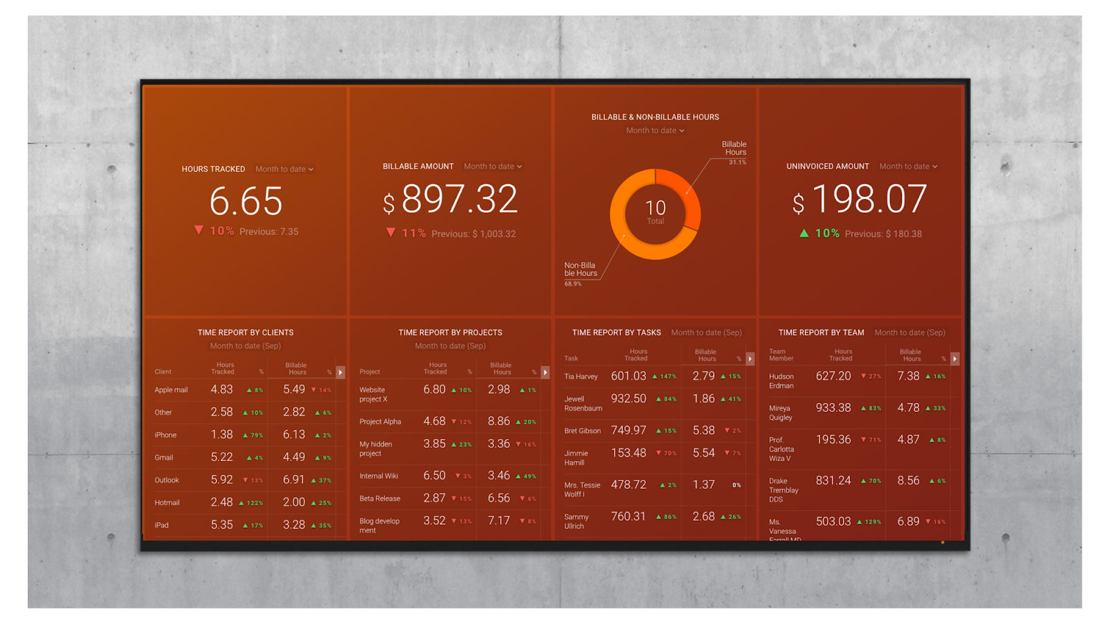
Track time by team, project, and task
There are several indicators that keep individuals, teams, and companies up-to-date on the status and overall efficiency for how work gets done. Now, you can visualize all of them from one dashboard.
See how many hours are tracked on a monthly, quarterly and yearly basis.
Segment tracked time by project, client, tasks, and team.
Monitor how your time report, by task, is trending compared to this time last month.
Being able to visualize all of this in real-time will allow you to make the necessary adjustments needed for you and your team to stay on track.
Grab this free template to get started.
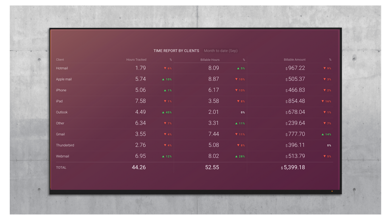
Visualize time, billable hours, and billable amount for every client
If project management is a challenge for most companies, it’s multiplied for agencies who are managing projects and tasks for dozens of clients. Now, your agency can visualize all of your critical time-based metrics in one place.
Keep track of total hours tracked, billable hours, and the billable amount for every one of your clients on one screen.
Quickly scan to see which accounts have seen changes in productivity or profitability and prioritize supports and make necessary adjustments in the right place.
Grab this free template to get started.
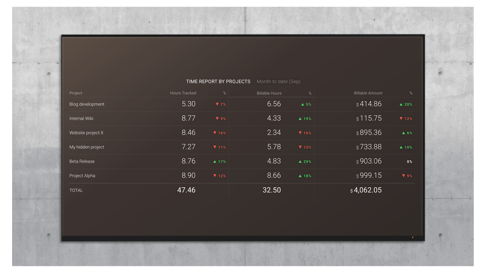
Track all of your projects on one screen
Having the ability to visualize hours tracked, billable hours, and the billable amount on a project-to-project basis is critical for getting work done and staying profitable.
Now you can visualize all of these key project metrics from one screen and even broadcast them on an office television to keep everyone up-to-date on the status of the work getting done.
Grab this free template to get started.
Need more?
You can browse our complete list of pre-built reports for Harvest here.
Or, you can create a dashboard from scratch and start visualizing all of the metrics from Harvest that you need.