Table of contents
Hello everyone. Welcome to another episode of Data Snacks. My name is Monja, and I’m the product marketer at Databox.
Do you know which sources fuel your sales pipeline?
Businesses invest in various marketing sources and channels to add new sales opportunities that the sales team can convert into customers. Doing so allows you to calculate return on marketing investment. But not all sources are equally productive at driving new sales opportunities.

In this Data Snack, we are going to show you how:
- To track and visualize New Opportunities based on their source
- Compare the success rate of those sources
- Decide which ones are worth the further investment and which ones you can reduce in your marketing budget.
Below, you can view the full episode, or, keep reading for a fully transcribed version of the episode complete with relevant screenshots.
Time to Track New Opportunities by Sources
We are starting in Databox, and using HubSpot Marketing as our main data source.
First, we will navigate to the Databox Designer. Adding metrics is quite simple here. Simply choose the data source from the Metrics Library here on the left and drag-and-drop some of the available pre-built metrics.
In this case, we will visualize New Opportunities by Email Marketing Source, New Opportunities by Organic Search Source, New Opportunities by Paid Search Source, and New Opportunities by Paid Social Source in separate data blocks. By tracking these metrics, you will see which sources are bringing you the most new opportunities, decide which ones are worth investing in, and easily compare the numbers. That way you’ll make the best possible decision regarding which ones are worth continual investment.
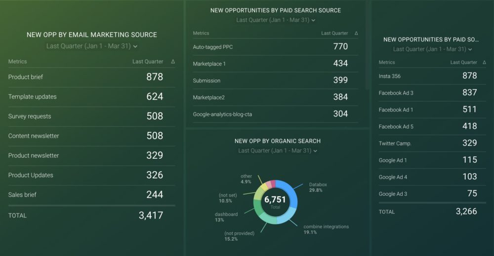
We can also choose different visualizations to track these metrics. For example, let’s drag and drop the table chart visualization onto the board here and add New Opportunities by Email Marketing Source as a metric. Here you can see which email campaigns have driven the most new opportunities. That provides insight into which email marketing strategies are having the biggest effect. Now let’s also show the total number of new opportunities for the last quarter. Or, you can adjust the data range as desired.
Let’s Visualize The Data We Have
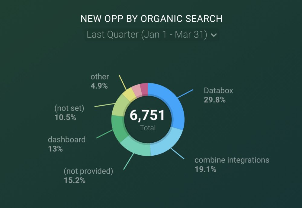
Let’s create a new data block to visualize New Opportunities by Organic Search Source using a pie chart. Now you can see which organic search source is bringing in the biggest share of new opportunities. Organic search is one of the most important sources as it shows how many people find your business naturally, without a paid ad showing up in front of them.
As I add the rest of the metrics we want to track, I want to make sure that the total is visible in all of these visualizations.
Now we have a finished dashboard and can see the results. Let’s see what our dashboard tells us. So we have several source types here, Organic Search, Email Marketing, Paid Search, and Paid Social, and for each of these, there are specific channels that you may be tracking.
PRO TIP: How Are Users Engaging on My Site? Which Content Drives the Most Online Activity?
If you want to discover how visitors engage with your website, and which content drives the most engagement and conversions, there are several on-page events and metrics you can track from Google Analytics 4 that will get you started:
- Sessions by channel. Which channels are driving the most traffic to your website?
- Average session duration. How long do visitors spend on your website on average?
- Pageviews and pageviews by page. Which pages on your website are viewed the most?
- Total number of users. How many users engaged with your website?
- Engagement rate. Which percentage of your website visitors have interacted with a piece of content and spent a significant amount of time on the site?
- Sessions conversion rate. How many of your website visitors have completed the desired or expected action(s) and what percentage of them completed the goals you’ve set in Google Analytics 4?
And more…
Now you can benefit from the experience of our Google Analytics 4 experts, who have put together a plug-and-play Databox template showing the most important KPIs for monitoring visitor engagement on your website. It’s simple to implement and start using as a standalone dashboard or in marketing reports!

You can easily set it up in just a few clicks – no coding required.
To set up the dashboard, follow these 3 simple steps:
Step 1: Get the template
Step 2: Connect your Google Analytics account with Databox.
Step 3: Watch your dashboard populate in seconds.
Interpreting The Data
So the first step is to look at all the totals for each source type. This tells you which ones are performing best overall and which ones could use some improvement. The total number of unique opportunities is the best way to compare the sources, as it can be viewed as the end result for each source.
Next, we analyze the data within each source, so for example, in the Paid Social Source, your Facebook ads might be bringing in all the new Opportunities while your Google Ads might be underperforming. This can help you decide which ones are worth the further investment and which ones aren’t delivering desired results. When it comes to your Email Marketing Source, you can clearly see which campaigns were the most productive, and that can help shape your future email content. With Paid Search Sources, you can see which ones are working and which ones you can stop investing in. Or at least ensure that you improve the current approach, from writing more engaging copies to targeting better keywords.
A dashboard showing which sources and channels create New Opportunities most effectively helps us make better decisions when it comes to our marketing investments.
You are Now Ready to Track
We hope that we have shown you how you can track new opportunities by source in a way that provides you with a clear insight when it comes to your marketing ROI.
Just by glancing at each metric, you can see which sources are performing better, and if you dig deeper within each source, you can see which campaigns work best.
If you need help tracking and visualizing your New Opportunities by Source metrics, our Support team can actually help build your first dashboard for free.
Just create your free Databox account and reach out to our team either via chat or email.
See you next time.