Table of contents
These days, most of us are tracking data from dozens of different marketing technologies––everything from content to SEO to sales to customer support to… well, everything.
And, if you have to go looking in each of these tools to understand how things are going, then do you really know how things are going?
This is why dashboards specifically ones that collate data from the various tools we use in one place, have become so important.
But, how do you actually create a business dashboard that’s meaningful and immediately accessible to anyone who views it?

It’s far too easy to overcomplicate your design and wind up with a cluttered, noisy mess that’s not actually helpful for anyone.
In this post, we’re sharing 21 design tips along with some dashboard examples from a few dozen marketing pros to help you build better and more meaningful business dashboards, including:
- Know your Key Business Objectives (KBOs)
- Understand your target audience
- Keep the dashboard simple
- Keep the dashboard to one page
- Include only the relevant metrics
- Build your dashboard using the Inverted Pyramid model
- Put revenue metrics on the top of your dashboard
- Know what you want to achieve
- Get buy-in from your team
- Create multiple dashboards
- Use simple visuals
- Answer questions with your dashboard
- Utilize white space
- Create a mockup first
- Present the data correctly
- Try color-coding
- Display information through both tables and graphs
- Segment metrics
- Use emojis to label your dashboards
- Follow data research-based practices
- Examine data and its usability
PRO TIP: How Are Users Engaging on My Site? Which Content Drives the Most Online Activity?
If you want to discover how visitors engage with your website, and which content drives the most engagement and conversions, there are several on-page events and metrics you can track from Google Analytics 4 that will get you started:
- Sessions by channel. Which channels are driving the most traffic to your website?
- Average session duration. How long do visitors spend on your website on average?
- Pageviews and pageviews by page. Which pages on your website are viewed the most?
- Total number of users. How many users engaged with your website?
- Engagement rate. Which percentage of your website visitors have interacted with a piece of content and spent a significant amount of time on the site?
- Sessions conversion rate. How many of your website visitors have completed the desired or expected action(s) and what percentage of them completed the goals you’ve set in Google Analytics 4?
And more…
Now you can benefit from the experience of our Google Analytics 4 experts, who have put together a plug-and-play Databox template showing the most important KPIs for monitoring visitor engagement on your website. It’s simple to implement and start using as a standalone dashboard or in marketing reports!

You can easily set it up in just a few clicks – no coding required.
To set up the dashboard, follow these 3 simple steps:
Step 1: Get the template
Step 2: Connect your Google Analytics account with Databox.
Step 3: Watch your dashboard populate in seconds.
1. Know your Key Business Objectives (KBOs)
“Our digital marketing agency is built on the foundational belief that great business dashboards create informed and on point business decisions,” says Warren Thompson of Ollo Metrics. “The right information is the information that, if acted upon, will have the greatest business impact based on your organization’s size and Key Business Objectives (KBOs). We do this by building dashboards that appeal to each member or department of the team, with one Executive Overview for them all to view at team meetings to bring the information all together. That is how you make informed business decisions.”
2. Understand your target audience
“I often say that creating a good dashboard requires a deep understanding of the target user’s world and needs,” says Rob Blackburn of Blackburn Labs. “Designing an effective dashboard is often more therapy than technology. Once you are truly in the head and mind of the user, the dashboard design often becomes self-evident.”
3. Keep the dashboard simple
“Keep it simple,” says Karen Green of OutwitTrade. “It should not be necessary to have a dozen different charts on the one screen, and the most important information should be top and center where you look first. Fortunately, our company just has to use one dashboard.”
Melanie Musson of US Insurance Agents says, “Don’t overload it with too much information. Keep it simple so that you can easily track what is important.’
Juli Durante of Impulse Creative adds, ”If you’re using a business dashboard software that lets you string together multiple dashboards and examine at ease, you don’t need to cram every stat, calculator, or visualization into one dashboard. Give your visuals room to breathe and let your blocks tell a story. Too often, I see dashboards packed to the brim with data. It may be valuable to have all of these points, but it’s also content overload. Be focused, be simple, and you’ll be more successful.”
“The dashboard is a summary view and shows critical parts of information,” says Samantha Odo of Precondo.ca. “It should be easy to read, understand, and appealing.”
Jared De Roo of VirtuSense adds, “Display only what your users need, a cluttered dashboard is almost as bad as not having one at all.”
For example, Aaron Walker of Blue Tree AI says, “Put vital stats at the top – clicks first. Also, use Google Data Studio to streamline/automate all your dashboards.”
Editor’s note: Talking about keeping things simple, did you know that with Looped Dashboards in Databox, you can connect multiple dashboard reports together in one centralized report and seamlessly share it with others? Get started now.
4. Keep the dashboard to one page
Some marketers recommend taking this a step further and keep their dashboards to one page.
“Keep your dashboard to one page,” says Andrew Becks of 301 Digital Media. “The whole idea of a performance dashboard is to provide quick, at-a-glance performance reporting to all relevant stakeholders. Avoid creating dashboards that contain too much data or spill onto multiple pages; otherwise, they lose their resourcefulness and become less of a dashboard and more of a report.”
5. Include only the relevant metrics
“Make sure to design the dashboard with your business goals at the forefront of the design,” says Dan Young of Loud Digital. “it’s very easy to create a stunning looking dashboard that doesn’t explain what it’s meant to be presenting. Be KPI led in your design ethos.”
Bruce Hogan of SoftwarePundit says, “There’s a tendency to want to include numerous metrics on every dashboard. It’s critical that you pick the 1-3 metrics that you want your whole team to monitor and prominently display those on your dashboard. This will help your team align around your key business metrics and internalize the related information.”
“Make your goals clear,” says Brandon Schmidt of YDOP. “Too often, a business dashboard will have a ton of metrics on it, but you need insider knowledge to know whether those numbers are good or bad. Instead, find ways to show whether you are hitting your mark or are behind. The perfect business dashboard is one that can be understood by anyone viewing it.”
Lindsey Marx of Best Company adds, “To create better business dashboards, organize them by most important and relevant. Only keep the metrics and charts that you actually need on your dashboard.”
Sarah Franklin of Blue Tree AI says, “Keep your goal clear and have it on your mind throughout the entire process. Remember why you are doing this and what your goal is. Focus and clarity in the brand will drive success.”
Aditya Sheth of Venngage adds, “This might be a bit cliched, but track less things. What do I mean by this? Well, tracking less but more impactful metrics helps you focus tremendously on metrics that really move the needle on your business goals vs. vanity metrics that you track because you read about it on some blog. At Venngage, we always approach building dashboards and reporting on metrics with brevity.
Less is more, and often picking 2-3 KPIs allows you to really drill down on what matters most. These same KPIs would often directly/indirectly influence other metrics.
For, e.g., Instead of tracking Clicks & Impressions to your blog post via Search Console, tracking just the CTR allows you to focus down and kill two birds with one stone in the process.”
6. Build your dashboard using the Inverted Pyramid model
“To create effective dashboards, I recommend borrowing the journalist technique of the Inverted Pyramid,” says Anna Tatelman of Pelicoin.
“Journalists most often organize their news articles using this structure so that the facts are communicated immediately to audiences, followed by the details. Keeping this organizational technique in mind, the most successful business dashboards put the most important information at the top. In the middle of the dashboard, you’ll provide context for these facts, and at the bottom, you’ll include further details. If you were creating a dashboard about sales growth, for instance, you might put numerical data such as revenue and cost at the top, contextual information such as the period of time and new customers in the middle, and any charts or graphs near the bottom. This business dashboard structure helps your employees to understand the key facts at a glance and develop a more nuanced understanding of the topic by reading further.”
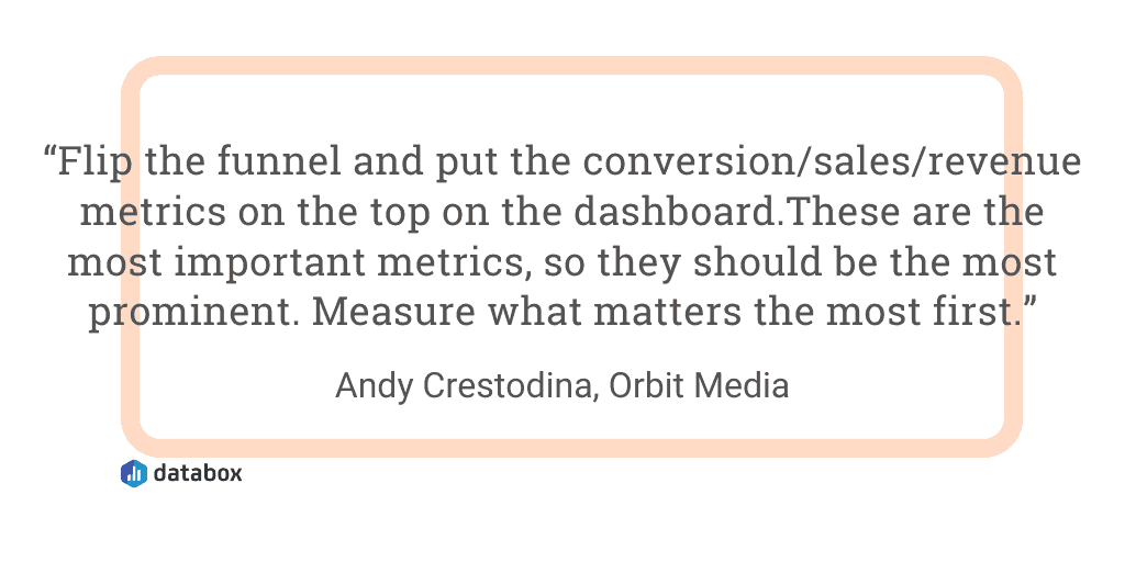
7. Put revenue metrics on the top of your dashboard
“Flip the funnel and put the conversion/sales/revenue metrics on the top on the dashboard,” says Andy Crestodina of Orbit Media. “These are the most important metrics, so they should be the most prominent. But a lot of dashboards put the traffic/engagement/visibility metrics on top. Not ideal. Measure what matters the most first.”
8. Know what you want to achieve
“The best design tip I can provide when creating a better business dashboard is to understand what you are trying to achieve,” says Lisa Chu of Black n Bianco. “It’s crucial to understand what the dashboard will be used for because that will influence the design. Understanding the purpose of the dashboard will help create a hierarchy of designs that needs to be heavily focused on. You want the dashboard to be clean and easily accessible for the important metrics that will be viewed daily. Remember to be consistent with the design, nothing is harder to read than a bunch of random designs mixed in together.”
9. Get buy-in from your team
“Making sure what matters most is at the top of your business dashboard,” says Aristide Basque of SH1FT. “We also recommend speaking with your team about what should be there and what they believe matters most. At the end, it’s the dashboard of your company, not just you.”
Jitendra Vaswani of BloggersIdeas.com adds, “Make your dashboard so your team can get inspiration every day & metrics that matter is in front of your team. It gives your team members the information they need to do their job — and nothing else — so they can focus on their goals and avoid any kind of distractions.”
10. Create multiple dashboards
‘Create multiple dashboards for different functions in your business,” says Brooks Manley of Engenius. “Your CEO will want to look at different metrics than your sales team. Cater each dashboard based on function and interest.”
Anand Sasi of Data Talks adds, “The same data means different things to people at different levels within an enterprise. The ability to present the exact insight each user type requires is what sets apart a really good dashboard design from an average one. In Machine Talkz, our asset consolidation platform serving the heavy machinery industry, the C-level executives are interested in the financial implications of the parameters we monitor, the mid-level managers are interested in what it means to the SLA adherence, operational teams are interested in how the assets perform, and the maintenance teams are interested in the raw data itself. We design separate dashboards using the same data(or it’s subsets) for each user type and then provide the ability to drill down to the next levels if a user chooses.”
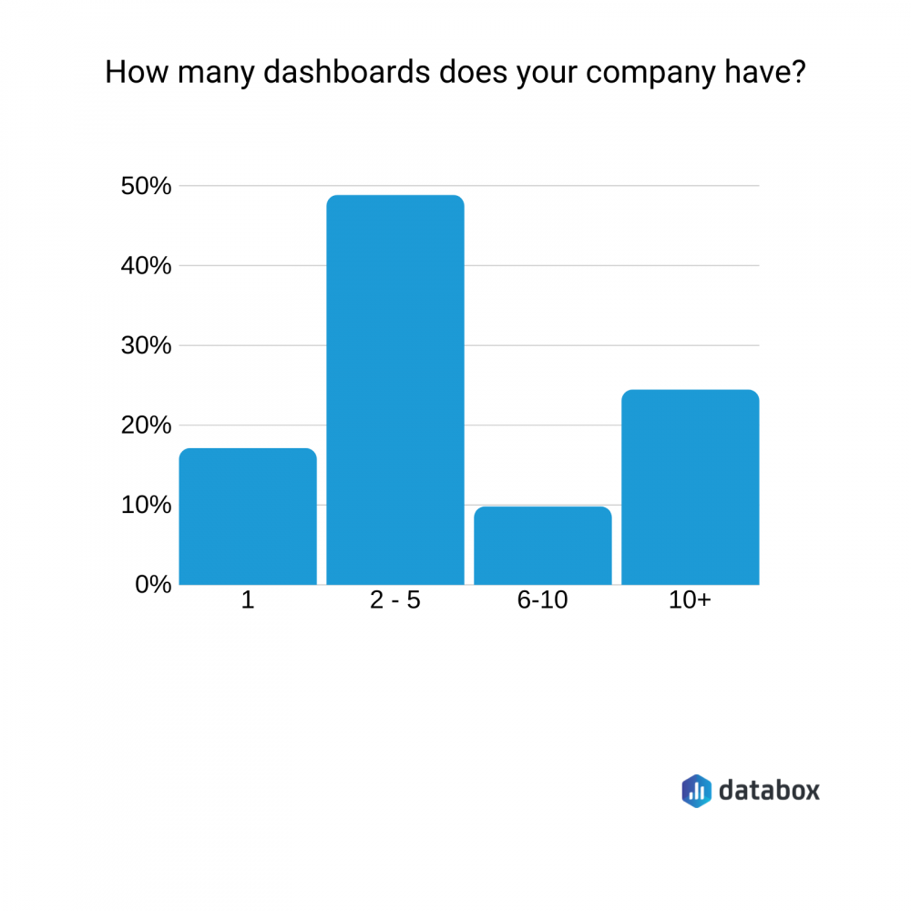
In fact, nearly 50% of the companies we surveyed have between 2-5 active dashboards.
11. Use simple visuals
“In order to provide a fuller picture, some dashboard designers add many details to the business dashboard,” says Mehul Rajput of Mindinventory. “But, cognitive psychology says that the human brain can grasp around 5-7 images at one time. So, as a designer, you should limit adding visualizations and follow the rules of “Less is More” while designing a small business dashboard.”
Richard Fischer of Shufti Pro adds, Classify the right metrics you want to report on. When it comes to design, less is always more so choosing a simple font, and a handful of colors to focus is the best strategy.”
12. Answer questions with your dashboard
Kenny Trinh of Netbooknews adds, “Dashboard designs should change based on the use cases of the dashboard. A great dashboard should be able to help answer the questions:
- What is going well?
- What is going poorly?
- What can I do to affect these numbers?
- What actions are needed?”
Jasmine Hippe of Augurian adds, “Instead of using titles to label each visual, use questions. Each data visualization in your small business dashboard software should answer a question that the user might have.”
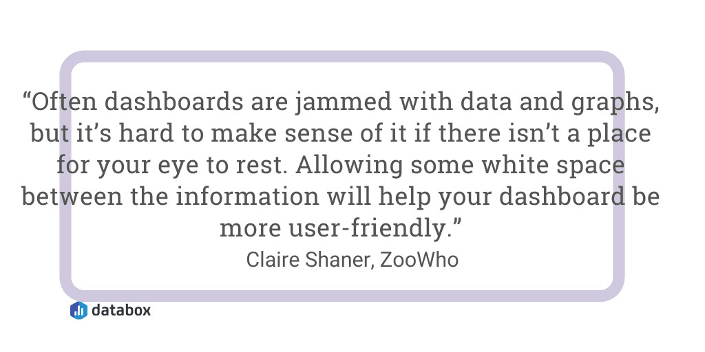
13. Utilize white space
“Don’t forget the white space,” says Claire Shaner of ZooWho. “Often dashboards are jammed with data and graphs, but it’s hard to make sense of it if there isn’t a place for your eye to rest. Allowing some white space between the information will help your dashboard be more user-friendly.”
14. Create a mockup first
Damien Martin of Shufti Pro says, “Clearly map out which information needs to go on, and then make it visually appealing.
So, data is displayed selectively, highlighting only key targets for the week or month. Our time frames are consistent, with consistent display icons and color schemes that help team members track goals visually.”
15. Present the data correctly
“Make sure that you present your data and analysis correctly,” says Bennett Lauber of The Usability People. “Don’t use categorical data as integers. Don’t use ranking data as integers. Don’t use color as the sole indicator of a status (an accessibility and Section 508 compliance issue). With ranking data, say you’re looking at the top 10 cities for horrible commute traffic. The distance between #1 and #2 is not the same as the difference between #3 and #4. Way too many dashboards make this mistake. I’d also recommend that your viewers read the Stephen Few book, Information Dashboard Design: The Effective Visual Communication of Data.”
16. Try color-coding
“Use colors to indicate increase or decreases,” says Brendan Hufford of Clique Studios. “An overall picture can be much more easily gleaned when we can visually see a trend.”
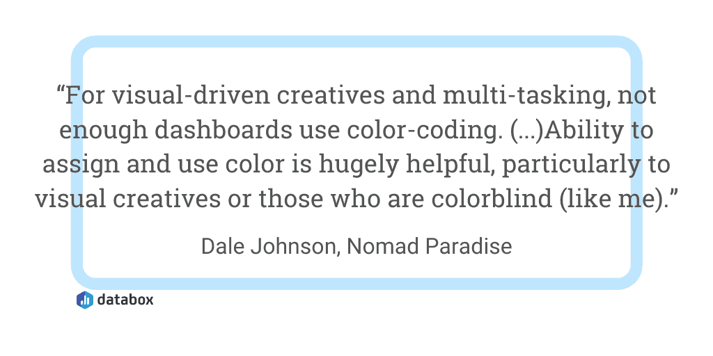
Dale Johnson of Nomad Paradise adds, “For visual-driven creatives and multi-tasking, not enough dashboards use color-coding. The science behind color theory tells us we respond to colors in certain ways (there’s a reason yellow button/black text is a thing). Brand cohesion is important, yes. But the ability to assign and use color is hugely helpful, particularly to visual creatives or those who are colorblind (like me).”
17. Display information through both tables and graphs
“Use a mix of tables and graphs depending on the purpose of the information,” says Bruce Clark of Northeastern University. “If you want people to compare numbers broadly, graphs tend to work better. If you want people to monitor or extract specific numbers, use tables.”
18. Segment metrics
“It seems obvious but is majorly important,” says Ben Johnston of Sagefrog Marketing Group. “Make sure that you’re putting the metrics that matter most front and center and segmenting them; however, a client (or your higher-ups) asks for them. Make sure that the metrics they won’t stop bugging you about are front and center and represented in a way that speaks to them and what they expect from you, or your departments, work.”
19. Use emojis to label your dashboards
If you are creating lots of dashboards in Google Sheets, it can be hard to organize and see all of your tabs.
“Our marketing dashboard is on Google Sheets,” says Jeremy Cross of Team Building San Francisco. “When we first set this document up, we used labeled tags like SEO, Goals, and Link Building. As we added more tabs, the screen started to fill up, and our labels were becoming harder to read. We switched from word-based labels to emoji-based labels, and it works much better. Now, each tab is a single character with an emoji that represents what it is. For example, we use a target emoji for goals.”
20. Follow data research-based practices
“Follow research-based practices for effective data communication,” says Jenny Rankin of Fulbright Specialist Program for the U.S. Department of State (and also Mensa). “Over 300 studies showing us what works best have been summarized as the Over-the-Counter Data (OTCD) Standards. Essentially, the standards help you make any data “over-the-counter,” meaning people can easily understand and use the data without an expert standing there to explain it all to them.”
21. Examine data and its usability
“Strive to improve the relationship between the data and its usability,” says Laura Gerber of Petro-Logistics. ‘We provide detailed information about global oil and gas-related inventories and trade flows. We monitor multiple sources from dozens of countries. As you can imagine, the data is in-depth and dense. The question is, how can we turn these various data streams into actionable insights for the typical business analyst and fund manager that comes to us? Our user dashboard is like a funnel, vast data points enter at the top, then through refinements to the dashboard, a user can easily filter down to what they need to know. We always remember that users have different technical abilities, so we simplify wherever we can.”
In sum, a great dashboard should be easy to read and see how your metrics are trending on a day-to-day or week-to-week basis. These 21 design tips can help you get your point across faster.
Ready to build your own business dashboard? Monitor and report performance from all of the tools your business is using in one place with our business KPI dashboards.