Table of contents
Hello everyone. Welcome to another episode of Data Snacks.
Today, we’re going to talk about Landing Pages, and more specifically, how to properly track how effective your landing page and the CTAs are at converting visitors to contacts.
In this episode of Data Snacks, I’m going to show you how to:
- Track and visualize relevant Landing Page metrics
- Interpret the data you have gathered
- Apply useful tips to make your landing pages are more engaging and better at converting
Below, you can view the full episode or keep reading for a fully transcribed version of the episode, complete with relevant screenshots.
Let’s start!
As you know, a lot of work goes into planning a marketing campaign, creating a landing page for a campaign offer, and executing the campaign. Tracking conversion metrics for landing pages is an essential step in meeting your marketing goals.
Decide What You Want to Track
Here’s what I want to see––so in order to get insights into my landing pages, I want to track the following:
- New Contacts by Landing Page to see how successful each of my landing pages has been in creating new contacts
- Average Time on Page by Landing Page to see how long people stay.
- CTA Views by Landing Page so that we can see if our chosen calls to action are visible and engaging [and finally]
- Views by landing page to see if the people who get to the page decide to become new contacts.
In Databox, New Contacts by Landing Page and CTA Views by Landing Page metrics are already created and ready to use for users who are on a Paid or above plan.
Time to Build a Dashboard
From the Databox Designer, I’m going to the Metrics Library, and I will select HubSpot Marketing as my data source and, from there, drag and drop the metrics I want to see.
For New Contacts by Landing Page, I will choose the table visualization so that I can easily get the order to be either ascending or descending and have a clear idea of which landing pages are performing well when it comes to bringing in new contacts. Next, let’s go with a pie chart as it can highlight better the differences between Avg. Time on Page by Landing Page, and you can see which ones are keeping the visitors engaged. For CTA Rate by Landing Page, I will go with a bar chart, and Views by Landing Page can stay in the default table visualization.
Now that the dashboard is ready, let’s analyze. There are several things that I want to look at here – first, I set the same Date Range in all the metrics so that I can compare the data accurately. Currently, it is – Last Month, you can adjust this depending on your marketing campaigns.
Let’s first look at the New Contacts by Landing Page. Once we see which are the high-performing ones, we can compare the content and the CTAs to get insight into what works better when it comes to getting new contacts. Next, compare individual CTAs to look for commonalities amongst the high performers—and under-performers—and use those insights to further optimize future calls-to-action. Here, CTA Views by Landing Page can help so that you know which ones have captured the attention of your visitors.
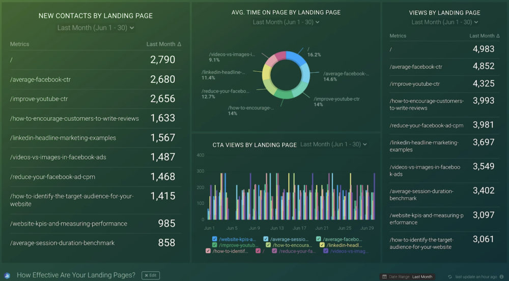
On this dashboard, I also want to see how long a visitor stays on average on my landing page – according to Contentsquare’s 2020 Digital Experience Benchmark report of 7 billion user sessions, the Average Time on Page across industries is 62 seconds. So that can give you a starting point. The calculation here is simple if they stay long enough to click on that CTA and turn into new contacts, your landing pages are doing their jobs.
Finally, there is Views per Landing Page, and this is a metric that can tell us a lot about which landing pages attract visitors. However, if they are entirely different than the ones creating new contacts, you need to adjust your content. Ideally, we want each viewer to become a contact, but a high percentage will do just fine.
Discover More Insights
There are certainly more insights you can pull from these metric visualizations––these examples were just a few to get you started.
Knowing how successful each landing page is will help you understand what creates new contacts for your business. That way, you can improve other pages to meet your pre-set goals when it comes to landing page performance.
Want our help setting this report up? Start a chat with our dashboard experts, and they’ll help build this report for you.
If you haven’t already, just create your free Databox account and reach out to our team either via chat or email.
See you next time.