Table of contents
Hello everyone. Welcome to another episode of Data Snacks. I’m Monja, a product marketer here at Databox.
Today, we’re going to talk about analyzing visitor engagement using Google Analytics metrics which helps us better understand the overall quality of our content, whether we’re attracting the right type of traffic, and more.
Specifically, we will assess how much time visitors spend on our website pages, or Average Time on Page and Average Dwell Time, or how much time they spend when they come from a Google search.

Let’s say we notice a drop in either time on page or dwell time. Is this an anomaly or a trend over time? Either way, why is this happening, and what can we do about it?
In this episode of Data Snacks, I’m going to show you how to:
- Visualize a variety of visitor engagement metrics, including Time on Page and Dwell Time
- Take a look at both Time on Page and Dwell Time on a longer time scale
- Look at load times for the most popular pages to see if that could be causing a reduction in Time on Page or Dwell Time
Below, you can view the full episode or keep reading for a fully transcribed version of the episode, complete with relevant screenshots.
Let’s start!
Start by Tracking the Right Metrics
Here’s what I want to see––I want to track both Average Time on Page and Average Dwell Time (in the aggregate) in the context of other website performance metrics to pinpoint areas where we might improve. Google Analytics is the perfect data source for this.
This is easy. From the Databox Designer, I’m going to the Metrics Library and selecting Google Analytics as the data source, then search on “audience” and drag and drop the Audience Overview advanced table metric to my data board. Next, I will click on the data block I just created and make a couple of adjustments to the table.
I’m going to move the Avg Time on Page metric to the bottom and create a new row, in which I’ll select the Avg Dwell Time Aggregate metric that I created before. I’m also going to check the date range and set it to Month to Date to see what’s going on recently.
What Story Do Our Website Metrics Tell
At a glance, I can see that while some of the website performance metrics are doing well, like Users, Sessions, and Page Views, others, like Session Duration and Bounce Rate, are not doing so well. This means that while Outcome Metrics like Sessions might be growing nicely, Quality Metrics, like time on page, might not be doing so well, signaling content quality issues, audience targeting issues, or more.

Since Average Time on Page and Dwell Time are up a little, I want to look at these numbers a little more closely in light of the reduced session duration and increased bounce rate.
So, I add bar charts for Average Time on Page and Average Dwell Time over the past 12 months. The Time on Page metric shows a steady increase over time, especially compared to the previous year, while the Dwell Time metric is more inconsistent. What’s the difference? We know that Dwell Time is specific to organic search, so something is going on with the pages that people most frequently visit from Google.
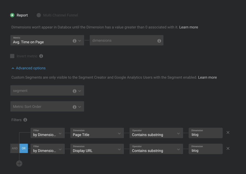
To answer this “why” question more directly, let’s dive into Databox custom metrics to find some answers. In this final table, we’ve queried Google Analytics data to find the average page load speeds for our most popular pages, which receive most of their traffic from Google.
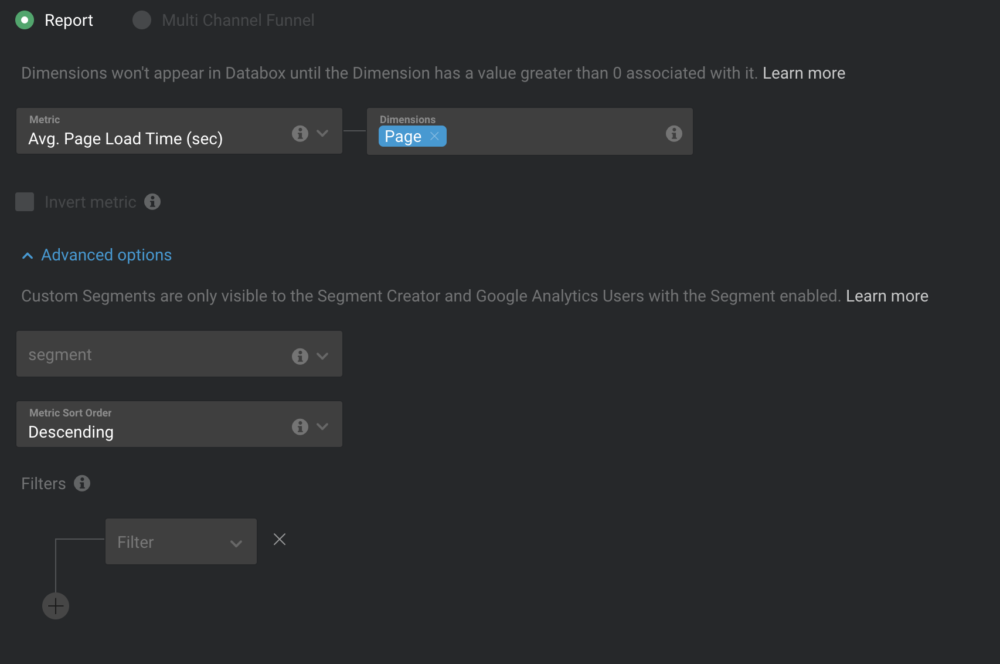
As you can see, some of our most popular pages have recently slowed down considerably in page load speed, which could be causing visitors to bounce and return to Google for the next search result. We know that page speed is one of the most common factors in dwell time, so our immediate priority is to study and fix these pages. There could be other factors as well, such as relevance or content quality, but these pages have performed well in the past, so we think it’s more of a technical issue, like a large image or added code slowing them down.
Additional Insights on Avg Time on Page and Avg Dwell Time
There are certainly more insights you can pull from this visualization––these examples were just a few to get you started.
At a high level, tracking your Avg Time on Page and Avg Dwell Time are good diagnostics for website engagement and page speed. Sometimes web analytics dashboards help you optimize, not just assess your overall performance.
Want help creating this report? Start a chat with one of our dashboard experts, and they’ll help build this report for you for free.
If you haven’t already, just create your free Databox account and reach out to our team either via chat or email.
See you next time.