Table of contents
Changing a logotype isn’t an easy job.
And while a logo doesn’t usually garner much attention on its own, all of that changes as soon as any company updates or changes its logo.
Then, all of a sudden, the logo is thrust back into the spotlight. Sometimes, those changes aren’t always received warmly, as in the case of of Slack’s recent logo change.
So, going into our logo redesign, we approached it more as an evolution of the company and brand, not a revolution.
So, why a change?
Logos are important to your brand’s identity. They give consumers a symbol to be recognized and attached to your brand without even the need to know its name.
Source
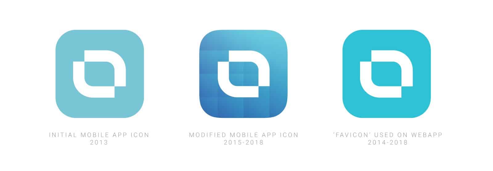
Although we liked our logo because of its great simplicity, our symbol didn’t have any special meaning.
Also, over time we have used many different variations (colorwise) and haven’t been as consistent as we should be.
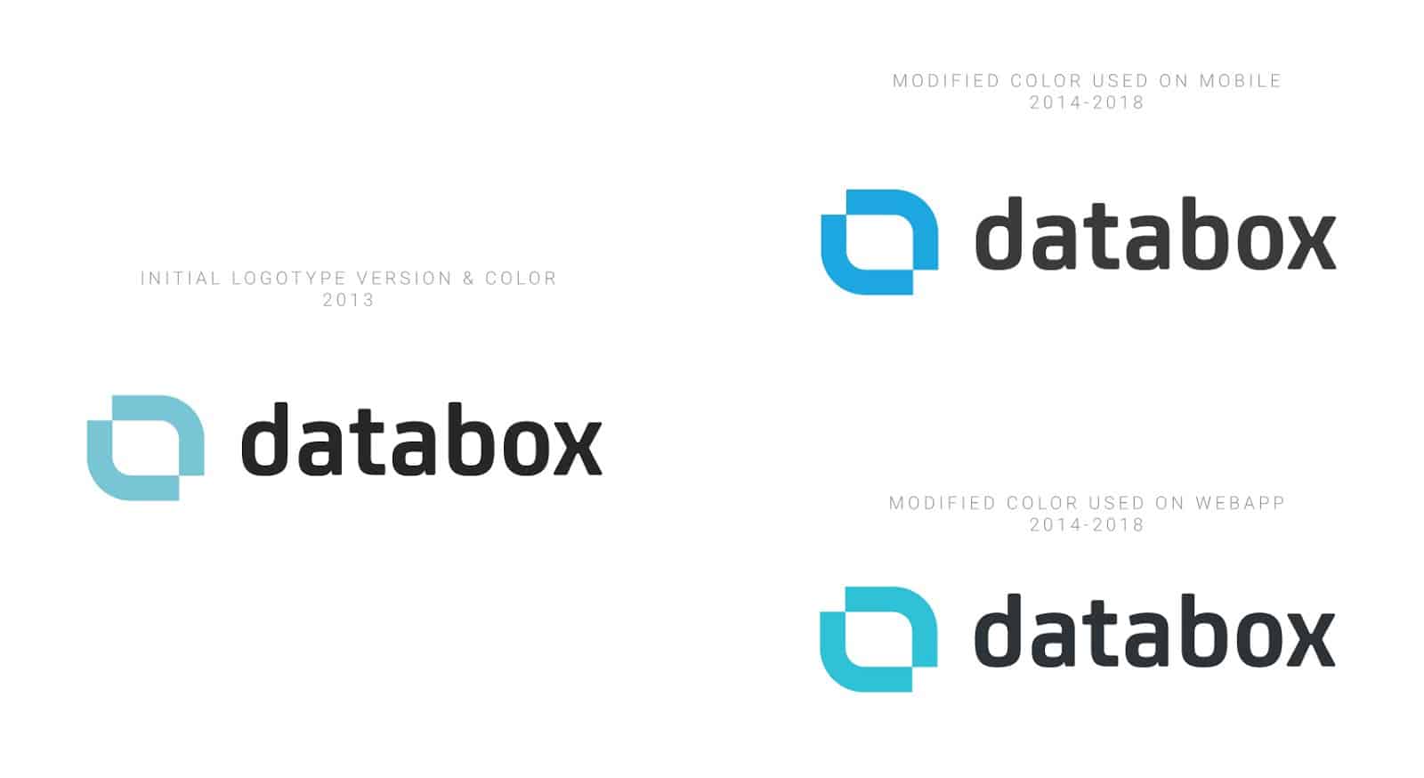
As Databox has grown and evolved, the logo begun to feel flat, blunt, and not to be toyed with. It was distinctive, but not a reflection of what we do, nor where we want to head.
Some thoughts behind the process
We wanted to achieve 2 things with the new logo:
- Add a subtle hint at the essence of the business, and
- Keep the simplicity
So, we started exploring new options.
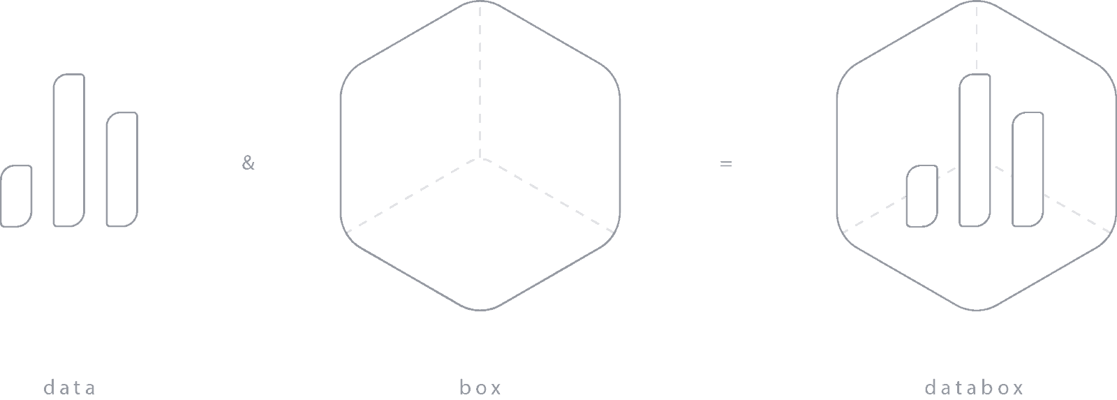
Two metaphors we wanted to “cover” with the new logo were: data and box. (Did you expect something else?)
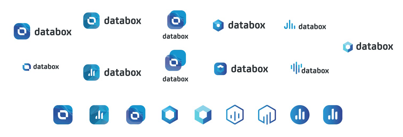
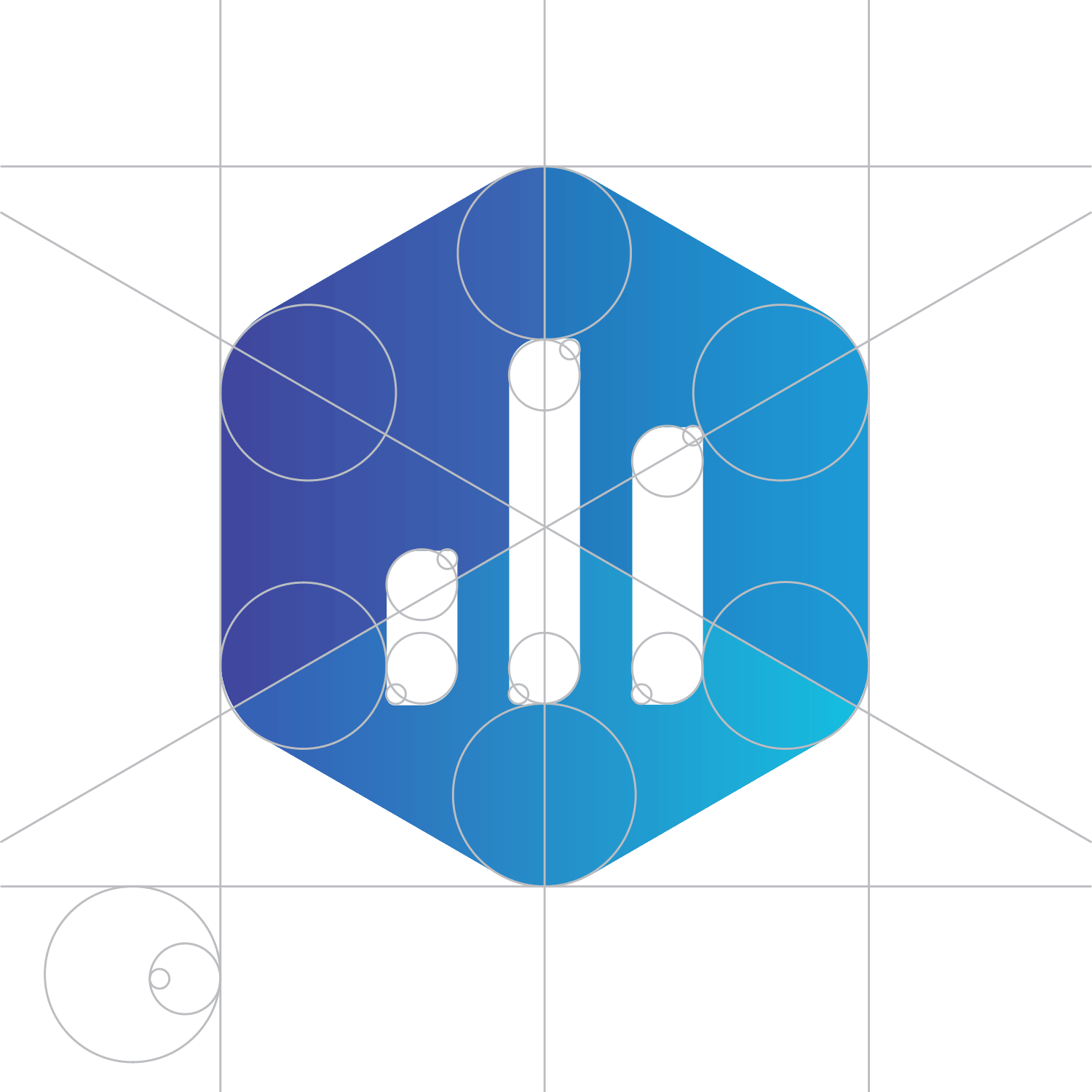
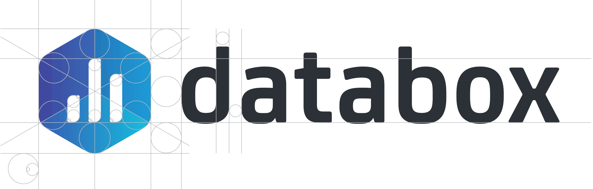
We started with several different concepts, but very quickly our favorite became the hexagon shape with rounded corners and gradients that give the symbol a 3-dimensional look and feel of a box.
On the hexagon shape, there are three bars, a well-known metaphor for a chart and the common graphical representation of data.
So, here is the data and the box.
Colors
We redefined our colors with the addition of purple to move us a little bit away from the cliche blue scheme.
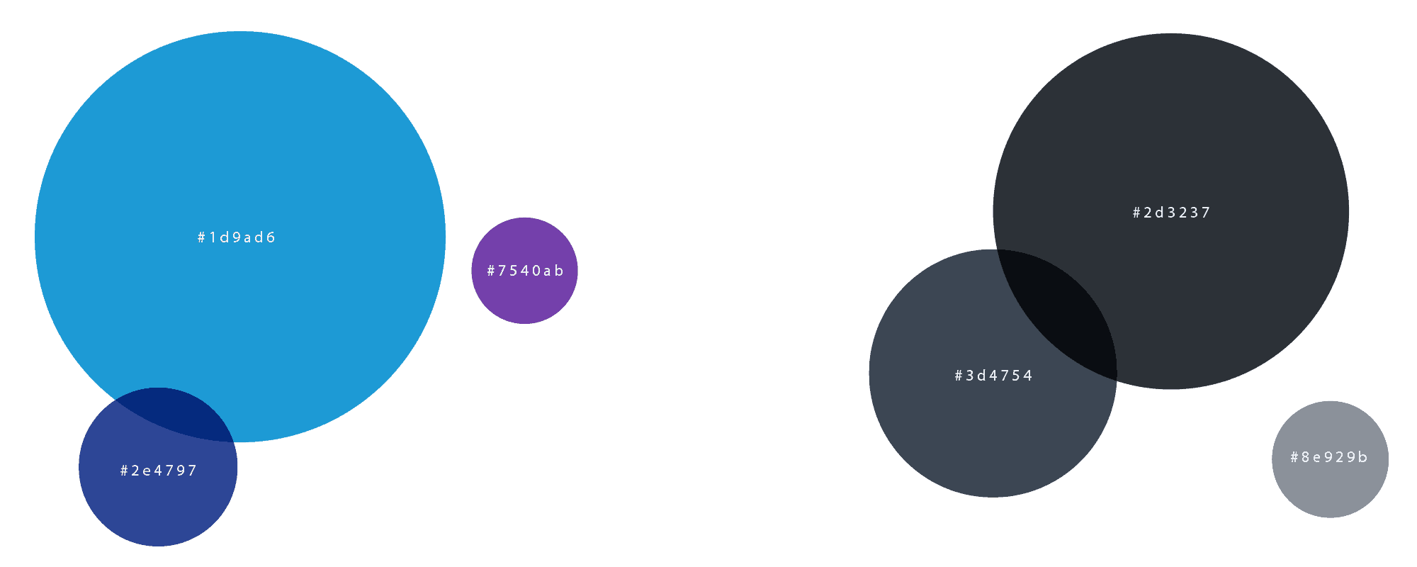
We played with different gradients a lot. Gradients are always delicate when your goal is to craft a simple and minimalistic logo. Clean and simple design is at the core of Databox and our product.
So, the final logo looks like this:
And together with the typeface (we decided to stick with the current type — a modified version of Neo Sans Pro):
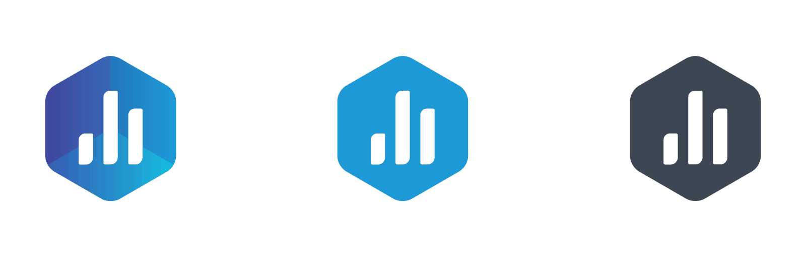
The usage of gradients adds some complexity to the logotype.
When using such a symbol in small size, it can compromise visibility. That’s why we also developed an additional single-color version of the symbol as an alternative. The simple versions will be used in smaller size elements, like our favicon.
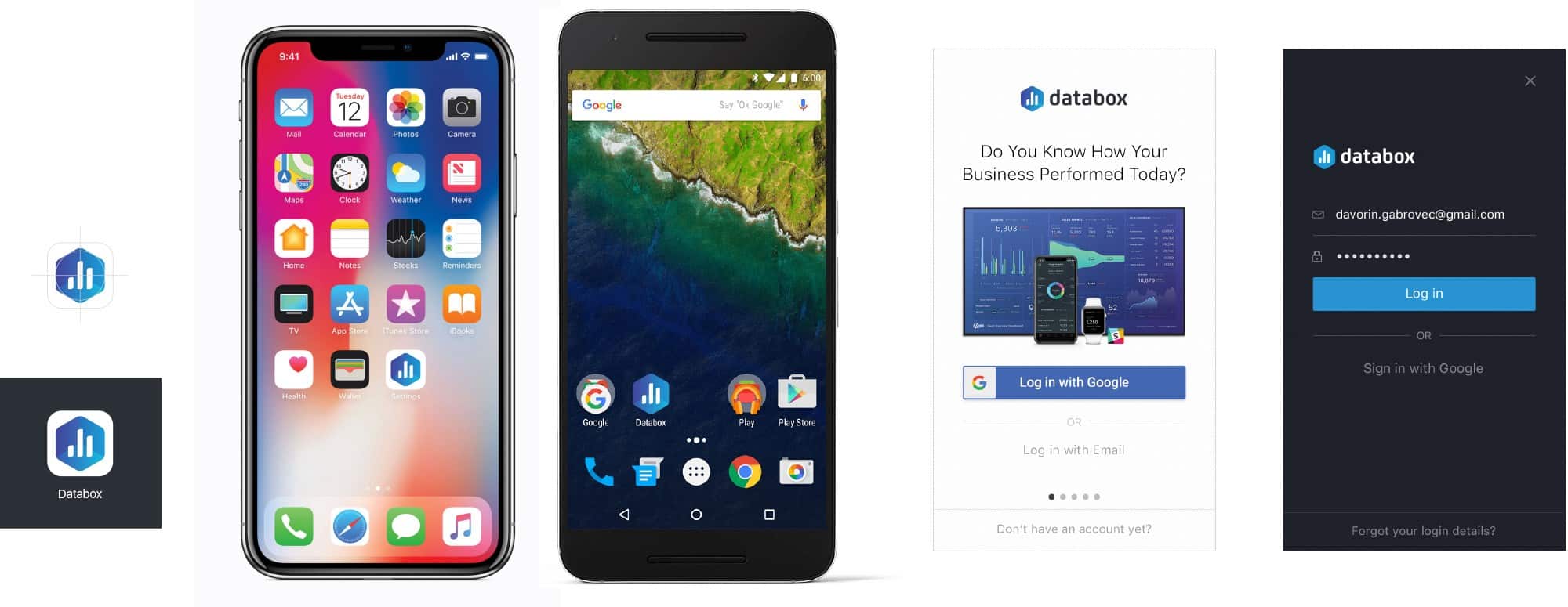
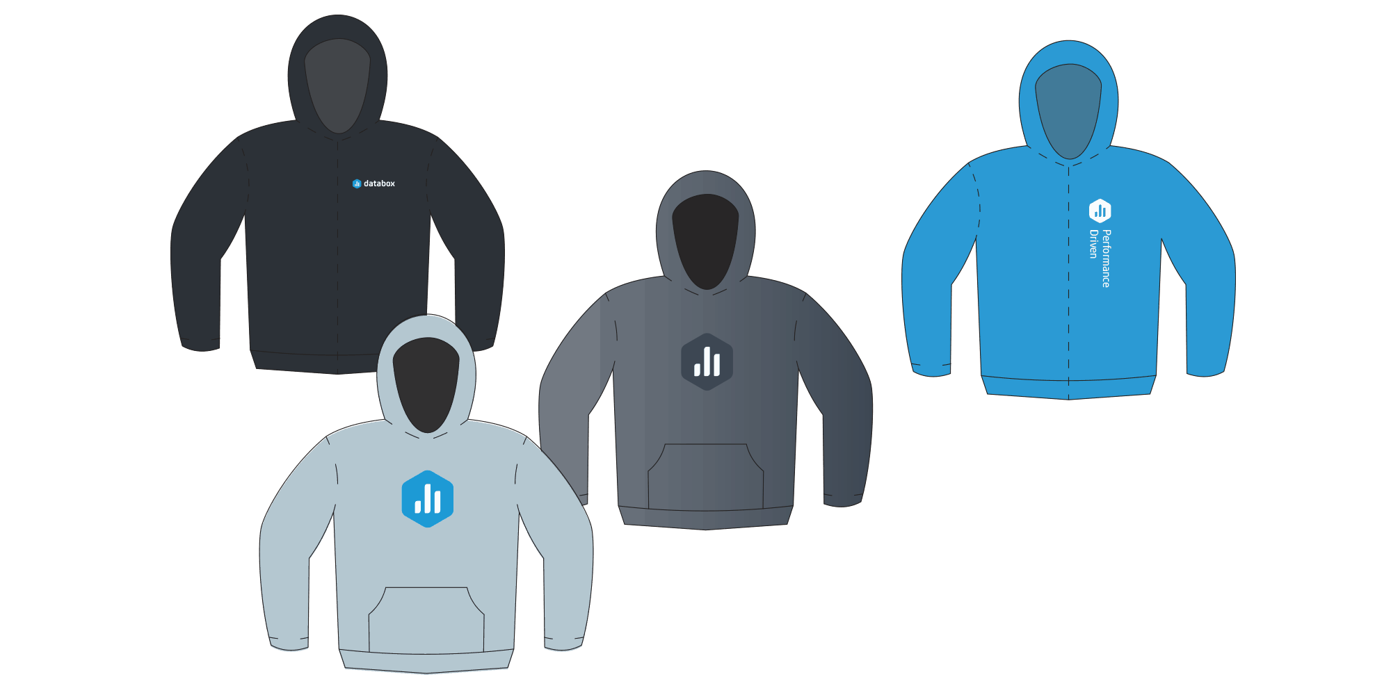
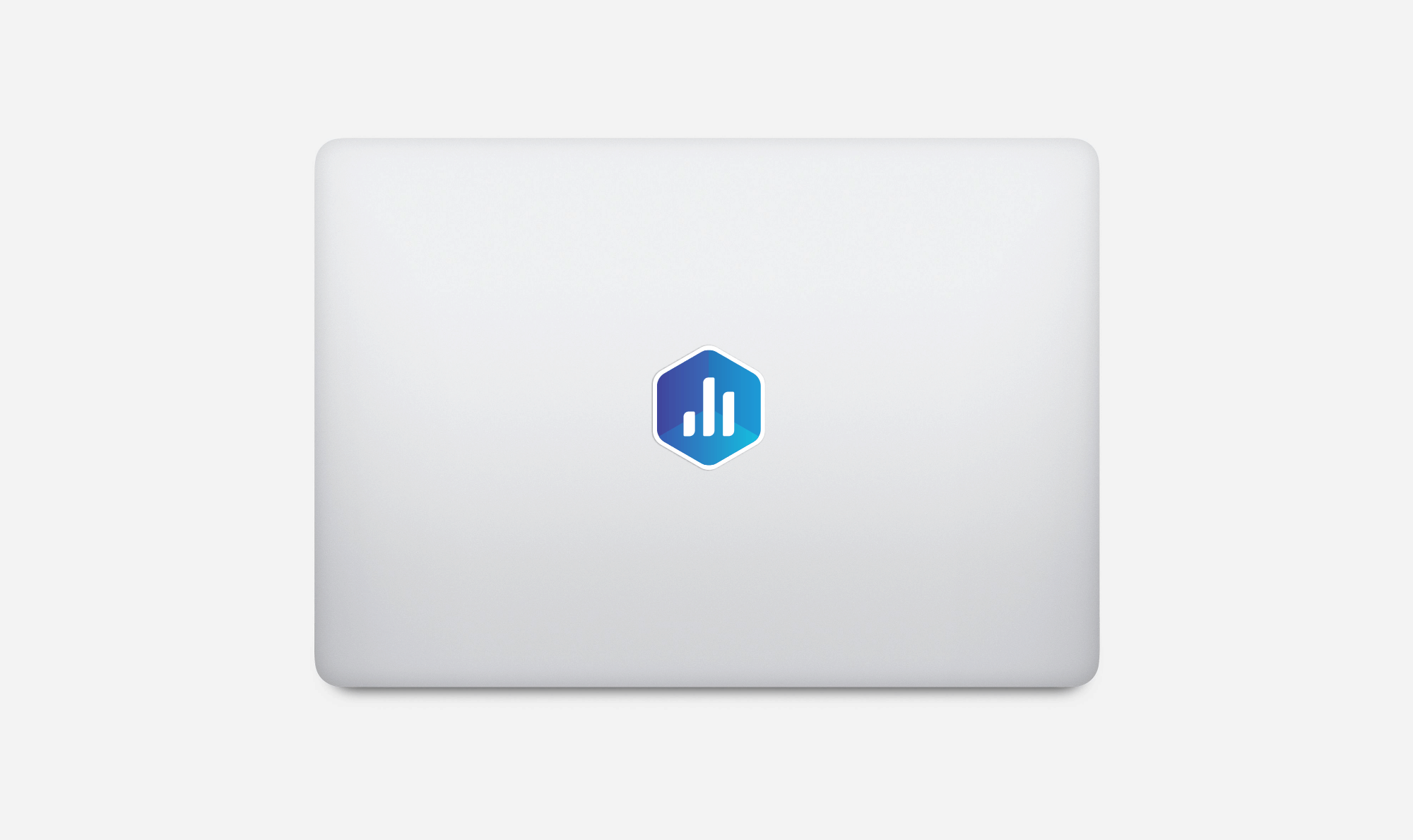
New Logo in the Wild…
Next up, we had to change our logo in about a million places. 🙂 But, since we were in the process of improving our navigation and the consistency of our entire app, we figured now was as good a time as any.
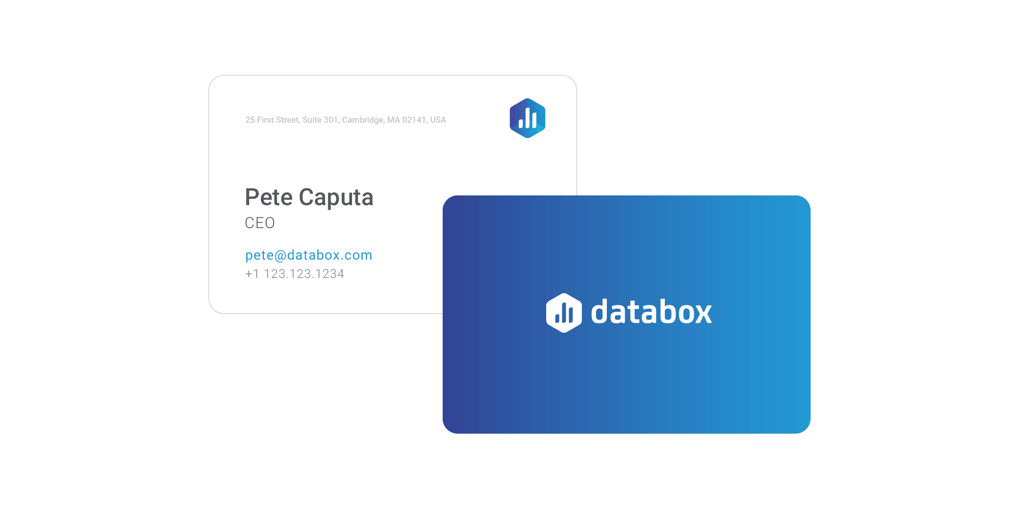
And the final result, ladies and gentlemen:

The Databox Logo & Brand Guidelines…
Databox Brand Guidelines (PDF)
Databox Logo (PDF)
What do you think of the new logo and our process for creating it?