Uses one-click integrations:
If you don't use Adobe Analytics, you can pull data from any of our 130+ one-click, native integrations or from spreadsheets, databases and other APIs.
Try this dashboard for freeWhat you’ll learn from this Adobe Analytics Store Overview Dashboard Template:
By connecting your Adobe Analytics account, you’ll be able to measure and report on the following:
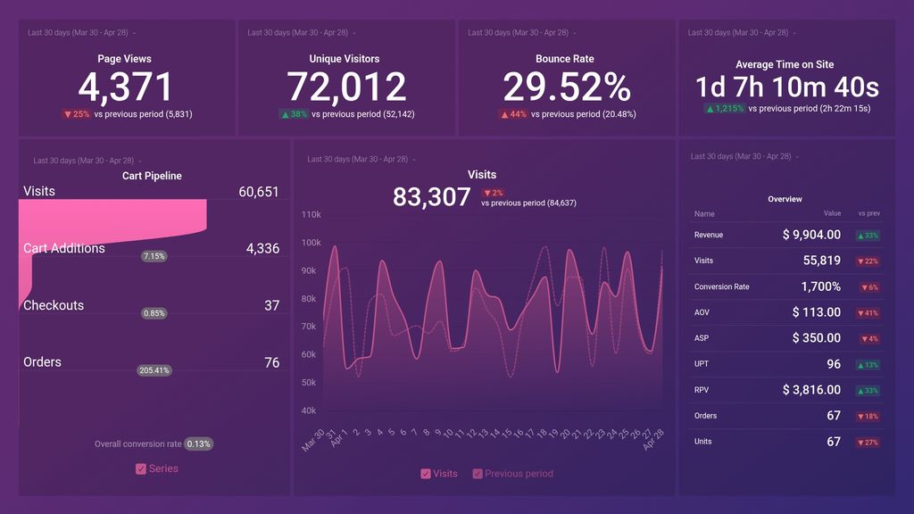
- How do website visits influence sales? Track the volume of website traffic you’re generating in any given time period and compare that to the number of sales you’ve generated during that time. Use this information to measure the effect that marketing has on sales.
- What does our sales funnel look like? Measure your store’s pipeline and track visits, cart additions, checkouts, and orders all in one visualization. Use this to monitor whether you’re generating enough to demand to hit your sales goals.
- How are our unit economics? Monitor metrics like average order value, average sales price, units per transaction, revenue per visitor, and more, to better understand the unit economics of your online store at-a-glance.
- How many unique visitors do we generate to our website? Track the number of unique visitors your website is generating month-over-month to determine whether your marketing efforts are reaching new audiences effectively.
- How long do people spend on our website? Monitor your average time on site and better understand the level of engagement needed in order to get website visitors closer to a sale. Compare previous periods to see if your website is doing a better job of engaging visitors.
Pull additional data using our integration with Adobe Analytics
What else can you track and visualize with our integration with Adobe Analytics?
- Visits, pageviews, and average time on site
- Cart pipeline
- Checkouts and orders
- Average order value (AOV)
- Daily units per transaction
- Daily revenue per visitor
- Top products by revenue, and more
There are many different metrics and metric combinations you can track using Adobe Analytics. And in Databox, you can quickly visualize 100s of Adobe Analytics metrics in a variety of different ways alongside all the important metrics from other data sources you’re using.
Read More about Databox’s Adobe Analytics integration to learn more.
Explore more Adobe Analytics dashboards.
-
Average Order Value
The Average Order Value (AOV) is a metric that calculates the average dollar amount spent by a customer in a single transaction or order on a website or e-commerce platform.
-
Average Selling Price
The Average Selling Price metric represents the average price at which a product or service is sold over a defined period of time. It is calculated by dividing the total revenue generated by the number of units sold.
-
Average Time on Site
The Average Time on Site metric in AdobeAnalytics measures the average duration of time that visitors spend on your website or mobile app over a defined period of time.
-
Bounce Rate
Bounce Rate is a website metric that measures the percentage of visitors who leave or "bounce" from a webpage without interacting or deepening their engagement.
-
Add to Cart
The Add to Cart metric measures the number of times a user adds a product to their virtual shopping cart on an e-commerce website.
-
Checkouts
The Checkouts metric in Adobe Analytics measures the number of times that customers initiated the checkout process on your website or app, providing insights into purchase intent and checkout funnel performance.
-
Conversion Rate
The Conversion Rate metric measures the percentage of visitors who complete a desired action, such as making a purchase or filling out a form, out of all the visitors who interact with a website or digital channel.
-
Orders
The Orders metric in Adobe Analytics measures the total number of completed purchases or orders made on your website or app during a specified time period.
-
Page Views
Page Views is a web traffic metric that measures the number of times a web page has been viewed by a visitor on a website. It counts every time a page is loaded or refreshed, giving insight into the popularity of the content on a site.
-
Revenue
Revenue is a metric that measures the total income generated by a business through sales of products or services, calculated before deducting any expenses. It is a key indicator of a company's financial performance and growth.
-
Revenue per Visitor
Revenue per Visitor (RPV) is a metric that measures the average amount of revenue generated per visitor to a website or digital platform. It is calculated by dividing the total revenue generated by the total number of visitors. This metric helps to track the effectiveness of marketing campaigns and website performance.
-
Units
The Units metric in AdobeAnalytics represents the total quantity of items or products sold, viewed, downloaded, or otherwise tracked within a specific time period. This metric helps measure the success and impact of marketing campaigns and product offerings.
-
Units per Transaction
Units per Transaction is a metric that measures the average number of products or items sold in each transaction, revealing the effectiveness of your sales strategy in promoting multiple items to customers.
-
Unique Visitors
The Unique Visitors metric represents the number of distinct individuals who have visited a website or app during a specific time period, regardless of how many times they visited.
-
Visits
Visits metric represents the number of sessions or visits to your website over a specified period of time. It includes both new and returning visitors and is a key performance indicator for website traffic and engagement.
