Table of contents
The HubSpot CMS has come a long way since I started selling it in 2007.
Specifically, the CMS Editor provides marketers the ability to modify text, images and even design elements of their websites in real-time with no coding skills required. Back in the day, you had to choose from one of five standardized templates where the layout was locked down.
With the latest version of the HubSpot CMS, though, you have ultimate flexibility.
As a result, you no longer need to go through a long, exhaustive design and build process, nor will you need to wait on a web development team for every little change you want to make. The CMS means “marketing” freedom!
And with HubSpot’s CMS, there is even a Template Marketplace where you can instantly download pre-made templates, many of them created by agencies that specialize in HubSpot site development.
But, “buyer beware” when purchasing a template or hiring a developer to build your site on the HubSpot CMS.
“A good portion of our work is fixing the mistakes of other developers and poorly designed templates,” says Joe Jerome, President of Brand Builder Solutions, an agency focused exclusively on helping other companies and agencies launch sites on the HubSpot CMS.
“Many of the HubSpot CMS templates are only a slight improvement over raw HTML, CSS and JavaScript code. Sure, they look amazing in the marketplace, and to an untrained eye, they might even look like they can be easily edited once you get them in your HubSpot portal. But under the surface, some templates are full of dependencies that will break the entire design if you go beyond minor edits.” added Jerome.
HubSpot CMS templates are like icebergs and you’re the captain of a ship — you have to worry about what’s below the surface.
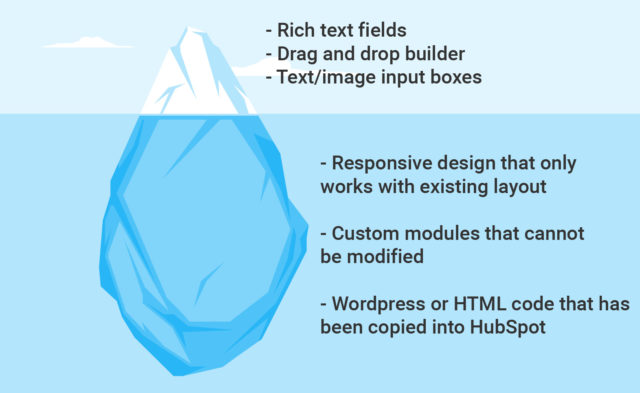
Even with a crappy template, you will probably still be able to modify existing text and images. But, once you need to do something like change the layout of a section or add a new content section to a page, you’ll be forced to turn to a developer.
To help you avoid sinking time and money into the wrong template or developer, we asked the Brand Builder Solutions team to share the most common problems they see and how us non-technical marketers can spot them.
This guide, as well as our previous article on the most cost-effective ways to build on the HubSpot CMS, will help you ask the right questions early in the process, before it’s too late.
Before we get to the common mistakes, here’s…
6 Quick Things You Need To Know about HubSpot’s Template System
1. Page and email layouts are built on sets of blocks called modules. For example, think of a banner image at the top of your website as one module, a navigation menu as a module, a text area as another and a form as one more. When the functions of these blocks or the arrangement of these blocks change for a specific page of your site, you need a new template.
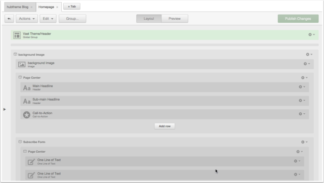
2. The Template Builder within the Design Manager allows you to customize these web page and email templates with a drag and drop interface. It provides a visual structure for the layout of the actual page. (See image below.)
3. The same template can be used for multiple pages. Using a template for multiple pages doesn’t mean that each of those pages will then look the same. In fact, a well-designed template can give you a very different look and feel, using the same modules. Well designed templates and modules give you the built-in flexibility and options to change the way a section looks with a few simple toggles.
4. A website can and usually does use multiple templates, though. If your designer does the job correctly and/or you buy a great template pack, launching and editing a site — where different pages have different layouts — should be very easy.
5. The “Edit Module” tab in the Page Editor allows you to add copy, images and styling to each of the sections or “modules” that you see below. This is where you will edit content.
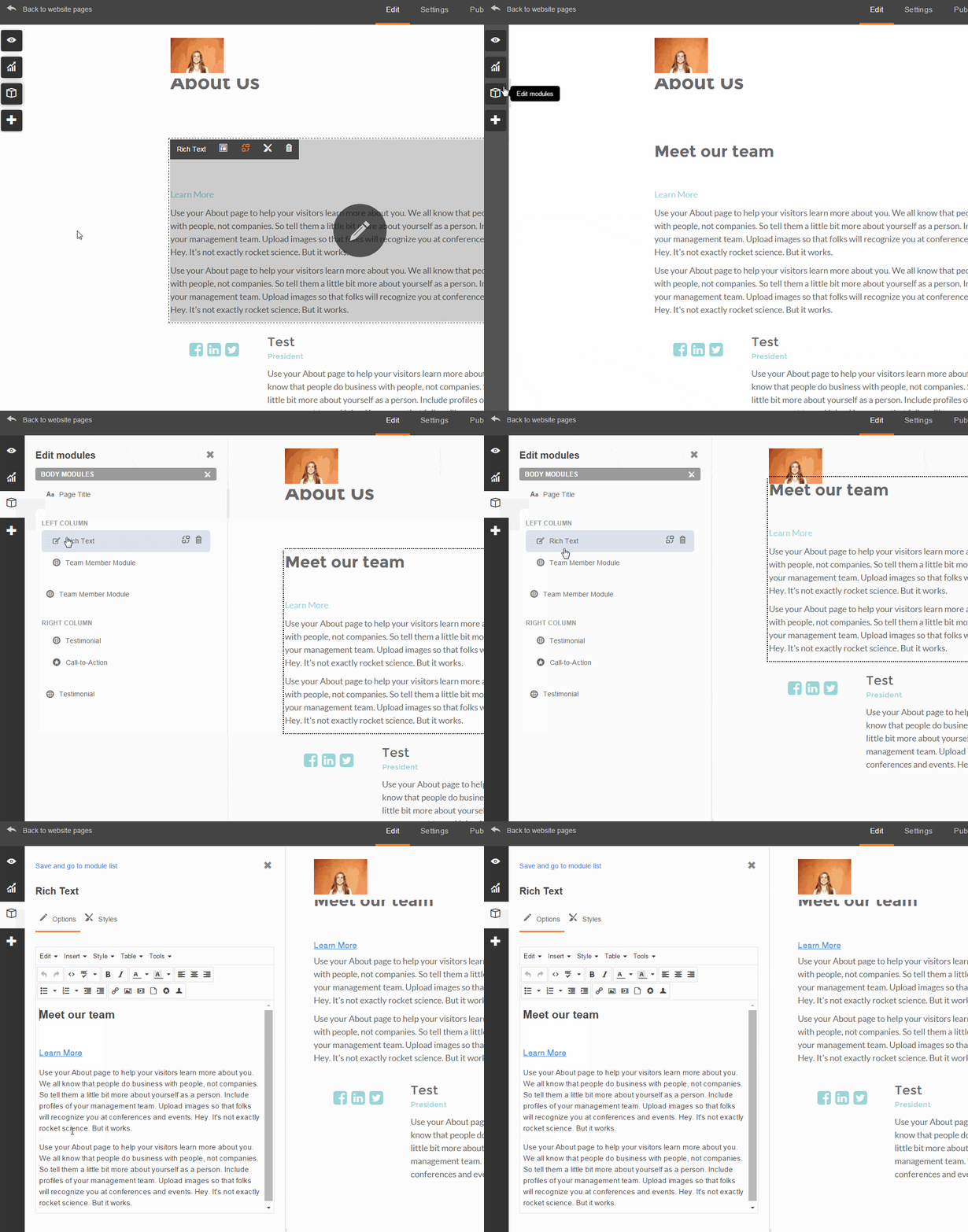
Once you make edits to the actual page itself, the changes are immediately visible for review, and you can update the live version of the page in two clicks. This system allows you to avoid HTML and CSS entirely. In fact, if your site is built correctly with great templates, you should never have to edit HTML or CSS yourself.
6. With the CMS, every page of your site doesn’t need to be custom built by a developer. “Some developers won’t tell you this because they’ll want to build the pages for you. But, the beauty of the CMS is that you can populate your content yourself.”
Now that you have a basic understanding of the system, let’s go through mistakes commonly made by developers that will prevent you from having full control of your site.
Be Wary of These 5 Common CMS Web Designer Mistakes
While there are more than 5 ways a developer can implement a crappy template for your site, we asked Jerome’s team what the most common were.
Here’s what they see most frequently…
1. A Coded File as a Template
If you open up the template editor and see something like the screen grab below, run away screaming.
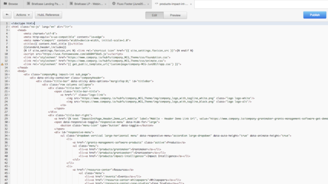
Would you be happy if you had to edit that after paying a developer to build out your site on the CMS?
I wouldn’t be.
While you still may be able to edit content in the page editor with a template like the one above, templates like these prevent non-developers from making key layout changes to your template using the drag-and-drop template editor.
2. One Big Un-Editable Custom Module in the Design Manager
Using the Hubspot Design Manager, you should be able to quickly inspect the layout of a template to see which parts are editable without a developer.
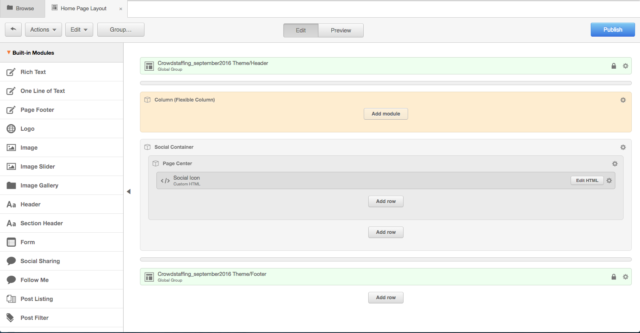
For example, in the screenshotted template above, you can see 4 sections on the website:
- A header bar (green top)
- A flexible column (tan)
- A container for the company’s social media links (grey)
- A footer bar (green bottom)
Here’s an example of a part of a page that was built using that template:

As you probably have gleaned already by comparing the two images, this is not the right template for a page like this. What’s wrong? All the complexity is jammed into section number 2, the flexible column.
Once you open that page in the Page Editor, you’ll see that all of that content is in one rich text field, as shown below:
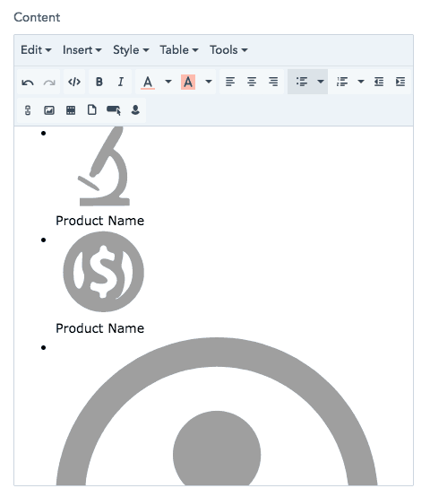
Because of this, editing this content is tricky. In the screen grab above, you can see that each image and text caption is encapsulated within a bulleted list. That is hard to edit because there is relatively complex HTML and CSS written directly into the rich text editor, in order to support the precise arrangement of the image and text.
God forbid you need to eliminate an icon or if you add one or delete one by accident. To change or fix anything, you would need to inspect and change the code.
Want to know what a template should look like for a page like the one above? The template below shows what better discipline in the Design Manager looks like. It has a variety of custom modules that mirror the layout of the whole page, so you can edit the page without even looking at code.
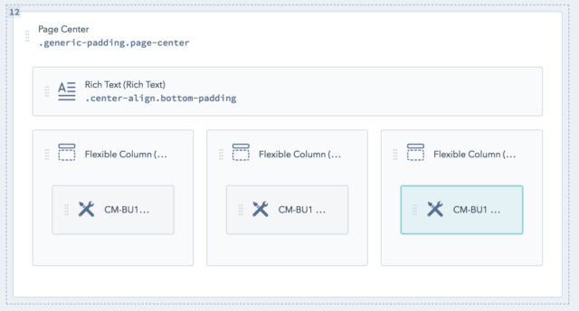
3. Only Allowing Users to Edit Text And Image Content
The third most common issue Brand Builder Solutions sees is almost the extreme opposite of the problem above.
In the template creation process, some developers create an ideal layout for a specific module, and split it up into a series of text and rich-text fields. For pages where the design is complex, this is a good way to make it easy for users to make changes.
But, if not done well, this restricts the user from editing other things like design elements — like colors, for example — of the module.
To determine if this will be an issue, open up the Editor and inspect the editable fields on a given module. If the template has custom modules, you will be able to edit each one individually. They might look like this:
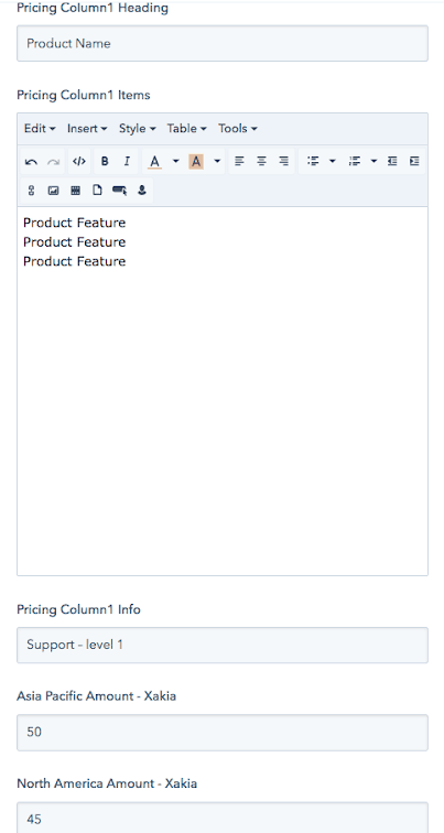
Here is what the actual site looks like:
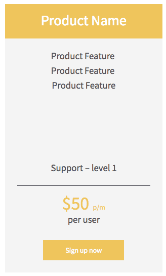
This is one column from a three-column pricing page. As you can see from the screen grabs, you can ONLY edit words in these sections:
- The title of the column
- The feature list
- Helper copy
- Price
With this template, you CAN’T change layout or colors, add new text sections or highlight the ideal pricing plan — without editing a style sheet that’s not easy to find.
Imagine if you changed your brand’s style guide to a slightly different shade of the same color, and you wanted your pricing page to fit with the new styling. You would need to dig into the CSS and learn how to update the color scheme for the entire template.
The right template would allow you to change these things via the Page Editor, like the screenshot below shows:
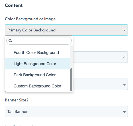
4. Using One Custom Module When It Should Use Multiple
In the example above, where the HTML and CSS required for a pricing page is relatively complicated, using modules with hard-coded fields makes sense. Using this approach, there are some templates that do a great job of breaking out different content into individual editable fields. This makes it more maintainable, and ensures that the website will not lose its formatting when you change one element.
But, for most pages, it’s better to use customizable modules, so that changes to layout can be made more easily.
Below is an example of what happens with an overly-engineered module. Here is what the page looks like.

Unfortunately, this entire section was built with one custom module. The screen grab below is 1/4th of what the module looks like. Specifically, here’s the part of the module that controls the green box on the left.
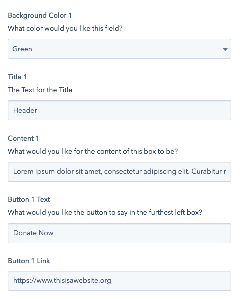
With this template, you are locked into 4 content boxes for this section of the website. If you want to turn that into 3 content boxes, or 5 content boxes, you need to dig into code. Sure, this is a standard format, and you could probably make it work, but if you needed to kill or add a box, you would need to contact a developer.
On the other hand, if the template used one module for each section, you would be able to add or subtract a column within the Design Manager.
5. Using Custom Modules When They Should Use Rich Text Modules
The developer who made the template above actually made two mistakes. It is unnecessary – and also restrictive – to have so many single line text fields.
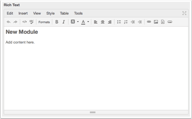
The correct way to code one of these boxes is to use a rich text field, like below, which would allow you to customize the headers, body text, and buttons to any arrangement.
How to Make Sure You’re Getting a High-Quality Website Template
That was a lot of technical detail at once, I’ll admit it.
And admittedly, there is no one correct way to design templates and modules on the HubSpot CMS.
However, if you have seen any of the top 4 things listed, you likely have a problem with where you are getting your templates and who has been making them. It’s not an easy problem to fix. Templates are the foundation of the pages on your site. If the templates don’t work, you’re going to be in a corner…
To avoid potholes like relying on developers for things you should be able to do yourself, try doing this for upcoming projects.
First, discover these risks early in the buying process by asking the template developer to show you examples of work they’ve done over a video chat. Look for the 4 common mistakes listed above.
Second (and if you don’t’ want to get on a call with anyone) download some of the developer’s free templates into your HubSpot portal and inspect them to ensure they give you the right level of flexibility. Many template developers publish free HubSpot Templates in the Marketplace.
By inspecting your developer’s work before you hire them or buy their template, you can ensure you will be able to take advantage of the website editing capabilities the HubSpot CMS provides.
Jerome added, “These aren’t ‘nice to haves’. Buyers have accepted an unacceptable standard by not understanding these issues. Even if you’re not a coder, it’s up to you to know what to expect, set a standard, and find the products and experts who can deliver what you need.”


