Table of contents
Now that Impulse Creative is all aboard the Databox train to way easier data reporting, some Datablocks are rising above others as more helpful for our marketers.
Essentially, Datablocks are prebuilt data visualizations, auto-populated with the metrics you want to track and analyze.
Just integrate your favorite data sources, then drag and drop a premade Datablock into your Databoard. Customize and create an endless combination of side-by-side data comparison dashboards in the same simple way.
It’s no big surprise that Google Analytics is a superstar in the Datablock library with 32 so far. Each one will appeal to you differently depending on your focus and function within your company.
At Impulse Creative, we manage the marketing of clients from every industry under the sun. As a wayfinding agency, our job is to navigate toward each client’s drastically different marketing, sales and financial goals.
Even though our Google Analytics metrics needs vary greatly, eight Datablocks have stood out to our marketing team as absolutely essential for day-to-day testing, reporting and success.
Video Version of This Post

Our Favorite 8 Google Analytics Datablocks
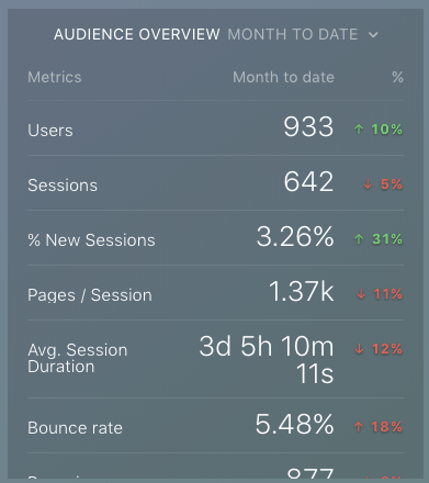
Audience Overview
This Datablock allows you to view the number of users in a set time period, the number of pages they visit per session, how deep they dig into your site, how long they’re staying and how all of that compares to the previous time period. For digital marketers, this high-level info is the meat and potatoes of monitoring website performance.
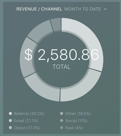
Revenue by Channel
By understanding where revenue is being generated, you can move valuable resources in a very agile way. Track revenue generation across all of your marketing channels. This metric is especially valuable to e-commerce companies and businesses investing in online marketing and tracking the visitor to customer journey.
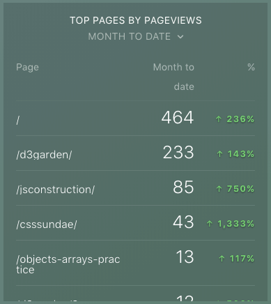
Top Pages by Page View
Understand the user experience of high traffic pages with the top pages by page view Datablock. This list format shows the top 10 pages, page names, page view numbers in the given time frame and the percent change. By focusing on this leaderboard of top pages, you can focus and increase engagement across your whole site by further optimizing these pages and continue to optimize other pages based on the fresh insights.
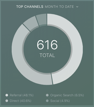
Top Channels
This pie-chart visualization and percentage breakdown show where your user sessions are coming from, in the language that’s most helpful to marketers: direct traffic, social, organic searches, email, referral, other and more. This provides a visual way to see what’s working best in whatever time frame you need to analyze.
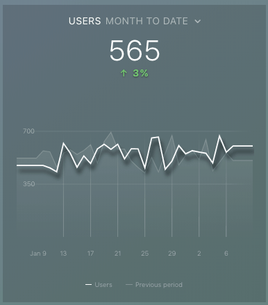
Users
This simple line graph lets you see day-by-day traffic spikes in any given time frame, overlayed on the previous time frame comparison. Not only is the time comparison helpful for tracking growth, exact dates allow you to pinpoint the actions the drove traffic increases.
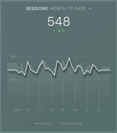
Sessions
Sessions is a line graph Datablock that’s similar to users but not focused on individuals. Instead of tracking your web traffic by person, you’re able to view every single visit, even if the user has visited before. For marketers, especially those following the inbound methodology, this metric can give important insights into the quality or variety of your content and the buyer’s journey. When viewed beside the users and top pages Datablocks, it’s easy to understand the repeat traffic you’re racking up and where it’s going.
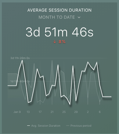
Average Session Duration
Marketing has never been so heavily reliant on content. By viewing a second-by-second breakdown of the average session length and an overlay of the previous period, you can start to understand how successful and engaging your content is. Many blog tools, for example, calculate average read time of your posts. Combine that information with this Datablock to gauge whether your blogs and other site content are being read in their entirety.
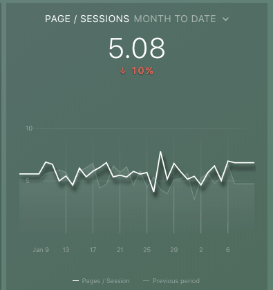
Pages Per Session
Exactly how much of your website are visitors seeing? Understand your overall user experience with the pages per session Datablock. Although it won’t tell the whole story, this metric can be the first to alert you of issues including: difficult navigation, a dysfunctional user experience and even the quality of the incoming traffic and readership.
It’s Your Databoard, So Own It
We may all have our favorites, but the greatest thing about Databox is still versatility. Your Databoards are blank slates, created for constant customization. By combining the specific metrics that matter most to your role or client, you’re writing the recipe for your own success.
Explore all of these pre-built Datablocks in our User Experience Dashboard below, or create your own, with more than 60 integrations (and growing).