Table of contents
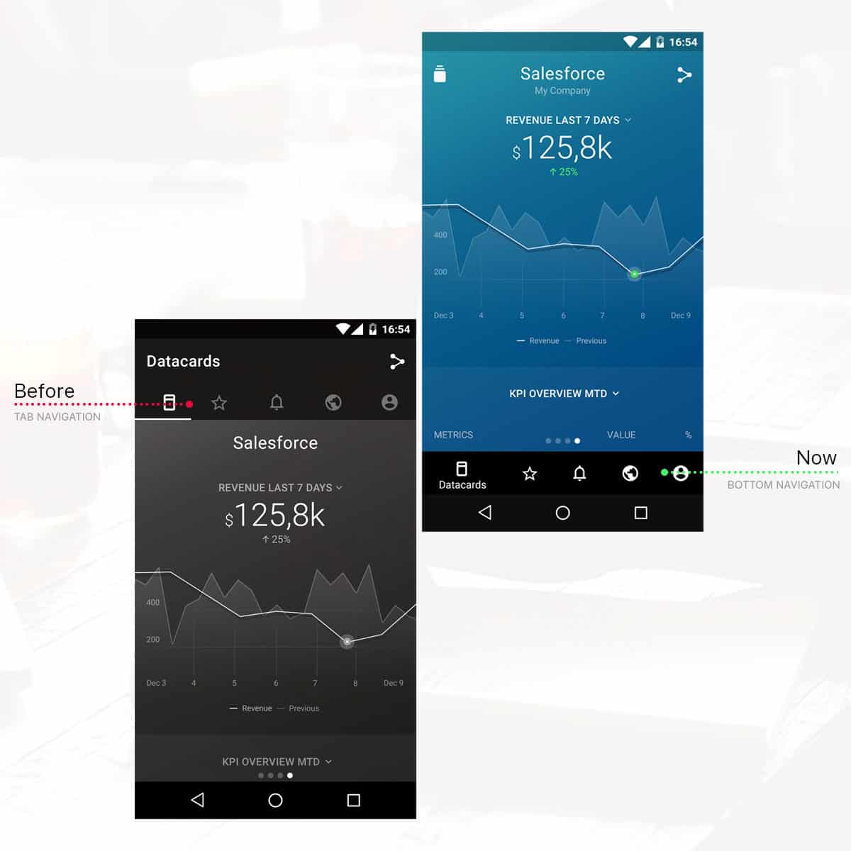
The Databox mobile app is the uppermost layer of the Databox platform. That’s why we do our best to make the as app user friendly and easy to use as possible. We’re constantly trying to innovate and push the limits of mobile app design and UX to the next level. This is the very reason we thought it was time to redesign our top-level navigation in our Android app. The new design offers better user experience and gives us slightly more real estate where we can show you things that matter the most, your key metrics.
Bottom navigation
This year Google introduced the new “bottom navigation” component in their design guidelines which makes it easier to explore and switch between top-level views with a single tap instead of tabs at the top. It is also easier to reach on larger devices. These are some of the reasons why we decided to drop tabs in favor of bottom navigation.

Main benefits of using bottom navigation
Easier to reach
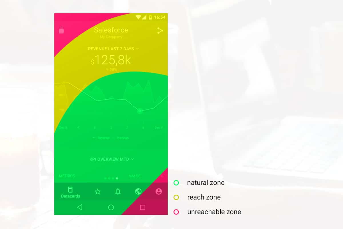
The bottom navigation is located on the bottom of the screen which makes it much easier to reach with your thumb on larger devices compared to tabs on top. This vastly improves switching between top-level views.

Similar to our Databox iOS app
The bottom navigation is also a standard navigation control in iOS apps (where it is commonly known as a tab bar) which makes our Databox iOS and Android app more similar. It also allows users to be familiar with both apps in case they switch platforms and also makes it easier for us to design UI for both platforms.
Gesture conflicts
Tabs utilize switching between tabs with clicks on tab icons and by swiping left or right. This swiping gesture was causing conflicts and confusion with our top-level Datacards view, where you use the swipe gesture to switch between Datacards. Bottom navigation uses doesn’t use any gestures, only taping on icons. With the new control mechanism we were able to resolve gesture conflicts when switching between Datacards and top-level views.
To get the new look grab the latest version of the Databox app from Google Play store. How do you like it? Feel free to send us your feedback to hi@databox.com


