Table of contents
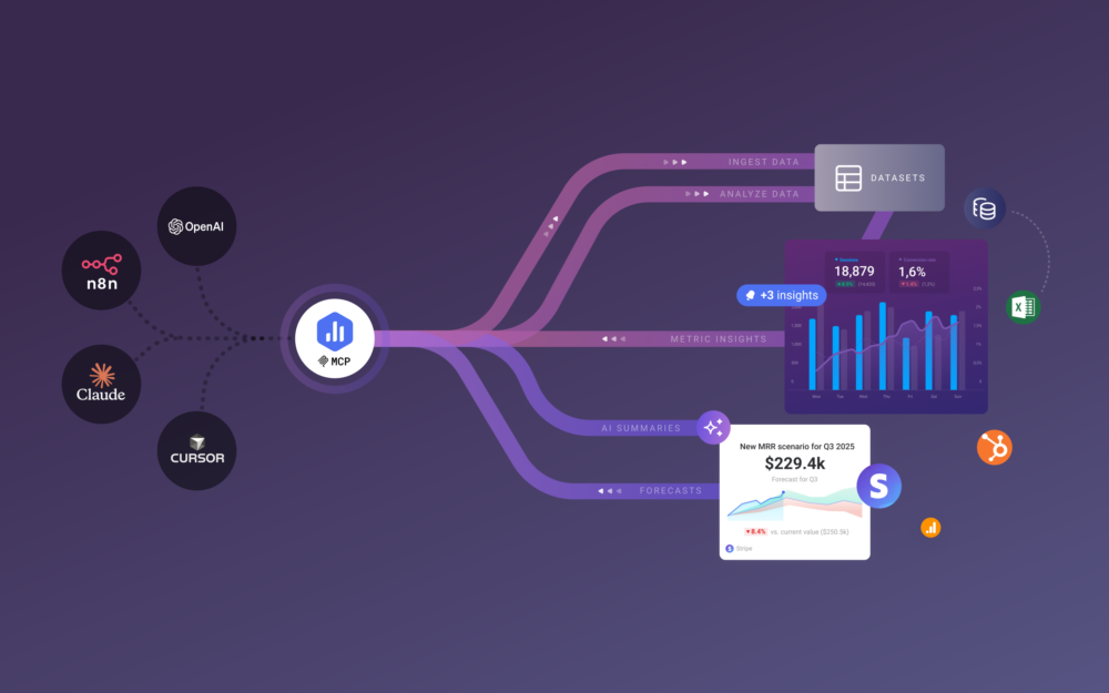
You probably think of Databox as easy-to-setup dashboard software for reporting high-level performance metrics. That we are. But, over the last year, we’ve been quietly working to add significantly more analytical horsepower to our software…
Many of the improvements we’ve made (building an infrastructure capable of real-time data sync, custom date ranges, better data warehousing, etc.) aren’t that visible to our users.
Today, we’re excited to announce a first batch of customer-facing improvements to our visualization capabilities enabled by our years-long behind-the-scenes engineering efforts.
With these new capabilities, you’ll be able to visualize and explore more of your data right from within Databox.
Check out the video to see all of the updates.
Or see the list of changes below. Then, jump back into your Databox account to start taking advantage of them right away.
All of these improvements are available to our free users and customers alike.
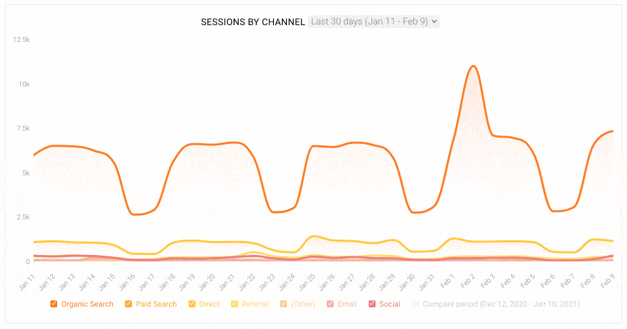
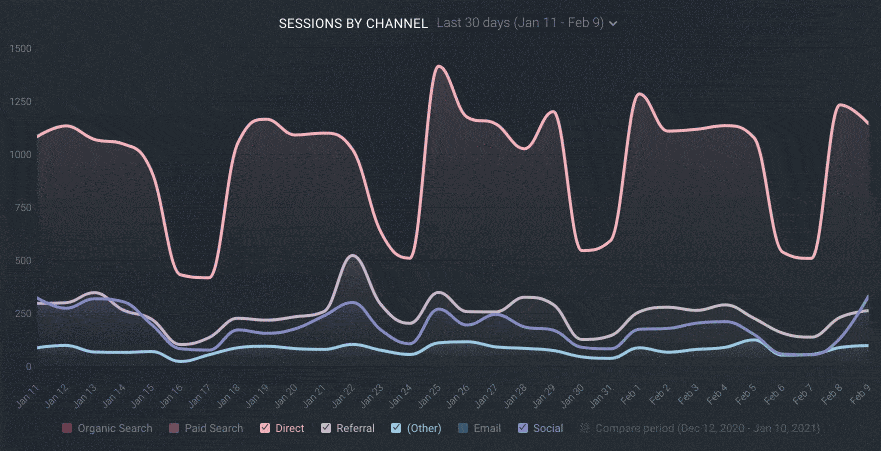
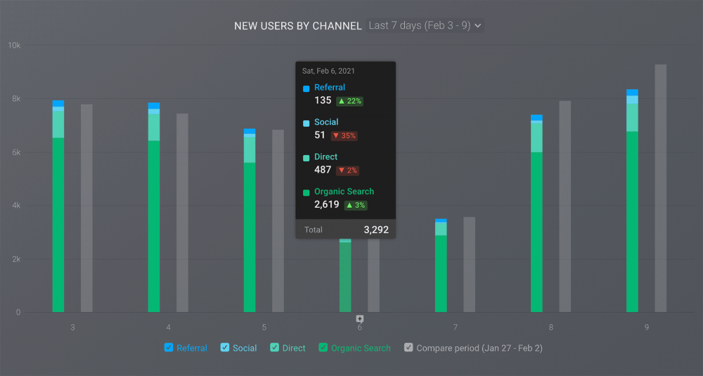
1. Toggle Stacked Line and Bar Charts On and Off
Sometimes it can get a little noisy when you’re using stacked lined or bar charts to track things like website traffic by marketing channel or Deals Closed by sales rep. Sometimes, you just want to isolate one or two dimensions in order to draw a conclusion.
With this update, you can use the interactive legend below the x-axis of any stacked line or bar chart to deselect (or select) the specific element you’d like to view within your visualization.
As seen in the image below, once you make your selections (or de-selections), your visualization will adapt so that you can focus on the specific metrics or dimensions that are needed.
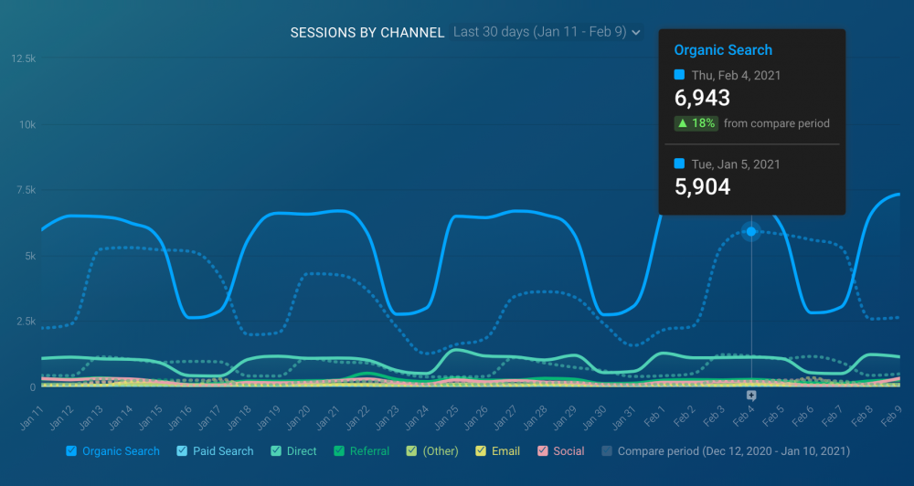
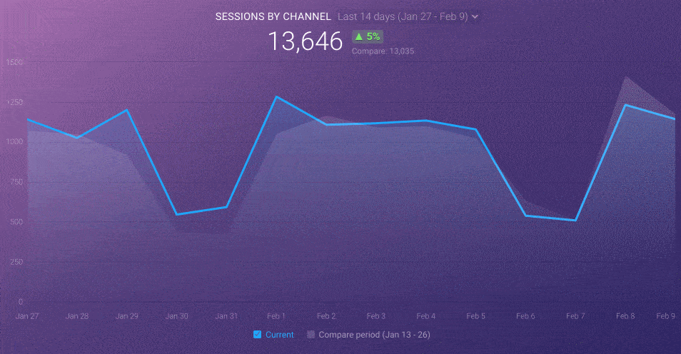
2. Interact with Comparisons in Line and Bar Graphs
We’ve made it a little easier to interact with specific points within a line graph––now when you’re hovering over certain dates in your visualization, your cursor will snap to the nearest point in the line graph and display the appropriate data for that period.
Also, now you can hover over a point in the previous period comparison line (e.g. last month, last week, etc.) or bar graph and see the performance data relevant to that period, too.
As you can see below, by hovering over a point on September 18th, you can see both current performance as well as the month-over-month percent change all in one tool tip.
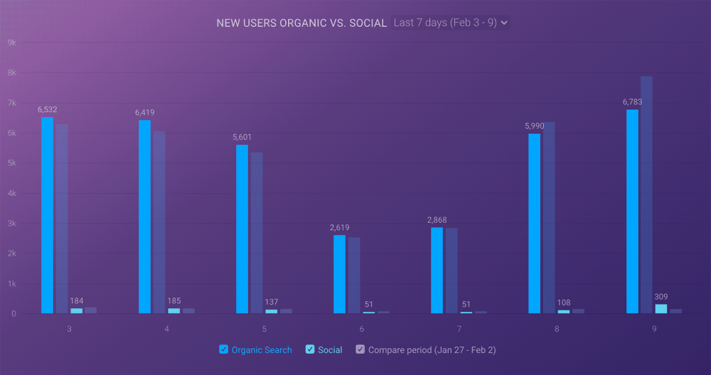
3. Display Comparisons for Multiple Metrics/Dimensions in One Graph
We’ve also made a small, but important, improvement to the way comparisons are displayed in stacked line charts. Before, all comparisons on a stacked line or bar chart were shown with the traditional shaded gray visualization. Therefore, there was no way to see the period-ago comparison for individual lines or bars
Now, as seen in the example below, each comparison for the metrics/dimensions in your stacked line chart will match the color of each specific metric/dimension and will also be a dotted line in order to clearly show that this was the previous period.
This makes your line charts far less noisy and makes it much easier to easily track previous performance.
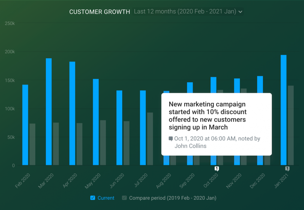
4. Better Visibility for Annotations
Before, you needed to hover over a specific point on your line graph in order to see an annotation that was added to a specific time period.
Now, we’ve moved annotations down along the x-axis in order to make them easier for you to interact with and also updated annotations to display the appropriate sequential number so you can quickly see how many annotations there are for that point in time and the order in which they were added.
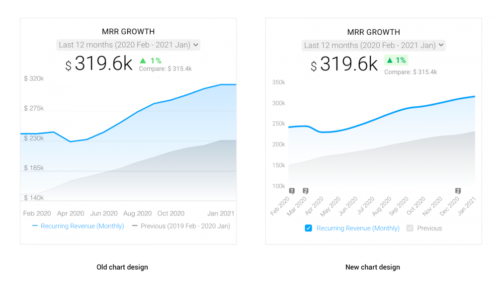
5. No More “Tails” on your Line Graphs
The original dashboard design included “tails” that would carry your line graphs to the very edge of the screen on mobile.
These were confusing to some, as it made it look as if your performance plateaued at the beginning or end of a given month. (Note in the image below. Kinda looks like MRR growth flattened out at the end of the month, doesn’t it?)
With this newest updated, we’ve removed these “tails” completely.
6. View the Value of Individual Data Points and % Changes
Gather more valuable insights at a glance from the individual data points in your dashboard visualizations.
Just hover over a specific element to quickly see metric totals and percent changes. For stacked line and bar charts, you’ll get a quick glance of all the metrics/dimensions and their associated percent changes in your visualization simply by hovering over them.
It’s an easy way of translating your data visualization into insights without having to calculate anything yourself.
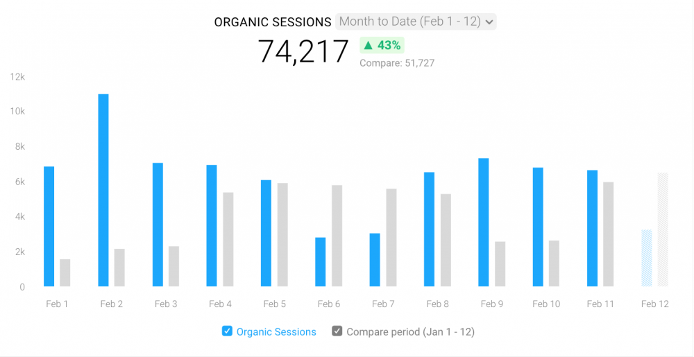
You can also choose the type of chart you’d like to see––stacked or unstacked. The latter is used when you want to track or compare your performance in a separate column, side-by-side.
As seen in the image below, this visualization is great for comparing your current performance to a previous period as you can compare both periods side-by-side to easily see whether you’re improving or not.
Stacked charts are used when you want to compare total values across several categories in one column. This makes it easier to visualize how separate campaigns, projects, etc., are contributing to your goals.
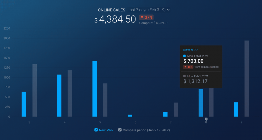
See the image below of the unstacked line chart. When you scroll your mouse over the datapoint for February 8th, a tooltip will pop up to tell you the amount of revenue from Online Sales for that day, as well as a week ago.
In a stacked bar chart (shown in the graphic below), the tooltip shows the values of all of the bars and the percent change from the previous period.
7. Change your Lines to Smoothen Lines
Trends help your business identify all the areas where you excel, as well as all of the ones where you could do better. And a line chart is a perfect visualization to show them.
And to make it even easier for you to follow the trend information, we added the ability to smoothen the line.
Smooth lines can give a connotation that the points on the graph are not exact but instead that data is roughly in this area – hence, perfect to track data like trends. Plus, smooth lines also make a chart look more simple and easier to understand the general idea.
8. Add Values to Line, Bar, and Pie Charts
How many orders were placed last month?
How many leads did we generate yesterday?
Now, you can quickly scan your bar charts to see these values. By enabling this setting, you’ll equip your bar, line, and pie charts with values connected to every dot on your line, to each bar and pie slice, and have those questions answered quickly.
9. Hide Total Metric Values Above Your Line or Bar Graphs
Sometimes, the total metric value above your line and bar graph can distract from the story you’re trying to tell over a specific time period. In some cases, like your website’s bounce rate or sales close rate, it might not make sense to add up numbers over a period of time.
Now, you can decide whether you’d like to display the total value of your data above your charts.
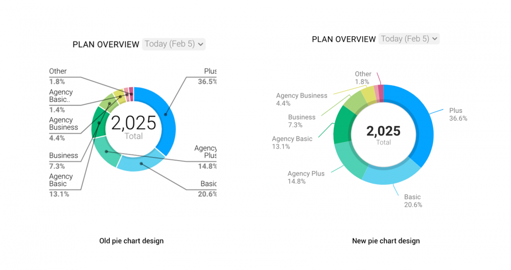
10. Easier to Read Pie Chart Descriptions
It used to get a bit messy any time you were tracking more than a handful of metrics or dimensions in a pie chart. Sometimes, the intersection of lines made it harder to decipher where specific metrics/dimensions were visualized.
Now, we’ve made it much easier for you to see how each metric/dimension is visualized in your pie charts by adding curved lines to connect your pie chart labels and percentage values with their corresponding pie slice in the visualization.
11. Accurately Display Incomplete Periods in Line and Bar Graphs
Nothing ruins a buzz quite like seeing a drop in your line chart simply due to an incomplete period, right?
Now, incomplete periods appear as dotted lines or dashed bars in your line and bar graphs. With it, you’re able to clarify that the period isn’t complete and avoid displaying a misleading pattern of change while also helping the viewers of your data anticipate what the value will be once the full period is complete.

Getting started
For current Databox users, log in to your Databox account to check out some of these improvements.
New to Databox? Start by creating your free account.
From there, you’ll be able to connect your data from more than 70 different platforms.
More chart improvements are coming soon to Databox. See what’s coming and vote for your favorites on our roadmap site.
If you have any questions or need help getting set up, you can visit our Knowledge Base or start a chat.