Supercharge Your HubSpot Reporting with Databox
Go beyond native HubSpot reporting with dashboards, alerts, and insights that scale.
HubSpot’s Built-in Reports Are a Great Start. But You’re Ready for More.
HubSpot has come a long way. For many teams, it’s the heart of marketing and sales reporting. But as soon as you need to do more in-depth analysis—across platforms, objects, or accounts—you hit the limits.
That’s where Databox comes in.
By layering Databox on top of HubSpot, you unlock the flexibility, automation, and cross-platform insights needed to make reporting easier, more scalable, and more powerful—without switching to a complex BI tool.
“In HubSpot, you are going to be tied to specific objects. With the native capabilities, you're going to have to create four or five or six reports. That’s the power of a BI tool like Databox: we're able to aggregate all of this cross object reporting into one place.”

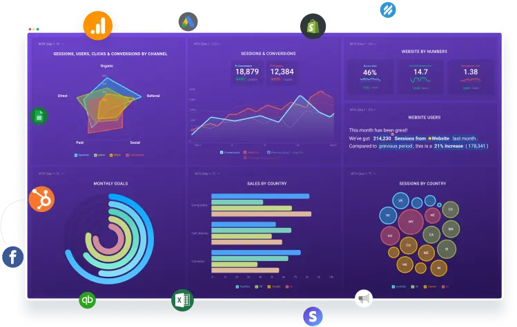
Explore a few of the ways teams are using HubSpot + Databox
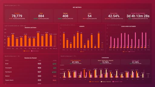
Quarterly Business Reviews (QBR) Dashboard Template
Example by Cameron Collins – RevPartners
Cameron uses Databox to run executive-level QBRs that map the entire customer journey—from web sessions to closed revenue—in one cohesive dashboard.
By combining cross-object metrics like average deal size, funnel conversion rates, and revenue trends into a single view, he enables leadership teams to spot inefficiencies and ask smarter “why” questions. All without building six separate reports in HubSpot.
Want to build this dashboard yourself?
Try the free template
Want us to build it for you? (It’s free!)
Get your free dashboard
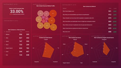
Webinar Analytics Performance Reporting
Example by Ali Schwanke – Simple Strat
Ali built a custom webinar dashboard that merges HubSpot and Zoom data to analyze attendance, first-touch conversions, and lead source attribution over time.
By pulling in registration, engagement, and survey data from Zoom—and layering on lead lifecycle insights from HubSpot—she can easily show which webinars are converting and why. Bonus: it’s designed for executive presentation, without the clutter of native tools.
Want to build this dashboard yourself?
Get the step-by-step instructions
Want us to build it for you? (It’s free!)
Get your free dashboard
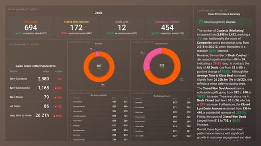
Sales Forecasting and Coaching
Example by Tory Ferrall – Databox
Tory and her team reworked their forecasting model by using Databox to calculate real win rates for each deal stage. By tracking when deals enter each stage and the likelihood they convert, they surfaced insights that HubSpot’s default probabilities missed.
The dashboards also break down win rates by rep—empowering more personalized coaching and driving better performance across the sales org.
Want to build this dashboard yourself?
Get the step-by-step instructions
Want us to build it for you? (It’s free!)
Get your free dashboard
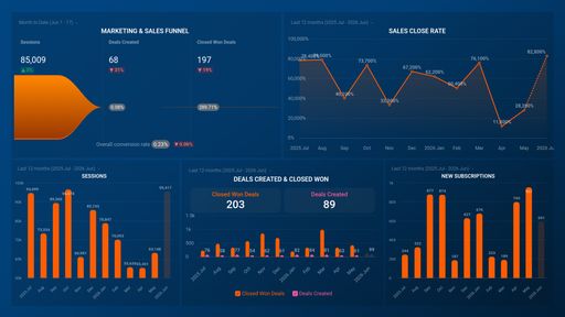
Sales Funnel Conversion With Custom Timeframes
Example by Alex Lee – Intellect
Alex created a dashboard that ties current sales results back to lead gen efforts from 60–90 days ago. By offsetting the timeline of new leads, discovery calls, and closed deals, his team can measure pipeline health and velocity more accurately.
He also segments the data by lead source, giving insight into which channels produce the fastest—and most valuable—conversions.
Want to build this dashboard yourself?
Get the step-by-step instructions
Want us to build it for you? (It’s free!)
Get your free dashboard
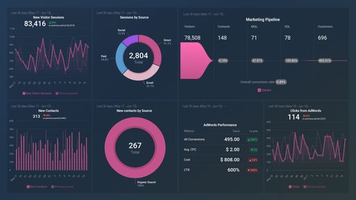
Paid Advertising Impact
Example by Devin Littlefield – Market Vantage
Devin and the team at MarketVantage created a Databox scorecard that combines Google Ads, LinkedIn Ads, HubSpot Marketing, and HubSpot CRM data to track critical outcomes like MQLs, SQLs, booked meetings, and deals – enabling full‑funnel visibility and ROI attribution.
This unified view enables more effective reporting and decisions for clients by showing how paid ads translate into real business outcomes.
Want to build this dashboard yourself?
Get the step-by-step instructions
Want us to build it for you? (It’s free!)
Get your free dashboard
“HubSpot can’t report on different date ranges for specific stages within a funnel report. Databox is very flexible and allows us to shift those time ranges by using custom metrics. It’s really enhanced our ability to report compared to HubSpot, especially being able to link in more than one data source very easily."

Explore Plug-and-Play HubSpot Marketing Dashboard Templates


Explore Plug-and-Play HubSpot CRM Dashboard Templates


Choose From Hundreds of Pre-Built HubSpot Metrics
Frequently Asked Questions
Why should I connect HubSpot to Databox instead of using HubSpot’s native reports?
HubSpot shows marketing metrics in isolation; Databox lets you blend HubSpot CRM data with dozens of other sources (including ad platforms) in a single dashboard, add calculated metrics (e.g., Cost‑per‑MQL, blended ROAS) and automate multi‑client or cross‑department reporting without spreadsheets. Agencies and RevOps teams use Databox when they outgrow HubSpot’s stock reporting. HubSpot also has limitations in storing historical data, while Databox allows access to a much larger set of historical data.
How do I connect HubSpot to Databox?
In Databox, go to Data Manager ▸ + New connection, choose HubSpot Marketing / HubSpot CRM / HubSpot Service, click Connect, and authorise with your HubSpot login. Super‑Admin permissions are recommended.
How often does Databox sync data from HubSpot, and can I change the frequency?
Sync frequency is plan‑based (hourly, daily or custom). Admins can adjust it at either the data‑source or dataset level in Data Manager ▸ Change sync frequency.
How much historical HubSpot data can Databox pull when I first connect?
Databox back‑fills up to 36 months of historical data for most HubSpot Service and CRM metrics, and up to six years for many Marketing metrics (where HubSpot’s API allows). Exact limits vary by metric and Databox plan.
In order to start syncing data for a Metric, you can add it to your Metrics screen, use it in a Scorecard, set a Goal around it, create an Alert for it, or add it to a Databoard.
Get Started Now
Compare
Databox Inc.
HQ: Boston, MA, USA
AI-powered analytics for teams that need answers now.
Databox Inc.
HQ: Boston, MA, USA

AI-powered analytics for teams that need answers now.


Compare