How To Build Better Quarterly Business Review (QBR) Reports with Hubspot and Databox
Quarterly Business Reviews (QBRs) are one of the most important touchpoints between RevOps teams and executive stakeholders – or between agencies and your clients. But most teams struggle to deliver a single, unified view of performance that spans the entire customer journey. This guide walks through how Cameron Collins, Revenue Operations Strategist at RevPartners, solves this using Databox.
Combine cross-object metrics to track the entire customer journey
Cameron Collins of RevPartners walks through how their team uses Databox and HubSpot to build a unified executive dashboard that anchors quarterly business reviews. He shows how to visualize metrics from multiple HubSpot objects – sessions, leads, MQLs, deals, and revenue – in a single view, making it easier for executives to understand what’s working, what’s not, and where to dig deeper.
Try it yourself
Check out our step-by-step tutorial to try building this dashboard for yourself or simply reach out to our team to get personalized help setting up your own dashboard.
See the full dashboard in action.
Explore the full dashboard RevPartners uses to power quarterly business reviews.
This dashboard includes cross-object HubSpot metrics like sessions, leads, MQLs, deals, revenue, and conversion rates – everything in one place.
Explore more resources
Browse related templates, tutorials, and expert articles to help you improve forecast accuracy and team performance with HubSpot and Databox.

How to a cross-object funnel report for QBRs in Databox
“Cross-object reports are really hard to not only create, but also to display,” Cameron explains. “Even with the capabilities that you do have in your native CRM, you’re going to have to create four or five or six reports in order to get the number of sessions, the number of leads, MQLs, closed-won deals. All of these reports that tell the same story now have to be interpreted separately.”
Native HubSpot reporting is powerful, but when it comes to pulling together Contacts, Deals, and Revenue in one view, it gets messy fast. That’s where Databox shines.
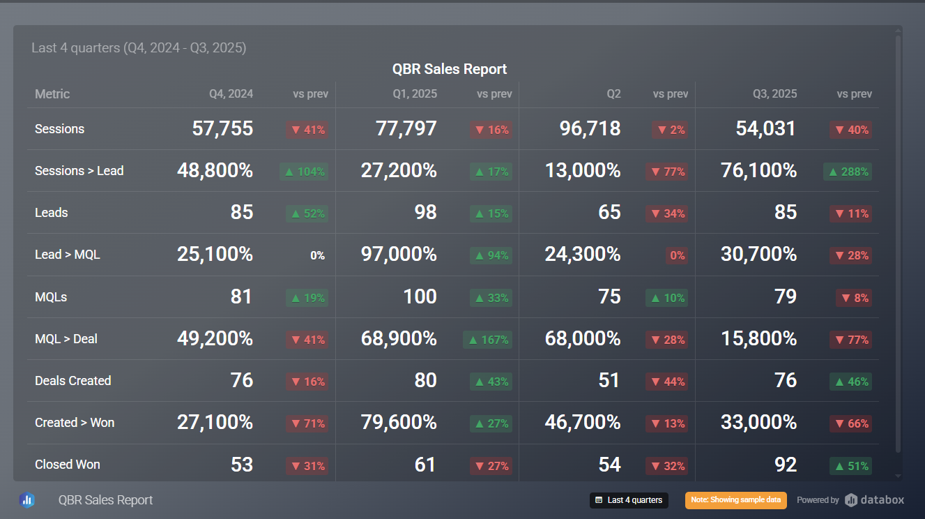
Cameron builds a single Databoard that visualizes Sessions, Leads, MQLs, Deals Created, Closed-Won Deals, Recurring Revenue.
Between those core metrics, he layers calculated conversion rates (e.g., Leads to MQLs, MQLs to Deals, Deals to Closed-Won), and Average Deal Size. Instead of six disconnected charts, executives get one narrative.
“This setup gives you answers, but more importantly, it helps you ask better questions,” Cameron says. For example:
- Why did average deal size drop in Q2?
- Why are we converting fewer leads to MQLs this quarter?
- Are we seeing fewer sessions, or are we leaking leads downstream?
You can also view the same data as a funnel chart to identify the biggest drop-offs at a glance. “That’s where Databox becomes really helpful,” Cameron explains. “One report, cross-object, actionable.”
How It’s Built
Cameron’s QBR report is powered by HubSpot CRM data, merged and enriched via Databox Datasets and Calculated Metrics. Here’s a simplified breakdown:
- Datasets: Combine data from Contacts, Deals, and Revenue objects.
- Calculated Metrics: Define conversion rates between stages using count-based formulas.
- Visualizations: Use tables for executive overviews and funnel charts for drop-off analysis.
Bonus: You can filter by date range (e.g., This Quarter, Last Quarter, Year-over-Year) or by source (e.g., Web, Webinar, Partner) to tailor the story.
Need more help with your go-to-market execution in HubSpot?
This dashboard was created by RevPartners, a full-service RevOps agency helping B2B companies align their go-to-market teams and systems to drive scalable growth.
Want help building your own version?
Contact our team – we’ll build it for free.
FAQ
Can Databox replace HubSpot reporting for executive dashboards?
Yes – with caveats. Databox is ideal when you need to combine data from multiple sources or want better visualization options. However, for simpler reports that live entirely in HubSpot, native reporting tools may suffice.
What are the limitations of HubSpot’s reporting when it comes to cross-object or multi-stage funnels?
Users frequently report difficulties combining properties across objects (e.g. contacts + deals), inflated counts due to associations, and limited capabilities for custom calculations or visualizations.
What should I check when using Databox to ensure the metrics I need are available and reliable?
Always review the Metric Library for each data source. Pay attention to sync limitations, filtering options, and visualization compatibility – especially for advanced calculated metrics or segmenting.
How can I track drop-off between funnel stages like sessions → leads → closed won?
Use calculated metrics to track stage-to-stage conversion rates, and visualize them in both funnel and table formats. Include time comparisons (QoQ, YoY) and segment filters to pinpoint performance issues.
Can I segment metrics by campaign, region, or lead source?
Yes. Databox allows filtering at the dataset, dashboard, or individual chart level. Use UTM parameters and property-based filters to break down performance by source.
What are common workarounds when HubSpot reporting doesn’t support the views I need?
Export data to a BI tool (like Databox), use custom properties/workflows to bridge gaps, or rely on APIs to prep data externally before visualizing. These approaches help create the cross-object views HubSpot can’t support native.
Make better decisions,
together, faster
Product
Compare
Databox Inc.
HQ: Boston, MA, USA
Modern BI for teams that needs answers now
Databox Inc.
HQ: Boston, MA, USA

Modern BI for teams that needs answers now


Product
Compare