Uses one-click integrations:
-
 Infusionsoft by Keap
If you don't use Infusionsoft by Keap, you can pull data from any of our 130+ one-click, native integrations or from spreadsheets, databases and other APIs.
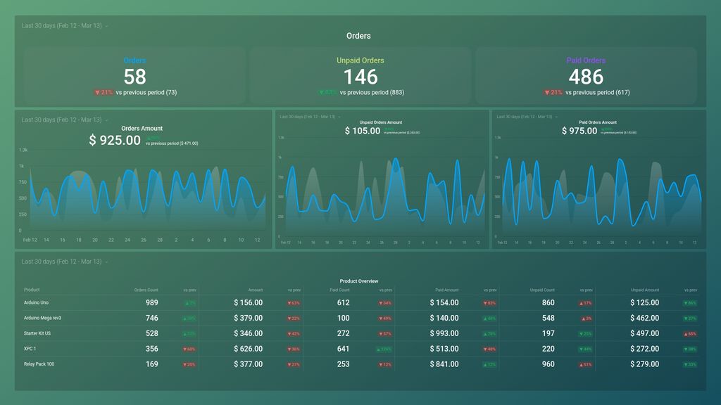
Try this dashboard for freeWhat you’ll learn from this InfusionSoft Orders Overview dashboard template:
With this dashboard template, you’ll learn how your business is performing and what you should be focused on. Use these insights to grow the number of orders and improve your marketing and sales strategy. Connect your InfusionSoft account and learn:
- How many orders were placed from our store? Find out the number of orders recorded over a specified period of time. Evaluate how effective your sales process is.
- How much money does my online store make? Track the total sales of all products and services through your online store within a given time period, i.e., last 30 days, month to date, last 7 days, and more.
- Is my shopping cart set up properly? Monitor trends in the checkout process that result in unpaid orders. Assess if your shopping cart is built to support the purchasing decisions of your visitors and repeat customers.
- Which metrics do we need to optimize? Keep your finger on the pulse of your most important e-commerce metrics and their performance month-to-month in order to make better-informed decisions for your business.
Pull additional data using our integration with InfusionSoft by Keap.
What other InfusionSoft metrics can you track and visualize with our integration with InfusionSoft by Keap?
- Orders
- Orders Amount
- Paid Orders
- Unpaid Orders
- Total Opportunities
- Total Contacts
- Total Campaigns
- Total Companies, and more.
Infusionsoft by Keap metrics included in this template
-
Orders Amount
The Orders Amount metric in Infusionsoft tracks the total value of orders processed within a specified time period, providing insights into sales performance.
-
Unpaid Orders
The Unpaid Orders metric in Infusionsoft tracks the number of orders that have been placed by customers but have not been paid for yet.
-
Unpaid Orders Amount
The Unpaid Orders Amount metric in Infusionsoft shows the total value of customer orders that have not yet been paid, helping businesses track outstanding invoices and manage their accounts receivable.
-
Unpaid Amount by Product
The Unpaid Amount by Product metric in Infusionsoft shows the total amount of outstanding payments owed by customers for a specific product or service, allowing businesses to track and manage their accounts receivables more effectively.
-
Unpaid Orders Count by Product
The Unpaid Orders Count by Product metric in Infusionsoft shows how many orders have been placed for a particular product but have not yet been paid for. This can help businesses to track unpaid orders for each product and take action accordingly.
-
Paid Orders
Paid Orders is a metric in Infusionsoft that tracks the number of orders that have been paid for by customers. It helps businesses monitor their revenue and track the success of their sales and marketing campaigns.
-
Paid Orders Amount
Paid Orders Amount is a metric in Infusionsoft that shows the total amount of money generated from all paid orders within a specific period of time. It helps businesses track their revenue and analyze their sales performance.
-
Paid Amount by Product
The Paid Amount by Product metric in Infusionsoft shows the total amount of revenue generated by each product over a specified time period, allowing businesses to track which products are most profitable.
-
Paid Orders Count by Product
The Paid Orders Count by Product metric is a measure of the number of products that have been purchased by customers, displayed in descending order of popularity or sales. It provides insights into consumer preferences and can be used to optimize product offerings and marketing strategies.