Uses one-click integrations:
-
 Amplitude
If you don't use Amplitude, you can pull data from any of our 130+ one-click, native integrations or from spreadsheets, databases and other APIs.
Try this dashboard for free
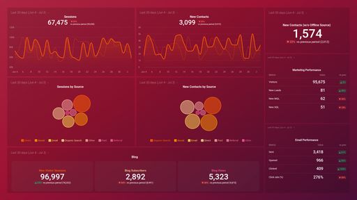
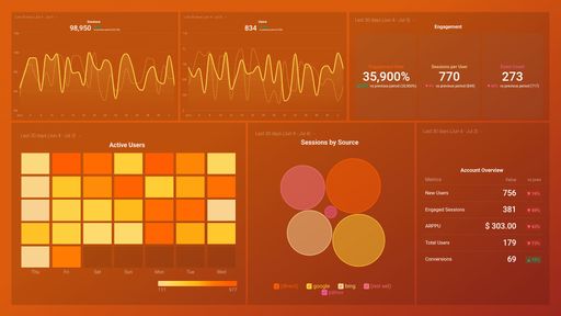
Amplitude metrics included in this template
-
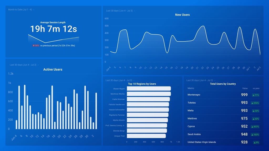
Active Users
The Active Users metric indicates the number of unique users who engage with a specific product or service within a defined time period.
-
Average Session Length
Average Session Length is a metric that measures the average duration users spend on a website or app, helping businesses understand user engagement and identify areas for improvement.
-
New Users
The New Users metric measures the number of unique individuals who have visited or used a product or service for the first time within a given time period.
-
Total Users by Country
The Total Users by Country metric tracks the number of users per country, providing insight into the geographical distribution of a platform's user base.
-
Total Users by Region
The Total Users by Region metric measures the number of users in each geographical region, providing insights into user distribution and potential market opportunities.