Analyze more historical data
See how you historically performed in the past to plan better for the future.
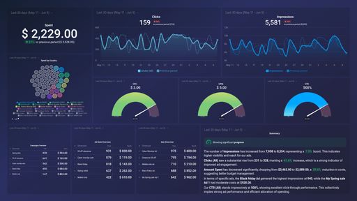
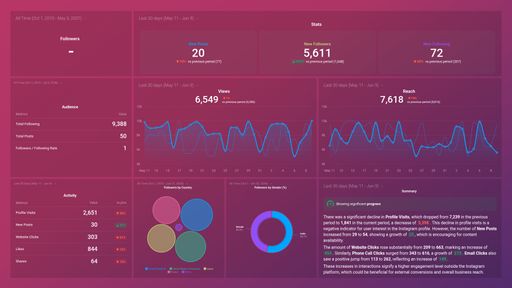
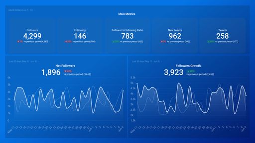
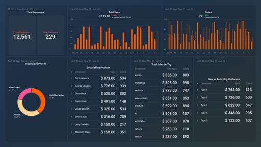
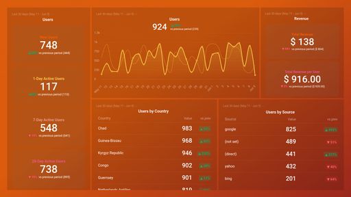
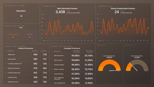
Create a single source of truth for your company’s data. Centralize it in Databox, then visualize it with performance dashboards to spot important trends, insights, or anomalies faster.


Scattered data across multiple platforms or spreadsheets, outdated reports, and rigid reporting tools make it difficult to see the big picture, let alone act quickly on new insights and emerging trends. Databox dashboard tool centralizes all your data, allowing you to easily visualize performance across departments and make informed decisions. Get the data you need, when you need it.

Monitor all your company’s metrics and KPIs in one place by syncing your data in seconds. Start with thousands of pre-made metrics, or build your own custom ones.

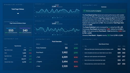
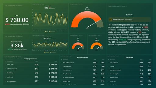
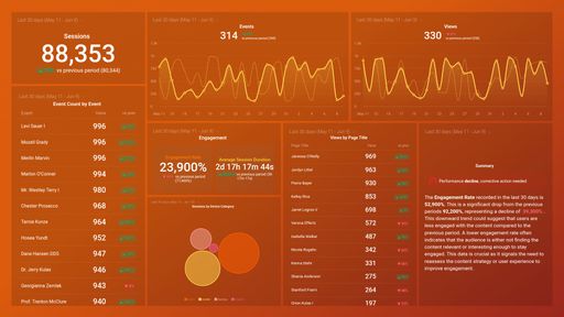
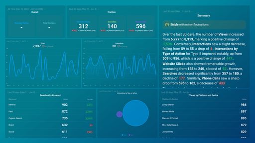
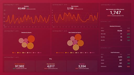
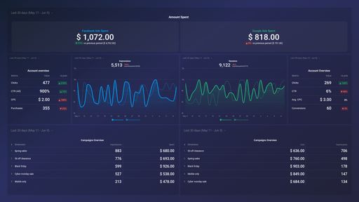
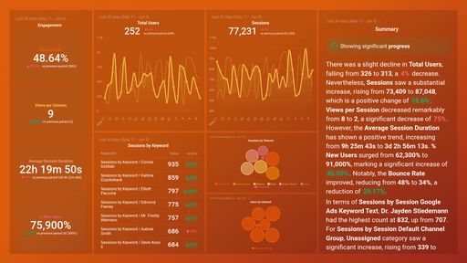
Create stunning dashboards to track performance for individuals, teams, or your company, blend insights from multiple sources, adjust visualization, compare periods, forecast, benchmark, and more.

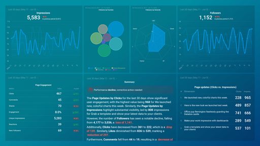
Leverage AI-powered summary of your performance so you always know how you’re progressing and get more context on how performance has changed over time, along with ideas to improve.

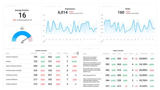
From Google Analytics 4 and Facebook Ads to LinkedIn and HubSpot, Databox makes it easy to pull in data from 100+ platforms you use the most. These integrations are designed to save you time, reduce manual work, and provide a 360-degree view of your company’s performance.
Whether you’re pulling data from your software, uploading spreadsheets, writing custom SQL queries, or syncing data from cloud-based apps via API, Databox ensures seamless integration.

Create a seamless, branded experience by customizing dashboards, reports, and the mobile app with your branding, host dashboards on your company’s domain, and send alerts and scorecards from your company’s email address.

Spreadsheets are cost-effective and powerful but fall short in sharing actionable insights. Databox’s Google Sheets integration enhances this by allowing you to easily select and visualize data from multiple sheets and ranges.
With a few clicks, you can design dashboards that effectively communicate the necessary information to your team or clients. For non-conventional data structures, our Manual Setup lets you choose the right cells to display your data without any coding.

Save hours of work every month, and share the information you need with anyone. Databox automatically delivers reports directly to email or Slack, ensuring your reports always include the latest dashboards, images, and text.
Start using customizable report templates, choosing from Page or Presentation format, to standardize your process and enrich reports with data stories for deeper insights. For live meetings, share a public URL so stakeholders can view performance data in real time, bypassing the need for PDFs.
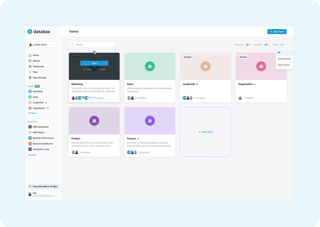
Organize your company’s performance data by department—so every team can access the insights they need to improve faster. Create custom team spaces for Marketing, Sales, Finance, and more. Add your brand colors, set permissions, and group key Metrics, Databoards, Loops, Reports, and Goals in one central hub.
It’s the simplest way to make data more collaborative—and actionable—across your organization.

Drag & Drop your metrics
No-code editor
Fully customizable
Analyze more historical data
See how you historically performed in the past to plan better for the future.
Set goals and track their progress
Easily track your goals by defining them for any metric, including custom ones. Monitor progress with a variety of visualizations like gauge charts, progress bars, tables, and line or bar charts. Select up to 15 metrics and receive automated reports to see how your current performance compares to the goals you’ve set.
Spot unusual patterns faster
View unusual increases or decreases in performance to quickly identify the cause and address them before they become bigger problems.
Mark important events or notes
Add short text notes to specific dates to provide important context. Explain spikes, dips, or key events that impacted performance, helping your team understand why changes occurred.
Forecast future results
See how you’re likely to perform to make more informed decisions, set realistic goals, and craft better plans.
Compare yourself to industry benchmarks
Benchmark your performance to see where you’re outperforming others and find opportunities to improve.


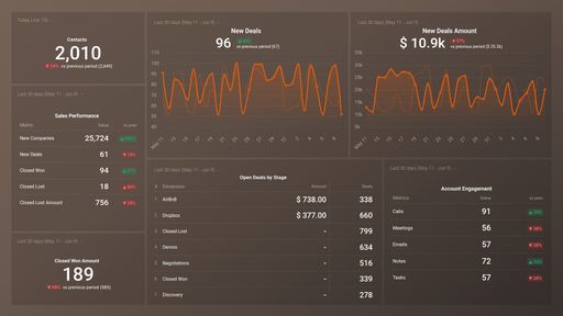
Whether you’re in SaaS, e-commerce, or running an agency, Databox makes it easy to bring all your data together. Connect with the tools you already use and customize dashboards to suit your team’s unique needs.
Agency
SaaS
E-Commerce
“One of my directors has spotted trends and rewritten and refilmed advertisements in a matter of days, because of what we were seeing in the dashboards. And rewrote a new release with the new launch strategy and completely turned around returns on investment.”
Andrew Campbell, Marketing Analyst & Technology Manager at Harmon Brothers
Trusted by brands like yours
“Databox is easy to use and allows us to use templates or create our own completely custom dashboards to track KPIs from many sources. It’s a great way for our team to get an overview of marketing performance and identify trends quickly.”
Eva Zelca, CMO at Accuranker
Trusted by brands like yours
“We’ve seen significant improvements in oney saved and money spent. It gives us the ability to make decisions quickly and optimize faster. It’s gives us quite a boost.”
Jack Fowler, Growth Marketing Manager at Raddish
Trusted by brands like yours
Trusted by 20,000+ growing businesses


Are perfromance dashboards interactive?
Yes, dashboards in Databox are interactive. Here are a few ways you can engage with the data: hovering over data points to view specific values, adjusting date ranges for individual visualizations, updating visualizations with a single click, and choosing which lines (metrics, trend, goals) to view on charts.
How can I share my dashboard?
In Databox, you have multiple sharing options.
Can I create dashboards combining data from different sources?
Yes! In fact, we recommend doing this to get a comprehensive view of performance. Inside the dashboard builder, you can swap through different data sources you’ve connected and pull whatever metrics you need right into your dashboard.
Can I combine multiple dashboards?
Yes! Dashboard Loops allows you to group multiple dashboards together to tell a more comprehensive story with your data. They’ll be joined together on one Shareable link that you can then share with your team and/or clients. You can add up to 20 dashboards to a loop.
Can I view my dashboards on my phone?
Yes, using our Databox mobile app for iOS and Android. And, you can receive your daily scorecards, weekly summaries, and performance alerts directly to your mobile phone.
Can I change the logo and customize my dashboard?
Yes, you can change the colors of your dashboards and charts. And customize the logo on your dashboards to reflect your brand. Even better, you can provide create a fully branded experience with the white-label add-on. Personalize the login screen, URL, mobile app, and much more.
How can I share a report?
Our business reporting tool allows you to share multiple ways:
What’s the difference between a Report and a Dashboard?
Dashboards are used to track and monitor your metrics in real-time. It gives you an answer to the question: “How am I doing right now”. They are ideal for “month-to-date” (or week-to-date, quarter-to-date, etc.) data. Our report generating tool, on the other hand, is designed to offer a more in-depth analysis of historical performance and trends. Typically sent as a PDF, reports cover broader time ranges like last month, last quarter, or last year.
Can I start free?
Yes! Everyone starts with a free 14-day trial of the Growth plan. After your trial, choose to purchase any plan that best suits your needs.
What happens after my free trial?
During the 14-day trial, you can purchase a paid plan and your first payment will be at the end of the trial period. If you do not purchase, the trial will simply expire. We do not require a credit card to start a trial.
Compare
Databox Inc.
HQ: Boston, MA, USA
AI-powered analytics for teams that need answers now.
Databox Inc.
HQ: Boston, MA, USA

AI-powered analytics for teams that need answers now.


Compare