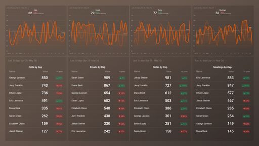
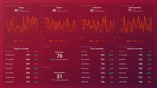
Track some of the most common Sales Team Activity metrics and KPIs and analyze your Sales Team Activity performance with just a few clicks.
TOP Sales Team Activity INTEGRATIONS
Use this free and customizable Appfigures Subscriptions Performance Dashboard Template to drill deep into your subscription tracking and have clear insight into your subscriptions by country and your net revenue.
What you’ll learn from this Appfigures Subscriptions Performance Dashboard Template:
By connecting your Appfigures account, you'll learn:
Where do most of your subscriptions originate from?
By tracking Subscriptions by Country, you will be able to see which market is most profitable for your product or service. This will allow you to adjust your strategy and work on increasing the revenue in the countries where you are underperforming.
What is my total net revenue?
Keep track of your total net revenue as it is an indicator of how much of your business's gross income is left over after accounting for all of the company's expenses. It reflects your company's total profit over a particular period.
How many active subscriptions do I have at the moment?
By tracking your subscription overview metrics, you can see how many active subscriptions you have in the given date range and how many are paying ones. In addition, you can get a very clear insight when it comes to your Gross Revenue, Gross MRR, and Churn.
What is my average monthly recurring revenue per subscription?
Within our Appfigures Subscriptions Performance Dashboard Template you can discover what your average monthly recurring revenue per subscription is. This can help you measure the profitability of your business, identify what's working and what isn't, review and improve your revenue strategy.
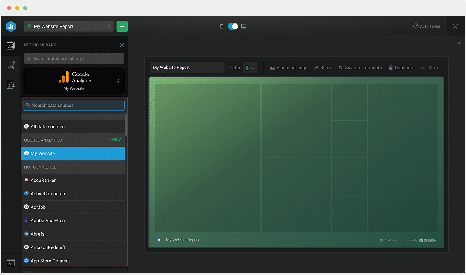
Data Source: Appfigures
Pull additional data using our integration with Appfigures.
What else can you track and visualize with our integration with Appfigures? When it comes to Appfigures, you can access new and insightful integrations and get more valuable data from your apps. You can also sync the following data sources through Appfigures integrations:
- App Store Connect
- Google Play
- Amazon Appstore
- Windows Store
- Steam
There are numerous metrics and metric combinations you can track using Appfigures. In Databox, you can quickly visualize 50+ metrics directly from Google Play, the Windows App Store, the Amazon App Store, App Store Connect, and Stream.
Read more about Databox's Appfigures Integration.
Customize this dashboard with Databox
Don't just track your KPIs. Here are hundreds of tips for improving your sales performance.
Visualizing your performance data in a way that's easy for everyone to interpret is the first step toward achieving better results for your business. So, what can you do when some of these metrics are trending down?
We've collected a few resources that contain tips from hundreds of other sales professionals on improving sales and revenue, avoiding sales mistakes, and more.
3 Simple Steps To Use Data And Analytics To Drive More Revenue
How to Maximize Profit and Manage Revenue Streams: 8 Strategies for Agencies
Sales Performance Metrics: 14 Metrics to Kick-Start Your Sales Analytics
Sales Metrics Reporting: Track These 16 Sales KPIs and Metrics to Improve the Performance of Your Sales Team
Sales Volume: Why It Matters and 12 Ways to Increase It
8 Key Steps in a SaaS Sales Process to Win More Deals
9 Ways to Unblock Bottlenecks and Boost Your Sales Velocity Rate
11 Common Sales Mistakes to Avoid If You Want to Close a Deal
 Intrix CRM (1)
 Pipedrive CRM (1)
 HubSpot CRM (3)
 HubSpot Marketing (1)
 Salesforce CRM (1)