Track all of your key business metrics from one screen
GET STARTED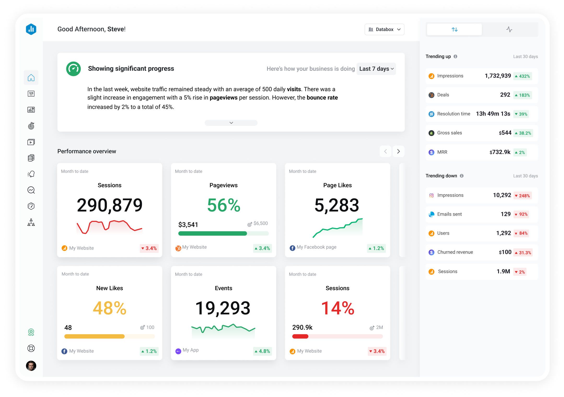

SendGrid is a cloud-based email service that enables businesses to send large volumes of emails reliably and efficiently. It provides features like email delivery optimization, analytics, and email templates, helping businesses manage and scale their email communication effectively.
SendGrid is a leader in trusted email delivery. Effortless for developers and marketers to craft, segment, test, and successfully deliver all of their email.
With Databox, you can track your Email delivery from SendGrid and combine KPIs from Campaign Monitor, MailChimp, Google Analytics, and many more on a single dashboard accessible from your phone or any device. Then, you can monitor anytime, anywhere.
Show more...
Show more...
Show more...
Due to the specific API limitation, for all dimensional ‘by Category’ metrics, Databox will fetch the data in the following way.
For any Date Range requested, we fetch only the last 2 subperiods.
So if the data is displayed with daily granularity (by day), Databox will fetch the data for the last 2 days.
If the data is displayed with weekly granularity (by week), Databox will fetch the data for the last 2 weeks.
If the data is displayed with monthly granularity (by month), Databox will fetch the data for the last 2 months.
And so on.
(Period = selected Date Range on Datablock, like ‘Last Week’)
(Subperiod = one of multiple datapoints on the chart, for example, Date Range ‘Last Week’ with daily granularity will have 7 datapoints (one for each day) on the chart > ‘Graph by’ granulation option in Datablock Editor)
At the same time, the Big Number above the graph will display the correct total value for the entire Date Range selected on Datablock, because this total value is provided by Sendgrid API. This also means that for any Visualization type that only displays the total Number for the selected Date Range (such as Number, Pie, Table, etc.), this limitation does not apply.
To display data for other subperiods besides the last two, the workaround is to create a separate Databoard and fetch the data in one Datablock by cycling through the 2-subperiods date range in it. For example, if the ‘Last Week’ Date Range is selected in the original Databoard for the first time, only data for Day 6 and Day 7 bars will be fetched. Then, you can choose Custom Date Range in a separate Databoard with Day 1 and Day 2 of last week as the whole period/Date Range. Data for those two days will be fetched and then you change the period/Date Range to Day 3 and Day 4 of last week and then Day 5 and Day 6 of last week. This way, daily data for the entire Last Week will be fetched.
An alternative solution is to keep the ‘Last 7 Days including today’ Date Range selected in a separate Databoard and this setup will continually aggregate historical data moving forward.
Compare
Databox Inc.
HQ: Boston, MA, USA
AI-powered analytics for teams that need answers now.
Databox Inc.
HQ: Boston, MA, USA

AI-powered analytics for teams that need answers now.


Compare
