Uses one-click integrations:
-
 Marketo
If you don't use Marketo, you can pull data from any of our 130+ one-click, native integrations or from spreadsheets, databases and other APIs.
Try this dashboard for freeWhat you’ll learn from this Marketo Email Marketing Dashboard Template:
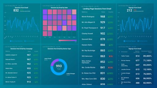
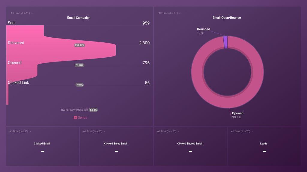
- How do I track my email marketing funnel? Track all sent emails to your email list, see how many (in terms of percentage) of those emails were delivered, how many people from your email list actually opened your email, and how people clicked through to an offer.
- What percentage of my sent emails were opened? Measure the success of your email marketing campaign by tracking what percentage of recipients opened your email. Also, see what percentage of email addresses in your list did not receive your email because the recipients’ mail servers returned them.
- How do I track email clicks? See how many people clicked on links in your sent email within a specific timeframe. Tracking this metric is useful as it lets you know if your CTAs, images, etc., are effective or need to be changed.
- How many people converted to leads from a specific email campaign? See how many people from your list clicked on a link in your sent email and went on to achieve the desired goal.
Pull additional data using our deep integration with Marketo
What else can you track and visualize with our deep integration with Marketo? When it comes to measuring your marketing efforts, almost anything:
- Campaign performance
- Lead management
- Sales velocity
- Click rates by campaign
There are many, many different metrics and metric combinations you can track using Marketo. And in Databox, you can quickly visualize 100s of Google Analytics metrics in a variety of different ways.
Explore more Marketo dashboards.
Marketo metrics included in this template
-
Clicked Email
The Clicked Email metric measures the number of times a recipient has clicked on a link within an email, indicating engagement with the content and potential interest in the product or service being promoted.
-
Clicked Link
The Clicked Link metric measures the number of times a link within an email or landing page has been clicked by a recipient, providing insight into engagement and the effectiveness of content.
-
Clicked Sales Email
Clicked Sales Email metric represents the number of times a sales email link was clicked by leads/prospects in an email marketing campaign managed by Marketo.
-
Emails Bounced
Emails Bounced is the number of emails that were not delivered to the recipient's inbox due to reasons like an incorrect email address, mailbox full, or blocked by the recipient's email server. It is vital in measuring the health and impact of your email campaigns.
-
Emails Delivered
Emails Delivered metric in Marketo represents the number of successfully sent emails that were accepted by recipient servers and were not bounced back.
-
Emails Opened
Emails Opened is a metric that measures the number of times an email campaign was opened by recipients. It is a key performance indicator in email marketing that helps to determine the effectiveness of subject lines, content, and timing of emails.
-
Emails Sent
The Emails Sent metric in Marketo measures the total number of emails that have been sent out from a specific email program or campaign. It helps track the volume of emails sent and analyze the overall performance of email campaigns.
-
Number of Leads
The Number of Leads metric tracks the total count of new leads generated within a specific timeframe and indicates the effectiveness of lead generation efforts.