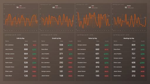
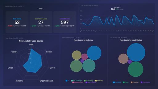
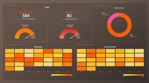
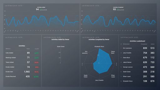
Track some of the most common Sales Team Activity metrics and KPIs and analyze your Sales Team Activity performance with just a few clicks.
TOP Sales Team Activity INTEGRATIONS
Use this free and customizable Freshdesk Tickets Overview Dashboard Template to track your tickets and hours to have a better insight into your customer’s needs and your team's efficiency so that you can take steps to swiftly resolve any customer issues that may occur.
What you’ll learn from this Freshdesk Tickets Overview Dashboard Template:
By connecting your Freshdesk account, you’ll learn:
1) What are my overall ticket statistics?
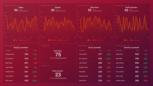
By tracking the number of ticket-related metrics you will be able to see at a glance what is the current status of all your tickets. How many are open/closed, pending, or overdue? In addition, you can check what is the ratio of resolved vs unresolved and if the number of unassigned is higher than you might want it to be.
2) What is the trend when it comes to the number of created tickets?
Keep track of your total tickets created to get a detailed drill-down of all the tickets created during the specific time period. More importantly, you can see compare that number to a previous period to see if this trend is rising or falling so that you can take steps that can help adjust it accordingly.
3) Keep an eye on the priority of your tickets created?
Keeping track of tickets created priority can help you see what is the severity of your customer issues. If you have mostly medium priority tickets and a small percentage of urgent ones that can be an indicator that you are on the right track.
4) Do you know how much time your team spends on tickets?
By tracking total house spent and then segmenting that to billable and non-billable hours you can drill down on exactly the amount of time needed to cover your existing ticket number and see what steps are needed to improve these numbers going forward.
Data Source: Freshdesk
Pull additional data using our integration with Freshdesk.
What else can you track and visualize with our integration with Freshdesk? When it comes to Freshdesk, you can access over 85 basic metrics and create custom ticket, company, and contact metrics and filtering and/or grouping data by standard or custom fields available in your Freshdesk account
Read more about Databox’s Freshdesk Integration.
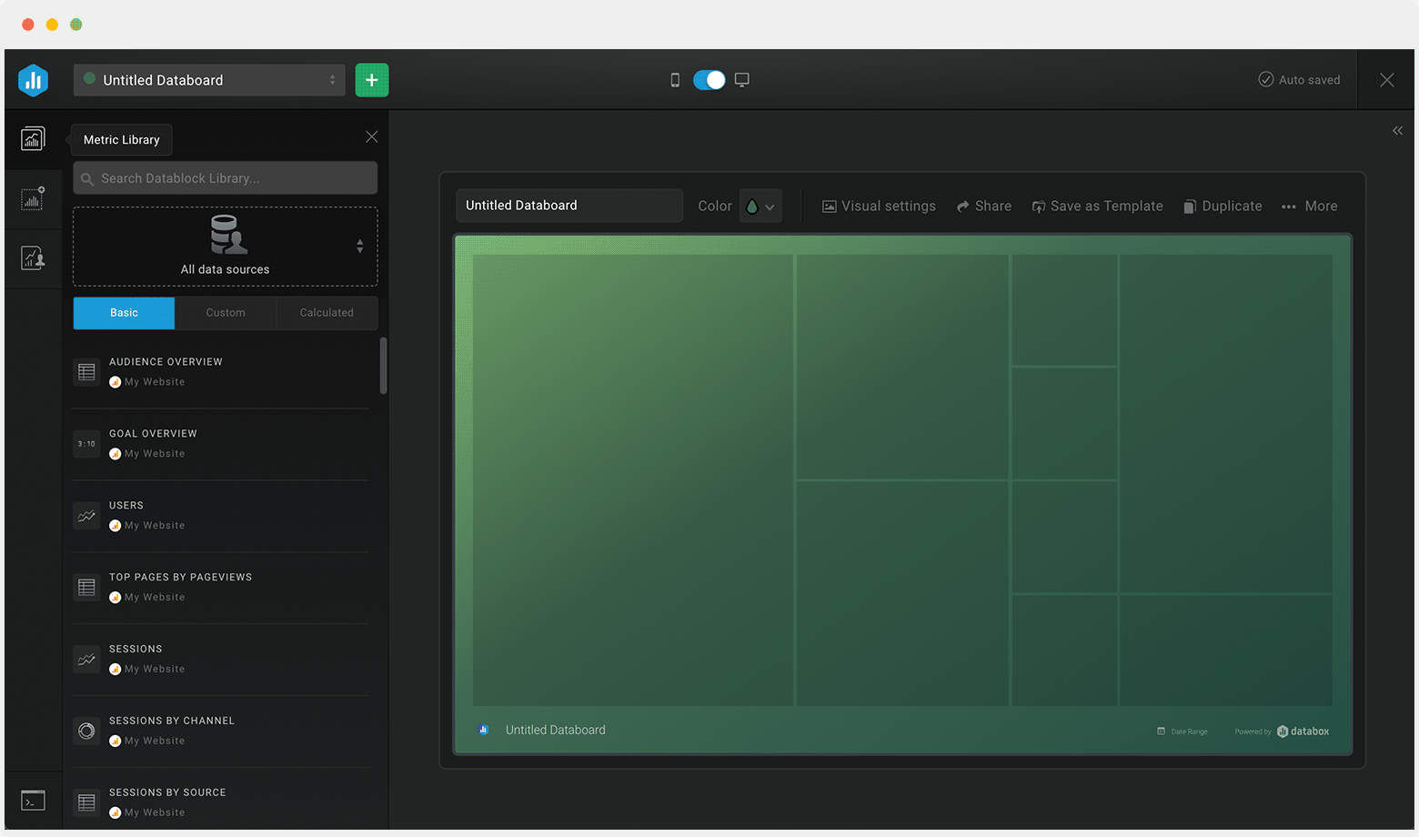
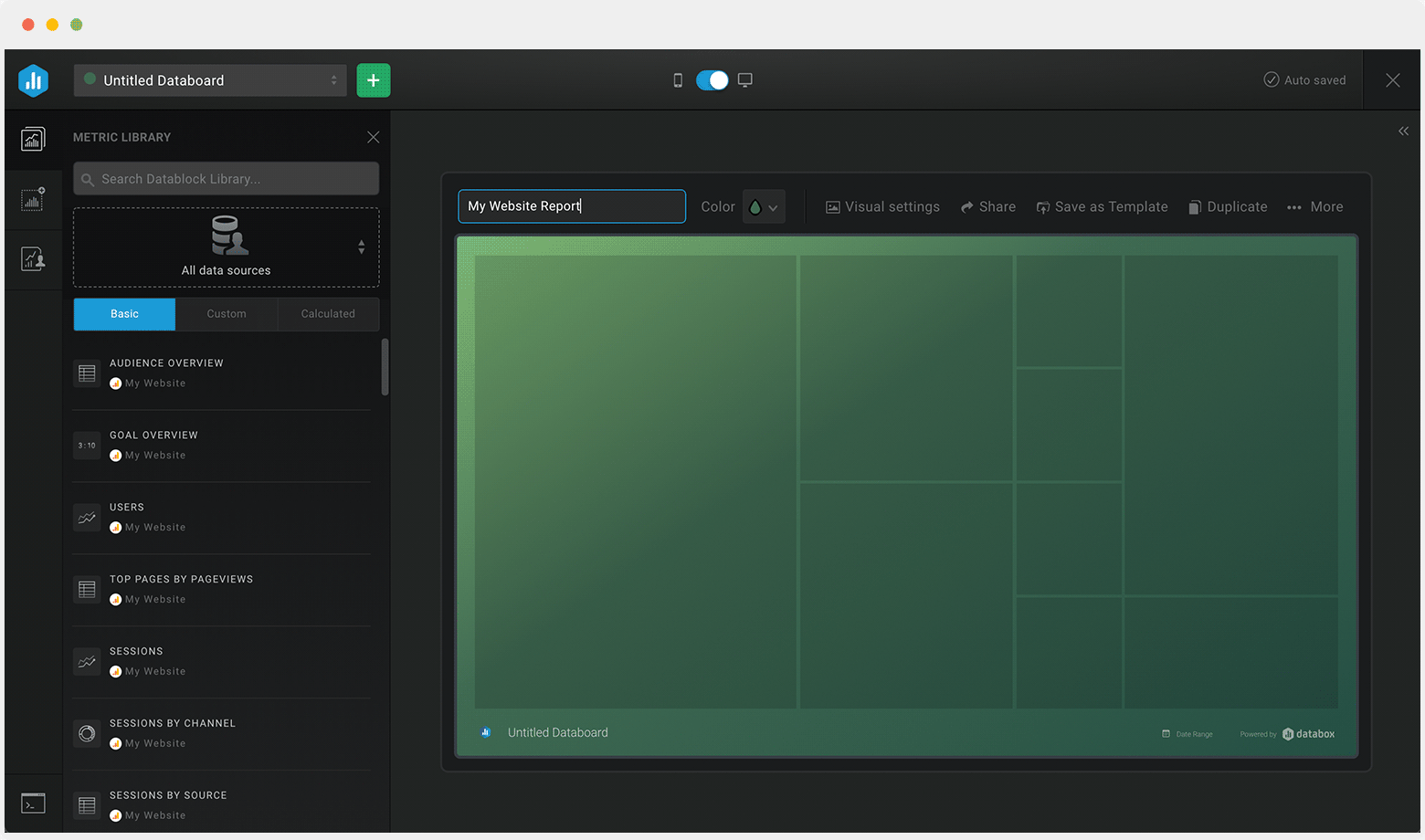
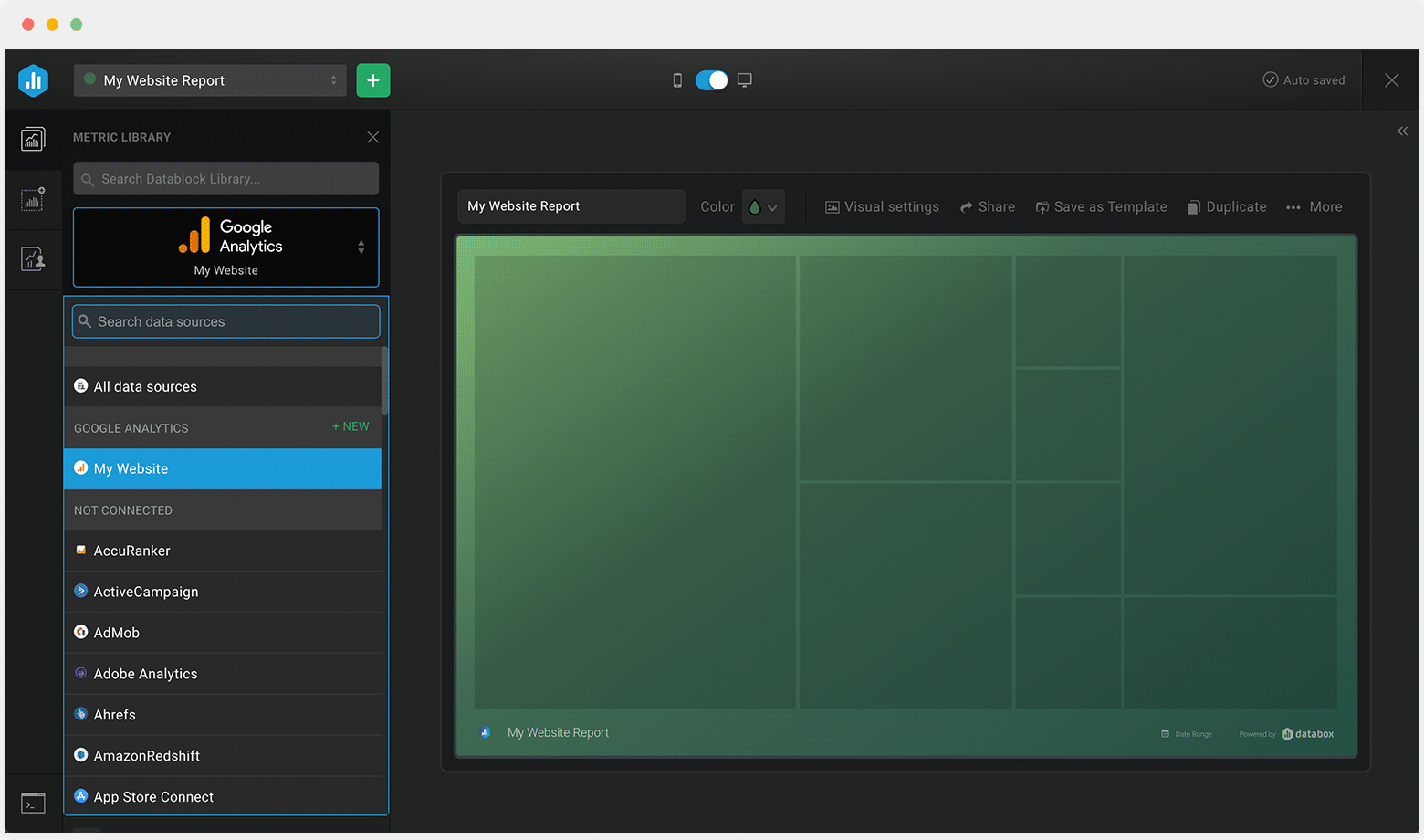
Customize this dashboard with Databox
Don’t just track your KPIs. Here are hundreds of tips for improving your customer experience.
Visualizing your performance data in a way that’s easy for everyone to interpret is the first step toward achieving better results for your business. So, what can you do when some of these metrics are trending down?
We’ve collected a few resources that contain tips from hundreds of other industry professionals on improving customer experience and more.
How Ecommerce Businesses Use Data to Improve Customer Experience
26 Effective Ways for Improving Your Customer Retention Rate
What is Customer Acquisition Cost and How to Keep it at a Minimum
11 Tactics for Effectively Measuring Your Customer Service ROI
Creating and Analyzing a Customer Service Report: Tips and Best Practices
 Intrix CRM (1)
 Salesforce CRM (1)
 HubSpot CRM (3)
 HubSpot Marketing (1)
 Pipedrive CRM (1)