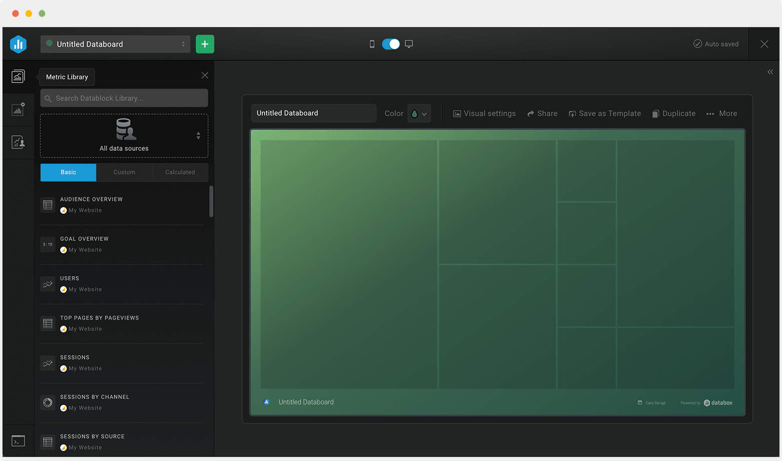
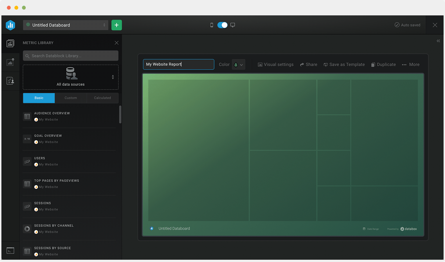
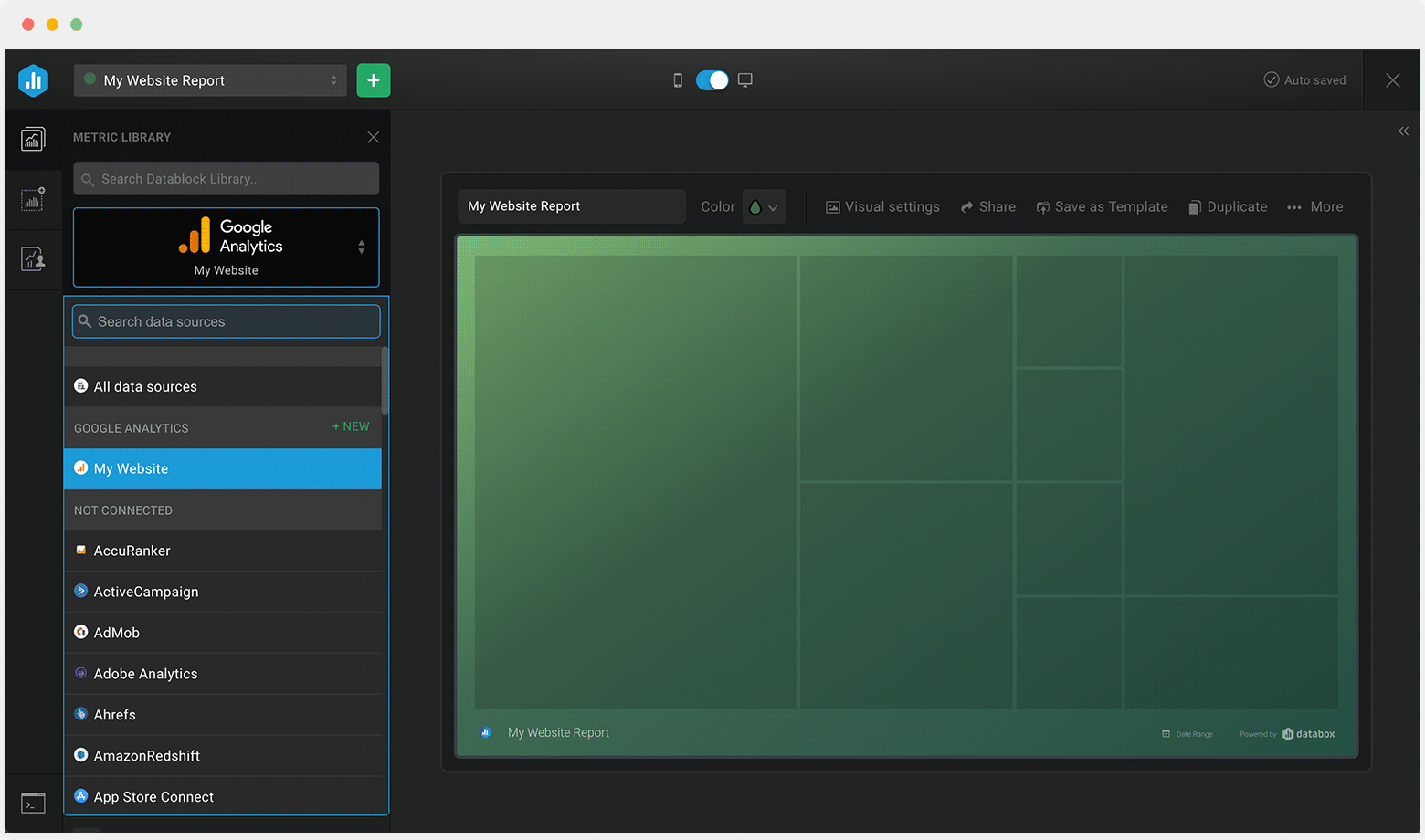
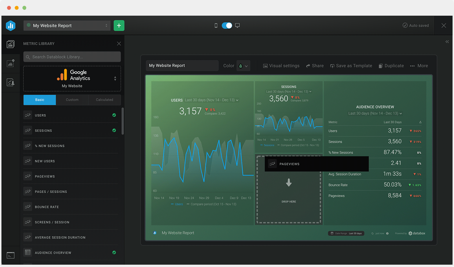
Track some of the most common Sales Team Activity metrics and KPIs and analyze your Sales Team Activity performance with just a few clicks.
You can build a dashboard with any data using Zapier, Make, Google Sheets, or a SQL database.

These sales team activity dashboards come pre-built with some of the most commonly tracked sales KPIs and metrics from the most popular tools. You can also customize your templates later. To get started, just choose a template, connect your data, and your metric visualizations will populate automatically.
Try It Free


No design or coding skills necessary.
Learn more about Dashboard DesignerUse this free and customizable Ads Spend Performance Overview Dashboard Template to drill deep into your ad spending and have clear insight into not just how your ad campaigns are performing when it comes to clicks and impressions but also what impact they have on your installs.
What you’ll learn from this Appfigures Ads Spend Performance Overview Dashboard Template:
By connecting your Appfigures account, you’ll learn:
By tracking Ads Spend Overview by Country, you will be able to see which market provides the best ROI when compared to the amount spent on ads. This will allow you to adjust your strategy and increase the revenue or adjust spending in the countries where you are underperforming.
Easily track your click-through rate (CTR) for your ad campaigns over time to see if you’re improving the engagement from your campaigns. Pinpoint the exact days where clicks were higher (or lower) and optimize and make adjustments based on what you learn.
By tracking your Ads Campaign Installs metric you can see how many installs are the result of your ad campaigns, and if your strategy needs to be improved if you are not reaching the set goal.
See how your ad campaign CPC is trending over the last 30 days. Has it increased or decreased? Use this information to make the necessary adjustments to your ad campaigns and/or audience targeting.
Pull additional data using our integration with Appfigures.
What else can you track and visualize with our integration with Appfigures? When it comes to Appfigures, you can access new and insightful integrations and get more valuable data from your apps. You can also sync the following data sources through Appfigures integrations:
There are numerous metrics and metric combinations you can track using Appfigures. In Databox, you can quickly visualize 50+ metrics directly from Google Play, the Windows App Store, the Amazon App Store, App Store Connect, and Stream.
Read more about Databox’s Appfigures Integration.
Don’t just track your KPIs. Here are hundreds of tips for improving your ads performance.
Visualizing your performance data in a way that’s easy for everyone to interpret is the first step toward achieving better results for your business. So, what can you do when some of these metrics are trending down?
We’ve collected a few resources that contain tips from hundreds of other marketing professionals on improving ads and revenue, avoiding marketing mistakes, and more.
What’s the Average CTR for Facebook Ads, and How Do You Improve It?
8 Proven Ways to Reduce Your Facebook Ad CPM
15 Tips for a Lower Facebook Ad Frequency and Higher Relevance Score
18 Ways to Improve the Google Ads Quality Score of Your Next Campaign
Create Better Google Ads with the Help of These 11 PPC Ad Copy Examples
Google Ads Click-Through Rate (CTR): What's Considered Good and How Can You Increase It?
