Uses one-click integrations:
-
 Stripe
If you don't use Stripe, you can pull data from any of our 130+ one-click, native integrations or from spreadsheets, databases and other APIs.
Try this dashboard for free
Stripe metrics included in this template
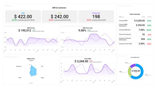
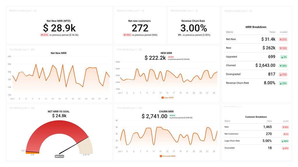
- Customer Churn Rate
- Churn rate
-
Churned Customers
Churned Customers measures the rate at which customers stop using a company's product or service within a certain period of time. It is an important metric for subscription-based businesses to track customer retention and identify areas for improvement.
-
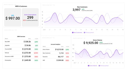
New Customers
New Customers metric represents the number of unique customers who have made their first payment or transaction with your business within a given time period.
- Net MRR Goal (Goal)
-
Downgrades
The Downgrades metric measures the number of customers who have shifted from a higher-priced subscription plan to a lower-priced one within a specified timeframe.
-
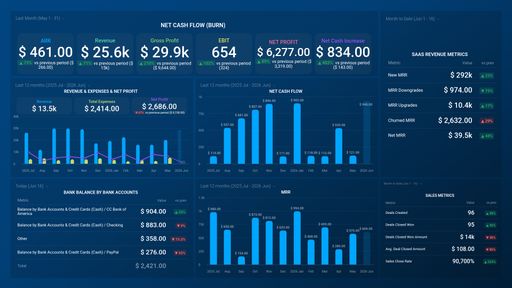
New MRR
New MRR is a metric used in Stripe to measure the total amount of recurring revenue generated by new customers who have signed up for a subscription or recurring product in a particular period.
-
Churned MRR
Churned MRR measures the loss or decline in revenue generated from existing customers due to cancellations, downgrades, or pricing changes.
-
Net MRR
Net MRR stands for Net Monthly Recurring Revenue and is a measure of the change in the MRR over a specific time period.
- Net New Customers - Stripe
-
Upgrades
Upgrades is a Stripe metric that measures the increase in revenue generated by customers who have upgraded to a higher pricing plan or subscription level.