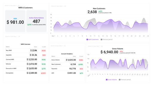
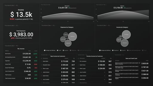
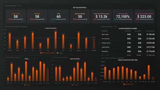
SaaS Leadership Dashboard Template (Profitwell + Xero)

Template created by Databox Databox
Stay on top of your SaaS financial performance with the SaaS Leadership (Profitwell + Xero) dashboard template. This interactive dashboard is the perfect fit for CEOs and business owners. It displays key SaaS financial metrics from Profitwell, Mixpanel, Xero, Google Analytics 4, and HubSpot CRM, such as MRR, Gross Profit Margin, Net Profit... and more, enabling you to monitor performance, analyze data, and make informed decisions about your financial strategy.

Uses one-click integrations:

  • Google Analytics 4 Google Analytics 4
  • HubSpot CRM HubSpot CRM
  • Xero Xero
  • Mixpanel Mixpanel
  • ProfitWell ProfitWell

If you don’t use Google Analytics 4, HubSpot CRM, Xero, Mixpanel or ProfitWell, you can pull data from any of our 100+ one-click, native integrations or from spreadsheets, databases and other APIs.

Get this dashboard for free

What you’ll learn from this SaaS Leadership Dashboard (Profitwell + Xero) Dashboard Template:

Connect your Profitwell, Xero, HubSpot CRM, GA4, and Mixpanel accounts and learn:

  • How do you monitor your annual recurring revenue? For subscription companies, like most SaaS businesses, annual recurring revenue gives you a high-level overview of your business health and helps you calculate the rate at which you need to grow to keep building on your success.
  • How to view a clear comparison of your revenue, expenses and net profit. By seeing your revenue, expenses and net profit side by side, you can easily detect if there is a major change in one or all three of these metrics. Ideally expenses should be lower than your revenue to allow for your net profit to grow. If there are any sudden or visible changes, you can easily detect them and take steps to find the cause and remove them. 
  • How to track your monthly recurring revenue? View the total amount of revenue you expect to make regularly. Monitor your business’ health and growth by keeping an eye on the following metrics: New MRR, upgrades, downgrades, revenue churn, and so much more.
  • What can I learn from my key sales metrics? Discover the total number of deals closed/won, the average deals close amount, and the average close rate. This will also give you insights into the productivity of your sales team
  • How do I track a bank transaction? See how cash comes in and goes out of your business’ bank accounts. Get up-to-date information on the state of your finances in regards to bank balance after withdrawals or transfers and deposits to your accounts.

Pull additional data using our deep integration with Profitwell, Xero, and HubSpot CRM

What else can you track and visualize with our robust integration with Profitwell, Xero, and HubSpot? When it comes to your most important sales, churn, payment metrics etc, almost anything:

  • Sales Leaderboard
  • Customer retention rate
  • Cash summary
  • Balance sheet
  • Conversion rate
  • Customer Retention rate

There are many, many different metrics and metric combinations you can track using Profitwell, Xero, and HubSpot CRM. And in Databox, you can quickly visualize dozens of Profitwell, Xero, and HubSpot CRM metrics & KPIs in a variety of ways, alongside all the important metrics from other data sources you’re using.

Read more about Databox’s Profitwell, Xero, and HubSpot CRM integrations.

Google Analytics 4 Google Analytics 4 metrics included in this template
HubSpot CRM HubSpot CRM metrics included in this template
Xero Xero metrics included in this template
Mixpanel Mixpanel metrics included in this template
  • Signup to Paid Conversion R. (Mixpanel + PW)

ProfitWell ProfitWell metrics included in this template
  • Upgraded Recurring Revenue

    The Upgraded Recurring Revenue metric measures the additional revenue generated by existing customers through upgrades or expansions of their subscription plans.

Customize this dashboard with Databox

Sometimes, you’ll want to dive deeper into performance. When you need to customize this template (or any other dashboard) to include different metrics, add metrics from different sources, etc., you can do so by using Databox’s Dashboard Designer.

The Designer allows you to easily drag-and-drop metrics and visualizations from any data source right into your dashboard.

Get Started