Uses one-click integrations:
-
 ActiveCampaign
If you don't use ActiveCampaign, you can pull data from any of our 130+ one-click, native integrations or from spreadsheets, databases and other APIs.
Try this dashboard for freeWhat you’ll learn from this ActiveCampaign dashboard template:
In this ActiveCampaign dashboard template, you will be able to measure the success of your marketing campaigns and sales efforts by evaluating these key metrics/areas: campaign engagement rate, pipeline, and goal performance.
Connect your ActiveCampaign account and learn:
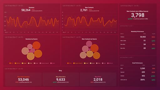
- Which campaigns have received the most engagement? Monitor how your email subscribers are engaging with your active email campaigns. Track the total number of email opens and clicks received for each email campaign sent during a specified time period.
- How clean is my email list? View how many of your email contacts did not receive your sent email for a variety of reasons (email address doesn’t exist, full mailbox, etc.). Also, track how many people opted out from receiving your email newsletter/resources.
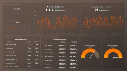
- How many deals did I close last month? Have an up-to-date detailed account of your deals and how much they are worth. Use this information to prioritize which deals to focus on.
- Is my list of contacts growing? See the number of contacts in your email list at any given point in time. Find out how many people signed up recently to receive your emails and keep track of how your email list grows over time due to these new signups.
- How do I keep track of our most important email marketing metrics? Get useful, actionable data on the metrics that matter the most to your email marketing efforts. See how many active campaigns you have in real-time as well as the number of deals, contacts, forms, and lists you have set up in your ActiveCampaign account.
Pull additional data using our deep integration with ActiveCampaign.
What else can you track and visualize with our deep integration with ActiveCampaign? When it comes to attributing to your traffic and conversions, almost anything:
-
- Email engagement
- Goal performance
- Pipeline performance
- Email list health
- Landing page automation
Explore more ActiveCampaign dashboards.
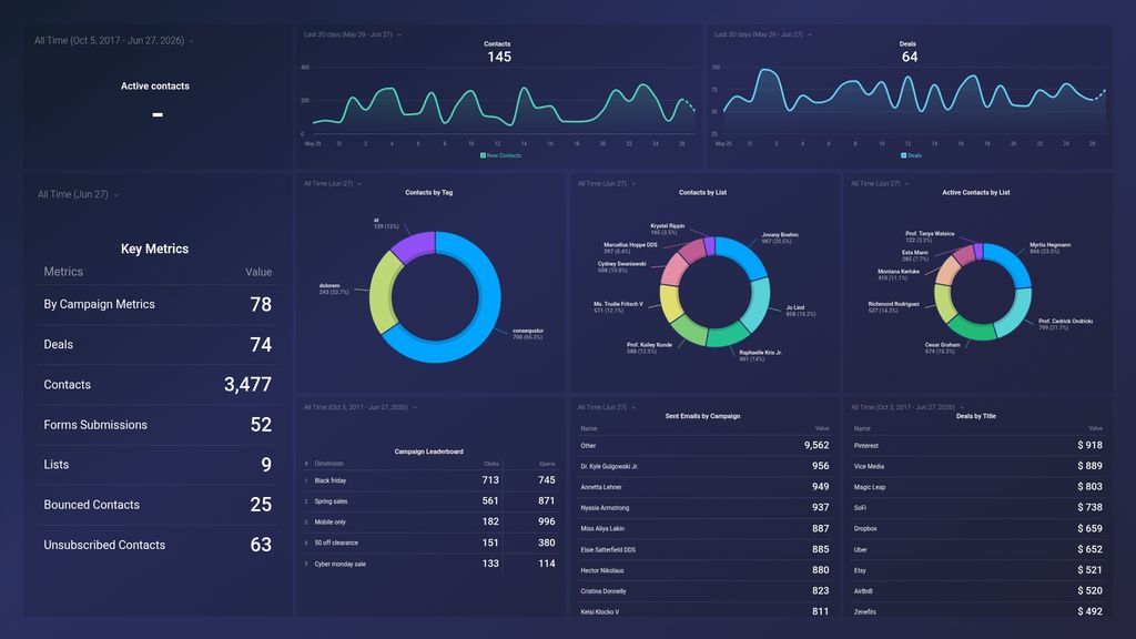
ActiveCampaign metrics included in this template
-
Bounced Contacts
The Bounced Contacts metric represents the number of emails that were not delivered to the intended recipient due to factors such as invalid email addresses or full inboxes.
-
Campaigns
The Campaigns metric in ActiveCampaign measures the efficacy of email marketing campaigns by tracking statistics such as open rates, click-through rates, and conversions.
-
Clicks by Campaign
Clicks by Campaign is a metric in ActiveCampaign that measures the number of clicks on links within emails sent as a part of a specific campaign. It helps assess the effectiveness of a campaign in engaging subscribers and driving traffic to a website or landing page.
-
Opens by Campaign
The Opens by Campaign metric measures the number of times an email campaign has been opened by recipients.
-
Sent Emails by Campaign
The Sent Emails by Campaign metric measures how many emails were sent out during a specific campaign. It helps track the overall reach of a campaign and can be used to evaluate its effectiveness in terms of driving engagement and conversions.
-
Contacts
Contacts represent individuals or organizations present in your ActiveCampaign account who have opted in to receive communication from you. The Contacts metric tracks the number of unique email addresses or unique individuals/organizations in your account.
-
Contacts by List
Contacts by List is a metric that shows the number of contacts present in a specific list in ActiveCampaign. It helps to track the growth of a particular list and analyze the engagement level of the contacts in that list.
-
Contacts by Tag
Contacts by Tag metric shows the total number of contacts associated with a specific tag. It enables you to segment your audience and tailor your communications to specific groups of people based on their interests or behaviors.
-
Deals
The Deals metric in ActiveCampaign tracks the progress of sales opportunities or deals through the sales pipeline, giving visibility into the status of each deal and the likelihood of closing.
-
Deals by Title
Deals by Title is a metric that measures the number of deals based on their stage title in your ActiveCampaign pipeline, providing you with an overview of the distribution of deals throughout the sales process.
-
Active Contacts
Active Contacts metric refers to the total number of contacts in your ActiveCampaign account who have engaged with your emails or other marketing campaigns during a specific period. It helps to measure the effectiveness of your campaigns and the size of your engaged audience.
-
Active Contacts by List
Active Contacts by List metric provides the number of active contacts currently subscribed to a specific list. It helps measure effectiveness of email campaigns on specific audience segments.
-
New Contacts
New Contacts is a metric that measures how many new leads or prospects have been added to your ActiveCampaign account within a certain timeframe, typically on a daily or weekly basis.
-
Unsubscribed Contacts
The Unsubscribed Contacts metric indicates the number of contacts who have opted-out or unsubscribed from your email campaigns, and are no longer eligible to receive future communications.
-
Deals
The Deals metric in ActiveCampaign tracks the progress of sales opportunities or deals through the sales pipeline, giving visibility into the status of each deal and the likelihood of closing.
-
Forms Submissions
The Forms Submissions metric in ActiveCampaign measures the number of forms submitted on your website or landing pages, providing insight into lead generation and engagement from website visitors.