Uses one-click integrations:
-
 HubSpot Service
If you don't use HubSpot Service, you can pull data from any of our 130+ one-click, native integrations or from spreadsheets, databases and other APIs.
Try this dashboard for freeWhat you’ll learn from this Hubspot Sales Rep Performance Dashboard Template:
Connect your HubSpot Service account and learn:
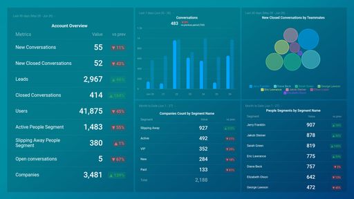
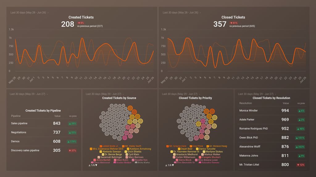
- Are we seeing any troubling trends with Support volume? Tracking ‘tickets created’ is a good measure for monitoring the customer impact of the changes you are making to your product or service.
- Are we staying on top of the tickets? Set a goal for the number of ‘closed tickets’ you’d like to have every day, week, or month, and closely monitor your team’s efficiency to hit it.
- Which areas of the business need more support? Find out through which pipeline the tickets came from. Tracking ‘tickets created by pipeline’ helps you flag specific areas of your business that may need additional support.
- Are we prioritizing our tickets correctly? View the number of tickets closed by priority to see if the priority system you have set up is working or if adjustments need to be made.
Pull additional data using our extensive integration with HubSpot Service
What other campaign metrics can you track and visualize with our integration with HubSpot Service? Almost anything:
-
- Created vs. Closed tickets ratio
- Tickets created by stage, pipeline, owner, priority, and resolution.
- Tickets closed by stage, pipeline, owner, priority, and resolution.
- A complete ticket overview.
There are many, many different metrics and metric combinations you can track using HubSpot marketing, CRM, and Service. And in Databox, you can quickly visualize hundreds of HubSpot metrics in a variety of different ways alongside metrics from all of the other tools you’re using.
Read more about Databox’s HubSpot Service.
-
HubSpot Service metrics included in this template
-
Created Tickets
The Created Tickets metric in HubspotServices tracks the number of new support tickets created within a specified time period, providing insights into customer demand and support team workload.
-
Closed Tickets
The Closed Tickets metric measures the total number of support tickets that have been resolved and closed within a specific timeframe.
-
Closed Tickets by Resolution
The Closed Tickets by Resolution metric measures the number of support tickets that have been resolved and closed based on the type of resolution, such as solved, not solved, or escalated.
-
Closed Tickets by Priority
The Closed Tickets by Priority metric tracks the number of support tickets closed based on their priority level, providing insights into the efficiency of your support team's response times to high-priority issues.
-
Created Tickets by Pipeline
The Created Tickets by Pipeline metric shows the number of support tickets created in each pipeline, providing insight into the volume of issues being handled by each team or department.
-
Created Tickets by Source Type
Created Tickets by Source Type is a metric that helps track the different channels (i.e. social media, email, phone, chat) a customer used to raise a support ticket in HubspotServices. This can inform companies on which channels are most effective for customer engagement and identify areas for improvement.