Uses one-click integrations:
-
 HubSpot CRM
-
 Stripe
-
 Xero
Xero
If you don't use HubSpot CRM, Stripe or Xero, you can pull data from any of our 130+ one-click, native integrations or from spreadsheets, databases and other APIs.
Try this dashboard for freeWhat you’ll learn from this SaaS Leadership Dashboard (Stripe + Xero + HubSpot CRM) Dashboard Template:
Connect your Stripe, Xero, HubSpot CRM, GA4, and Mixpanel accounts and learn:
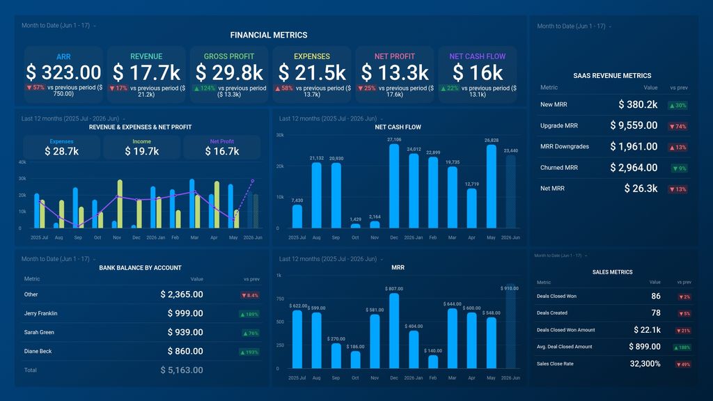
- What is your gross profit margin? Find out how much money you made after accounting for the cost of doing business. And you can also compare it to previous periods to track company growth.
- How to view a clear comparison of your income and expenses? By seeing your income and expenses side by side, you can easily detect if there is a major change in one or both of these metrics. Ideally, your income should be significantly higher than your expenses, but if there are any sudden or visible changes, you can easily detect them and take steps to find the cause and remove them.
- How do you track our monthly recurring revenue? View the total amount of revenue you expect to make regularly. Monitor your business’ health and growth by keeping an eye on the following metrics: New MRR, upgrades, downgrades, revenue churn, and so much more.
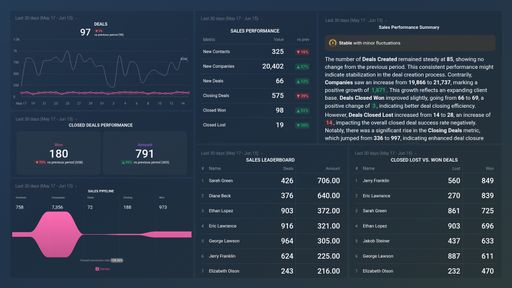
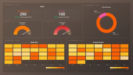
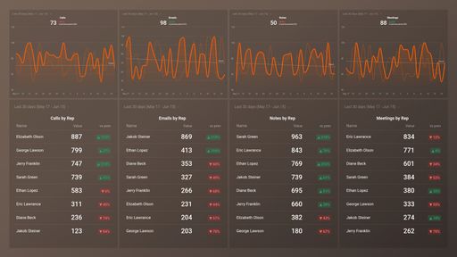
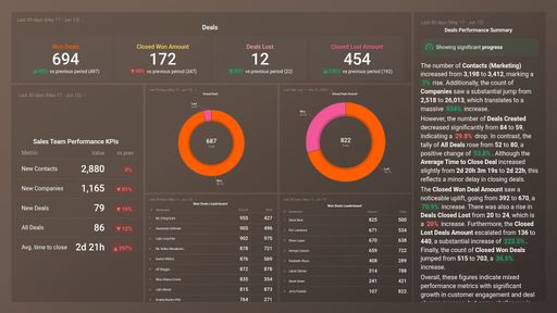
- What can I learn from my key sales metrics? Discover the total number of deals closed/won, the average deals close amount, and the average close rate. This will also give you insights into the productivity of your sales team
- How to track a bank transaction? See how cash comes in and goes out of your business’ bank accounts. Get up-to-date information on the state of your finances in regards to bank balance after withdrawals or transfers and deposits to your accounts.
- Keep track of your marketing and product performance? Track and visually monitor your most important marketing and product metrics - sessions, signups, new subscriptions and more. Use this data to map out future growth opportunities for your marketing.
Pull additional data using our deep integration with Stripe, Xero, and HubSpot CRM
What else can you track and visualize with our robust integration with Stripe, Xero, and HubSpot CRM? When it comes to your most important payment metrics, churn, etc, almost anything:
- Gross and Net volume
- Customer retention rate
- SEO results
- Cash flow
- Conversion rate
There are many, many different metrics and metric combinations you can track using Stripe, Xero, and HubSpot CRM. And in Databox, you can quickly visualize dozens of Stripe, Xero, and HubSpot CRM metrics & KPIs in a variety of ways, alongside all the important metrics from other data sources you’re using.
Read more about Databox’s Stripe, Xero, and HubSpot CRM integration.
Xero metrics included in this template
-
Opening Balance by Bank Account
The Opening Cash Balance by Bank Account metric in Xero is a report that displays the balance of each bank account at the beginning of a specified financial period. It provides a snapshot of the account balances before any transactions for the selected period have been entered into Xero.