Uses one-click integrations:
-
 ChartMogul
If you don't use ChartMogul, you can pull data from any of our 130+ one-click, native integrations or from spreadsheets, databases and other APIs.
Try this dashboard for freeWhat you’ll learn from this SaaS Key Revenue Metrics for Leadership - ChartMogul Dashboard Template
Get quick updates on your revenue reporting KPIs without hassle. Connect your ChartMogul account and learn:
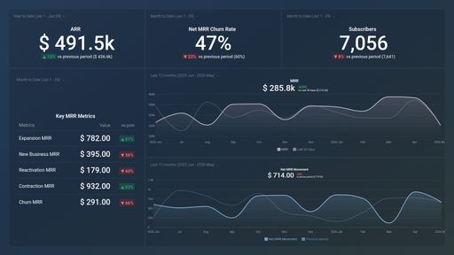
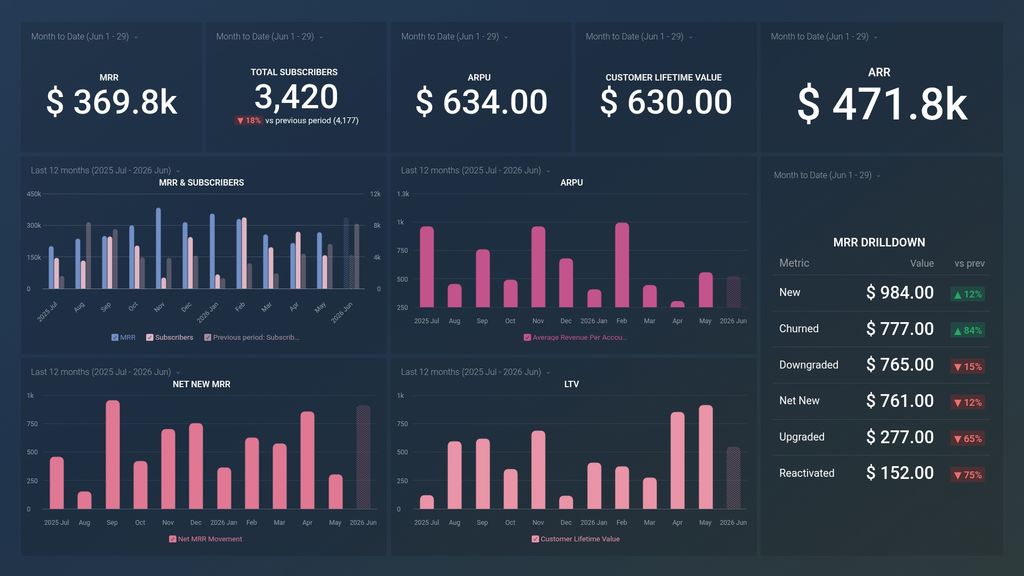
- How do you keep track of your monthly reocurring income? Find out high your reoccurring income is within a given month. Monitor your income stream and identify key periods of growth and decline in money coming in and take the required steps to get back on track if your income flow is down.
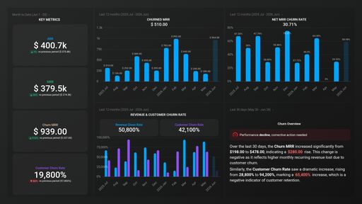
- How do you track customer lifetime value? This metric shows you the total net profit a company can expect to generate from a customer throughout their entire relationship. And it is important to see it trending up, and if its not discover what are the possible causes.
- How to track and manage your active subscriptions? See the total number of active subscriptions you have at any given point in time. You can also compare the number side by side with your MRR so you can see how one affects the other.
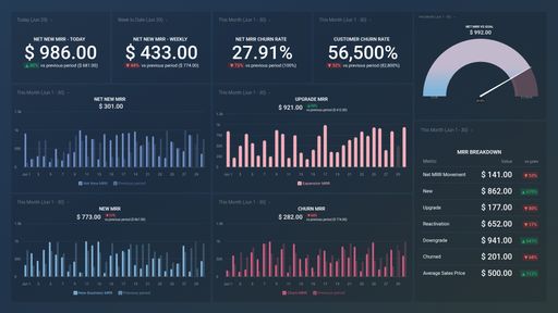
- Determine the ROI of your marketing efforts. By tracking your Average Revenue Per User you can determine the ROI of your marketing efforts and calculate the lifetime value of your customers. This metric is also beneficial for evaluating pricing structure (should you charge more?) and understanding how ARPU is changing over time.
- How to understand your MRR numbers better? Get deeper insights into your MRR by tracking metrics like Net New MRR, New, Upgraded, Churned, Downgraded and more.
Pull additional data using our deep integration with ChartMogul
What other financial metrics can you track and visualize with our ChartMogul integration? Among others:
- MRR
- ARR
- Customer Churn Rate
- Average Revenue per Account
- Average Sales Price
- Refunds
There are many different metrics and metric combinations you can track using this integration. And in Databox, you can quickly visualize your most important financial metrics in various ways to help you create consolidated reports.
Read more about Databox’s ChartMogul integration.
Explore more ChartMogul dashboards.
ChartMogul metrics included in this template
-
Average Revenue Per Account
The Average Revenue Per Account (ARPA) metric is the average monthly revenue generated per customer or account. It helps businesses understand the average value of each customer and their overall revenue potential.
-
Customer Lifetime Value
Customer Lifetime Value (CLTV) is a metric that calculates the total revenue a customer is expected to generate over their entire relationship with a business. #CLTV #metric
-
Subscribers
The Subscribers metric tracks the number of active customers or users that have been billed for a service or product during a specific time period.