
TL;DR
- Root cause analysis traces a performance change (a ROAS decline, a CAC spike) from the symptom your dashboard shows to the specific driver that caused it. Dashboards give you the what; this workflow gives you the why.
- AI will run the diagnosis in seconds. The failure mode to watch is not just wrong numbers but omission: a contributing driver left unmentioned, a disconnected data source silently skipped, a real decline smoothed into “flat.”
- Readers cannot catch this by eye, so the workflow has to force completeness: ranked contributions instead of “the cause,” before-and-after values instead of adjectives, a visible calculation behind every figure.
- The manual path works with platform exports and a spreadsheet: five steps, verifiable at every stage, roughly an afternoon per incident. The Genie path runs the same decomposition with five prompts, in minutes, on your connected data.
- Either way, verify before you act: the guide closes with a quick test that tells you whether any AI analytics tool returns numbers that match your source of truth.
Your dashboard already told you ROAS dropped. The expensive question is why, and answering it means correlating data across platforms, isolating variables, and testing hypotheses against the numbers. Done by hand, that is an afternoon per incident. Done by AI, it takes seconds, with one catch.
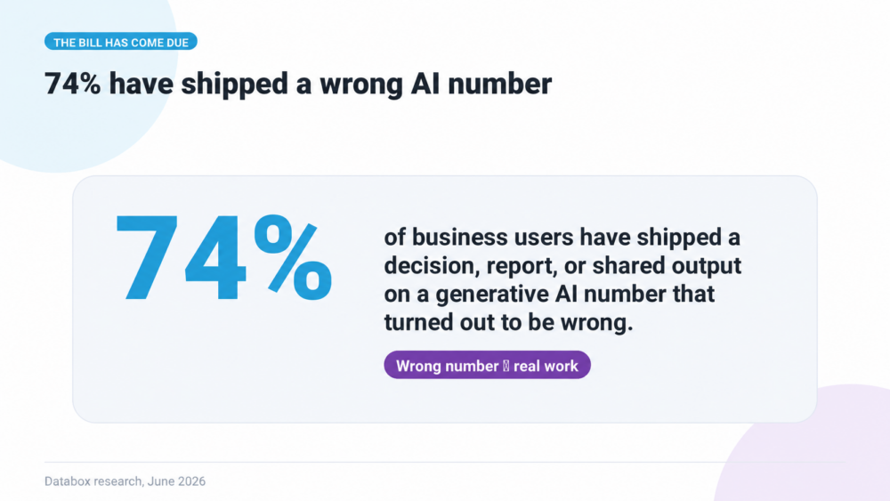
The catch is that AI does not just retrieve your numbers. It synthesizes them into a story, and synthesis makes choices: which drivers to name, which to drop, which details to round away so the narrative reads cleanly. In Databox’s survey “Using AI You Don’t Trust: How Business Users Actually Run Analytics in 2026,” 74% of business users had shipped a decision, a report, or a shared output based on a generative AI number that later turned out to be wrong. The explanation read fine. That is the problem.
This article shows how to use AI for the diagnosis while keeping an eye on what it leaves out: the omission patterns to watch, the full workflow two ways (manually with exports and a spreadsheet, and in Genie with five prompts written to force completeness), and a quick test for any AI analytics tool already in your stack.
What root cause analysis means in marketing, and why the “why” is the expensive part
Root cause analysis, in a marketing context, is the process of moving past what happened (ROAS dropped, CAC spiked, MQL volume declined) to why it happened: which specific combination of inputs, conditions, and dependencies produced the outcome. Reporting tells you pipeline fell 22%. Root cause analysis tells you the drop traces to a nurture sequence where open rates collapsed after a deliverability change, which starved the webinar of registrations, which cut the demo requests that feed pipeline. That chain, from symptom to root, is what RCA (root cause analysis) frameworks were built to trace.
Most marketing teams already have the symptom layer covered. Between Google Analytics, HubSpot, Salesforce dashboards, and BI tools, identifying what changed takes minutes. The expensive problem has always been the next step: diagnosing the why, which requires correlating data across sources, isolating variables, and testing hypotheses against the numbers.
Whether you run the diagnosis by hand or hand it to AI, the logic is the same decomposition. What differs is what it costs and how you verify it. And with AI, verification starts with knowing what to look for.
What AI leaves out when it synthesizes your data
An AI-generated diagnosis is a synthesis, and a synthesis makes editorial choices. Most of them are invisible in the output. These are the omission patterns worth checking every time, because each one changes what you do next:
The single-cause narrative. Performance changes usually have more than one driver, but a clean story names one. If the answer says your ROAS drop was “driven by rising CPCs,” the question is what share of the drop CPC actually explains, and what the rest was. A diagnosis that names a cause without ranking the contributions has made the ranking for you, silently.
Smoothed language over real movement. “Conversion volume remained flat” can mean conversions dropped 3%. “Broadly stable” can hide the one segment that collapsed. Adjectives are where small declines go to disappear, so ask for the before-and-after values, not the characterization.
Missing data treated as no data. A channel that isn’t connected, a date range that didn’t load, an attribution source the tool can’t see: none of these announce themselves in the narrative. The analysis reads complete because the synthesis only describes what it had. If a channel you spend on isn’t named in the answer, that is a finding, not an omission to shrug at.
Correlation narrated as cause. “Driven by” and “due to” are causal claims. A synthesis will make them from co-movement, because causal language is how fluent explanations are written. The check is whether the claimed driver’s contribution was actually computed, or whether the story just fit.
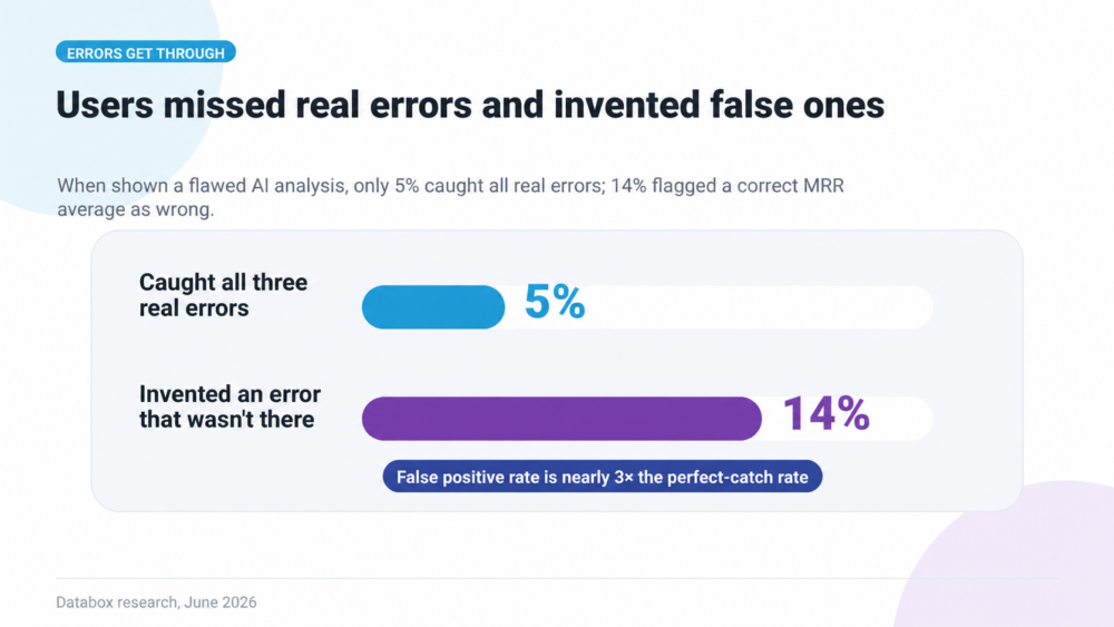
How likely are you to catch these by reading carefully? The same Databox survey ran an error-detection test: respondents reviewed an AI analysis containing three planted errors, and 5% caught all three. Meanwhile 14% flagged a problem that was not there.
Careful reading is not a verification method. The workflow has to force completeness instead, which is what the two versions below are built to do.
How to run a marketing root cause analysis without any special tooling
The analysis itself is not complicated. It is the logic the classic frameworks formalized: the 5 Whys pushes past surface symptoms to structural causes, the Fishbone Diagram maps candidate causes across channel, creative, audience, timing, and budget, and Pareto Analysis ranks contributors by magnitude so you address the largest one first. You can run all of it with platform exports and a spreadsheet. What makes it hard is not the logic. It is the time each step takes and the mistakes each step invites, most of which produce no warning.
Step 1: Define the symptom precisely
One metric, one magnitude, one time window: “ROAS dropped from 4.2 to 3.1, May versus April.”
- Where mistakes creep in: comparing periods of unequal length, or a period still inside the attribution window, so part of the “drop” is conversions that haven’t been credited yet.
- How to catch them: confirm both periods have the same number of days and that the later one has closed its attribution window before you start.
Step 2: Pull the component data from each platform
ROAS is revenue divided by spend, so you need revenue and spend per campaign for both periods, exported from every ad platform and your attribution source. This is where most of the afternoon goes.
- Where mistakes creep in: each platform exports in its own format, time zone, currency, and attribution model. A campaign renamed mid-month splits into two rows. A platform you forgot to export simply isn’t in the analysis, and nothing tells you it’s missing.
- How to catch them: total each export and compare it to the platform’s own dashboard figure for the same period. List every platform you spend on and tick each one off before moving on.
Step 3: Decompose the change in a spreadsheet
Compute the metric per campaign per period, the delta per campaign, and each campaign’s contribution to the total decline. This is Pareto Analysis with formulas instead of intuition.
- Where mistakes creep in: a formula range that stops one row short, a lookup that fails silently on a mismatched campaign name, averaging ROAS across campaigns instead of recomputing it from summed revenue and spend.
- How to catch them: the campaign contributions must add up to the total change. If they don’t, a row or a formula is wrong.
Step 4: Drill into the top contributor
For the campaign with the largest decline, split the change into its drivers: how much came from CPC moving, how much from conversion rate moving. This split decides what you do next (bid strategy review or landing page investigation), so it is where a wrong number does the most damage.
- Where mistakes creep in: stopping at the first driver that looks big enough, and missing the second one that explains the rest.
- How to catch them: the driver contributions must add up to that campaign’s total change. Whatever is left over is a driver you haven’t found yet.
Step 5: Verify against the source, then write it up
Spot-check the figures that drive the conclusion against the ad platform’s own reporting, then build the summary your leadership team will see.
- Where mistakes creep in: the write-up. Rebuilding the analysis as slides means retyping numbers, and every retyped number is a fresh chance for a typo.
- How to catch them: check the figures in the final summary against the spreadsheet, not just the spreadsheet against the source.
There is a shortcut many teams now take: export the data and paste it into a general-purpose AI chatbot, which runs the decomposition and writes the narrative in one pass. The time savings are real, with two caveats. A chatbot computes with the same language model that writes the prose, so its figures can drift from your exports. And it synthesizes, so every omission pattern from the previous section applies: single-cause narratives, smoothed language, missing data described as if it were complete. Re-check the numbers that drive the conclusion, and re-ask for anything the narrative skipped, before acting on it.
Done with that discipline, the manual workflow produces a trustworthy diagnosis. It also costs an afternoon or more per incident, and the checks are what make it trustworthy, so skipping them to save time defeats the point. That cost is why most teams run root cause analysis quarterly, after the damage is already in the numbers, instead of the week the metric moved.
The same analysis in Genie: five prompts
Genie runs the same five-step decomposition, and each step removes the mistakes the manual version invites. Your platforms are already connected, so there are no exports to reconcile. A query engine computes every figure, so there are no formulas to break. And the prompts below are written to force completeness: rankings instead of a single cause, before-and-after values instead of adjectives, and the calculation behind any number you want to check.
Paste these prompts in sequence, substituting your own metric or time window. The same sequence works for a CAC spike, a conversion rate drop, or any metric that moved.
Step 1: Start from the symptom
Why did our ROAS drop this month?Replaces: manual steps 1 and 2. Genie pulls revenue and spend per campaign from every connected platform for both periods, in one consistent time zone, currency, and date range. No exports, no reconciliation, no platform forgotten.
Step 2: Decompose the change
Break the ROAS change down by campaign. Rank the campaigns by how much each one contributed to the decline.Replaces: the spreadsheet decomposition. The contributions are computed from the data, so there is no formula range to break, and a ranked breakdown of every campaign blocks the single-cause narrative. Nothing gets left out of a ranking.
Step 3: Drill into the primary driver
For the campaign with the largest decline, how much of the ROAS drop came from CPC changes versus conversion rate changes? Show the before and after values for each.Replaces: the driver split, where a wrong number does the most damage. Asking for before-and-after values keeps a 3% decline from becoming “flat,” and asking for both drivers keeps the second one from going missing.
Step 4: Verify
Show me the query and the calculation behind the CPC change figure.Replaces: spot-checking against the source. Every figure traces back to a query you can read, so checking one number against the ad platform takes a minute instead of a re-run of the spreadsheet.
Step 5: Turn the answer into the deliverable
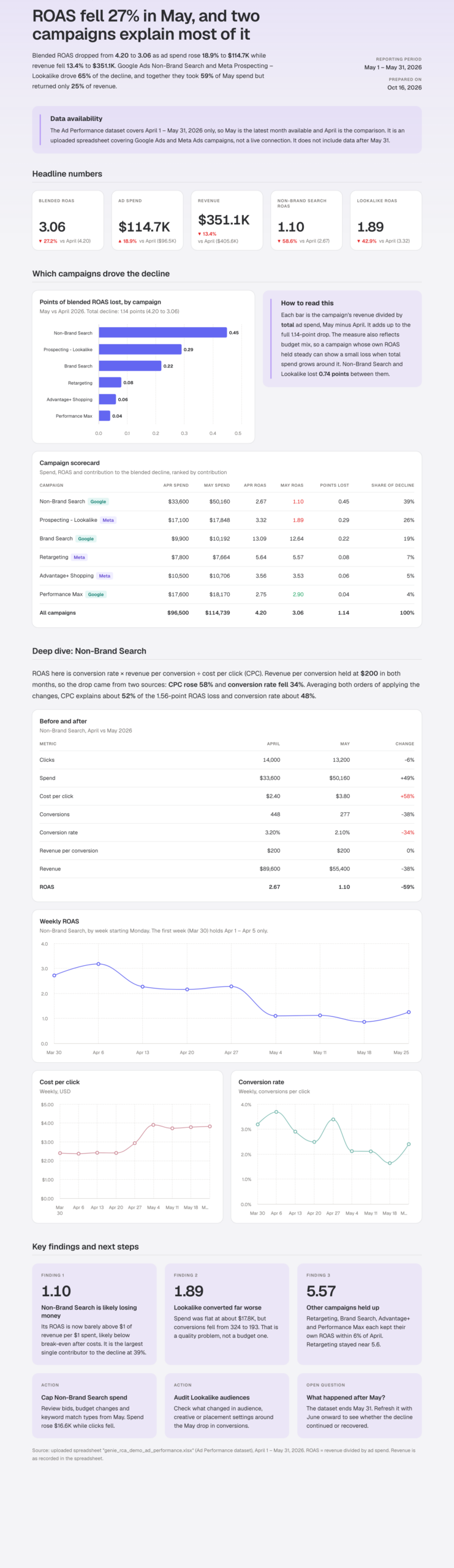
Turn this analysis into a report I can share with my leadership team.Replaces: the write-up. The answer becomes an Artifact, a report built directly from the computed results. No numbers are retyped, so none can be mistyped.
Side by side
| Step | Without Genie | With Genie |
|---|---|---|
| Define the symptom | Check period lengths and attribution windows by hand | Asked in one prompt; Genie applies the date ranges consistently |
| Pull the data | Export from every platform, reconcile formats, time zones, currencies; a forgotten platform goes unnoticed | Already connected; every platform included in one consistent dataset |
| Decompose the change | Spreadsheet formulas that can break silently; check that contributions sum to the total | Computed by the query engine; ranked breakdown of every campaign |
| Find the drivers | Easy to stop at the first big driver; check the leftover | Both drivers with before-and-after values, on request |
| Verify | Re-check key figures against each platform | Read the query behind any figure |
| Share | Retype numbers into slides | Turn the answer into an Artifact; no retyping |
| Total time | An afternoon or more per incident | Minutes |
The logic is identical, and so is the standard: every number checkable against its source. What changes is what it costs to meet that standard. One more thing stays the same, too. Genie writes its answer as a narrative, and narratives compress, so read each answer for the omission patterns above. The prompts are built to make that check fast, not to make it unnecessary.
How to check whether an AI analytics tool returns numbers you can trust
If you already use an AI analytics tool, one test tells you whether its numbers are computed or generated. Ask the same question three times, 30 seconds apart. A query engine returns the same result every time, because it runs the same query against the same data. A tool whose language model does the math may not. If you get 31.8% once and 32.4% the next time on unchanged data, verify every figure before it drives a budget decision. The checks from the manual workflow work on any tool’s output too: contributions should sum to the total, and every platform you spend on should appear in the answer.
Tools built for agentic analytics, where a query engine computes the numbers and the language model only explains them, pass these tests by design. Genie is built that way, which is why the prompts above return figures you can check against your own platforms.
Root cause analysis as a weekly practice, not a quarterly post-mortem
The manual workflow and the Genie workflow run the same decomposition. The difference is cost: an afternoon of exports and reconciliation against five typed questions. That cost difference decides how often the analysis happens, and how often it happens decides whether the diagnosis arrives before the budget decision or after it.
When “why did ROAS drop this week?” gets a verified answer in minutes, root cause analysis stops being the post-mortem that explains last quarter and becomes the check you run the day the metric moves. Both versions of the workflow are above. Run whichever your tooling supports, verify the numbers, and read every diagnosis for what it left out.
Run the analysis on your own numbers
Connect your marketing data to Genie and paste the first prompt: Why did our ROAS drop this month?
Frequently asked questions
What is root cause analysis in marketing, and how does it differ from standard performance reporting?
Root cause analysis in marketing is the process of tracing a performance change (a CAC spike, a ROAS decline, a drop in MQL volume) from the observed symptom back to the specific input or condition that caused it. Standard performance reporting tells you what changed; RCA tells you why, with enough causal specificity to determine what action to take. Knowing pipeline dropped 22% is reporting. Understanding that the drop traces to a deliverability change that collapsed email open rates in a key nurture sequence is root cause analysis.
Can you run marketing root cause analysis without specialized tools?
Yes. The analysis is a decomposition: define the symptom, pull component data from each platform, compute the metric per campaign per period in a spreadsheet, rank the contributions, drill into the top driver, and verify against the source. It produces a trustworthy diagnosis because the spreadsheet engine does the math. The cost is time: exports, reconciliation across platforms, and manual verification, which is why most teams run it quarterly rather than the week the metric moves.
What should you double-check in an AI-generated marketing diagnosis?
Four things. Whether the named cause comes with a ranked contribution breakdown, or stands alone (a single-cause narrative usually hides co-drivers). Whether characterizations like “flat” or “stable” are backed by before-and-after values. Whether every data source you spend money on actually appears in the analysis (a missing channel reads as completeness, not absence). And whether causal language like “driven by” traces to a computed contribution or just a plausible story. If the tool can show the calculation behind a figure, check one against your source platform.
How can a marketing leader tell if an AI analytics tool’s numbers are computed or generated?
Ask the same question three times in succession. A query engine returns identical results each time. A tool whose language model does the math may return slightly different numbers across runs, because it is generating, not computing. Then check one key figure against your source platform before it drives a decision.
Do traditional RCA frameworks like the 5 Whys still matter when AI tools can automate the analysis?
The 5 Whys, Fishbone Diagram, and Pareto Analysis defined the logic of root cause analysis: ask why repeatedly, map causes across categories, rank by magnitude. AI-powered tools automate the execution of that logic, but the framework is unchanged. A tool ranking contributing factors by impact is applying Pareto logic; the difference is that the computation takes seconds instead of hours when a query engine handles the math.
How often should marketing teams run AI-powered root cause analysis on their campaign performance?
When the computation layer is trustworthy, root cause analysis shifts from a quarterly post-mortem to a continuous practice. “Why did organic conversion rate drop this week?” gets a verified answer before the next standup. Frequency is limited only by how often the data updates and how quickly the query engine returns results, not by how long a human analyst takes to build a spreadsheet.