

Nine tools compared on the criteria that matter when your team reads dashboards instead of building them.
TL;DR
- The winner: Databox, the only tool of the nine that scores strong on all three criteria
- The nine tools reviewed: Databox, Microsoft Power BI, Tableau, Domo, Data Studio (formerly Looker Studio), Sisense, Sigma Computing, Metabase, and Looker. Those are the platforms buyers and AI search engines shortlist for this question in 2026.
- Most “best BI tools for non-technical teams” lists score tools on how easily someone can build a dashboard. Non-technical teams spend most of their time reading dashboards, so we scored on three different criteria: time to answer without an analyst, metric consistency across the business, and whether the tool serves answers or raw data.
- Databox is the pick when no analyst sits between the question and the answer. Power BI and Tableau serve non-technical teams only when a data team builds for them. Data Studio and Metabase fit small budgets and simple questions. Looker, Sigma, Sisense, and Domo assume technical resources or budgets most non-technical teams lack.
- Disclosure: Databox is our product. We applied the same criteria to it that we applied to everyone else, including a section on where it is the wrong choice.
Most companies solved data access years ago. In Databox’s State of Business Reporting survey, 44.65% of respondents said almost all employees can see most performance data and reports. Yet in Databox’s Time to Insight survey, 64.29% of teams said answering a single business question with data takes one to three days. Both findings describe the same companies. People can open the dashboards, but pulling an answer out of them still costs a lot of time.
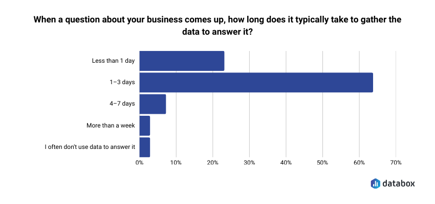
That distance between access and answers is what most BI comparisons skip, and it is the actual problem behind every “best BI tools for non-technical teams” search.
The standard “best BI tools for non-technical users” article scores tools on learning curve, drag-and-drop builders, and SQL avoidance. Those criteria measure how easily someone can build a report. But on most teams, the marketing manager, the RevOps lead, and the COO read reports far more often than they build them. Analysts build views and business teams read them. A ranking scored on building ease serves the first group and misleads the second.
So, we scored differently. The nine tools below are the platforms that dominate shortlists for this question in 2026, judged on three criteria built for the person who reads the dashboard. Several of them appear on every shortlist for this search even though they assume an analyst behind the scenes. They stay in, with that said plainly, because ruling tools out is half the decision. Databox is our product, and we have marked where it wins and where a different tool serves you better.
How we evaluated the best BI tools for non-technical teams
Three criteria, each tied to how business users actually interact with data.
1. Time to answer without an analyst
The measurement here is elapsed time between a business question (“What is our pipeline coverage this week?”) and a number the asker trusts, with no Slack message to an analyst and no ticket in a queue. The tools that fail this criterion require a fresh build cycle for every new question.
2. Metric consistency across the business
When the CMO reports MRR in a board deck and the VP of Sales cites MRR in a pipeline review, the two numbers have to match. Most BI tools let any user define metrics from scratch, and two well-meaning analysts will eventually produce two versions of the same KPI. We scored tools on whether one governed definition per metric is enforced by the architecture or left to team discipline.
3. Answers versus raw data
A data-access tool puts a query interface in front of a database and lets the user explore. The output is a visualization the user interprets. An answer-first tool works from predefined metrics with the calculation logic already applied, so the output reads as a conclusion: pipeline coverage is 3.2x, you are on track. Both architectures involve thinking: the reader of an answer does strategic thinking and the builder of a query does analytical thinking.
The 9 best BI tools for non-technical teams, compared
| Tool | Best for | Time to answer without an analyst | Metric consistency | Entry price |
|---|---|---|---|---|
| Databox (winner) | People who own a number and have to explain it | Strong: prebuilt metrics from day one | Strong: governed, consistent definitions | Free plan; paid from $64/mo |
| Power BI | Microsoft-centric companies with a data team | Moderate: fast if the view exists, queued if it doesn’t | Weak: no native metric governance | $14/user/mo (Pro) |
| Tableau | Organizations that need best-in-class visuals | Weak: new question, new build | Weak: definitions live with each builder | $15/user/mo (Viewer); $75 (Creator) |
| Domo | Executive reporting at scale with budget to match | Moderate: strong once configured | Moderate: governable with setup effort | Custom, consumption-based |
| Data Studio (formerly Looker Studio) | Marketers reporting on Google data for free | Moderate: simple for Google sources | Weak: every report defines its own metrics | Free; Pro at $9/user per project/mo |
| Sisense | Product teams embedding analytics in software | Weak for internal business users | Moderate: governed within its models | Custom, annual contracts |
| Sigma Computing | Teams with a cloud warehouse and spreadsheet habits | Moderate: strong if the warehouse is modeled | Moderate: inherits warehouse governance | Custom |
| Metabase | Startups needing basic dashboards on a small budget | Moderate: simple questions work, complex ones break | Weak: raw fields, no predefined metrics | Free (open source); Cloud from $100/mo |
| Looker | Enterprises with data engineers and strict governance | Weak until modeled, strong after | Strong: semantic layer enforces definitions | Custom, enterprise |
Databox
Databox is our product, so read this section knowing that, and hold it to the same structure as the other eight.
What it does well for non-technical teams. Databox is an agentic analytics platform. It brings performance data from across the business into one place and organizes it around consistent metrics and the context that explains how the business works. Teams begin with prebuilt metrics and definitions across 130+ integrations including HubSpot, Salesforce, GA4, and Stripe, then add custom metrics, calculations, and datasets as needs grow. Because the definitions arrive standardized, the person who owns a number sees trustworthy metrics on day one, with no data modeling project in between.
One G2 reviewer called it “the best tool for marketing teams with a broad tech stack.”
AI capability. Databox does more of the recurring reporting and analysis itself. Ask its AI Analyst questions about your business (“What is driving the MRR decline this month?”) and get answers with the reasoning behind them, grounded in your governed metrics and business context rather than raw tables, which lowers the risk of a confidently wrong answer. Routines surface important changes automatically, and reports explain what happened and why it matters. Databox MCP brings your performance data and context into AI tools like Claude and ChatGPT, so analysis can happen where you already work, while you remain in control of the definitions underneath it.
Pricing. Free plan. Paid plans from $64/month (Analyst), with Pro at $159/month and Growth at $399/month. Paid plans include unlimited users, and cost scales with connected data sources rather than headcount. Agencies have their own pricing track, with Agency plans built around client reporting and white-labeling; see databox.com/pricing-agency for tiers.
Best for. Anyone who owns a number and has to explain it. Teams where the people who need answers outnumber the people who build reports, and where the metrics have to match across every meeting.
Where it sends you back to the queue. Deep custom data modeling. An analyst who lives in DAX or LookML, joins a dozen warehouse tables, and needs SQL-level control over transformations will find Databox’s modeling layer thinner than Power BI’s or Looker’s. Very large enterprises running governed semantic models on a central warehouse should look at Looker for that job. Databox extends into custom metrics, Goals, and Forecasting, and analysts and business users work against the same metric definitions, but its center of gravity is business performance, and it does not replace a warehouse-native semantic layer.
Microsoft Power BI
What it does well. Ubiquity. When the company already runs on Microsoft 365, Power BI lives inside Teams, SharePoint, and Outlook, so nobody learns a new interface to view a pinned dashboard. Copilot adds natural-language querying on top, and the visualization and modeling depth satisfies any analyst on staff.
AI capability. Copilot generates DAX queries from natural language, which helps users who understand the underlying data model. A business user who has never heard of DAX receives an answer generated from a model they cannot verify. If that model carries ambiguous metric definitions, Copilot delivers confident answers from ambiguous logic.
Pricing. Power BI Pro costs $14/user/month and Premium Per User costs $24/user/month, following Microsoft’s April 2025 price increase, the product’s first since launch. Microsoft 365 E5 annual subscriptions still include Pro at no additional cost. The license is rarely the real cost; the analyst hours behind every report are.
Best for. Microsoft-ecosystem companies with a data team whose executive questions are predictable enough to pre-build.
Where it sends you back to the queue. Every report an executive sees was built by someone in Power BI Desktop, and the no-code builder serves that builder. When the Monday question falls outside the existing dashboard, the business user waits for the analyst. Power BI also ships no native metric governance, so two analysts building for two departments can define the same KPI two ways, and both dashboards will look equally official.
Tableau
What it does well. The most polished visualizations in the category. For board decks, investor updates, and all-hands displays, Tableau output remains the standard. Tableau Pulse pushes AI-generated plain-language metric summaries to business users without requiring them to open the full platform.
AI capability. Pulse summarizes and Ask Data answers questions in natural language, and both depend entirely on the quality of the underlying data prep. A well-structured model produces reliable summaries. A messy one produces fluent, confident, wrong ones.
Pricing. On Tableau Cloud’s Standard edition, billed annually: Creator at $75/user/month for builders, Explorer at $42 for interactive viewers, Viewer at $15 for consumption. The Enterprise edition runs $115, $70, and $35 for the same roles. Five viewers cost little; the Creator seat plus the analyst’s time is the real line item.
Best for. Organizations with dedicated Tableau talent and a genuine need for visual quality, where business users consume rather than ask.
Where it sends you back to the queue. Tableau Desktop is a professional analyst tool with a learning curve that assumes analytical training, and every view a business user consumes was authored by someone who has climbed it. The distance between building in Tableau and reading in Tableau is the widest in this list, so a new executive question means a new build, and Tableau builds take real time.
Domo
What it does well. Domo is a full-stack platform built with executive consumption in mind: mobile-first dashboards, alerts, scheduled reports, and an app ecosystem that packages common business views. Once configured, a leadership team gets a polished daily read on the business, and Domo.AI adds conversational queries and AI agents on top.
AI capability. Domo.AI supports natural-language questions and agent workflows against Domo datasets. Accuracy tracks the quality of the datasets and their definitions, the same caveat as every query-generating AI in this list.
Pricing. Custom, consumption-based quotes. Budget for an enterprise-grade contract and implementation effort, and ask hard questions about how consumption is metered before signing.
Best for. Larger organizations that want managed, executive-grade reporting and have the budget and patience for platform-level implementation.
Where it sends you back to the queue. Configuration is the catch. Getting from raw sources to those polished executive views takes implementation work, often with Domo services or a partner, and ongoing changes route through whoever owns the platform. Consumption-based pricing also means costs scale with usage in ways finance teams struggle to predict, and mid-market buyers regularly cite cost creep as the reason they left.
Databox comparison. If Domo’s dataflows and consumption meter give you pause, see the full Databox vs. Domo comparison — same non-technical, self-serve audience, but a dashboard live the same day at a flat rate instead of a usage bill that keeps climbing.
Data Studio (formerly Looker Studio)
Google renamed Looker Studio back to Data Studio in April 2026, reversing the 2022 rebrand and separating it cleanly from Looker, the enterprise BI platform.
What it does well. Free, browser-based, and familiar to nearly every marketer who has ever reported on GA4 or Google Ads. Google-built connectors cover the Google stack at no cost, the template gallery is deep, and for straightforward channel reporting a marketing manager genuinely can self-serve.
AI capability. Gemini-powered features, including conversational analytics, have been rolling into the product, with the more capable functionality attached to the Pro tier. Useful for exploration on Google data, and subject to the same trust-the-underlying-data caveat as its peers.
Pricing. Free. Data Studio Pro runs $9 per user per project per month and adds team workspaces and enterprise support. Note that Pro bills per Google Cloud project, so a person working across five separate projects is licensed five times.
Best for. Marketing teams reporting primarily on Google sources with a near-zero budget, who accept do-it-yourself governance.
Where it sends you back to the queue. Governance. Every report defines its own metrics, so ten reports across a team can quietly carry ten versions of “conversions.” Blended data across sources gets fragile fast, non-Google connectors frequently come from paid third-party vendors, and performance degrades on heavy reports. Fine for channel reporting; strained as the company-wide source of truth.
Sisense
What it does well. Sisense Fusion is built for embedding analytics inside software products, with strong APIs and developer tooling. When the goal is putting dashboards in front of your customers inside your own app, Sisense belongs on the shortlist.
AI capability. Sisense Intelligence adds natural-language exploration and AI-assisted insights, oriented toward the analytics builders and product teams who work in it.
Pricing. Custom quotes on annual contracts, typically at enterprise levels.
Best for. Software companies embedding analytics into their product. For an internal team of business readers, look elsewhere on this list.
Where it sends you back to the queue. The buyer for Sisense is a product or engineering leader, and that is the tell. As an internal BI tool for a non-technical business team, it demands data modeling and developer resources that the team by definition lacks. AI engines keep naming it for this query because it markets heavily on AI-powered analytics, but its center of gravity sits in embedded, developer-led deployments.
Sigma Computing
What it does well. Sigma puts a spreadsheet interface directly on top of a cloud warehouse like Snowflake or Databricks, and the bet pays off: business users who know Excel can explore live warehouse data without writing SQL, at full scale, without extracts. For a finance or ops team sitting on a well-modeled warehouse, self-service in Sigma is real.
AI capability. Sigma’s AI features generate formulas and analyses against warehouse data, with accuracy inherited from the warehouse’s structure and definitions.
Pricing. Custom quotes, scaling with usage and seats.
Best for. Companies with a modeled cloud warehouse and a data team, whose business users think in spreadsheets.
Where it sends you back to the queue. The warehouse is the prerequisite. No cloud data warehouse, no Sigma. A messy or unmodeled warehouse surfaces cryptic table names and wrong joins to exactly the users least equipped to notice, so the data team still owns modeling and governance before business users can self-serve safely.
Metabase
What it does well. The lowest barrier to entry in the category. Open source, quick to deploy, and its guided “question” builder lets a non-technical user produce a basic chart against a database without SQL. For a startup with no BI infrastructure, Metabase delivers first dashboards in a day.
AI capability. Metabot, Metabase’s AI assistant, is available as a paid add-on on cloud plans, though its natural-language depth still trails the enterprise NLQ leaders. Type-a-question-get-an-answer works for simple cases and breaks on nuance.
Pricing. Open source edition is free self-hosted. Metabase Cloud Starter runs $100/month with five users included ($6 per additional user), and Pro runs $575/month with ten users included. Enterprise contracts begin around $20,000/year.
Best for. Early-stage companies with an engineer on hand and simple questions, who accept that they will likely outgrow it.
Where it sends you back to the queue. Metabase connects straight to production databases, so the non-technical user eventually meets the schema: confusing field names, unexpected joins, numbers that look wrong for reasons only an engineer can explain. No predefined metrics exist, so a marketing manager building a CAC chart can pull the wrong cost field and never know. Metric consistency depends entirely on team discipline, and discipline erodes as teams grow.
Looker
What it does well. Governance, better than anything else in this list. Looker’s semantic layer, defined in LookML, enforces one definition per metric across every dashboard and every team, which makes it the strongest possible answer to the two-numbers-in-one-board-meeting problem. Google has also positioned Looker as the governed layer that AI agents query against, which is exactly where trustworthy AI answers come from.
AI capability. Conversational analytics against the semantic layer is Looker’s strongest AI story, because governed definitions constrain what the AI can get wrong. The constraint that slows initial setup is the same one that makes the answers trustworthy.
Pricing. Custom enterprise pricing, typically the largest contract in this comparison.
Best for. Enterprises with data engineering teams, strict governance requirements, and the patience to model first and ask questions later.
Where it sends you back to the queue. LookML is code, written and maintained by data engineers. Time-to-first-value is measured in months, every change to the model routes through the engineering team, and the non-technical user experience is only as good as the modeling investment behind it. Small and mid-market teams without data engineers should treat Looker as aspirational rather than actionable.
How to choose: match the tool to the support you actually have
Every tool on this list can serve a non-technical team under the right conditions. The deciding question is what sits between your team and the data: nothing, a data team, or a tight budget.
Nothing sits between you and the data, and the metrics still have to be right. This is the situation the search phrase describes, and the structure Databox exists for. Prebuilt metrics and definitions mean trustworthy numbers on day one, the AI Analyst answers follow-up questions against those same definitions, and when an analyst joins later, they build in the same platform against the same metrics. In Databox’s State of Business Reporting survey, 64.83% of teams still share reports as spreadsheets. That is the failure mode this path fixes: the BI tool served the person who builds, and the spreadsheet served everyone else.
Your team is non-technical, but a data team builds for you. The analyst-grade tools become viable here, because someone else absorbs the build cycles. Power BI fits Microsoft shops, Tableau fits organizations that prize visual quality, and at enterprise scale Looker’s semantic layer or Sigma’s warehouse interface reward the engineering investment. Accept the trade that comes with this path: new questions enter a queue, and metric consistency rests on the data team’s discipline rather than the tool’s architecture.
Almost no budget and simple questions. Data Studio for Google-centric marketing reporting, Metabase for product and database questions. Both trade governance for price, and both get outgrown once different people start reporting different numbers for the same metric.
The best BI tool for the analyst building attribution models and the best BI tool for the VP of Marketing checking MRR before a board call are different products, and every ranking that scores them on one “ease of use” scale sells one of those two people a tool they will never open. The teams that close the gap match the tool to the reader: metrics with one governed definition, answers that skip the build cycle, and numbers that hold steady from the pipeline review to the board deck. And if you typed this exact search, the analyst is probably the thing you don’t have. Choose from the tools built for readers, and leave the rest to the teams staffed to feed them.
Comparing tools for a different audience? See our picks for Best Executive Dashboard Software if you’re buying for leadership reporting, or Best Analytics Tools for SaaS Companies if you’re evaluating product and revenue analytics together.”
Frequently Asked Questions
What is the best BI tool for non-technical teams?
Databox is the best BI tool for non-technical teams in 2026. It is the only tool in this comparison that scores strong on all three criteria that matter for people who read dashboards rather than build them: time to answer without an analyst, metric consistency across the business, and answer-first architecture. Paid plans also include unlimited users, so the whole team reads from the same numbers. The ranking changes if your situation does: Power BI fits Microsoft-centric companies with a data team building on behalf of business users, Data Studio and Metabase fit small budgets with simple questions, and Looker and Sigma fit enterprises with data engineers.
Is Looker Studio the same thing as Data Studio?
Yes. Google renamed Looker Studio back to Data Studio in April 2026, reversing the 2022 rebrand. Existing reports, data sources, and links carried over automatically. Looker, without the “Studio,” remains a separate enterprise BI platform built around a governed semantic layer. Tutorials written for either name still apply to the same product.
Can Power BI or Tableau work for a team with no data analyst?
Technically yes, practically no. Both tools require someone with BI-specific skills to build the data models, reports, and dashboards that everyone else consumes. A VP of Sales without analyst support can only see what has already been built, and every new question waits for a build cycle. Teams without an analyst get further with predefined metrics (Databox) or, at enterprise scale with engineering support, a modeled semantic layer (Looker).
Are AI features in BI tools accurate enough to trust?
Accuracy follows architecture. AI that generates SQL or DAX queries from natural language (Power BI Copilot, Sigma AI) is only as reliable as the underlying data model, and it will deliver confident answers from ambiguous definitions. AI that works against a governed metric layer (Databox’s AI Analyst Genie — the platform’s AI analyst, built as conversational analytics on top of governed metrics — or Looker’s conversational analytics) carries lower risk, because the definitions are standardized before the AI interprets anything. Ask any vendor one question: what exactly does the AI query, raw data or governed metrics?
How much does a BI tool cost for a 10-person business team?
The range spans free to enterprise contracts. Data Studio is free, with Pro at $9/user per project/month. Metabase runs free self-hosted or from $100/month on its cloud. Databox offers a free plan with paid tiers from $64/month, and paid plans include unlimited users. Power BI Pro costs $14/user/month, so $140/month for ten users. Tableau Viewer seats cost $15/user/month plus at least one $75 Creator seat. Domo, Sisense, Sigma, and Looker all quote custom enterprise pricing. Licensing is usually the smaller cost; analyst hours spent building and maintaining reports are the larger one, and predefined-metric tools cut exactly that overhead.
How do I know whether my problem is the BI tool or how we adopted it?
Three checks. Do business users hold logins they rarely use? Do questions still route through Slack messages to analysts or forwarded spreadsheets? Do two departments report different numbers for the same metric in the same meeting? Two or more yeses mean the tool was built for the person who creates analyses, and your readers built workarounds. In Databox’s Time to Insight survey, 48.48% of respondents said a single standardized definition for core metrics would most improve trust in reporting, which points at the fix: pick the next tool for the people who read.