

The best executive dashboard software in 2026 lets executives ask their dashboards questions and trust the answers. For mid-sized companies that’s Databox; enterprises with data teams fit Power BI, Tableau, or Looker.
TL;DR
- Databox is the best executive dashboard software for mid-sized companies in 2026: executives build dashboards and ask them questions in plain language with AI, and every answer comes from verified, owned metrics, calculated by a query engine, with no data warehouse or data engineer required.
- 86% of business users reach for ChatGPT, Claude, Gemini, or Copilot before any other tool for analytical work, and 74% have shipped a decision on an AI number that later turned out wrong, per Databox’s “Using AI You Don’t Trust: How Business Users Actually Run Analytics in 2026” survey. Executives now get their answers from AI, so the best dashboard tool is the one that makes sure the AI answers with the right numbers.
- Power BI, Tableau, Looker, Omni, Qlik Sense, and Domo fit companies with data teams. Executives can ask questions in most of them, but an analyst or administrator has to build and maintain what the answers come from.
- Geckoboard fits teams that want KPIs on an office TV; Klipfolio PowerMetrics fits small teams that want a curated metric catalog with AI answers limited to it; Zoho Analytics fits companies already running the Zoho suite.
- The evaluation question changed in 2026. Pick the platform on whether executives can ask it questions and get governed numbers back, and on who has to keep those definitions current.
In Databox’s “Using AI You Don’t Trust: How Business Users Actually Run Analytics in 2026” survey, 86% of the respondents said they reach for ChatGPT, Claude, Gemini, or Copilot before any other tool for analytical work, including the BI tool, the analyst and the dashboard your team spent a quarter building. The same survey found 74% have shipped a decision, report, or shared output on an AI number that later turned out wrong.
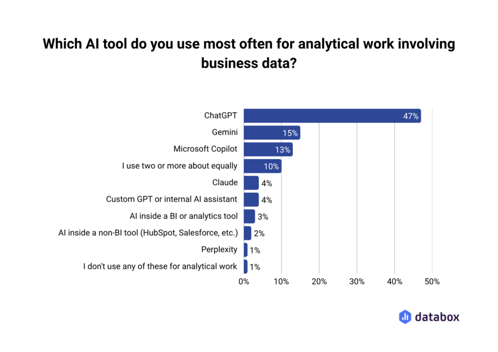
Read those two numbers together and the category changes. Your executives are in that 86%. When your CFO wants pipeline coverage the night before a board meeting, she asks an AI, and the AI answers with whatever it can reach: a stale export, a forked dashboard, the wrong revenue definition. The answer sounds confident either way.
So the best executive dashboard software in 2026 is the one that makes sure the number an executive gets, from a screen or from an AI, is the number the company agreed on.
A good executive dashboard tool in 2026 gets executives answers, and makes sure the answers are true
Executives never wanted dashboards; they wanted answers: is pipeline on track, why did CAC jump, which region is slipping. For fifteen years a dashboard was the closest thing to an answer they could get without waiting on an analyst, so the category competed on display. AI removed the wait. An executive now types the question and gets an answer in seconds, which is why 86% reach for AI first.
The catch is that AI answers from whatever it can reach, minus the context your team carries in their heads, like which of the three dashboards titled “Pipeline” the CRO actually opens. A human analyst filters that out before a number reaches the board. AI weights every version equally and answers first.
The infrastructure gap is measurable. In the same “Using AI You Don’t Trust” survey, only 9% of business users said they have a unified data layer their AI can query freely; 66% feed AI by pasting exports or connecting one tool at a time. Meanwhile 66% believe ChatGPT or Claude could replace their company’s BI tools outright. The belief runs far ahead of the plumbing.
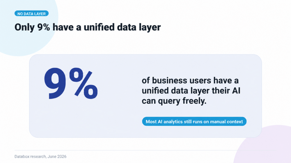
That gives the 2026 definition two halves. A good tool lets executives get answers by asking, in plain language, with no analyst in the middle. It also makes every answer true: computed from the numbers the company agreed on, by a system that can show its work. Tools that do only the first half produce confident wrong answers.
The evaluation criteria for executive dashboards changed in 2026
The old checklist asked about chart types, templates, and connector counts. Every tool on this list passes it, so it no longer separates anyone. The 2026 checklist follows from the definition above, and each criterion tests one half of it: can executives get answers, and are the answers true.
AI belongs on that checklist because it is already where executives do their analysis. In the same “Using AI You Don’t Trust” survey, 69% of business users use AI often or always for analysis they share with leadership, boards, or clients. A dashboard tool that leaves AI out does not keep executives away from AI. It sends them to a chatbot that cannot see the company’s numbers.
- Executives build and adjust dashboards with AI. They describe what they want to see and the tool assembles it from governed metrics. A dashboard that needs an analyst ticket to change answers last month’s questions.
- Executives ask the dashboard questions. A follow-up in plain language, on the same screen, answered from the same data the chart shows.
- Every number on the dashboard is the official one. The tool marks which dashboard and which metric definition the company agreed on, so “Revenue” means one thing on every screen leadership opens. Definitions kept in a Notion doc drift away from the dashboards within weeks.
- Every number has an owner and a history. A named person is accountable for each metric, and a log records who changed its definition and when. When a figure moves the week of a board meeting, someone can explain why in minutes.
- Answers match the chart. When an executive asks the dashboard a question, a query engine calculates the answer from the same data the chart shows. If the LLM does its own arithmetic, the answer and the chart can disagree, and the executive stops trusting both.
- No data engineer required. Mid-sized companies rarely have a spare $180,000 engineer to maintain a modeling layer. A tool that needs one goes stale by Q2. Test it in the trial: setup to a live executive dashboard should take hours, and every member of the leadership team should be able to view it without a paid seat. Databox’s “The State of Annual Planning & Modeling” survey of 116 senior leaders found 71.55% still run planning in spreadsheets, which is where executives drift back when a tool needs specialist upkeep.
The 10 best executive dashboard software tools in 2026, and who each one actually fits
Every tool below displays executive KPIs competently. The differences live in who maintains it, what happens when an executive asks a follow-up question, and where the metric definitions sit. Each entry names the team the tool fits and the constraint that comes with it, held to the same standard across all ten.
| Tool | Best for | Can executives ask the dashboard questions? | What grounds the AI’s answers | Needs a warehouse or data team |
|---|---|---|---|---|
| Databox | Mid-sized companies without a data team | Yes, through the AI Analyst, which also builds dashboards | A query engine on verified, owned metrics | No; Databox stores the data |
| Power BI | Microsoft 365 companies with an analyst | Yes, through Copilot, on Fabric or Premium capacity only | The analyst-built semantic model | Yes, an analyst to own the model |
| Tableau | Visualization-led enterprises | Yes, through Tableau Agent in Pulse (Tableau Cloud; more in Tableau+) | Pulse metrics an analyst defined | Yes, analysts define the metrics |
| Looker | Google Cloud enterprises | Yes, through Gemini Conversational Analytics | The LookML semantic layer | Yes, a warehouse and LookML modelers |
| Omni | Warehouse teams that want Looker-style governance | Yes, through AI chat | Omni’s semantic layer | Yes, a cloud warehouse |
| Domo | Large operations teams with many sources | Yes, through AI Chat and agents | Check in demo | Dedicated administration |
| Qlik Sense | Analyst-led exploration at scale | Yes, through Qlik Answers on Qlik Cloud | The Qlik analytics engine | Trained builders |
| Klipfolio PowerMetrics | Small teams that want a metric catalog | Yes, limited to metrics in the catalog | The curated metric catalog | Someone to curate the catalog |
| Geckoboard | KPIs on an office TV | No; only through Claude or ChatGPT via MCP | Geckoboard’s metrics engine | No |
| Zoho Analytics | Companies on the Zoho suite | Yes, through the Ask Zia agent | Check in demo | No for Zoho apps; check other sources |
1. Databox
Best for: mid-sized companies where executives want answers from governed data, without a data engineering team behind the curtain.
Databox dashboards are easy to make and easy to understand. Executives describe what they want to see in plain language, the AI builds it, and when a question comes up, they ask the AI in plain language and get an answer computed from the same metrics the dashboard shows. The data comes from 130+ tools, and the dashboards are delivered wherever leadership already works: office TV, mobile, Slack. The trust comes from what happens before a number reaches the screen. Each metric gets an agreed definition and a named owner, and once it is checked, a verification badge tells people and the AI that this is the approved version. When an executive asks a question, the AI computes the answer from that same verified data. If revenue suddenly jumps next quarter, the change log shows who edited its definition and when, so the team can trace the jump to its source.
When an executive asks Databox’s AI a question, a real query engine runs the calculation, so the LLM never touches the math. General-purpose chatbots working from pasted exports do the arithmetic themselves, which is how 74% of survey respondents ended up shipping a wrong AI number. Databox also stores the data itself, so there is no warehouse to build first.
The constraint: teams running heavy custom SQL modeling on a warehouse, with data engineers on staff, may prefer warehouse-native BI where the modeling layer is the product. Databox aims at the company that has data everywhere and a data team nowhere. See how it handles the executive use case specifically at databox.com/dashboard-software/executive.
2. Microsoft Power BI
Best for: organizations already living in Microsoft 365, with an analyst who owns the data model.
Power BI gives executives polished report pages inside Teams and Excel workflows they already know, and Copilot adds conversational summaries on top, though only for workspaces hosted on a paid Fabric or Premium capacity. The modeling depth in DAX rewards enterprises with real BI teams.
The constraint: everything an executive self-serves depends on the model an analyst built and maintains. When the model drifts from the business, Copilot summarizes the drift fluently. Licensing also decides who can see what: viewers need a Pro license unless the content sits on an F64 or larger capacity, which turns sharing with a leadership team into an admin project.
3. Tableau
Best for: enterprises where visualization quality and exploratory analysis carry the culture.
Tableau remains the strongest pure visualization environment in the category, and Tableau Pulse, available on Tableau Cloud, pushes metric digests to executives by email and Slack, with Tableau Agent answering questions about why a metric moved. Analysts who know the tool produce boardroom-grade visuals faster than in anything else.
The constraint: executives consume in Tableau; builders build. Pulse answers questions about metrics an analyst has already defined, and anything outside that set goes back into the analyst queue. The richer conversational features sit in the premium Tableau+ tier, and governance depends on how disciplined the deployment is rather than on defaults.
4. Looker
Best for: Google Cloud companies that want one governed metric definition compiled into every query.
Looker’s LookML modeling layer is the strictest governance stance on this list: define a metric once, and every dashboard and Gemini-assisted answer inherits it. For enterprises that can staff it, definitional drift becomes a code review problem.
The constraint: LookML is code, and the discipline that makes Looker trustworthy is the same discipline that makes it slow to change. Mid-sized companies without modeling engineers rent a semantic layer they cannot maintain.
5. Omni Analytics
Best for: data teams on a cloud warehouse who want Looker-style governance with faster self-serve exploration.
Omni pairs a governed semantic layer with point-and-click and SQL exploration on top of the warehouse, so a metric defined once stays consistent across every dashboard and AI-assisted answer. Teams that outgrew Looker’s rigidity tend to find the balance they wanted.
The constraint: Omni assumes the warehouse and the people who model it. A mid-sized company whose data lives across HubSpot, Stripe, and GA4 has to build that warehouse layer before Omni has anything to govern.
6. Domo
Best for: large operations teams that need hundreds of data sources and a mobile-first executive experience.
Domo built its reputation on executive consumption at scale, with 1,000+ connectors and an app-like mobile surface leadership actually opens. Its 2026 releases added an AI agent builder and an MCP server for outside AI tools. Alerting and scheduled digests keep executives current between reviews.
The constraint: the platform’s breadth demands dedicated administration, and buyers should factor in ownership: in July 2026 Progress agreed to buy Domo’s operating business for $400 million, so a new parent will set the roadmap.
7. Qlik Sense
Best for: analyst-led teams whose value comes from exploring relationships across large datasets.
Qlik’s associative engine lets users pivot through data relationships without predefined drill paths, which surfaces connections a fixed dashboard hides. Qlik Answers adds a conversational layer whose calculations run through that same engine.
The constraint: the agentic experience runs on Qlik Cloud, so on-premises Qlik Sense customers migrate first, and the associative model rewards trained builders. In practice an analyst sets up what the executive later asks about.
8. Klipfolio
Best for: small teams that want a catalog of defined metrics without a full BI deployment.
Klipfolio PowerMetrics treats the metric, with its definition and history, as the core object rather than the dashboard. Small teams get a lightweight metric catalog that resists definitional drift by design, and PowerMetrics AI answers plain-language questions with visualizations drawn only from that catalog.
The constraint: the AI answers only with metrics already in the catalog, so someone has to curate it before executives get value. Klipfolio also sells two separate products, Klips and PowerMetrics, so confirm which one a demo shows.
9. Geckoboard
Best for: teams that want KPIs on an office TV with near-zero setup.
Geckoboard does one thing with real craft: legible, live KPI displays a team walks past all day. For a sales floor or a support team, visibility alone changes behavior.
The constraint: display is the core product. An executive who sees a number move cannot ask the screen why. Geckoboard’s MCP server lets Claude or ChatGPT query the same metrics, but that conversation happens outside the dashboard.
10. Zoho Analytics
Best for: companies running the broader Zoho suite that want reporting in the same ecosystem.
Zoho Analytics covers dashboards, scheduled reports, and Ask Zia, an AI agent for plain-language questions, plus an MCP server for outside AI tools. Pricing is per account rather than per seat, and Zoho apps arrive with prebuilt reports.
The constraint: Zoho’s 500+ data source figure includes reach through Zoho Flow and Zapier, so check native depth for your specific tools. It fits best where the Zoho suite already runs the business.
Conclusion
The executive dashboard category spent fifteen years competing on display, and display is now table stakes across all ten tools above. What separates them in 2026 is what happens after the display: whether an executive’s follow-up question gets a governed answer, whether the AI reading the workspace can tell the official number from the forked copy, and whether keeping all of it current requires headcount you have.
Enterprises with data teams get real value from Power BI, Tableau, Looker, Omni, Qlik, and Domo, because those platforms assume the analyst stays in the loop. Teams that want a screen get Geckoboard, and teams that want a lightweight metric catalog get Klipfolio. Mid-sized companies whose executives already ask AI for the numbers, which the research says is most of them, need governance and answers in the same workspace, and Databox built for exactly that gap.
Your leadership team joined the 86% before your evaluation began. Pick the tool that makes their answers right.
See how verified metrics, the semantic layer, and AI answers work for a leadership team: databox.com/dashboard-software/executive
FAQ
Frequently asked questions
What separates executive dashboard software from regular BI tools?
Audience and altitude. Executive dashboards compress a company’s health into the handful of metrics leadership acts on, surfaced on TVs, mobile, and scheduled digests, with governance deciding which numbers qualify. General BI tools optimize for the analyst exploring data. Some platforms cover both; the failure mode is buying an analyst tool and expecting executives to self-serve in it.
Why does it matter whether the AI or a query engine calculates the answer?
An LLM reading numbers off a chart and computing its own averages produces results that are sometimes close and sometimes fabricated, with identical confidence in both cases. A query engine computes deterministically from source data, and the LLM only translates the question and the answer. For revenue, pipeline, or board-level figures, “sometimes close” fails the trust bar. The risk is highest with general chatbots working from pasted exports; most BI platforms now ground AI answers in a semantic model or calculation engine.
Can a mid-sized company get governed executive reporting without hiring a data engineer?
Yes, when governance lives inside the dashboard tool rather than in a separate modeling layer. Verified metrics, semantic context, ownership, and change logs managed by the same people who build the dashboards remove the maintenance burden that dbt- or LookML-style layers place on engineering. The enterprise playbook assumes headcount most 200-person companies never get.
How many metrics belong on an executive dashboard?
Fewer than the first draft has. A leadership dashboard earns attention by answering the questions the executive team actually asks weekly, and most leadership teams act on a dozen or fewer, each with a named owner and an agreed definition. Past that, the dashboard becomes a place numbers go to avoid decisions.
Which executive dashboard software works best if leadership already uses ChatGPT or Claude for analysis?
Pick a platform whose governed metrics reach the AI tools leadership already uses. Databox MCP connects Claude and ChatGPT to the same semantic layer its AI Analyst reads, with no warehouse required. Looker and Omni offer similar grounding for companies with a warehouse and modelers, and Domo, Geckoboard, and Zoho also ship MCP servers.